Hit-By-Pitch Rates Have Been Falling for Five Years Now

What is the sound of a batter not getting hit by a pitch? I ask because as hit-by-pitch rates climbed over the years (and kept climbing), we writers have made lots of noise about them. In 2007, Steve Treder published an article called “The HBP Explosion (That Almost Nobody Seems to Have Noticed)” in The Hardball Times. After that, everybody noticed. We’ve seen articles about rising hit-by-pitch rates here at FanGraphs, Baseball Prospectus, the Baseball Research Journal, MLB.com, The Athletic, SportsNet, FiveThirtyEight, the Wall Street Journal — even the Clinical Journal of Sports Medicine. The venerable Rob Mains of Baseball Prospectus has been writing about it (and writing about it and writing about) ever since he was the promising Rob Mains of the FanGraphs Community Blog. Tom Verducci wrote about the “hit-by-pitch epidemic” for Sports Illustrated in 2021, then wrote a different article with a nearly identical title just two months ago. There’s good reason for all this noise, and in order to show it to you, I’ll reproduce the graph Devan Fink made when he wrote about this topic in 2018:
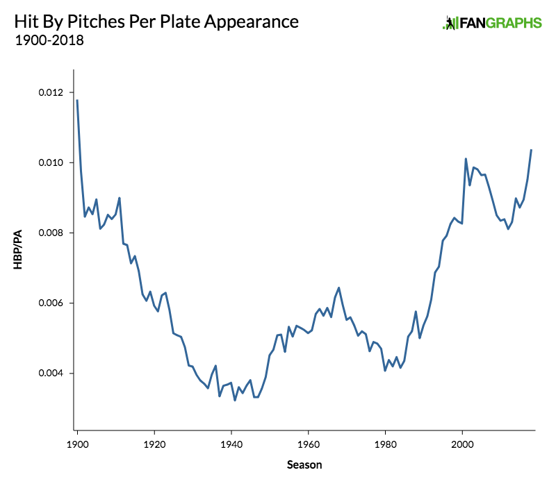
Hit-by-pitches have been rising since the early 1980s, and despite a decline in the 1970s, you could argue that they’ve been rising ever since World War II. Devan’s graph ends in 2018, but the numbers kept on going up — for a while, anyway. Here’s a graph that shows the HBP rate in recent years. After a couple decades of sounding the HBP alarm, it’s time for us to unring that bell (which I assume, without having looked it up, is an easy thing to do):
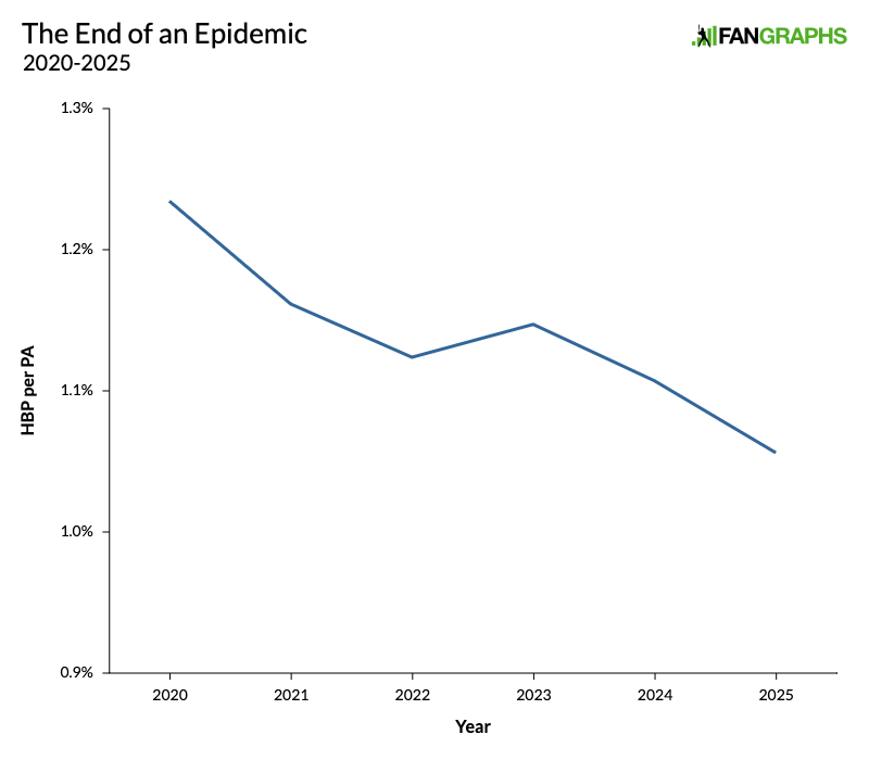
Congratulations everybody, we’ve done it! We’ve ended the epidemic. The HBP rate has fallen in four of the last five seasons. It’s safe to leave your home again. You can enter a public space without fear that you’ll be bombarded with stray baseballs. Rob Mains can finally take a vacation. Tom Verducci can finally take a deep breath.
Now, to be clear, the graph I just showed you is highly misleading. Here’s one that shows the recent decline in a bit more context:

The HBP rate has been rising since the early 1980s. That rise slowed down in the mid-1990s, then hit an abrupt drop-off after 2006. Then the HBP rate took off just in time for the Statcast Era, and now it’s starting to come back down to earth. That’s still an awfully big drop off, though, and while I’ve spent a lot of time looking, I haven’t found an article about this sudden decline. After all those articles about the rising HBP rate, not a single one about the dropping rate! The silence is deafening.
We’re going to dive into this deeper, but let’s first take a moment to acknowledge that there’s no such thing as an ideal HBP rate, in the way that we might think of there being an ideal home run or strikeout rate that makes for a more balanced game. In an ideal world, nobody would get hit by a pitch; after all, it’s dangerous. Pitchers don’t want to hit batters. Most batters don’t want to get hit. But it’s an unavoidable part of the game, and as Devan’s graph showed, it’s been happening for as long as baseball has been around, though even in 2020, when it was happening more often than ever, it was still a relatively freak occurrence.
Over the million or so articles I mentioned earlier, all sorts of culprits have been suggested for the rising HBP rate. The introduction of the designated hitter. Increasing velocity. Protective gear that allows batters to crowd the plate with impunity. A focus on stuff over command. Higher fastball locations. Increased deception. Improved pitch tunneling. The rise of the reliever. Using sticky stuff. Banning sticky stuff. Batters diving toward the plate because they’re focused on covering the outside pitch. Pitchers countering with more inside pitches. A greater emphasis on on-base percentage. A trickle-down effect of the rising popularity of the HBP in college. Some of these ideas bear more scrutiny than others, but I’d like to throw a few more recent factors on the pile.
Let’s start with the juiced baseball. In the second half of the last decade, baseballs started flying farther and home run rates soared. As Andy of Baseball Reference noted back in 2010, the home run rate and the HBP rate have a very strong correlation. Since 1937, when the HBP rate finally bottomed out after the wilder pitching of earlier eras, the correlation coefficient of the home run rate and the HBP rate is .87. We should be expecting a high number anyway, as both rates have risen over time, but that’s extraordinarily high. Here’s a graph that shows home run rate and HBP rate over that period. Just for the purposes of the graph, I’ve tripled the HBP rate in order to put it on the same scale as home run rate:
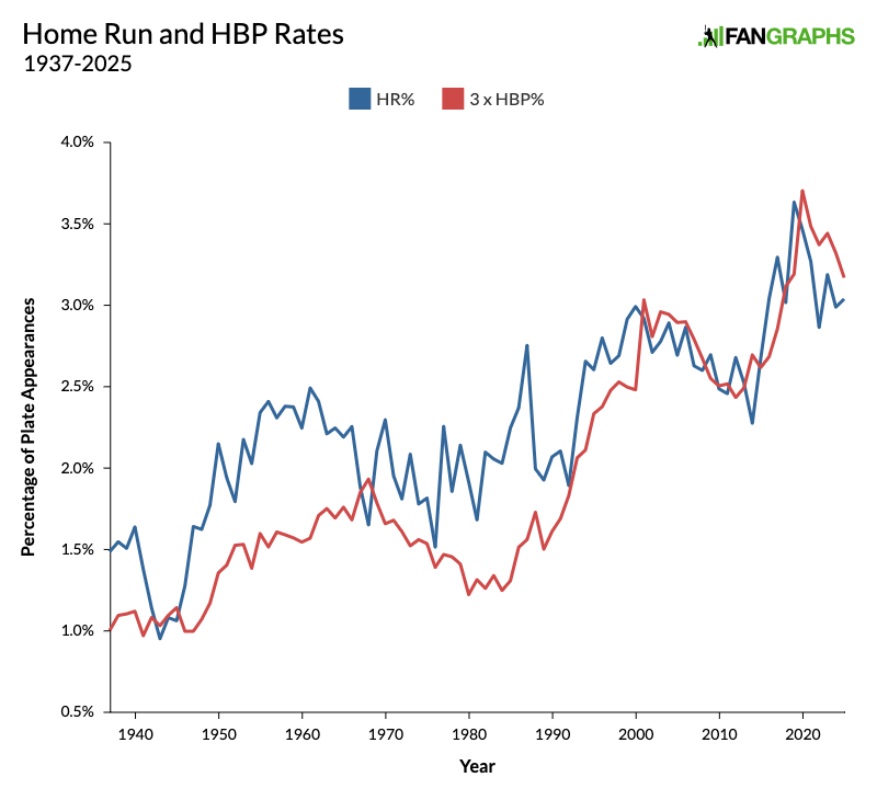
In this century, there have been three times as many homers as HBPs in any given season, like clockwork. The correlation coefficient since 2000 is .70. Andy proposed a few theories for this connection and I have a few of my own, but regardless of the reason, the connection is hard to dispute. Knowing this, it’s no surprise that when the ball started flying and home run rates spiked, hit-by-pitch rates went with them, and it’s no surprise that they’ve started falling together too.
Another reason for the spike is that pitchers have been working inside more often. HBPs obviously come on inside pitches and on pitches that break toward the batter, but we can put some numbers to that. This year, the average pitch moves 1.2 inches away from the batter horizontally, and it crosses the plate 2.1 inches toward the outside part of the plate. The average HBP, on the other hand, is located 14.7 inches off the plate inside and breaks an average of 6.2 inches toward the batter. Knowing that, let’s look at the percentage of pitches that break at least three inches toward the batter, and the percentage of pitches that are located at least 2.4 inches toward the inside part of the plate:
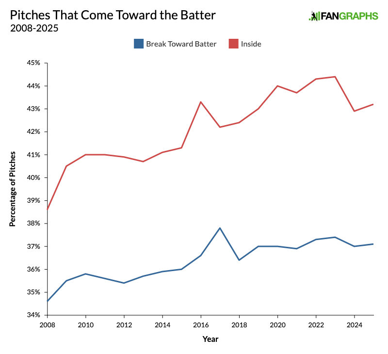
Since the beginning of the Statcast era, pitchers have been coming inside more often and have been throwing more pitches that break toward the batter. No wonder the HBP rate has risen. However, inside pitches have dropped off some in the last two seasons. The really interesting thing is how the numbers break down once you separate left-handed and right-handed batters:
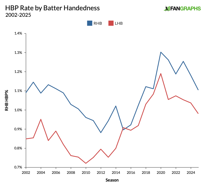
Righties have always gotten hit a bit more often than lefties, but specifically during this recent surge, lefties were getting hit just as often. Then they dropped right back down.
Now let me show you how often batters see pitches that look like they’re ticketed for a HBP. The graph below shows pitches with at least five inches of break toward the batter that are at least 10.7 inches off the plate inside. In other words, these are pitches with a very high likelihood of hitting a batter:
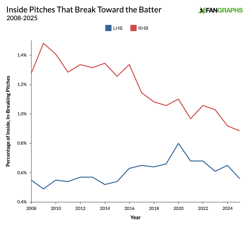
This is really strange. The blue line for lefties looks exactly like we’d expect it to. They saw more of these pitches during the recent big spike, and they’re seeing fewer nowadays. However, the red line for righties has been dropping steadily since the beginning of the pitch-tracking era. If righties – who make up the majority of batters – have been seeing fewer and fewer of these pitches, why haven’t HBPs just been dropping steadily for the last 15 or 20 years? The answer is that those pitches have been hitting batters more and more often. The graph below takes those same pitches from the graph above, way inside and breaking toward the batter, and shows how often they actually end up hitting the batter:
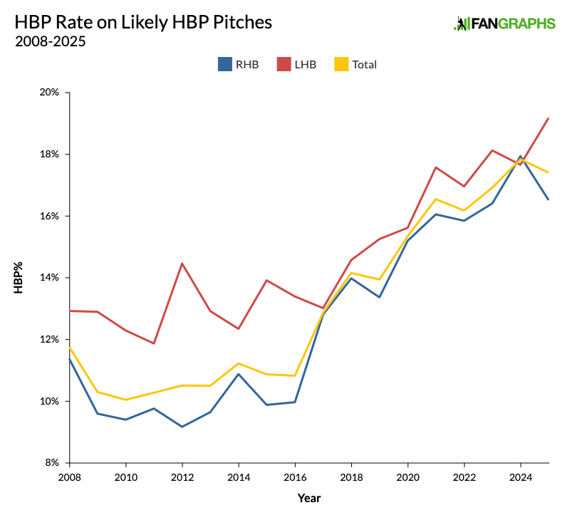
There used to be a big gap here. Those pitches used to hit lefties much more often, but now they’re hitting righties nearly as often, and both rates have gone way up. In other words, when the ball is coming at the batter, it’s getting harder and harder to avoid it.
Let’s recap what we’ve covered so far. Pitchers are throwing inside more often, and they’re throwing pitches that break toward the batter more often. Despite that, they’ve actually been throwing fewer of the pitches that are most likely to hit batters. If you assumed that HBPs are up because today’s hard-throwing pitchers have no control over where the pitch is going – not exactly a minority opinion – you were dead wrong.
The HBP rate has risen anyway because when pitchers do throw those pitches, they’re hitting the batter much more often. In fact, even over the past five years, when the HBP rate has been declining, the HBP rate of those pitches has nearly doubled.
The rise of the sweeping slider helps illustrate the way pitches have become more dangerous for batters. With their extreme horizontal break, sweepers were basically designed to run way inside and hit batters. In recent seasons, pitchers have been throwing them to opposite-handed batters more and more often. This season, roughly 40% of all sweepers are thrown to opposite-handed batters. If you go by Baseball Savant’s pitch classifications, which use whatever the pitcher in question calls the pitch, sweepers are 44% more likely to hit a batter than other sliders this season. If you classify them in terms of movement – where more than 12 inches of glove-side break means the pitch is a sweeper and less than that means it’s a regular slider – that number is 88%.
Classifying sweepers using that method, over the entirety of the pitch tracking era, sweepers have hit batters 0.46% of the time, while regular sliders are at 0.22%. That’s more than twice as often, and although we only started talking about sweepers (and whirlies) a few years ago, they started making up a bigger proportion of sliders back in 2015. That’s right when the HBP rate started rising again, and it’s right when the league started throwing way more sliders. From 2008 to 2015, 1.5% of all pitches were sweepers. From 2016 onward, that number is 3.6%:
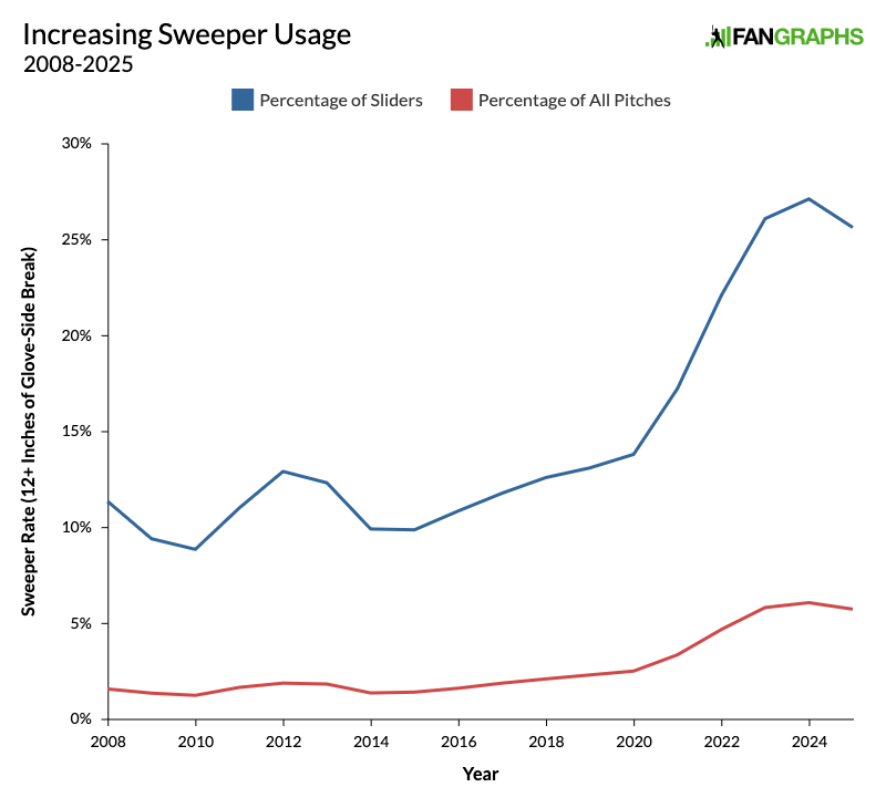
But as this graph shows, the sweeper really took off right when the HBP rate started to decline again. So pitchers are now throwing them three times as often as they used to, but the HBP rate has been dropping anyway. Other pitches must be offsetting the sweeper, so let’s take a look at the league’s pitch mix:
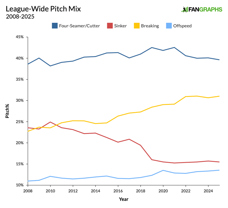
As you surely know, pitchers’ use of breaking pitches has been increasing for years. Offspeed pitches have also been rising, especially since 2018 or so. Sinkers have been declining since 2010, but they really fell off starting in 2019. Lastly, I grouped four-seamers and cutters together because they tend to have roughly the same HBP rate. Now let’s look at how often these pitches end up hitting batters:
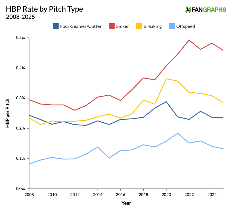
Every pitch type has seen a decline over the past few years, even sinkers. Despite the rise of the sweeper, breaking pitches are hitting fewer batters. Although pitchers are throwing more splitters (which hit more batters than traditional changeups), offspeed pitches are hitting fewer batters too. Because pitchers are throwing fewer sinkers and more soft stuff, the overall HBP rate is going down.
In all, sinkers, breaking pitches, and offspeed pitches have made up 66% of all HBPs since 2021. From 2008 to 2016, that number was below 60%. Those pitches cross the plate much lower than four-seamers and cutters. As a result, the average HBP is much lower. The graph below shows the height at the time that a pitch crosses the plate:
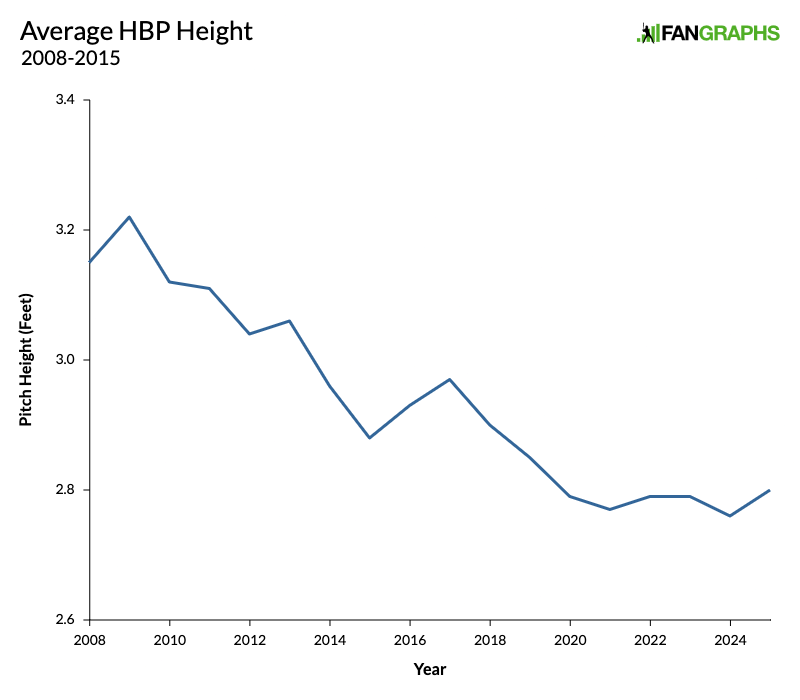
When we think about players getting hit by pitches, our minds understandably leap to the scary high pitches that can hit a head or hand. As Matthew Trueblood recently documented for Baseball Prospectus, those injuries are on the rise. But the numbers make it clear that the pitches likeliest to cause those injuries are actually being thrown less often. Once again, it seems that when they do come speeding toward the batter, they’re just harder to avoid. The average HBP has dropped by nearly five inches. (As Trueblood noted, that’s not necessarily a good thing either, because those low, inside pitches can result in fouls off the lower leg, which can cause their own injuries. Sometimes it’s all bad.) The really interesting thing about HBP location, though, comes on the horizontal axis. The graph below shows the average horizontal location the moment it crosses the plate:
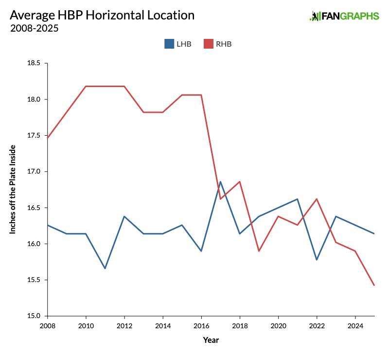
This is a very noisy graph, but it tells a clear story. For years, if you wanted to hit a right-handed batter, you’d have to throw it more than an inch farther inside than you would to a left-handed batter. But that gap completely disappeared in 2017, and the overall number has dropped a full inch since then. Surely some of this is due to the increased horizontal break that we talked about earlier, but it also indicates that it’s just harder to avoid an inside pitch than it used to be, and that also brings us to the elephant in the room.
Many studies have shown the velocity of an individual pitch has no bearing on HBP rate, but that doesn’t mean that velocity has no effect. I don’t think anyone would make that argument. Batters have less reaction time when facing a faster pitch. Logic tells us that they therefore have to gear up for their swing earlier against a pitcher who throws harder. They’ll be further into their swing when they realize that the ball is coming at them and they need to take evasive action. That makes avoidance more difficult, even on breaking and offspeed pitches, or the mis-throws that make up a lot of HBPs and can tend to come out of the hand slower.
But let me show you a correlation in the other direction. The graph below shows the hit-by-pitch rate for fastballs – four-seamers and sinkers – bucketed in 2 mph increments. The trendline very obviously goes straight down:
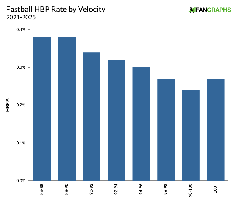
Up until we get to pitches above 100 mph, the faster you throw a fastball, the less likely you are to hit a batter. Maybe you’re thinking pitchers who throw softer have better control, and that’s skewing the numbers. To check, let’s normalize for location. We’ll throw out everything except for pitches that are located in a spot where they’re likely to hit a batter. Here’s the same graph, but only showing the percentages for pitches that are at least 10.5 inches off the plate inside:
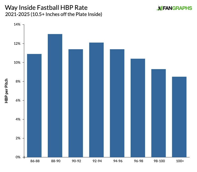
Even when you control for location – even when you’re throwing a pitch at a batter – there’s a clear downward trend. The harder you throw it, the less likely you are to hit somebody. I think the only inference you can draw here is that batters are scared of faster pitches, and they’re doing a better job of getting out of the way. The strongest piece of evidence for that case is that it hasn’t always worked that way. The two graphs above are for 2021 to 2025. Here’s the same graph, but for the five years prior, 2016 to 2020:
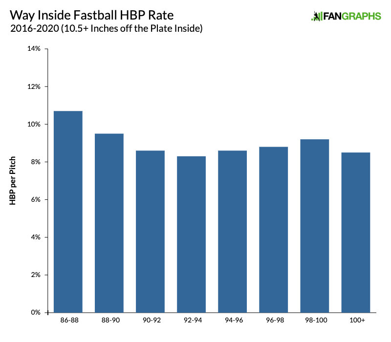
If there is a trend here, it’s a lot less clear. Over the past five years, whether they’re being instructed to do so or the instinct toward self-preservation is simply taking over, batters across the league have started making sure that when a pitcher who can throw 97 mph misses inside, they aren’t in the line of fire. The overall HBP rate of fastballs is up, but it’s up specifically for slower fastballs.
We obviously can’t know every reason for the fluctuation in the HBP rate. If we could, this piece’s introductory paragraph wouldn’t have listed dozens of different articles, but rather one or two that explained everything simply. So, so many factors are involved. For example, batters are a lot bigger and stronger than they used to be. Who’s to say that the HBP rate hasn’t increased at least in part because, as players have started to look more like Aaron Judge and less like Pee Wee Reese, there’s just more physical mass for the ball to hit when it ventures into the batter’s box? This is an incredibly dumb idea and I’ve never seen anyone else raise it, but it also seems like it could maybe, possibly be a little bit true.
Still, there are some clear takeaways here. Sinkers are more likely to hit batters, so the fact that they’re being thrown less often than ever is clearly contributing to the league-wide drop in HBP rate. Even though pitchers are throwing inside more than ever, they’re throwing fewer of the way inside, in-breaking pitches that are likeliest to result in HBPs. Unfortunately, those pitches are more likely than ever to hit pay dirt when they are thrown, presumably because of increased velocity and horizontal break. Lastly, players seem to be making a concerted effort to avoid getting hit by the fastest fastballs, and that is a relatively new phenomenon. There’s no way of knowing whether this recent drop in HBP rate will continue, but it’s definitely worth investigating, so I hope this is just the first of many articles about it.
Davy Andrews is a Brooklyn-based musician and a writer at FanGraphs. He can be found on Bluesky @davyandrewsdavy.bsky.social.
Maybe umps being judged by computer made a difference in 2016/2017 for lefties (re: avt HBP horizontal location chart)? That happened around then, right? I also seem to remember a bunch of discussion about the “extended strike zone” that umps used to have for LHB in partiuclar disappearing.