Strike Zone Update Part 2: How the Zone Has Tightened
I’ve been writing about the strike zone for a few years now, and if there’s been one overarching theme to my work so far, it’s the inescapable takeaway that umpires are excellent at what they do. When Major League Baseball introduced PITCHf/x in 2008, umpires got 84.1% of ball-strike calls right according to the Statcast strike zone. Over the intervening years, while ever-nastier stuff and a revolution in pitch framing had made their jobs harder and harder, umpires did nothing but get better. Accuracy broke 92% in 2021 and inched its way toward 93% over the next two seasons. That trend of improving every year finally changed in 2024.
As I wrote yesterday, last season marked the first time that umpires got worse rather than better. That’s interesting enough on its own, but right when it was time to wonder whether they’d gotten as good as they could get, the rules of the game changed. Over the offseason, a new labor agreement included a change to the way that umpires are assessed by the league. The grading got much tighter, reducing the buffer around the edges of the strike zone from two inches on the outside of the zone to three-quarters of an inch on either side. The strike zone is the same, but umpires are being judged much more tightly. Let’s dive into the numbers and see what looks different so far this season. Here’s a graph that shows overall accuracy in every season of the pitch tracking era.
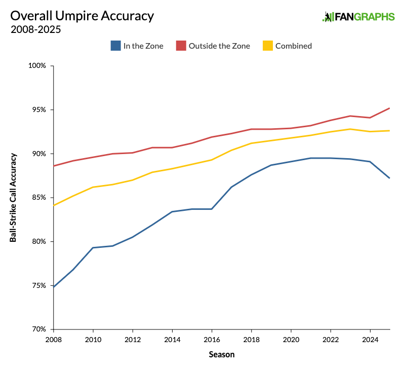
The yellow line shows overall accuracy, and it’s ticked back up from 2024. Even though it’s early in the season, a time when umpires are at their least accurate, they’re still doing better than they did last year. Accuracy fell from 92.81% in 2023 to 92.53% in 2024, and is now back up to 92.63%. In fact, if you look only at March and April stats – which is more fair, because umpires are worse earlier in the season – you’ll find that umpires just had their best opening month of the season ever. They called 82% of pitches in the shadow zone correctly.
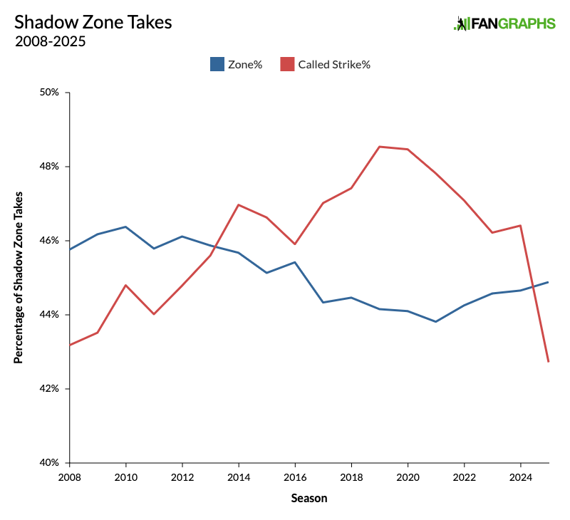
The fact that accuracy has ticked back up isn’t necessarily what interests me. I suspect that was likely to happen anyway. Umpires have been getting better every season for decades, and one very slightly worse season didn’t mean they were done improving entirely. What interests me is the way the red and blue lines in the graph above diverged so drastically. The graph below shows the effect more clearly, because it shows only pitches in the shadow zone, within one baseball’s width of the edge of the zone, where an umpire’s judgment is really tested.
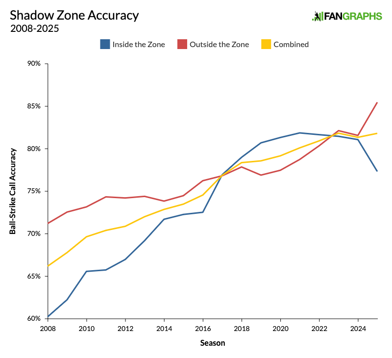
All the way at the right of that graph, the paths of those red and blue lines is the real story here. Yes, umpires have been slightly more accurate this season, but there’s a very clear pattern to their improvement. They’ve been much better at judging pitches outside the strike zone and much worse at judging pitches inside the strike zone. In other words, they’ve been calling a lot more balls. That’ll make you more accurate because, naturally, players tend to swing at more pitches in the zone and take more pitches outside it. The blue line shows that performance on pitches inside the zone fell to its lowest level since 2016. That’s 10 years of progress erased! This season, 42.7% of ball-strike calls in the shadow zone have ended up as strikes. That’s the lowest rate ever recorded. Here’s what that looks like in a line graph.
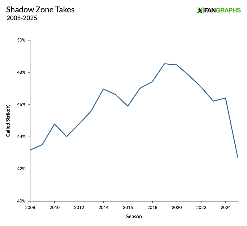
Look at the way that line has shot down this season. Now consider the fact that so far, 44.9% of those pitches actually hit the strike zone, the highest rate in 10 years. Here’s the same graph, but with zone rate also included.
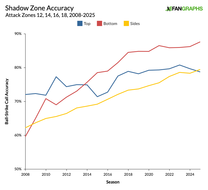
The zone rate really doesn’t seem to have any bearing on the called strike rate, especially this year. This is why pitchers and catchers have been telling The Athletic that the strike zone is shrinking. Yes, accuracy has improved, but it’s improved very much in the batter’s favor. Not only that, but the Giants were even more specific with their complaints, telling the San Francisco Chronicle that the high strike in particular has been disappearing. In order to examine that, I pulled accuracy data on three particular parts of the shadow zone. Let’s start on the sides of the plate. Attack zones 14 and 16 cover the shadow zones on each side of the plate — 14 is inside to a right-handed hitter, 16 is outside — but exclude pitches in the top and bottom shadow zones. We’ll get to the corners later. The trend here has been clear for a long time.
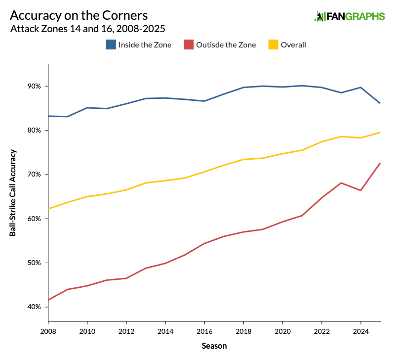
Umpires have been steadily getting better on the sides of the plate, and that improvement has generally come on pitches outside the strike zone. They’ve been getting better at identifying balls, but this season, for the first time, that improvement has really come at the expense of their accuracy inside the zone. They’re still more accurate overall, but they’re missing more strikes than they used to. Here’s another way of viewing these trends. The graph below shows the average horizontal location of every ball or called strike in those two zones. The gray area shows the actual width of home plate.
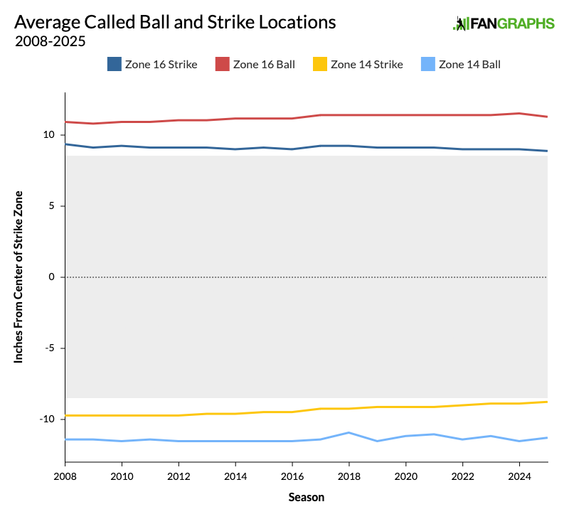
As you can see, the called strikes have been getting closer and closer to the actual edge of the plate, while the called balls have been getting farther and farther away. The average called strike on the edge of the plate really is right on the edge of the plate. However, this season, all four lines have ticked a bit closer to the plate. The zone is just plain tighter.
Now let’s look at the bottom of the strike zone. As I’ve written before, over the years, umpires have gotten more accurate at the bottom of the zone by calling more strikes. The graph below shows attack zone 18, the bottom of the zone over the middle of the plate. We’re ignoring the corners again because we want to get a sense of where the true bottom of the zone is without letting the sides of the plate affect it.
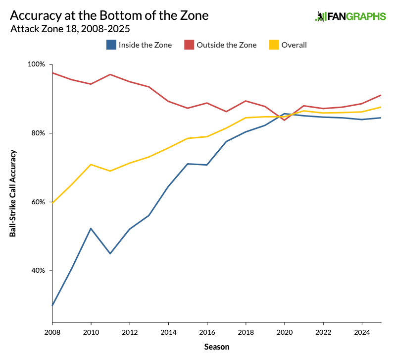
Over the years, the bottom of the strike zone has gotten significantly lower, and catchers around the league have adopted one-knee down stances in order to earn more called strikes down there. From 2009 to 2020, the height of the average called strike at the bottom of the zone dropped by 1.92 inches. However, ever since, that average has been ticking back up. This season, it’s 0.6 inches higher than it was in 2020. Still, so far this season, the effect hasn’t been as drastic as it is on the edges of the plate, where umpires have actually gotten worse at identifying strikes.
Finally, let’s take a look at the top of the zone, the problem area highlighted by the Giants. The graph below shows attack zone 12, the top of the zone over the middle of the plate, and it certainly looks like San Francisco has a point. Not only have umpires been calling a tighter zone up there, but they’ve been calling it so tightly that they’ve actually gotten less accurate overall.
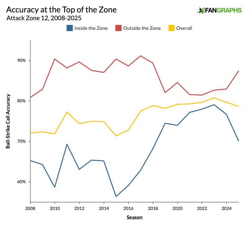
This graph does not look like the others, and there’s a reason for that. The others had straight lines that told a tidy story. On the sides, umpires were always good at identifying strikes, and over the years they’ve gotten better at identifying balls, essentially squeezing the zone as they got better at finding the edges of the plate. At the bottom of the zone, umpires were always good at identifying balls, but they gradually improved at identifying strikes, lowering the zone.
The top of the strike zone is a lot fuzzier than the sides and the bottom. Umpires can’t just glance down at home plate to guide them visually, and the top of the zone varies much more from batter to batter than the bottom. Moreover, the top of the rulebook zone varies the most from the top of the Statcast zone, as umpires have to take the batter’s stance into account, but Statcast doesn’t. All of this is to say that the top of the zone is where umpires have to exercise the most judgment. This season, for the first time ever, it’s where they’re least accurate.
Below is a heat map wherein I tried to show the probability that a pitch in the shadow zone would be called a strike. This includes every shadow zone take from March and April in both 2024 and 2025. The darker the red, the more likely a pitch was to be called a strike.
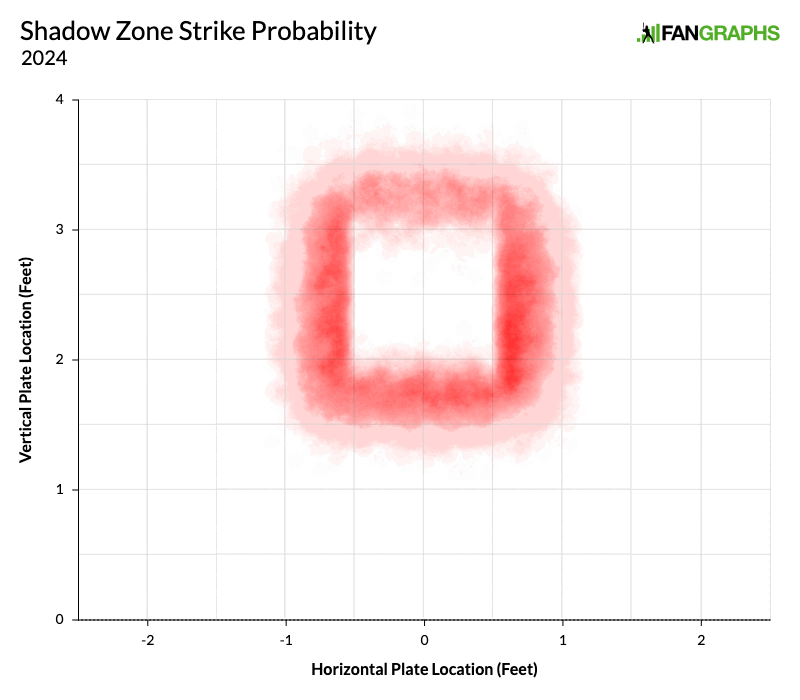
On the sides and at the bottom of the zone, it’s clear that things have tightened up. The edges are less spread out and the reds are more intense. But the top is a completely different story. If anything, it’s more spread out. The light red portion at the top reaches higher. The darker portion isn’t as dark, and it pushes lower. Umpires have been less consistent up there. They’re calling both lower and higher strikes at the top of the zone. It’s just plain messier. However, if you break things down by Statcast’s attack zones, the overall picture couldn’t be more clear. The diagram below shows the change in called strike rate from 2024 to 2025. A blue zone and a negative number means umpires are more likely to call balls. A red segment and a positive number means that umpires are more likely to call strikes, but you don’t really need to worry about that. There aren’t any red segments.
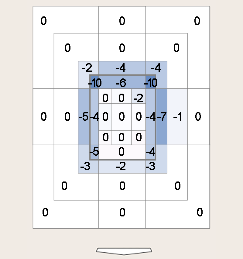
There’s no red on this chart whatsoever. The biggest gains came at the bottom of the heart zone, but they were on the order of a couple tenths of a percentage point. This is a very blue chart and the corners are the darkest. The zone has definitely shrunk, and all the catchers and pitchers arguing that they’re losing strikes have a real point. As Patrick Dubuque noted at Baseball Prospectus, the league’s walk rate has increased.
In a way, it’s hard to imagine this adjustment in umpiring going any other way. As I try to wrap my head around the changes we’ve seen so far, I keep thinking back to the first graph I showed you.
I’ve been making versions of this graph for years, and I think it says a lot about what umpiring is actually like. It’s just plain easier to identify a ball than it is to identify a strike, and that’s going to be true no matter how accurate umpires get. The zone has always been something of an oval, and while the corners have tightened up considerably over time, they’re never going to get perfectly crisp. Tightening it up this season has predictably resulted in more balls, and to some extent that bias has disguised the fact that umpires are off to the most accurate start we’ve ever seen.
Editor’s Note: Since this article was initially published earlier this week, The Athletic has corrected its original reporting to indicate that the previous buffer zone was not two inches on either side of the edge, but rather two inches outside the edge. The new buffer zone is as reported, three-quarters of an inch on either side. This article has been updated to reflect the new information.
Davy Andrews is a Brooklyn-based musician and a writer at FanGraphs. He can be found on Bluesky @davyandrewsdavy.bsky.social.
Really great info here! I’m curious which pitchers these changes can explain an increase their BB% in increasing. It seems from the data the first place to look would be pitchers who throw a lot of up in the zone fastballs.