An Attempt to Quantify Pitcher Deception
Deception seems impossible to quantify. How are you going to put a number on something like the Invisiball thrown by Yusmeiro Petit? The ball is there, and then it isn’t, and then it’s back! Put that in your number machine, nerd boy.
Except, hidden in that description of the Invisiball is a possible guide. The release point. The release point is a huge moment for the hitter — it can tell him about the type of pitch and type of movement he’s about to see even before the ball is released.
Think of Brad Ziegler. You see that arm dragging along the ground, and you know the ball is going to move down and away from you. You adjust. Think of Darren O’Day. You see that arm slot, and you think the ball will drop, and when it doesn’t, you miss his Submarine Riseball. Tyler Clippard! You see that over the top and you think the ball will rise — and his fastball does, but not his changeup.
So maybe deception is deviation from the expected movement given a pitcher’s arm slot. Or at least that’s maybe one sort of deception. It probably won’t help us understand Petit’s Invisiball any better, but it may give us something with which to work on this hard-to-define aspect of pitching.
A confession first. I was thinking about Mychal Givens before I went to bed, and the fact that his minor league pitching coach called him a unicorn. So when I graphed height-adjusted release point against horizontal movement, I was gratified to see Givens as a big ole red outlier.
Here is that graph, with Givens above the line. What you’re looking at is height-adjusted release point (release point minus height, so Chad Bradford is the mostest negative) against horizontal movement on the fastball. Generally, the lower your arm slot, the more horizontal movement you have. The color describes the swinging strike rate on the pitch, with red being above average. The size of the bubble is the ground ball rate, with bigger meaning more ground balls. Givens gets whiffs and has less horizontal movement than you would expect, given his release point.
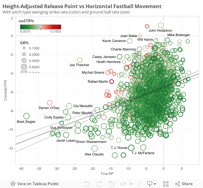
The relationship between a pitcher’s release point and horizontal movement is significant (p values less than .0001) but not strong (r-squared is .107, meaning that the release point describes about 11% of the variance in horizontal movement). But if Givens and O’Day are deceptive, this graph is doing a decent job of capturing that deception.
The graph for vertical movement against release point is less exciting because the relationship is stronger. Release point describes almost a third of the variance in vertical movement, so if all you did was look at how over-the-top a guy’s delivery is, you’d do a decent job of knowing how much his fastball “rides” — you’d know if it was a fastball that jumped at you or dove away, most likely.
So now we can use these two relationships to find the outliers and see how they do against the general population. What I did was use the correlation statements to predict horizontal and vertical movement from the pitcher’s release point. Then I took the absolute value of the difference between predicted and actual movement — those are your weirdos. Then I grouped the weirdos in the x and y directions and try to compare the top 10% in each case to the sample average.
| Group | Actual Movement | Predicted Movement | Swinging Strike% | Ground Ball % | Pop up% |
| Sample | 6.1x, 7.8y | 6.1x, 7.8y | 5.77% | 42.31% | 7.17% |
| Top 10% X Deviators | -5.1 | -6.2 | 6.38% | 43.05% | 7.69% |
| Top 10% Y Deviators | 8.7 | 9.2 | 5.53% | 41.13% | 7.23% |
(Predicted horizontal movement = .147*TrueReleasePoint – 5.49
Predicted vertical movement = .274*TrueReleasePoint + 8.98)
Top 10% deviators = top 10% by absolute difference between predicted and actual movement
n = 1491 pitchers with more than 100 fastballs thrown in PITCHfx database
Maybe we found something on the x axis. If you have a low arm slot and your ball doesn’t fade as much as people expect it to fade, it looks like they whiff more often. And hit grounders more often. And hit pop ups more often. They just expect the ball, coming out of a slot like Givens shows, to fade to the arm side. They don’t expect it to “cut” relative to other pitches. Maybe there’s something here.
Surprisingly, though, the guys with more rise than expected did not necessarily share the riches. Though rise is correlated to pop ups, those with surprising rise didn’t outperform the sample by much in that department. Given they had the lowest ground-ball rate, maybe they are profiting from weak fly balls. But since release point and vertical movement are more tightly related, maybe it just means the outliers are not as weird. Look at the average difference in movements — it’s half an inch for vertical movement, but a full inch for horizontal.
We can’t say a ton definitively here. Release point only predicts a tenth to a third of the movement in a given fastball, after all. But maybe this will be an avenue for better research in the future. Because it does look like some pitchers benefit greatly from having surprising movement given their arm slot.
| Name | Throws | PFXx | avg(pfx_z) | swSTR% | GB% | True RP | xX | xZ | Diff X | Diff Z | PU% | Deception |
| Chad Bradford | R | -9.3 | -7.3 | 4.1% | 65.0% | -58.2 | -14.0 | -7.0 | -4.7 | -8.5 | 1.3% | 10.2 |
| Steve Kline | L | -10.4 | 7.7 | 2.7% | 47.1% | 8.4 | -4.3 | 11.3 | 6.1 | 4.5 | 2.9% | 6.5 |
| Mike Myers | L | -8.5 | -1.9 | 4.2% | 52.9% | -42.6 | -11.7 | -2.7 | -3.3 | -5.4 | 8.8% | 5.3 |
| Josh Fields | R | 1.0 | 11.0 | 13.4% | 26.2% | -4.7 | -6.2 | 7.7 | -7.2 | 2.1 | 14.3% | 4.4 |
| John Holdzkom | R | 1.1 | 6.5 | 8.5% | 53.8% | -0.9 | -5.6 | 8.7 | -6.8 | 2.2 | 23.1% | 4.2 |
| Chris Waters | L | -10.7 | 7.2 | 3.3% | 47.6% | 0.7 | -5.4 | 9.2 | 5.3 | 3.1 | 5.4% | 4.1 |
| James Parr | R | -0.6 | 12.1 | 10.1% | 22.5% | 4.4 | -4.8 | 10.2 | -4.3 | 3.7 | 7.0% | 4.0 |
| Josh Collmenter | R | -0.6 | 11.8 | 6.6% | 28.4% | 6.7 | -4.5 | 10.8 | -3.9 | 3.9 | 12.2% | 4.0 |
| J.P. Howell | L | -10.5 | 4.5 | 3.8% | 53.7% | 0.5 | -5.4 | 9.1 | 5.1 | 3.1 | 5.8% | 3.9 |
| Brad Ziegler | R | -8.6 | -5.8 | 5.8% | 68.8% | -38.5 | -11.1 | -1.6 | -2.6 | -4.7 | 1.1% | 3.8 |
| Tom Layne | L | -10.1 | 4.0 | 6.5% | 59.9% | 1.8 | -5.2 | 9.5 | 4.8 | 3.2 | 5.1% | 3.8 |
| Daniel Herrera | L | -10.3 | 3.1 | 3.1% | 43.8% | -1.0 | -5.6 | 8.7 | 4.6 | 3.3 | 2.1% | 3.8 |
| Mike Bolsinger | R | -0.4 | 8.1 | 4.8% | 47.1% | 1.0 | -5.3 | 9.3 | -4.9 | 3.1 | 1.4% | 3.8 |
| Preston Guilmet | R | -1.4 | 11.6 | 1.9% | 33.3% | 8.4 | -4.3 | 11.3 | -2.9 | 4.4 | 4.2% | 3.8 |
| Sean Burnett | L | -10.5 | 5.9 | 5.8% | 52.1% | -0.1 | -5.5 | 8.9 | 5.0 | 2.9 | 4.6% | 3.6 |
| Rich Thompson | R | -0.8 | 11.5 | 6.7% | 28.4% | 1.8 | -5.2 | 9.5 | -4.4 | 3.2 | 9.9% | 3.6 |
| David Robertson | R | -0.5 | 10.5 | 8.3% | 36.1% | -2.3 | -5.8 | 8.3 | -5.3 | 2.6 | 8.0% | 3.5 |
| Tyler Thornburg | R | -1.5 | 10.3 | 5.0% | 31.4% | 4.6 | -4.8 | 10.2 | -3.3 | 3.9 | 3.7% | 3.5 |
| Mike Mussina | R | -8.4 | 8.8 | 3.5% | 38.7% | 4.7 | -4.8 | 10.3 | 3.6 | 3.7 | 6.3% | 3.5 |
| Tom Glavine | L | -7.9 | 9.7 | 2.8% | 42.9% | 5.2 | -4.7 | 10.4 | 3.2 | 4.0 | 3.1% | 3.5 |
Diff X/Z = difference between release=point projected movement and actual (in z-scores)
xX / xZ = release-point projected movement
PFX = absolute value of horizontal movement
With a phone full of pictures of pitchers' fingers, strange beers, and his two toddler sons, Eno Sarris can be found at the ballpark or a brewery most days. Read him here, writing about the A's or Giants at The Athletic, or about beer at October. Follow him on Twitter @enosarris if you can handle the sandwiches and inanity.
I’m surprised there’s no mention of Chris Young. Him being able to blow a letters high 88mph fastball by Miggy Cabrera and his astronomically high IFF% seem to indicate some deception.
The chart is adjusted for height, and I would wager that is where most if not all of his deception would come from.
When did you guys start to use Tableau for charts? Is it a per author thing or a FanGraphs wide-license?
I am a big fan of Tableau, you can do some cool stuff in there.
interesting. i’d also define deception as having the same arm angle/release point for all of your pitches and high spin rates so the batter can’t immediately pick the pitch type/eventual location up immediately. i think that’s how some guys get a bunch of swings/whiffs/weak contact without actually throwing many strikes. the batter can’t tell if a pitch headed for the outside corner is a sinker that will run back over the plate, or if it’s a slider that bites the other direction. you get them guessing, which leads to bad/weak swings.