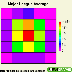
In the past week I've gotten some really great feedback on the PitchZone charts. In the hopes of making them more accurate and just simpler in general, I've revised them to be just a 5×5 grid, with the 9 boxes in the center being the strike zone. Remember that these are the percentage of all pitches that become hits for each box. Here's the major league average:
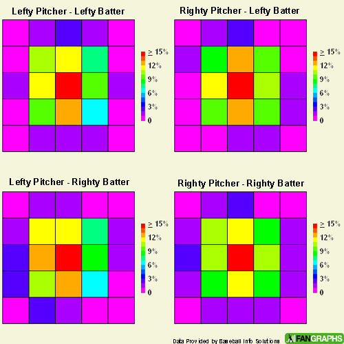
I also got a lot of requests to break them out the four different pitcher-batter match-ups. Here's that:
And finally, let's take a quick look at Abert Pujols and Vladimir Guerrero:
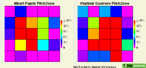
Guerrero is pretty scary. I'm pretty happy with these, so they'll probably start showing up occasionally in Daily Graphings for batters. Next up, I'm going to start looking at contact rates, swing percentages, and BABIP by pitch location. Then of course, there's the pitcher's side of things which I have a feeling is going to be a lot more complicated.
You Aren't a FanGraphs Member
It looks like you aren't yet a FanGraphs Member (or aren't logged in). We aren't mad, just disappointed.
We get it. You want to read this article. But before we let you get back to it, we'd like to point out a few of the good reasons why you should become a Member.
1. Ad Free viewing! We won't bug you with this ad, or any other.
2. Unlimited articles! Non-Members only get to read 10 free articles a month. Members never get cut off.
3. Dark mode and Classic mode!
4. Custom player page dashboards! Choose the player cards you want, in the order you want them.
5. One-click data exports! Export our projections and leaderboards for your personal projects.
6. Remove the photos on the home page! (Honestly, this doesn't sound so great to us, but some people wanted it, and we like to give our Members what they want.)
7. Even more Steamer projections! We have handedness, percentile, and context neutral projections available for Members only.
8. Get FanGraphs Walk-Off, a customized year end review! Find out exactly how you used FanGraphs this year, and how that compares to other Members. Don't be a victim of FOMO.
9. A weekly mailbag column, exclusively for Members.
10. Help support FanGraphs and our entire staff! Our Members provide us with critical resources to improve the site and deliver new features!
We hope you'll consider a Membership today, for yourself or as a gift! And we realize this has been an awfully long sales pitch, so we've also removed all the other ads in this article. We didn't want to overdo it.
In case you didn't read all that, here's the short version. Membership includes:
✓Ad-free browsing
✓Unlimited FanGraphs & RotoGraphs articles
✓Historical & platoon projections
✓Leaderboard & player-page stat heatmaps
✓One-click data exports
✓Customizable player-page dashboards
✓Dark & Classic site modes
✓Weekly Members-only mailbag
✓FanGraphs Walk-Off, your year in review
✓Optional homepage photo removal
✓Gift articles to non-Members
✓Full postseason coverage

David,
Great stuff! I prefer these pitchzones over the other ones – they’re much easier to read.
It would be interesting to break down these pitchzones by HRs (or doubles or any other stat) hit in each zone.
You mention contact rates (I assume swings with contact divided by total swings); I wonder how the contact rate correlates (how much it increases/decreases) with each zone or if it correlates with any other stat. It might have some predictive power.
What do you mean by swing percentages?
I’m not sure major league teams break the zones down like you’ve done, but I wouldn’t be surprsied if advance scouts using something similar to what you’ve done when preparing their pitchers for batters of opposing teams.
-Mike
I’d like to see one of these for Ichiro.
Thanks!
These charts are absolutely interesting. In my opinion you should use a different color coding: the color used for 0% has some red and some blue in it, so it’s a little difficult (for me) to get it right at first glance. I would suggest either you use blue as the lowest value (simply discarding the last 3 colors) or use a monochromatic scale (i.e. from white to red).
I’m sure I’m in the minority on this, but I actually preferred the original version. They look like computer art. Still, I do agree that these are much easier to interpret.
I agree that the magenta for the 0% cells is confusing. White would work, but I think black is more appropriate. Darker = lower. Eliminating the violet probably would help too. The different shades of green are hard to distinguish too, at least for me. Could you add numbers to the boxes, so I could be sure I’m reading them right?
Is “Inside” always to the left, or does it depend on whether the batter is L or R?
Glad to hear you’re going to do swing rates and BABIP. My first reaction (until I saw Guerrero) was that all the boxes outside the strike zone SHOULD be in the 0-2% range because batters aren’t supposed to swing at those pitches. Yet obviously those rules don’t apply to Vlad (and some others). BABIP should provide much greater discrimination.
What do you mean by swing percentages?
Basically this will be how often a player swings at a pitch in a certain zone. Hopefully this will help us identifiy where certain players like to chase balls they shouldn’t be swinging at.
I would suggest either you use blue as the lowest value (simply discarding the last 3 colors) or use a monochromatic scale (i.e. from white to red).
I like this idea, I also like the idea of using black as the lowest color. I’ll mess around with the color scheme and see if I can come up with something easier in the next itteration.
Could you add numbers to the boxes, so I could be sure I’m reading them right?
Unfortunately, no (it’s essentially a contractual agreement), but hopefully improving the color scheme will make it so that numbers aren’t much better.
Is “Inside� always to the left, or does it depend on whether the batter is L or R?
These charts are always from the pitcher’s perspective, so right-handed batters are on the right side and left-handed batters are on the left side. I’m going to be putting in a batter on either side to make this more clear, just need to find the right graphic.
Thanks for the feedback everyone! I think with one or two more revisions these PitchZone charts will be right where they need to be in terms of readability.