FanGraphs Prep: Strikeouts, ERA, and the Relationship Between Variables
This is the latest in a series of baseball-themed lessons we’re calling FanGraphs Prep. In light of so many parents suddenly having their school-aged kids learning from home, we hope is that these units offer a thoughtfully designed, baseball-themed supplement to the school work your student might already be doing.
Overview:
A four-day unit that uses strikeouts, walks, and home runs to describe relationships between variables and predictive logic.
Many statistics in baseball are inter-related. We examined the relationship between runs and wins a few weeks ago. Today, we’ll learn about a few more of these relationships and how to think predicatively about them.
Learning Objectives:
- Make a hypothesis about the relationship between two variables
- Create a scatter plot using a dataset containing multiple variables
- Estimate and calculate a trend line
- Evaluate a hypothesis using data
- Describe the relationship between variables
Target Grade Level: 7-9
Daily Activities
Day 1
ERA, or earned run average, measures how many runs a pitcher gives up per nine innings. It’s measured in runs — the only thing this statistic cares about is how many innings a pitcher throws and how many earned runs they surrender. But we can look at other statistics as well: what percentage of opposing batters a pitcher strikes out, what percentage they walk, and what percentage of opposing batters hit home runs.
Come up with a hypothesis about how these three statistics relate to ERA. Do you think that pitchers who strike out more batters allow fewer runs on average, or more? Why? Do the same for each of strikeout rate, walk rate, and home run rate.
Use the attached data set to create three scatter plots, each with ERA on the y axis and the other variable on the x axis. Make sure to save down a copy of the spreadsheet first so that you can edit it. Look at the plots. Did you correctly hypothesize the relationship? If you did, good job! If not, think about it one more time. Why do you think these relationships exist?
Day 2
Let’s take a look at the relationship between strikeout rate and ERA. Pull up the chart you made yesterday, or take a look at this one instead:
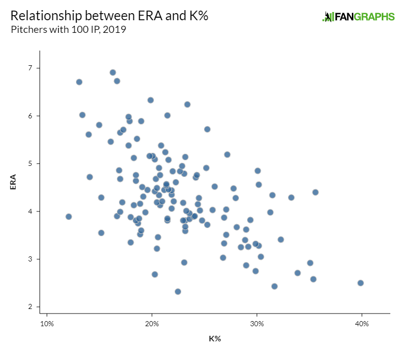
How would you describe this relationship? Is it linear? Non-linear? Draw a line through it with your best estimate of the fit.
Next, draw a line through the other two scatter plots you created yesterday. Do they all have similar relationships? Which set of data do you think has the strongest relationship between the two statistics?
Find a few points that are outliers and look them up in the attached data set. Who are these pitchers? If they have a lower ERA than you’d expect from their strikeout rate, do they have other skills that might help them prevent runs? If their ERA is higher than you’d expect, what do you think is happening there?
Day 3
So far, we’ve learned how strikeouts, walks, and home runs can tell us a lot about a pitcher’s performance in a given season. However, baseball doesn’t happen over only a single year. Let’s ask another question: if we know something about a pitcher in one year, what does that tell us about the next year?
Use the Day 3 — Pitching section of the attached worksheet to test the year-over-year relationships between ERA, strikeout rate, walk rate, and home run rate. Which looks like the best fit to you? Which looks worst?
Strikeout rate and walk rate appear to have the best relationship from one year to the next. ERA, on the other hand, shows a comparatively weak fit. One reason for this is that many different components go into allowing a run. How many batters you strike out, how many you walk, how many hits you allow to the batters who neither strike out nor walk, and how many runners you strand on base rather than allowing to score all matter.
On the other hand, a strikeout, and to some extent a walk, are more straightforward. They’re merely a yes/no question — did the batter strike out? More inputs, and more noise, make ERA less consistent from year to year.
Using this knowledge, come up with a hypothesis about this similar question: batters also have rate statistics. Which of the following do you think will have strong relationships from year to year, and which will have weak relationships?
- Strikeout rate
- Home run rate
- RBI’s per plate appearance
Use the Day 3 — Batting section of the attached worksheet to test your hypothesis. What did you get right and wrong? Which statistics do you think are easiest to predict from one year to the next? Taking that intuition one step further, if a batter has a high strikeout total and a high RBI total, which one do you think is more likely to repeat itself next year?
Day 4
Today, we’re going to introduce a new statistic: FIP. FIP, or Fielding Independent Pitching, looks at many of the statistics we’ve already investigated in this module. If you’d like to read more about FIP, you can read our explanation here, but for our purposes, FIP combines strikeouts, walks, and home runs to form a single number. Fortunately for this exercise, that number is on the same scale as ERA — it’s a measure of what you would expect a pitcher’s ERA to be if everything about that pitcher other than his strikeouts, home runs, and walks was league average.
Use the Day 4 section of the attached worksheet to graph the relationship between FIP and ERA. How does this compare to the previous same-year relationships you’ve seen — between ERA and strikeout rate, walk rate, and home run rate?
Come up with a reason why you think this year’s FIP correlates better to this year’s ERA than the other statistics. If you wanted to know how good a pitcher was at preventing runs, what statistics other than ERA would you like to see? What factors could cause a pitcher to have a low FIP and a high ERA, or vice versa?
Adaptations for Older or Younger Readers
To add complexity: Rather than draw best-fit lines and estimate which relationships look best, calculate correlation coefficients and R-squared’s for each relationship and quantitatively determine which relationship is strongest.
In the section about FIP, answer this additional question: why do you think FIP does a better job of predicting next year’s ERA than this year’s ERA? Do you think FIP would work better without the noisy home run term? Learn about xFIP and come up with a list of pros and cons for using xFIP or FIP.
To reduce complexity: Skip the last two sections of the module. Instead, spend the first day working on this new module.
Alternative Day 1
Many baseball statistics are listed as counting statistics. Home runs, RBI, wins, strikeouts — all of those statistics simply count how many times a player did that particular thing. On the other hand, other baseball statistics are rates. Batting average, ERA, on-base percentage — all of these measure how often a player did something as a proportion of the number of times they attempted it.
Most analysts prefer to use rate stats rather than counting stats to think about baseball. To explain why, complete this exercise. A team wonders which of their two batters is better. The first batter has better counting statistics. He has more home runs, more hits, and has more total bases. The second has played only half of the year. Their statistics look like this:
| Player | AB | H | HR | TB |
|---|---|---|---|---|
| Batter One | 250 | 65 | 8 | 99 |
| Batter Two | 100 | 29 | 5 | 51 |
Convert each set of numbers from a counting statistic to a rate statistic. How many home runs per at-bat does each player hit? What are their batting averages? How many total bases does each player get per at-bat (a fancier way of saying slugging percentage)? Which batter do you think is having a better year?
Ben is a contributor to FanGraphs. A lifelong Cardinals fan, he got his start writing for Viva El Birdos. He can be found on Twitter @_Ben_Clemens. Jake Mailhot is a contributor to FanGraphs. A long-suffering Mariners fan, he also writes about them for Lookout Landing. Follow him on Twitter @jakemailhot.