Getting Upside Down: A Floor-to-Ceiling Look at Free Agency


During free agency, baseball fans have a tendency to throw out terms like “upside,” talk about players’ “ceilings” and “floors,” and do their best to evaluate the “risk and reward” of any given move. When teams make offseason additions, it’s impossible not to imagine not only what level of production can be expected, but also what might happen if everything clicks and, as the case may be, what might happen if things don’t. This becomes the basis of endless debate: what kind of heights can the prospect just traded for reach? Should that last spot in the rotation go to the reliable veteran or the young flamethrower who has yet to put it all together?
Teams have to make these evaluations themselves when considering roster construction. Say, for instance, that Player A was expected to contribute 2.0 WAR, but a team’s projection models indicate that he could be as valuable as 4.0 WAR or as unproductive as replacement level. Player B, on the other hand, is also projected for 2.0 WAR, but the models expect him to end up somewhere between 1.3 and 2.7 WAR. It’s not necessarily inherently better to choose one player over the other; it’s ultimately a matter of the club’s priorities at the time. This could depend on all sorts of factors: the size of the investment in the first place, where this player is expected to fit on the roster, how much the team anticipates competing for a title, maybe even player development insights that the front office or coaching staff thinks might help push the player toward the top of his projected spectrum.
As this winter’s free agency was unfolding, I was curious if there were insights to draw from how the disparity of players’ varied outcomes were playing out on the market. A handful of players with relatively uncertain futures (let me stress “relatively”) like Robert Suarez, Zach Eflin, and Masataka Yoshida were commanding larger — and longer — contracts than projected. Meanwhile, some relative knowns — veterans like Jean Segura and Noah Syndergaard — were coming in under their projections, and players like Elvis Andrus and Brad Hand are still out there looking. There are counterexamples, to be sure, but it made me want to explore whether there was particular interest in (and resources being allocated to) players that offered a high ceiling, even if that meant taking on the risk of a lower floor.
This winter, master FanGraphs projectionist Dan Szymborski has done us all the kindness of including 80th and 20th percentile projections for certain stats, including WAR, in his ZiPS updates. These WAR projections make for a decent measure of a player’s ceiling and floor. And while ceilings and floors are not at 80% and 20%, these are pretty good indications of what a great and underwhelming season would look like for a given player. You could define a “ceiling height” as the difference between a player’s 80th percentile projection and his median projection, and a “floor height” as the difference between the median and the 20th percentile.
To see how this relates to free agency, we can evaluate spending on the players with higher ceilings and lower floors compared to that on players with lower ceilings and higher floors. Let’s first take a look at the relationship between ceiling height in absolute WAR and average annual contract value as a rough estimation of how the free-agent market has evaluated a player’s value. One of the obvious limitations of this approach is that we’re only looking at one year of projected WAR and the average value of one year of the contract; a deeper dive might include multi-year projections over the course of full contract terms.

Using a sampling of nearly 100 free agents who signed this winter, we can see some positive relationship (r=.39) between absolute ceiling height and AAV, which makes sense; players who will only add, say, 0.5 WAR for an 80th percentile season are unlikely to be among the top producers in the first place, and as such, they’re likely to command smaller contracts. In the top-right section of the above graph, all with high ceilings and high earnings, are players like Justin Verlander, Aaron Judge, and a bunch of shortstops you may have heard of before. On the bottom left are players like Brett Phillips and Adam Engel — according to ZiPS, even a strong season for these players would be modestly more valuable than the median projection.
To get a look at this in a way that isn’t influenced so much by a player’s median projection, let’s look at ceiling height instead as a percentage of players’ median WAR projections. Instead of AAV, let’s compare that to AAV per projected WAR. On the y axis, this will give us, instead of a measure of how valued a player was on the free-agent market, a measure of how over or undervalued he was for a player with his median projection.
Some brief caveats before we do this: reliever contracts muddy the waters here a little bit, so it will be best to remove them from this next step. Controlling for WAR drastically inflates the ceiling height for players who are projected to sit right around 0 WAR but in a good season might get up somewhere around 1.0 and in a bad season could end up in the negative. The same can be said for those players’ AAV/WAR values; the league tends to spend more per WAR on relievers, and others before me have written on this site about the way relief contracts get in the way of analyses like this one. To curb the issue for all types of players with small median WAR projection values, borrowing from Ben Clemens’ and Craig Edwards’ past approaches, I also added a cutoff, including only players above 1.5.
Back to our look at ceiling height as a percentage of a player’s projected WAR and AAV/WAR, now with 39 players included:

Again, we see a moderate positive trend, this time with our r coefficient coming in at .42, with players whose ceilings are far higher than their median projections tending to earn more per WAR than their counterparts with lower relative ceilings. Among the players with the highest 2023 performance ceilings in this group: Martín Pérez and Tyler Anderson, who outperformed all expectations last year but whose median projections expect them to come back down to earth; Verlander, who is bound to age out of being a 6.0-WAR pitcher at some point, but who’s to say when that day will come; and Josh Bell and Joc Pederson. Projecting upside leaves plenty to argue about, which is why I turned to ZiPS to help do so with as little bias as possible. In any case, this certainly isn’t an overly strong relationship, but it does suggest that this offseason, money moved with upside.
This makes sense; you’d rather have the 2.0-WAR player who could get to 4.0 when you don’t factor in what might happen if he underperforms. But teams should want to consider the bad case scenarios, too, and we would expect there to be a similar relationship between a player’s annual contract value and his floor. Players with a higher floor offer higher security for the team’s investment, and those with lower floors are riskier additions. Let’s see:
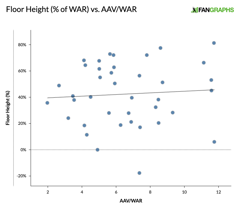
That’s good for an r value of .07, which means it’s more of a random assortment of dots than an indication of any meaningful correlation. Based on this group, it seems like a player’s floor was of less consequence to his earnings this offseason than his ceiling was.
But what about the overall breadth of outcomes? Did players with a wider range from their 20th percentile to 80th do measurably better than those whose seasons ZiPS found overall more predictable? I took the difference between the WAR projections as a percentage of their median projection and called it “WAR spread,” and compared that to AAV/WAR:

The r value between these variables is .19, another pretty weak coefficient, which suggests that the spread between a player’s ceiling and floor didn’t have much of an impact on his earnings this winter.
Ultimately, this is a preliminary exploration; we can only learn so much from one batch of signings over one offseason. But it is interesting to consider how the concepts of upside and risk can impact a team’s plans or a player’s future. A look at a longer time frame with more data to work with might reveal more. Are certain teams more averse to risk? Have the relationships between these concepts changed over time?
Baseball fans cherish the sport for its propensity to surprise (you famously “can’t predict” it) and mythologize its moments of unpredictability. As the season plays out, the difference between expectations and experience is part of what makes us love the game. It’s reasonable that there would be some bias towards expecting overperformance; signing a new addition is exciting, and whether you’re a fan or a front office member, it’s much more fun to imagine the heights that player could reach than the mistake your team might be making. Maybe that bias is showing up here.
Chris is a data journalist and FanGraphs contributor. Prior to his career in journalism, he worked in baseball media relations for the Chicago Cubs and Boston Red Sox.
Really interesting article. Thanks!