The Other Weird Thing About the Home-Run Surge
The first weird thing about the home-run surge is that there’s been a home-run surge. No one expected this, yes? It’s worked out conveniently, given how many conversations were taking place about the diminished levels of offense. At the very least, those have been put on pause.
Now, since we’re given the reality of a home-run surge, we can poke around within it. I’ll show you what Dave showed me yesterday:
Jean Segura (@Dbacks): 104th player to hit 20 HR this season, setting all-time record (breaking tie at 103 with 1999)
— ESPN Stats & Info (@ESPNStatsInfo) September 27, 2016
Last year, Jean Segura slugged .336. The year before, he slugged .326. This year, he’s slugging .496. His is one of the many faces of the homer explosion. Yet just where has this been taking place? Are homers up across the board, or has there been a change in distribution? I’ll give you a hint: There’s been a change in distribution. We’re seeing more home runs from what you might label as the lower classes.
Just to start with, I pulled data stretching back to 1950, selecting individual player-seasons with at least 200 plate appearances. For every player-season, I calculated home runs per batted ball. That was the easy part. The analysis was sure to be the hard part, so I enlisted the help of my friend Mike Skirvin, who is much smarter than me, on account of math being literally his whole job. I talked to him about analyzing spreads and distributions, and he came back at me with Gini coefficients. To some of you, Gini coefficients might be quite familiar! It was most definitely not familiar to me, but it turns out to be a pretty common measure of inequality. And it can be applied here to our home-run rates.
It’ll be easier to explain after the plot, so, here’s the plot:

We’re at a low point. Over the entire time period, the 2016 season has the lowest Gini coefficient. Possible values range between 0 and 1, with 1 designating total inequality, and 0 designating perfect equality. A coefficient of 0 here would mean that everyone posted the same home-run rate. So, a lower coefficient means that, across the population, the player home-run rates are more similar to one another. In 2016, there’s been an unusual amount of similarity, in terms of power output.
There’s something else we can look at. For every individual season, it’s easy to calculate a mean, and it’s easy to calculate a median. Therefore, it’s easy to also calculate the median/mean ratio. For every season since 1950, the mean has been higher than the median. That indicates some pull coming from the very best home-run hitters. Yet:
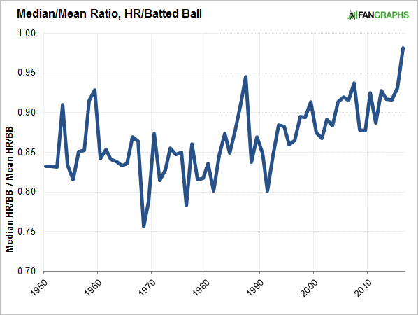
The ratio this year is its highest. It’s not quite 1.0, but it’s the closest it’s gotten. That suggests a reduction in how top-heavy the player sample is. Again, it’s evidence that home runs are being a little more evenly distributed.
The following plot should be the easiest one to understand. For this one, I just bothered to go back 20 years, for simplicity. I split the players for every season into fourths, ordered by home-run rate. So there are the best home-run hitters, the next-best home-run hitters, the third-best home-run hitters, and the relative lightweights. For each group in each season, I calculated the average home-run rate. Here is how those rates have progressed over time:
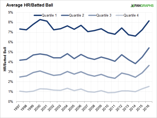
This year, there’s been an increase for every group. The home-run surge has touched everybody. And yet, it hasn’t touched everyone the same. Take the highest quartile, for example. There’s an increase in 2016, but it’s just back around the level where it was at the turn of the millennium. Each of the other three quartiles has peaked, within this 20-year window. They’re at new levels. Which is interesting!
For every quartile, I calculated the 20-year average. In 2016, Quartile 1 has a rate higher than its average, by 10%. Quartile 2 has a rate higher than its average by 21%. Quartile 3 has a rate higher than its average by 31%. Quartile 4 has a rate higher than its average by 35%. To try to put this in the simplest terms: The best home-run hitters are hitting a few more home runs, but the bulk of the work is coming from the other classes. The non-elites are showing more power, and the boost has been disproportional.
It feels like one solitary data point against the idea that the baseball itself has changed. I might be wrong, but I suspect that, if the baseball were truly that different, everyone would be affected about the same. That’s not what we observe. There are more home runs, but mostly that’s because lesser home-run hitters are showing more power. It’s not like teams are suddenly just now seeking out power hitters. Rather, this might suggest changes in approach. That could be hard to believe on a league-wide basis, given how suddenly things started to happen, but we all know the anecdotal evidence about various hitters trying to generate better speeds and launch angles. When enough players do that, you can see a change among a whole population.
I’m not saying anything here is conclusive. And it’s possible we have a population change and a baseball change. Some of the evidence for a different baseball is very convincing. But now there’s more power coming from baseball’s middle class. And there’s more power coming from baseball’s lower class. The upper class has more power, too, yet not really by a whole lot. Homers are being distributed fairly equally, perhaps more than ever before, and so it’s not just Jean Segura who’s opened a lot of eyes. There’s evidence to believe more hitters are just going for it. There’s evidence to believe that it’s working.
Jeff made Lookout Landing a thing, but he does not still write there about the Mariners. He does write here, sometimes about the Mariners, but usually not.
I don’t think everyone would be impacted the same though, with a change in the baseball. For guys who were already good power hitters, if the baseball is going further, then you’re going to have a bunch of home runs that are just longer home runs. Sure, some warning track fly balls are now out of the park from these guys too, but if there’s a change in baseballs I would think you would expect hitters who don’t have good power to see a much bigger chance. Like if you take Mark Reynolds and give him a baseball that goes 10% further, I’m not sure he hits any more home runs, because he either crushes it or mis-hits. But if you take someone who’s more maxed out power-wise around the warning track/just over the fence, and give them 10% more distance, they’re going to see a lot more home runs, right?
I’ve had this thought and I really don’t know the answer. Statcast could help. How do power hitters distribute their fly balls, versus non-power hitters? Do they actually hit fewer toward the track that just don’t go out? Totally possible. Maybe even probable! But I’d love to see someone research it.
Research is certainly needed to settle this, but absent that, the logical explanation is that weaker hitters have a shorter range of FB–from the shallowest caught to those that clear the fence. From this it follows that the proportion of their FB that travel to any fixed area within that range is going to be greater than for sluggers, who have a greater scatter. Even taking into account that the proportion falls off the deeper we go, this suggests that weaker hitters should have a greater proportion of balls caught near the fence to those that clear it–and hence, can potentially increase their HR rate more with the same increase in distance.
I’m sure there are other factors involved, but this seems to me likely to be an important one.
Would also think a juiced ball would make more of an impact regarding home runs for hitters with a generally lower launch angle, since they’re taking advantage of more horizontal distance. A natural power hitter who has more upper cut to take advantage of that power, they’d be wasting more of the added bounce on vertical distance.
Is there a formal definition for a power hitter? Like has an ISO over .170?
You could probably also use the ESPN HR tracker and look at distribution of Plenty vs No Doubt vs Just Enough/Lucky for the quartiles.
Also could look at the Avg. True Distance. We know that Speed off the bat is higher, which in my mind supports isavage’s comment. If Stanton hits it 400′ or 495, it’s still a HR.
This is a very clear description of something I just spent 5 minutes trying to describe, before finally giving up.
Thanks!
It would be interesting to see the long fly ball per batted ball rate for each of the quartiles. I wouldn’t be surprised if the power hitters actually hit more long fly balls than non-power hitters… leading to… a different conclusion than yours 😛
This logic is the best explanation I can come up with for explosions like Dozier’s: He had an incredible knack for hitting warning track shots prior to 2016.
Jean Segura is the next 30/30 player.
This begs the question: why did the Sosas/McGwires/Bonds see such a surge 15-20 years ago into the 60’s/70’s? Why can’t such a surge happen today? What makes this era different from that one? Is it the higher K rate?