Which Ballparks Make It Easiest to See the Pitch?
For a while now, I’ve been having fun analyzing how accurate umpires are when calling balls and strikes according to the Statcast strike zone. Honestly, I might be having too much fun. It’s just that there are so many variables that might affect the way the umpire sees a pitch. Today we’re looking into the most literal one: the ballpark. Every stadium is different, and that can affect how easy it is to track the baseball. This is a well-established issue, which is why every ballpark has a batter’s eye, a dark background that’s supposed to ensure that the batter is able to see the ball out of the pitcher’s hand. Those backdrops vary quite a bit, from evergreen trees and ivy in Colorado, to a painted wall in Texas, to tinted glass in the Bronx.
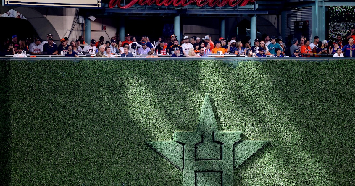
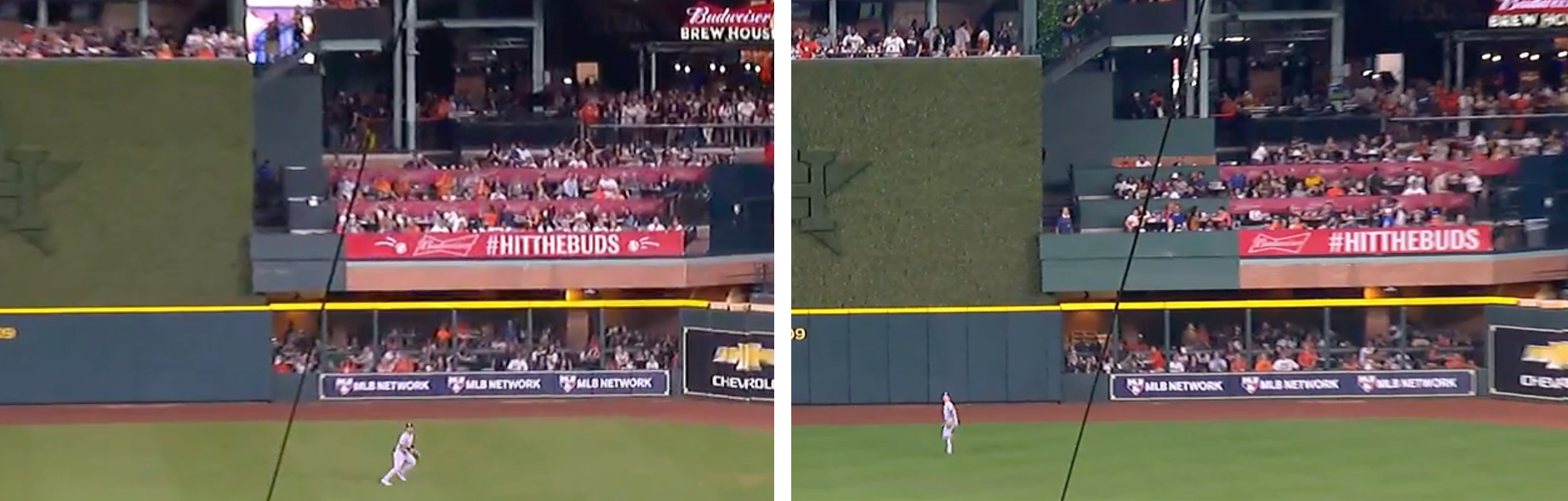
When Drew Smyly nearly threw a perfect game last April, it helped that it was a day game at Wrigley Field, and his left-handed release point was so wide that the ball appeared to be coming not from the batters eye, but from the bleachers in right-center. Last September, in response to multiple public complaints from players, the Astros effectively extended Minute Maid Park’s batter’s eye several feet farther into right field, awkwardly repainting part of a formerly red section of brick and signage green. “It’s like night and day,” one player told The Athletic after the paint job:
If the ballpark affects how the players see the ball, it’s logical to assume that it affects how the umpires see it too. In order to measure that difference, I calculated the accuracy of ball-strike calls in the shadow zone — close pitches on the edge of the strike zone — for each ballpark in each season since 2008. Please keep in mind that for the rest of this article, when I talk about umpire accuracy, I’m only talking about those close calls in the shadow zone. Next, I compared each park’s accuracy to the accuracy in the same park in the following year. The correlation between year one and year two is .35.
It’s not the strongest correlation, but it’s not that weak when you consider how many things can change from year to year in a given park. Catchers can bring their framing skills with them from team to team. Some pitchers also show an ability to earn called strikes, and they can change teams or repertoires. Teams also change their ballparks fairly often, sometimes dramatically, sometimes in ways that are subtler than repainting a whole section. To stick with Minute Maid Park, the Astros installed new lights in 2016, removed Tal’s Hill and completely redid the batter’s eye in 2017, and got a new LED scoreboard and signage in center field in 2023. Lastly, umpires are becoming more accurate every year, which shrinks the differences between the parks. In 2008, the standard deviation from park to park was 1.7%, nearly triple the 0.6% standard deviation of 2023.
That’s a whole lot of changes that could affect an umpire’s view of the pitch. Even so, if you combine a couple years of data to get a bigger sample, the general contours are pretty easy to see. Here’s the American League East. Please note that these are four-year rolling averages, so 2011 means the average of 2008 through 2011, and so on for each year. (This also means that from 2020 to 2023, the Rogers Centre has less data than the other parks, since the Blue Jays played their home games elsewhere in 2020 and for part of 2021.):

Fenway Park generally has the most accurate calls, Camden Yards and the Trop are in the middle, and Yankee Stadium and the Rogers Centre bring up the rear. The point of all this is to establish that there’s some real signal here. There are lots of variables, and some of them change quite frequently, but umpires really do a better job of calling balls and strikes in some parks than others.
With that out of the way, I combined each ballpark’s data for the 2021, 2022, and 2023 seasons, and I looked for connections. I now need to warn you that the next paragraph contains a lot of correlation coefficients. As a matter of fact, the rest of this article contains a lot of correlation coefficients. I am sorry. I don’t know very many ways to dice up numbers. I should have taken more math classes in college. However, I also think that in this situation they might be the right tool for the job. A correlation coefficient shows the statistical relationship between two sets of numbers. It doesn’t mean that one causes the other; it just means that they’re related. And this is a situation where we really are looking for sets of numbers that are related by the same root cause.
My hypothesis was that in ballparks where it’s easier to see the ball, umpires would be more accurate, batters would make better swing decisions, and batters would also make more contact. To check those numbers, I pulled contact rates specifically for pitches over the heart of the plate, and I pulled swing rates specifically in the chase zone — the area outside the shadow zone, where pitchers are hoping to tempt batters into an ill-advised swing. For the rest of this article, when I mention contact rate and chase rate, I’m only talking about those specific zones:

I started with the contact rate on pitches over the heart of the plate. The correlation coefficient between a ballpark’s umpire accuracy and its contact rate is .18. Players do make more contact when umpires are making more accurate calls. However, it’s not a strong enough correlation that I’d call it a smoking gun. I found a much stronger correlation between umpire accuracy and swing rate on balls in the chase zone. However, the correlation was not in the direction that I expected. I expected a negative correlation, which would mean that when umpires were making more accurate calls, batters would chase less. Instead, it’s a positive correlation, which means that when accuracy went up, chase rate went up too. That might sound counterintuitive at first, but there’s also some logic in the idea that, even on pitches that are out of the zone, batters will be more likely to swing when they can see the ball better. The correlation coefficient is .52, and the scatterplot tells a convincing story:

This makes it pretty clear that in ballparks where umpires are more accurate, batters are chasing more. At the very top is Progressive Field in Cleveland, then right beneath it is Truist Park in Atlanta. All the way at the bottom is Coors Field. This is a pretty convincing scatterplot. In fact, although there’s nothing wrong with the numbers, the scatterplot is probably too convincing. It’s time to acknowledge some glaring holes in my methodology.
That lovely scatterplot is somewhat skewed by each home team’s natural tendencies. Let’s start with two examples: For the past several years, Cleveland has had great pitching and not so great hitting, both of which would drive up the chase rate at their home park. Colorado is home to pitchers like Antonio Senzatela and Austin Gomber, who don’t earn chases no matter where they’re playing, which would drive down the numbers at Coors Field.
That effect will be mitigated due to something that I’m going to start calling the Symmetry Doctrine: Teams with good pitching tend to have good hitting, and teams with bad pitching tend to have bad hitting. If you’re building a good club, you want it to be good in all facets of the game, and if you’re building a bad club, you don’t care much about either side. As a result of this, there’s a negative correlation (R = -.18) between the chase rates of a team’s batters and pitchers. A good team tends have batters who don’t chase and pitchers who earn chases, and vice versa for bad teams.
That balances out the home team skew somewhat. It doesn’t balance it out completely, because umpire accuracy when the home team is pitching is much more determinative of a park’s overall accuracy than when they’re hitting (R = .81 for pitching, as opposed to R = .64 for hitting). That makes plenty of sense, since catchers and pitchers can affect the umpire’s decisions through factors like pitch framing and command, whereas batters don’t have that much control. Combine those two factors, and you’re left with a surprising finding: Umpires tend to be more accurate in the ballparks of better teams with higher winning percentages (R = .19). That might sound wild, but keep in mind that umpires tend to get more calls wrong on pitches inside the strike zone than outside it. When they get a call wrong, it’s usually a ball that should have been called a strike, so if they’re getting fooled into calling extra strikes by a catcher who’s a great framer, they’re often calling a more accurate game.
In order to remove some of the bias that a team’s tendencies might bring into the numbers at their home park, I ran all of my numbers by team instead of by park — combining the stats for both their pitchers and their hitters — then I measured the difference between their home stats and their road stats. For that reason, I can tell you that when the Guardians are playing at home, umpires are 1.3 percentage points more accurate than when they’re on the road. For the Rockies, the calls are 1.1 percentage points less accurate at Coors Field.
Next, I calculated the correlation between accuracy and chase rate. The R-value dropped all the way to .11. That’s a much weaker correlation. There are plenty of reasons for that: We stripped out some bias, cut our sample sizes in half and compared smaller overall changes. Interestingly, the R-value for pitchers was .02, compared to .17 for batters. That might sound strange. After all, we’re looking at the numbers for all pitchers and all batters across the entire league, which means the chase rate for pitchers has to be equal to the chase rate for batters. The answer is that from team to team and park to park, the standard deviation was much bigger for batters than for pitchers. It’s the same reason that the home team’s pitchers affect a park’s overall accuracy rating more than hitters do. Pitchers tend to have roughly the same chase rate no matter where they play, whereas batters chase more depending on where they’re playing. The correlation isn’t quite so dramatic, but we’re back where we started: In ballparks where umpires are more accurate, batters are more likely to chase.
This method — measuring the difference between home and road stats, rather than the overall stats — yielded one more really interesting finding. When I went back to the first thing we measured, contact rate on pitches over the heart of the plate, I found that the correlation to umpire accuracy was much stronger, with an R-value of .40:

Once again, it’s fairly easy to see the general shape of the plot. Teams that have more accurate ball-strike calls when they play at home also tend to make more contact when they play at home. When umpires are seeing the ball well, so are batters.
One of the last things I checked was whether chase rate would have a stronger correlation to umpire accuracy if I only looked at shadow zone pitches in the strike zone, and excluded those outside the strike zone. It occurred to me that if pitches looked more hittable to batters, then maybe they also looked more like strikes to umpires. However, I was wrong. The correlation was weaker, and I can only assume that’s because batters and umpires are tracking the ball with very different intent. Batters are looking to do damage, and umpires are looking to judge the location.
I should now stress a couple things. First, there’s more research to be done in this area, preferably by someone smarter than I am. It’s entirely possible someone else could find better ways to measure the things that I’ve been trying to measure. Second, all of the numbers in this article are extremely small. There’s still some home-team pitching bias in the numbers, and the team with the biggest overall changes in ball-strike accuracy still has a difference of 1.3%. Moreover, that’s just 1.3% of the 20% of the pitches that end up as takes in the shadow zone. However, as far as I can tell, these are real, measurable effects, and they do make intuitive sense. Ballparks are different, and it only follows that if batters can see the ball better in some places, then umpires can see it better too. In ballparks where umpires are more accurate, batters chase more, but also they make more contact when they swing at good pitches.
I’m going to leave you with a big, sortable table. The first column is simple. It’s just umpire accuracy on pitches in the shadow zone in each ballpark for the last three seasons. This column should give you something to either complain about or to brag about for the next couple months. If you’re an A’s fan, a Rangers fan, or a Rockies fan, you should feel comforted knowing that the umpires really are worse in your neck of the woods! If you’re an O’s fan, this is just one more reason to wax grandiloquent about your superior ballpark.
The last four columns combine the three metrics we’ve broken down this article in order to give a comprehensive Pitch Visibility Score. For each club, I’ve taken the difference between their home and away stats, then measured how many standard deviations each one was away from average. In the last column, I’ve added all three together. Using the sort feature, you can discover that although Oriole Park at Camden Yards has the highest overall score, batters actually chase slightly less often there. It’s possible that two years of superlative framing from Adley Rutschman have goosed the numbers a little bit. On the other hand, Citi Field scores lower across the board. When they take place at Citi Field, Mets games feature fewer chases, less contact, and less accurate umpiring. Happy sorting!
| Team | Home Park | Accuracy | Accuracy+/- | Chase+/- | Contact+/- | Total | |
|---|---|---|---|---|---|---|---|
| 1 | BAL | OPACY | 81.6% | 1.9 | -0.3 | 1.8 | 3.4 |
| 2 | ATL | Truist Park | 81.9% | 1.9 | 1.9 | -0.6 | 3.2 |
| 3 | STL | Busch Stadium | 81.3% | 0.8 | 0.8 | 1.4 | 3.1 |
| 4 | CLE | Progressive Field | 82.2% | 2.1 | 0.9 | -0.4 | 2.6 |
| 5 | MIA | loanDepot park | 81.5% | 0.0 | 0.9 | 1.3 | 2.1 |
| 6 | LAD | Dodger Stadium | 81.0% | 0.0 | 1.7 | 0.0 | 1.7 |
| 7 | BOS | Fenway Park | 81.5% | 0.2 | 0.3 | 0.8 | 1.4 |
| 8 | PIT | PNC Park | 81.2% | 0.5 | -0.6 | 1.5 | 1.4 |
| 9 | LAA | Angel Stadium | 80.9% | 0.6 | 0.7 | -0.1 | 1.2 |
| 10 | HOU | Minute Maid Park | 81.3% | 0.0 | 0.9 | 0.3 | 1.1 |
| 11 | KC | Kauffman Stadium | 81.6% | 1.4 | -2.2 | 1.9 | 1.0 |
| 12 | SFG | Oracle Park | 80.9% | 0.4 | -0.3 | 0.7 | 0.9 |
| 13 | TOR | Rogers Centre | 81.2% | -0.2 | 1.0 | -0.2 | 0.6 |
| 14 | ARI | Chase Field | 81.1% | -0.2 | 0.1 | 0.5 | 0.4 |
| 15 | TEX | Globe Life Field | 79.9% | 0.4 | -0.3 | -0.1 | 0.1 |
| 16 | OAK | Oakland Coliseum | 80.1% | -0.6 | 0.7 | -0.6 | -0.5 |
| 17 | CIN | Great American | 80.9% | 0.2 | -0.5 | -0.5 | -0.9 |
| 18 | SEA | T-Mobile Park | 80.5% | -0.3 | 0.9 | -1.5 | -0.9 |
| 19 | MIN | Target Field | 81.1% | 0.0 | -0.9 | -0.1 | -1.0 |
| 20 | PHI | Citizens Bank Park | 81.2% | -1.5 | 0.6 | -0.2 | -1.2 |
| 21 | CHC | Wrigley Field | 81.2% | 0.7 | -1.3 | -0.6 | -1.2 |
| 22 | WSN | Nationals Park | 80.6% | -0.6 | -0.7 | 0.0 | -1.2 |
| 23 | NYY | Yankee Stadium | 80.3% | -1.0 | -0.2 | -0.4 | -1.6 |
| 24 | DET | Comerica Park | 81.3% | -0.4 | -1.4 | 0.1 | -1.7 |
| 25 | COL | Coors Field | 79.7% | -1.7 | -1.1 | 1.0 | -1.8 |
| 26 | SDP | Petco Park | 80.1% | -0.7 | 0.0 | -1.1 | -1.8 |
| 27 | CHW | Guaranteed Rate Field | 80.9% | -0.7 | -1.3 | 0.1 | -1.8 |
| 28 | TBR | Tropicana Field | 80.8% | -1.6 | 1.1 | -1.7 | -2.2 |
| 29 | MIL | American Family Field | 81.2% | -0.1 | -0.6 | -1.9 | -2.7 |
| 30 | NYM | Citi Field | 80.4% | -1.6 | -0.9 | -1.4 | -4.0 |
Davy Andrews is a Brooklyn-based musician and a writer at FanGraphs. He can be found on Bluesky @davyandrewsdavy.bsky.social.
Something I’ve wondered about before, very cool