
A LOBster in Every Pot
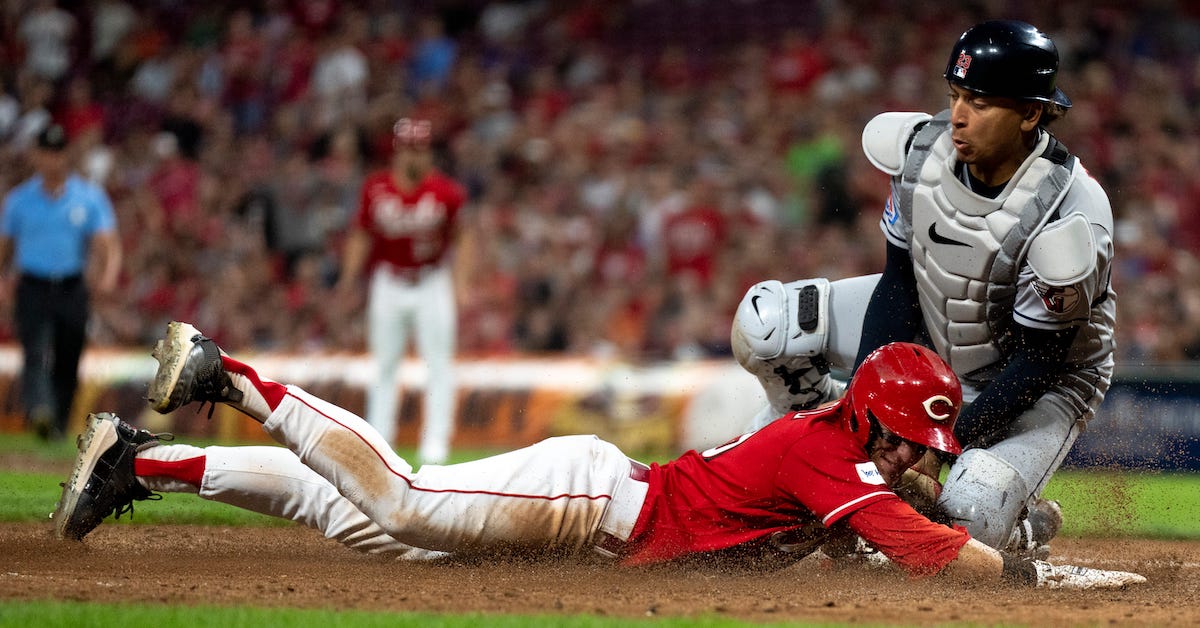
Look, I know that isn’t the line. It’s a chicken in every pot. But I came up with a good lobster pun last week, and I’m writing more about the ins and outs of teams driving home runners from third base, so I decided to go back to the well. You’ll just have to live with it; I’m the one driving the boat here, and as it turns out, it’s a lobster boat.
With the puns are now settled, let’s get down to business. Last week, I chopped up the 2023 season into halves to see how well various statistical indicators correlated with a team’s future ability to cash in their runners. As a recap, strikeout rate had a fairly strong correlation, and not much else did. Quite frankly, though, I wasn’t particularly convinced by that. There just wasn’t enough data. With only 30 observations, it’s too easy for one team to skew things, or at least that’s how it feels in my head.
There’s an easy solution: more data. So I used the same split-half methodology from last week and started chopping past seasons in two. More specifically, I picked the years from 2012-22, excluding the shortened 2020 season. In each case, I followed the same procedure: I split the season in two and noted each team’s offensive statistics in the first half. Then I looked at how efficient each team was at scoring when a runner reached third with less than two outs. I got a much bigger sample this time; 300 observations, which makes it a lot harder for a single outlier to mess things up.
As it turns out, a single outlier might have been messing things up. Over this much larger sample, every major statistical measure of offensive performance did quite “poorly,” at least inasmuch as they predicted very little of a team’s subsequent ability to convert runners on third with less than two outs into runs. In an effort to conserve words and not have to type that long and confusing phrase every time I want to talk about this concept, let’s just call that “conversion rate.”
So yeah… conversion rate is a tricky thing to predict. Here, for your tabular enjoyment, are the correlations between various first-half statistics and second-half conversion rate, as well as r-squared’s in case you don’t feel like doing the math yourself:
| Statistic | Correlation | R-Squared |
|---|---|---|
| BB% | 0.087 | 0.008 |
| K% | -0.121 | 0.014 |
| ISO | 0.101 | 0.01 |
| BABIP | 0.004 | 0 |
| AVG | 0.102 | 0.01 |
| OBP | 0.136 | 0.018 |
| SLG | 0.126 | 0.016 |
| wOBA | 0.137 | 0.019 |
| wRC+ | 0.124 | 0.015 |
In plain English: blah. None of this is all that interesting. Want to turn your good offensive situations into runs more frequently? Just hit for average… or power… or get on base a lot… or don’t strike out… or just have a generally good offense. The highest correlation between first-half performance and second-half conversion rate is wOBA, which just happens to be the most basic “is your team good at hitting” number available. It does just a hair better than wRC+, which makes sense to me; wRC+ adjusts for park effects, but “did you score a run” and wOBA both don’t. In my future analysis, I decided to throw out BABIP and wRC+; they didn’t seem to be bringing much to the party.
So should you just give up, go the nihilistic route, and say that nothing can help you understand which teams will post the best conversion rates? You could, if you want, in the way that the answer to a ton of baseball questions seems to be “random variance.” But that’s not a particularly satisfying answer, and there are real effects here; better offensive teams really do convert at a higher rate. So I tried a few other methods to try to get at the heart of the problem.
First, I ran two-variable correlations for every combination of two core offensive statistics. I didn’t have a ton of hope that this would give me interesting data, but it’s worth trying something even if you aren’t sure it’ll work just to rule it out. Bad news, though: it didn’t work. I hope you like long, mostly-meaningless tables with far too many data points:
| Stat 1 | Stat 2 | Correlation 1 | Correlation 2 | R^2 |
|---|---|---|---|---|
| BB% | K% | 0.522 | -0.289 | 0.028 |
| BB% | ISO | 0.236 | 0.164 | 0.012 |
| BB% | AVG | 0.428 | 0.378 | 0.02 |
| BB% | OBP | 0.106 | 0.414 | 0.019 |
| BB% | SLG | 0.244 | 0.178 | 0.019 |
| BB% | wOBA | 0.17 | 0.377 | 0.02 |
| K% | ISO | -0.305 | 0.293 | 0.033 |
| K% | AVG | -0.184 | 0.161 | 0.016 |
| K% | OBP | -0.164 | 0.355 | 0.024 |
| K% | SLG | -0.218 | 0.188 | 0.028 |
| K% | wOBA | -0.178 | 0.349 | 0.026 |
| ISO | AVG | 0.17 | 0.279 | 0.016 |
| ISO | OBP | 0.097 | 0.381 | 0.02 |
| ISO | SLG | -0.11 | 0.279 | 0.016 |
| ISO | wOBA | 0.011 | 0.413 | 0.019 |
| AVG | OBP | -0.059 | 0.501 | 0.019 |
| AVG | SLG | 0.11 | 0.17 | 0.016 |
| AVG | wOBA | -0.048 | 0.459 | 0.019 |
| OBP | SLG | 0.317 | 0.089 | 0.02 |
| OBP | wOBA | 0.209 | 0.249 | 0.019 |
| SLG | wOBA | -0.007 | 0.437 | 0.019 |
These are better, but not by much. And the pairs that explain things the most aren’t the ones I expected. Walk rate and strikeout rate? Strikeout rate and ISO? It makes perfect sense to me that strikeout rate is a key part of the puzzle, but what goes with it doesn’t really track. One small note: because of the way I pulled the data by aggregating results, I couldn’t include fly ball rate, but I’m guessing that ISO is something of a proxy for it, perhaps with other information on hard-hit rate as well.
I didn’t want to stop there, but we’re getting outside of the realm of easily interpretable solutions. A few commenters last week suggested alternatives: dominance analysis, relative weights analysis, principal components analysis, and maybe some others that I missed. I was already familiar with PCA weighting from past experience, but it didn’t really fit with what I was looking for. The other two seemed somewhat promising, but also phenomenally hard to interpret. Then I had an epiphany: If my output is going to be hard to interpret anyway, why not just chuck it into a machine learning algorithm and see what comes out?
Bad news on that front: I chucked it into a variety of machine learning algorithms, and not much came out. Chewing up all that data at once in a multivariate regression did about as well as I did on my own, with a negligible r-squared. Only strikeout rate appeared to be significant, and not very significant at that. I started throwing everything I had at it, including trying to interpret those methods from up above. Relative weights analysis gave ISO, average, and slugging percentage high weights (with slugging having inverse correlation), which sounds like gibberish to me. PCA transformed the data into three uninterpretable principal components, and still only produced an r-squared about as good as using strikeout rate and ISO.
I hate to say it, but I don’t think I can find any clear patterns despite all of this extra data. As an added flourish, the year-to-year correlation between teams’ ability to drive runners home from third with less than two outs is essentially zero, so it’s not like there’s even much evidence that teams have cracked the code. I’m still hopeful that something will shake out, but I have no clue where. Hey, maybe you can help! Here’s a spreadsheet with the data I smashed into various models in the previous section. If you feel like messing around with it, go nuts.
In the end, perhaps the biggest message here is the lack of predictability. You can’t tease out what will happen on the field based on broad aggregates. You can’t forecast what will happen in the biggest moments now based on what happened in the biggest moments in the past. The game today is what matters. No one is doomed to strand those runners, or fated to cash them in. The way you win is by executing each day, not by cashing in on some innate trait that makes you more likely to do the clutch thing. I find that comforting. Even in this age of big data and omnipresent cameras, players doing their thing better is still the most important factor, and who those guys are can and does change from one day to the next.
Ben is a writer at FanGraphs. He can be found on Bluesky @benclemens.
Super interesting stuff, Ben!
Have you looked at breaking it down into runner on 3rd with 0 outs vs. 1 out and predicting each of those individually? Presumably if a team has a disproportionate amount of “runner on 3rd, fewer than two outs” situations with 0 outs, they’ll convert more often. There’s still probably too much noise to say anything, but in this case your label is quite noisy too.
So if we’ve mostly settled this conversion rate is pretty random, can we turn this around and figure out how much of “generic baseball randomness” is specifically this?
Like how much of a teams deviation in final record vs baseruns record is explained by their conversion rate vs average?
To me, the combination of K% and BB%’s significance is screaming “bases loaded”. I wonder if you took out such situations, would the r-squared drop?
K% and SLG seems like the most intuitive combination, honestly. I’d bet if you asked a baseball fan who is both knowledgeable and not particularly sabremetrically inclined, those would be the things they deemed most important. If anything is the takeaway here, it’s that the r-squared isn’t larger.
“better offensive teams really do convert at a higher rate”…do they convert at a higher rate because they are better offensive teams, or are they better offensive teams because they convert at a higher rate?
Specifically, are there effects brought on by having a stronger lineup generally, vs the results of individual players’ component stats? I’m asking a different version of the lineup protection question essentially. We’ve pretty well established that lineup protection doesn’t exist in the AVG/OBP/SLG sense, but does it exist for RBI conversion?
thank you for what may be a proof on the randomness of baseball
Good stuff. Thanks for looking, Ben, and also thanks for acknowledging that there doesn’t seem to be much to find.
If you have “far too many data points” and your conclusions are “mostly meaningless” then I would suggest that the conclusions are not meaningless – they are evidence that luck is the most important variable.
I would say that this is further evidence that winning close games is not a sign of team quality or “grit,” but luck. Good teams aren’t those that win close games. Good teams are those that blow other teams out.
Thanks Ben for doing what most scientists fail to do: say that you didn’t find much significance and show what you did to get that lack of conclusion.
But what about at the individual level? Your findings suggest past performance does not predict future performance in the aggregate. But my biased memory tells me Hideki Matsui was a much better bet to get that guy in from third base than Alex Rodriguez, whether we’re talking about the first half of the 2009 season or the second half.
Sure. But over both of their careers? Probably not.
Love the objective and analysis robustness, however I feel you are to restrictive in regards to data points…not sure how to get at team level, but maybe analyzing components that predict strikeout rates such as contact % and first strike swing rate as well as other stats that lead to runs scored such as BsR, HR / fly ball rate, etc.
curious if there is an opponent defense or stadium effect, given how much a stadium can impact offense.
also, assume there is a high correlation between low LOB and runs scored / PA, so teams that score a lot of runs have a low LOB%
it may be effective to divide data into segments, such as high LOB % vs low LOB % to find the causal links, as high scoring teams are constructed differently than low scoring teams.
As suspected, I split data into High 2HCP (top 100) and Low 2HCP (bottom 100) and there was a clear difference in all offensive stats between the two sets, e.g. average wOBA for top 100 is .006 higher average wOBA of the bottom 100, so better offensive teams have a higher conversion rate,
https://docs.google.com/spreadsheets/d/1ElAGC1bSzx9q819KxLqrcSvn7DCA1xFT8q3VvfVIPK0/edit?usp=sharing
Sorry if this is too simplistic, but doesn’t using first half data to predict 2nd half conversion add a bunch of noise? I thought 1st half stats don’t predict 2nd half very well? (Maybe better for a team than player.) Why not just use 2nd half stats? Or, use predicted stats based on multiple years (maybe harder?)
I went back and read the first article…and I still wonder if the issue created in using actual stats aren’t smaller than the noise in splitting the season. Maybe the correlated stats in the split season are the more sticky stats instead of the more important ones.