
Errors and Omissions: Fixing the Line Score
Admit it: you don’t like line scores. If you look at them, it’s only in passing, or to make yourself a little angry (the indignant kind) after a game your team lost. Nine hits, and we only scored two runs?!? The other team scored four runs on four hits?!? There ain’t no justice. They even made an error, and we kept a clean sheet! How could this have happened?
Of course, if you weren’t looking at a line score, you probably wouldn’t make either of those complaints, because it’s unlikely that which team made an error had that much of a bearing on the outcome. And that’s a shame, because the line score should be a great source of information. It’s an ingenious construction – tons of data conveyed in a compressed format. The inning-by-inning scoreline gives you the dramatic beats of the game – who scored when, whether it was a comeback or a wire-to-wire romp, and so on. The smattering of information on the right tells you roughly how the runs scored with great efficiency.
Or at least, it should tell you how the runs scored. The problem is, it really doesn’t. Take this one (courtesy of Baseball Reference), from an April 1 tilt between the Astros and Athletics:

The Astros barely out-hit the A’s. They played atrocious defense. They won by seven runs anyway. That’s because a single and a double (or a triple or a home run) count the same under “hits.” Meanwhile walks don’t count anywhere but errors, which occur far less frequently than walks and produce similar results, take up a third of the available real estate. Home runs matter more than either, and are nowhere to be found. Let’s look at a more complete tale of the tape for this game:
| Team | 1B | 2B | 3B | HR | BB | HBP | ROE |
|---|---|---|---|---|---|---|---|
| Astros | 4 | 3 | 0 | 2 | 6 | 2 | 0 |
| Athletics | 4 | 2 | 0 | 0 | 3 | 1 | 2 |
Houston had three more extra-base hits. They reached base on non-hit outcomes more often than Oakland. Look at that list, and it’s obvious who won this game. Maybe you wouldn’t expect it to be quite the blowout it was, but Houston had five extra baserunners and slugged .545 to Oakland’s .267. That’s a rout – not this:
| Team | Hits | Errors |
|---|---|---|
| Astros | 9 | 2 |
| Athletics | 6 | 0 |
Of course, fixing that is easier said than done. The extensive categorical breakdown from above won’t work for a line score, because it’s far too much data. Whatever the line score’s faults, you can’t knock it for brevity. The reason it’s still posted for every game is that it takes up little space but provides useful context.
I have a solution to that. Can you fit all the categories I care about into two lines? Definitely not. But an approximation doesn’t have to be very good to beat the old standard of hits and errors. My solution? Group every one-base event into one pile and every multi-base event (with one exception I’ll explain shortly) into another. Let’s call them “1B” for one-base events and “XB” for extra-base events. Now the result makes more sense:
| Team | Runs | 1B | XB |
|---|---|---|---|
| Astros | 8 | 12 | 5 |
| Athletics | 1 | 10 | 2 |
The one exception to the dividing line I proposed is errors. Most errors are of the one-base variety, but they come in all kinds of flavors, from dropped foul balls that don’t even produce a baserunner all the way up to four-base errors. You could put these into the correct categories, but I think the added precision isn’t worth the extra fiddling. Most errors cost a base, so throwing them all into the one-base bucket is close enough for our purposes here.
Normally, this is the part of the FanGraphs article where I present data to support my argument. In this case, though, I don’t think data would be particularly useful. What data would you want here? Times I’ve looked at a line score and thought “the wrong team won this game” in error? Empirical estimates of how much happier you’d be knowing that your team socked five extra-base hits rather than looking at an inscrutable line of eight hits and two opposing errors and wondering how they scored nine runs?
The real gain in this is that we would care more about line scores, and they’d tell us more about what happened on the field. What do you think happened in this matchup between the Rangers and A’s?

After making up your mind, let’s look at it in our new format:
| Team | Runs | 1B | XB |
|---|---|---|---|
| Rangers | 5 | 9 | 2 |
| Athletics | 10 | 19 | 2 |
Now you’re getting it. The A’s juiced the bases all game long. They put a six-spot up without an extra-base hit in the second, and didn’t hit a single home run. They were fairly efficient with their baserunners, in the grand scheme of things. It’s a lot easier to score those one-base advancements if you’re clocking the ball into power alleys or over the fences, but that stops being true when you run a .455 OBP as a team.
Or take another one, Padres-Diamondbacks from September 1, with both teams sputtering but the Padres still nine games over .500. Arizona won, and you’d be forgiven for thinking it looked like a standard rout:

But the Padres had some pop in this one. Let’s see it in our new format instead:
| Team | Runs | 1B | XB |
|---|---|---|---|
| Padres | 3 | 2 | 5 |
| Diamondbacks | 8 | 19 | 3 |
This game was actually intriguing. The Padres slugged the ball all over the park, with two homers and three doubles. But Arizona, led by starter Luke Weaver, limited the damage – not allowing a single walk helps, as does running a BABIP below .200 – and so the Padres got nearly nothing to show for their big knocks.
Meanwhile, the Diamondbacks overwhelmed the Padres with hits both small and large. They put a baserunner aboard in every inning, and while they mostly squandered them, they did manage to string together a pile of baserunners in the second inning to make it a walkover.
Not every game would be enhanced by a more descriptive line score – I picked some evocative ones on purpose – but providing more useful information in the same space can’t be a bad thing. Yes, after all this, I think that the line score is a great idea – just one whose execution could stand improving.
The Hall of Fame credits Henry Chadwick with inventing the box score and line score in 1858. That’s amazing! The game – and even more so, the world – have changed many times over since then. For decades, box scores changed with them. More categories were added, statistical summaries jumped in below the box score, and when the RBI was developed, it became a full-box-score mainstay.
But aside from those early innovations, line scores have remained static. Nothing has changed even as the way baseball is played has evolved into something that would be nearly unrecognizable to a fan from the 19th century. Errors aren’t one of the most important statistics in the game anymore. That wasn’t always the case – look at this wild box score from 1876 I sourced from Wikimedia Commons:
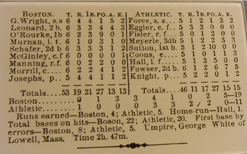
In a game with 28 errors (and 13 “first base by errors”), devoting a third of the line score space to errors makes perfect sense. As best as I can tell, there were two extra base hits in the game – a column for extra bases would have looked like the error column does today, a strange vestigial limb. A line score of this game, in the original runs/hits/errors form, does exactly what my proposed change would do today: encapsulate the most important events with a concise presentation.
In fact, I’ll go out on a limb: if Henry Chadwick were alive today and following baseball, he’d change the line score. He had a genius for presenting information, and in modern baseball, how often you’re walking and hitting for extra bases – or preventing the opposing team from doing so – has a lot to do with winning, so I’m sure he’d want to see it.
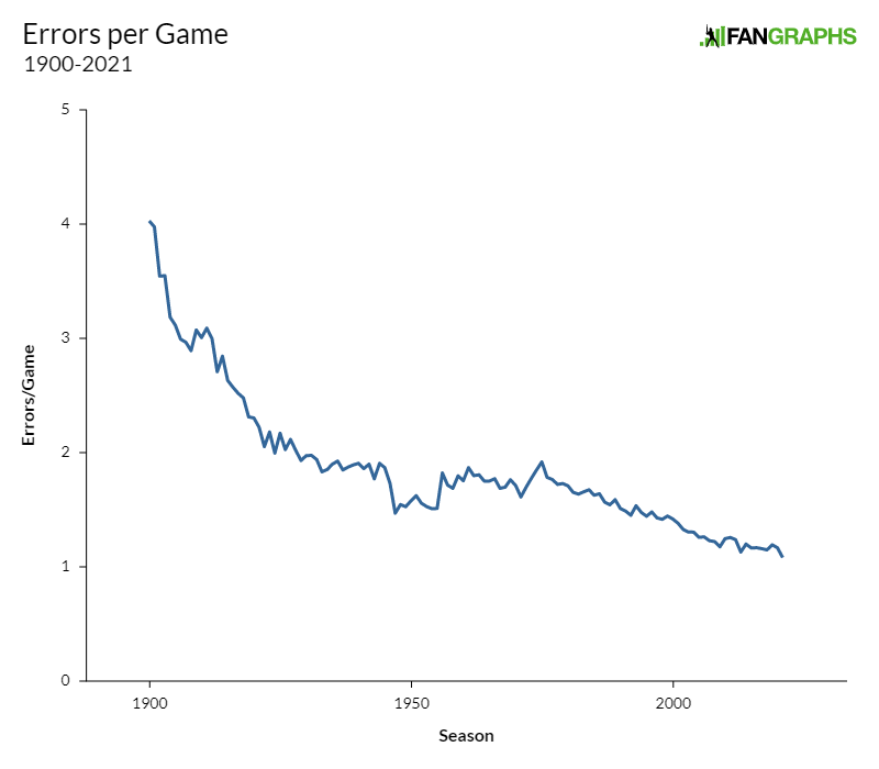
Would his line score change mirror mine? I have no idea! But he’d surely do something. Errors have been sitting there, occupying space on pages and in minds, while their frequency has plummeted:
So let’s end the tyranny of the error and remove it from line scores. Let’s replace it with something better, and get walks in there while we’re at it. I’m not sure how to propose this change more widely. I don’t run Baseball Reference, or ESPN, or wherever people get their line scores. I’m open to ideas for how to talk about this more. But I really do think that this change would improve my consumption of baseball. I look at a lot of line scores in a year. It’s about time that they showed me the data I really want.
Ben is a writer at FanGraphs. He can be found on Bluesky @benclemens.
Thanks, Ben, I like this idea! Would you just include hits, errors, bases on balls, and hit by pitches in the 1B column? Or would you also include things like catcher’s interference (maybe that already counts as an error?), reaching on a dropped strike three, or a fielder’s choice where nobody is put out?
I’m open to doing either, but I think my default is to keep it simple in general. Catcher’s interference is already an error, so that’s covered — but maybe the fielder’s choice-type plays could be handled by the below suggestion (by g4) of a ‘total baserunners’ column? I do think that most FC’s that don’t result in an out are due to error, so it would be a pretty small addition.
I like the total baserunners idea.
As an aside, I know it is not common, but it is a pet peeve of mine when everyone is safe and it is scored a fielder’s choice. I am perfectly fine with a fielder’s choice where the fielder gets a different baserunner out and the batter is safe. But when everyone is safe, I strongly feel it should always be ruled either an infield hit or an error and I fail to see the logic behind a fielder’s choice where no one is out.
💯
The logic is that the batter would’ve been thrown out at first base had it been thrown there. The defense took a risk, and it didn’t pay off, but they didn’t actually commit an error; while the batter didn’t have anything to do with that defensive decision, so he shouldn’t get credit for it, either.
Then roll such cases into the long-proposed “team error” category (along with popups landing in between 3 fielders and such).
Just thinking off the cuff, instead of rounding all errors to 1 base (which can result in false info), what about replacing the 1B column with Baserunners (BR) or Total Baserunners (TBR), comprised of walks, hits, HBP and all errors that resulted in a player reaching base.
A line score 14 TBR +5 XB vs 18 TBR + 2 XB conveys much of what Ben is shooting for in the examples — one team hit homers, the other went station to station — while ignoring the dropped foul pop-up that didn’t result in a baserunner. (Optional: a 2-base error could be added to the XB bucket.)
Maybe a horse apiece.
Oh I like this!
I think this also helps alleviate the (nitpicky) problem I came here to point out, which is that if I see “1B” in a box score context, I’m thinking “singles.” But having TBR be the metric instead takes care of that AND gives more info.
Was going to mention this as well, that 1B causes one to assume singles
I like that for a two columns besides runs solution, which matches the current amount of real estate.
Ideally, I’m kind of interested in an idea with one more column: 1Bs, XBs, and all baserunners as a result of non hits – reached on error plus walks (and catcher’s interference, etc.)
Even a minor tweak to the existing box score that replaces errors with “baserunners as a result of non hits” (mostly but not exactly errors plus walks) would be an improvement to the current one. Bases on balls were much rarer than bases on errors when the box score was invented, and now it’s the reverse.
Do you include runners who is reached on XBHs in TBR though? If you don’t then it’s not really *total* baserunners, but if you do then you’re counting them twice.
Why not just roll it all into “total bases”? That can include hits, walks, IBB, HBP, and errors and shows the offensive production into a single, readily understandable number.
That is a good idea. However total bases is technically already a stat that is using for slugging pct. and it doesn’t include BB, HBP, or E. So you would probably have to call it something slightly different.
ALLBases? perhaps? downside is it shorts to AB. but we could just use ALLB or something like that.
Fowser sure was busy that day – 6 putouts, 7 assists – but five errors? Yeesh.
(By the way “Force” and “Fowser” are excellent names for Bases Loaded I on the NES. They would fit in well with Paste, Brutus, Patty, and Princo.)
I’d cut Fowser some slack–errors were a lot easier to make back when baseball gloves were essentially fingerless Isotoners.
Preach! What a great suggestion. I have nothing else to say but that you’ve taken something we all take for granted and actually put some thought into why it’s there and how it can be more useful. This is the kind of deep thinking I love at Fangraphs. Thank you.
I liked this article, Ben.
Great article Ben. That errors per game graph is deceivingly interesting. The peaks and valleys are likely pretty pronounced if you zoom in. I’d be so curious how all the trends in “modern” baseball – shifting, launch angle, player dev, pitching labs, all that – track with that chart.
My theory is there is a TON of selection / survivor bias at work with that chart (ie crappy fielders are being phased out before they have the chance to make those errors) and that while errors/game are down, the COST of an error (more guys on for the big boppers) has probably risen!
There’s also the fact that official scorers have become more biased towards awarding hits over errors over the years.
Reminds me of some of the discussion in this FG article from a while back… https://community.fangraphs.com/foundations-of-batting-analysis-part-2-real-and-indisputable-facts/
“Reaches” and your “1B” are basically the same thing
To add on a bit to what others have suggested, I’d propose three columns:
BR: Total baserunners. Men on base no matter how they got there.
TB: Total bases
UFE: Unforced errors (could use a better name) which is a count of walks, errors, HBP, and other such non-hit events that led to guys on base or advancing.
That kind of gets you a high level picture of everything
What are the most likely ways this gets implemented in “real world box scores”? If I ran a broadcast team I would not want to throw out the “historic” line score – few of us would I imagine – but could see toggling back and forth between old and new each inning. During the games when they tell divergent stories put them side by side once or twice to illustrate different ways of looking at the game at a high level. DEFINITELY keep the historic one when there is a no-hitter brewing!
The only thing I can think of missing from the above proposals are strikeouts. Those tell a pretty big story of pitcher dominance, such as are the lack of baserunners due to strikeouts, or are they due to “atom (at ’em) balls”. Is this a Kyle Hendricks type game or Max Scherzer type game. Probably not necessary to cram that info in – but if we did I would wonder which would be better: K% or total strikeouts? Feels like K% is more interesting and informative but total K is less confusing.
This is fun stuff to think of. We take so much for granted in baseball and in life. Articles like this are not just an exciting thought-exercise but an encouragement to keep your eyes and mind open when observing ALL aspects of life. Great job Ben.
Wow – 2 centerfielders, presumably playing the whole game, and only 1 total chance (an error) between them.
He was likely asleep or pickin’ daisies
Yesss this is a great idea
That old timey box score would lead the casual fan to think first-base was the most important defensive position.
Also. who here thinks Manning’s grandkids played a bunch of football?
Great article. I never stopped to think about how little relevant information the traditional line score gives. Obviously the most important information about a game is the score, but the other 2/3rds are numbers we know don’t hold a lot of value (hits and errors)
I appreciate that you suggested a change without completely revamping the line score.
If Fangraphs had an app where I could see scores with my mobile device and with this line score, this is where I would get my line scores.
I love this suggestion the most. I think the information you’d want in the line score is the data that is most correlated with runs scored.
Ben, as someone who still likes to keep score, I love the article topic. One stat that hasn’t come up in the comments that also reflects number of baserunners, is “Left On Base”. This approach to the line score then would show runners who scored and runners who didn’t. This may be personal preference but then there’s no overlap with the total base runners and runs scored. There’s also a little bit of extra information as GIDP’s eliminate those baserunners from being counted as left on base.
As a PIT fan, growing up, there were many games where the LOB number would be high, and then I’m sure the XBH were low. I think my programs had a fourth column “LOB”.
That’s interesting that you should mention that, since many TV broadcasts in recent years have indeed been adding LOB to the line scores.
I think one way we could directly evaluate the value of these summary statistics is run a regression with runs as the Y variable and the measures listed after runs as the X variables. The goal should be to maximize the explained variation in runs with 2-3 extra stats.
How about runs and the 3 components of runs created – R PA OB TB? Again, morphing errors into the appropriate result – i.e. a wild throw after a hit adds to the TB column without the OB column.
Love this idea. It’s almost certainly because I’m playing it a lot, but there should also be a visual equivalent like Wordle.
How do you feel about many TV broadcasts adding LOB to the line score in recent years? That’s as close to an official change to the line score as we’ve ever had since it was first created.
I like the inning by inning score it shows the ebb and flow – or a win expectancy chart!
I like the idea of grouping singles and XBH separately
I think errors should be replaced by a combined fielding score covering one of … or a combo of DRS and UZR or something similar so that it captures the defensive value.
The point of the line score is that it conveys a lot of data while still remaining simplistic. Win expectancy charts and advanced fielding metrics would undermine that simplicity. If anything, you would add things like that to the box score rather than the line score.