
How Good Are Those Probabilities on the Apple TV+ Broadcasts?
As you’re probably aware, Apple TV+ has stepped onto the baseball broadcasting scene this year, airing two games every Friday. They’re stylistically different from your average baseball broadcast, even at a glance. The colors look different, more muted to my eyes than the average broadcast. The score bugs are sleek, the fonts understated. The announcers are mostly new faces. And most interestingly, to me at least, the broadcast displays probabilities on nearly every pitch.
As a big old math nerd, I love probabilities. They appeal to something that feels almost elemental. Every time I watch a baseball game, I wonder how likely the next hitter up is to get a hit – or to reach base, or strike out, or drive in a run. It’s not so much that I want to know the future – probabilities can’t tell you that – but I would like to know whether the outcome I’m hoping for is an uphill battle or a near-certainty, and how the ongoing struggle of pitcher against hitter changes that.
The Apple TV+ broadcasts gets those probability numbers from nVenue, a tech startup that got its start in an NBC tech accelerator. According to an interview with CEO Kelly Pracht in SportTechie, the machine learning algorithm at the heart of nVenue’s product considers 120 inputs from the field of play in making each prediction.
Machine learning, if you weren’t aware, is a fancy way of saying “regressions.” It’s more than that, of course, but at its core, machine learning takes sample data and “learns” how to make predictions from that data. Those predictions can then be applied to new, out-of-sample events. Variations in initial conditions produce different predictions, which is why you can think of it as an advanced form of regression analysis; at its most basic, changes in some set of independent variables are used to predict a response variable (or variables).
If that all sounds impenetrably math-y to you, well, that’s one of the downsides of the approach. It’s an opaque process, which makes sense: you try using the interaction between more than 100 variables to predict the odds of a player getting on base and see if it’s anything other than confusing. Add to that the fact that companies aren’t exactly handing out the secret sauce driving their predictions, and there’s really only one way to judge algorithm accuracy: by looking at the results.
And for me, the nVenue results have been confusing. Take this example, from that interview with Pracht I referenced earlier:
Pracht’s favorite example of how the algorithms have worked came during the first at-bat of the first game from last year’s World Series. She recalled that Braves designated hitter Jorge Soler opened with a 2% chance of homering against Astros starter Framber Valdez, which increased to 3% after ball one. The second pitch was also a ball, at which point Soler’s homer potential grew to 19%. Soler then slugged a 2-0 fastball into the leftfield seats.
You Aren't a FanGraphs MemberIt looks like you aren't yet a FanGraphs Member (or aren't logged in). We aren't mad, just disappointed. We get it. You want to read this article. But before we let you get back to it, we'd like to point out a few of the good reasons why you should become a Member. 1. Ad Free viewing! We won't bug you with this ad, or any other. 2. Unlimited articles! Non-Members only get to read 10 free articles a month. Members never get cut off. 3. Dark mode and Classic mode! 4. Custom player page dashboards! Choose the player cards you want, in the order you want them. 5. One-click data exports! Export our projections and leaderboards for your personal projects. 6. Remove the photos on the home page! (Honestly, this doesn't sound so great to us, but some people wanted it, and we like to give our Members what they want.) 7. Even more Steamer projections! We have handedness, percentile, and context neutral projections available for Members only. 8. Get FanGraphs Walk-Off, a customized year end review! Find out exactly how you used FanGraphs this year, and how that compares to other Members. Don't be a victim of FOMO. 9. A weekly mailbag column, exclusively for Members. 10. Help support FanGraphs and our entire staff! Our Members provide us with critical resources to improve the site and deliver new features! We hope you'll consider a Membership today, for yourself or as a gift! And we realize this has been an awfully long sales pitch, so we've also removed all the other ads in this article. We didn't want to overdo it. In case you didn't read all that, here's the short version. Membership includes:✓Ad-free browsing✓Unlimited FanGraphs & RotoGraphs articles✓Historical & platoon projections✓Leaderboard & player-page stat heatmaps✓One-click data exports✓Customizable player-page dashboards✓Dark & Classic site modes✓Weekly Members-only mailbag✓FanGraphs Walk-Off, your year in review✓Optional homepage photo removal✓Gift articles to non-members
I think about baseball odds professionally. I was following right along on 0-0 and 1-0. But a 19% chance of a home run sounds inconceivable to me.
An individual probabilistic prediction, though, is no way to judge any system. “That doesn’t sound right to me, and I watch baseball” is a weak argument. Even if the face validity of these predictions is low, the predictions could still be good.
Rather than name a few examples, I did something slightly more involved. First, I recruited a little help from my friends. Ben Lindbergh organized some Effectively Wild listeners to help me chart the probabilities shown in every pitch of each Apple TV+ game of the year. Then I set out to test those probabilities.
For every pitch where the broadcast recorded a probability, we noted the last probability that was shown before the pitch was thrown – both the type and the likelihood. In some cases, the broadcast showed multiple statistics before the pitch was thrown, but we recorded only the last reading in each case. Then I noted whether the result had happened or not – as all the predictions are binary, a simple 1 or 0 sufficed. In cases where the play ended without a satisfactory answer to the probability in question – when a runner was thrown out to end a half-inning mid-plate appearance, for example – I threw out the predictions.
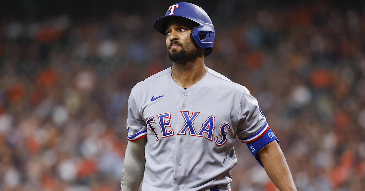
This gave me what we in the data industry refer to as “a big honking sample.” For reasons that will become apparent, I skipped the two April 8 games, but that still gave me 12 games, and thousands of pitches. As an example, let’s take Marcus Semien’s at-bat in the top of the first inning last Friday night. When he came to the plate, the broadcast listed him with a 22% chance of reaching base. After he took a strike, that number increased to 31%, then 32% after he got down 0-2. He then took a ball (30%), another ball (18%), and a foul (20%) before striking out on a foul tip. I recorded each of those counts and probabilities, as well as a 0 for the outcome – he didn’t reach base.
In the 12 games I charted, that gave me 2,575 observations in 10 categories: strikeout, walk, reach base, hit, out, in-play out, GIDP, RBI, extra-base hit, and home run. Some were used sparingly; extra-base hits only showed up for a few games, and in-play out was only used for one pitch.
With all the data painstakingly recorded, all that remained was to test it. To do this, I needed some control predictions. After all, I can tell you the Brier score – a measure of probabilistic prediction accuracy – of the sample set as a whole is 0.196, where 0 is the best possible score and 1 is the worst. That’s meaningless without context, though; if you can’t compare one set of predictions to another, that Brier score is just a number in space.
The nVenue model uses upwards of 120 inputs. I decided to use exactly one: the count. For each game, I snapped the major league average rate of each result after the relevant count through the prior day. For games from April 15, for example, I calculated the odds of each outcome as of all major league plate appearances through April 14. That particular one looks like this:
| Count | K | Reach | Walk | Hit | Out | XBH | HR |
|---|---|---|---|---|---|---|---|
| 0-0 | 23.0% | 31.3% | 9.2% | 20.7% | 68.7% | 7.4% | 2.8% |
| 0-1 | 31.0% | 25.9% | 5.3% | 19.1% | 74.1% | 5.9% | 2.2% |
| 0-2 | 47.1% | 18.5% | 2.7% | 14.6% | 81.5% | 4.2% | 1.1% |
| 1-0 | 18.9% | 38.1% | 16.6% | 20.3% | 61.9% | 8.4% | 3.3% |
| 1-1 | 27.2% | 30.9% | 10.9% | 18.8% | 69.1% | 6.5% | 2.5% |
| 1-2 | 44.2% | 21.9% | 6.7% | 14.1% | 78.1% | 4.4% | 1.5% |
| 2-0 | 15.5% | 48.4% | 30.7% | 16.8% | 51.6% | 7.3% | 3.0% |
| 2-1 | 23.4% | 39.6% | 20.3% | 18.4% | 60.4% | 7.1% | 2.7% |
| 2-2 | 39.0% | 27.7% | 13.3% | 13.7% | 72.3% | 4.9% | 1.8% |
| 3-0 | 7.0% | 72.9% | 63.2% | 9.7% | 27.1% | 4.3% | 2.1% |
| 3-1 | 13.1% | 61.1% | 47.3% | 13.4% | 38.9% | 6.3% | 2.6% |
| 3-2 | 27.9% | 46.1% | 32.6% | 13.1% | 53.9% | 5.0% | 1.8% |
I used this to make my own predictions for reaching base, getting a hit, walking, striking out, making an out, hitting a home run, and hitting an extra-base hit. Double plays and RBIs don’t work with my one-factor model – count isn’t sufficient, as you need base/out state as well – so I simply didn’t test the accuracy of those predictions. The same is true for that single in-play out prediction; I simply tossed it out. That’s also why I didn’t use data from the games of April 8; there wasn’t enough major league data to use after only one day of games.
That left me with a set of 2,075 pitches where I had a naive prediction (how all major leaguers have done after that count in 2022) to test against the nVenue prediction. Let me be quite frank about my “model”: it’s clearly terrible. It doesn’t take enough into account. Do you think the chances of Mike Trout getting a hit against Joe Bullpenshuttle are the same as those of a backup catcher getting a hit against Gerrit Cole? They’re obviously not! Do you think that Maikel Franco is as likely to walk with the bases loaded as Juan Soto is with first base open? Again, no. A purely count-based prediction is obviously flawed, but I think it’s a good baseline.
How did the two models do? In the plays where they both made predictions, the naive model slightly outperformed nVenue’s predictions, putting up a Brier score of 0.218 as compared to 0.226 for nVenue. The naive count-based prediction put up a lower (superior) Brier score in eight contests, and finished tied in another. The on-screen odds did better only three times.
Brier scores penalize overconfidence, and I wanted a metric that was confidence-neutral, so I devised another test. I let each model gamble against the other. For every pitch where they both made predictions, I made each model make a “bet” based on the probability the other model gave for the target outcome.
That’s a mouthful, so let’s take an example. Let’s say, for the sake of argument, that the count-based model gave a batter a 30% chance of reaching base. If the nVenue probability was higher than that, I had them bet “reach base.” If it was lower, they bet “don’t reach base.” The payout is simple: if the model “bets” on reaching base, the payout is 0.7 if the player reaches base (1-0.3), and -0.3 if the player doesn’t reach base. It’s the same for every pitch; the “payout” is either one minus the odds (for a positive result) or the negative of the odds (for a negative result).
You could rinse my model by gambling against it this way. All you have to do is bet on good outcomes when the batter/pitcher matchup favors the hitter (a platoon advantage, say, or a great hitter against a bad pitcher) and vice versa when the opposite is true. It should be incredibly easy to beat this count-only prediction.
In practice, the count-only prediction drubbed nVenue’s displayed probabilities. Over those 2,075 pitches, the nVenue prediction did slightly worse than breakeven when gambling against the count-only predictions, losing 11 units across the entire set. On the other hand, when the count-only predictions got to gamble against nVenue’s posted number, it racked up a score of 134.8 units.
You might wonder why the two numbers don’t add up to zero, but that’s normal in this style of test. There’s no constraint that makes it sum to zero; the two “gambling” runs use different odds, since each set of predictions uses its counterpart to set odds. More important than the exact numbers is the fact that the posted probabilities were consistently beaten by my extremely simple one-factor estimation, and the size of the deficit; the count-only model did far better, and did so consistently. In their description of the odds, nVenue touted “15,000 ways to bet on baseball,” but I’m skeptical that any of them involved betting against a count-only model and losing; perhaps the gambling advice part of the model isn’t ready for prime time.
Why is that the case? One reason is that the posted odds make some obvious missteps. Take that Semien at-bat I mentioned above. Twice, he took a strike only to see his chances of reaching base increase. Twice, he took a ball, only to see his chances of reaching base decrease. Those shouldn’t happen. That’s not true for every possible outcome – situations like hits, RBIs, and home runs aren’t so cut and dry, as your odds of getting a hit (hits divided by total plate appearances) decline as a walk becomes likely and vice versa – but for strikeouts, walks, odds of reaching base, and odds of making an out, the odds simply shouldn’t tick the “wrong” way.
That’s not to say there’s no interesting information in these probabilities; given how he’s hitting, it isn’t necessarily wrong to peg Semien as being less likely to reach base than an average hitter before the at-bat started. But despite correctly shading Semien’s odds of reaching base down in that 0-0 count, the six probabilities nVenue displayed over the course of his at-bat came out roughly even against the count-only model, thanks to the unintuitive probability moves as he took strikes early in the count.
In general, it seems to me that the on-screen odds suffer from over-fitting. Even if you’re not a statistical sort, you can implicitly understand this from watching a few baseball broadcasts over the years. If the screen displays that a hitter is 5-for-7 on Fridays against opposite-handed pitching in the sixth inning or later, you rightly say “yeah, that doesn’t sound like it matters.” A poorly calibrated model might not, though. It doesn’t have to be anything specific like that – but overfitting is a risk when you’re training models on past data, and my guess from the outside looking in is that that’s the culprit here. (Following Kelly Pracht’s appearance on Effectively Wild yesterday, during which Ben Lindbergh mentioned the results of my analysis, we reached out to nVenue for further comment. They responded by saying, “We all know that in sports, player averages can’t paint the whole story. nVenue believes in going beyond the average to generate predictions for each and every individual match-up and situation. Our team has run millions of regression data points outside of the twelve baseball games aired during Friday Night Baseball that have been included in this study. Our studies validate that our data is more relevant and accurate than an average. We love talking data, especially around baseball. We look forward to reviewing any studies as we prepare to release our own in the future.”)
Of note, the on-screen odds seem to have tightened up over time. Half of the naive prediction’s “gambling” gains came in the first four games. In those four games, the on-screen odds made what I’ll call “wrong-way errors” – those probability moves that go against the count – 101 times. There have only been 115 such strange odds moves in the subsequent eight games. The count-only predictions still had a superior Brier score and superior gambling results in those last eight games, but it was far closer. You can see the game-by-game comparison of the two “models” – nVenue’s and my count-based one – here:
| Date | Game | Apple Brier | Naïve Brier | Apple Betting | Naïve Betting | Wrong-Way Errors | Pitches Tracked |
|---|---|---|---|---|---|---|---|
| 4/15 | Reds Dodgers | 0.216 | 0.184 | -9.2 | 21.4 | 23 | 135 |
| 4/15 | White Sox-Rays | 0.176 | 0.143 | -8.2 | 25.0 | 25 | 177 |
| 4/22 | Rangers-A’s | 0.165 | 0.142 | -0.2 | 19.4 | 21 | 159 |
| 4/22 | Cards-Reds | 0.247 | 0.236 | 4.8 | 10.6 | 32 | 162 |
| 4/29 | Giants-Nats | 0.210 | 0.206 | 0.0 | 9.2 | 18 | 193 |
| 4/29 | Yankees-Royals | 0.319 | 0.319 | -3.7 | 2.9 | 17 | 233 |
| 5/6 | Red Sox-White Sox | 0.249 | 0.254 | 6.6 | 2.2 | 16 | 170 |
| 5/6 | Rays-Mariners | 0.252 | 0.235 | -14.1 | 26.6 | 6 | 197 |
| 5/13 | Padres-Braves | 0.258 | 0.255 | 1.0 | 4.6 | 15 | 184 |
| 5/13 | Cubs-Dbacks | 0.244 | 0.245 | 7.2 | -0.7 | 13 | 129 |
| 5/20 | Cards-Pirates | 0.164 | 0.155 | -5.3 | 13.1 | 15 | 171 |
| 5/20 | Rangers-Astros | 0.177 | 0.178 | 10.1 | 0.6 | 15 | 165 |
| Total | — | 0.226 | 0.216 | -11.0 | 134.8 | 216 | 2075 |
These tests aren’t conclusive in some scientifically provable way. There’s some serial correlation between our observations; this system takes multiple observations of the same plate appearance. But even if we limit the test to 0-0 counts, when the dummy predictions reflect the league average rate of every outcome with no further information, the count-only predictions have a lower Brier score and positive gambling returns when compared to nVenue’s predictions.
I should reiterate: my count-only “model” is terrible. It’s so bad! Do not use it to predict things. You could vastly improve on it by adding more variables. Maybe not over 100 – the only model with that many variables I’ve seen underperformed my one-factor model in the tests I just described – but I’m not claiming any special expertise in predicting baseball here. I am, instead, claiming that the predictions shown on these broadcasts every Friday would lose money if they gambled against my objectively bad predictions. They’re flawed, perhaps past the point of usability.
That doesn’t mean there’s nothing cool in them. In that same Rangers-Astros game, Kole Calhoun stepped to the plate in a 1-1 tie in the top of the fourth. The broadcast displayed an 8% chance that he would hit a home run, more than triple the rate at which the league hits home runs on a per-PA basis. He promptly bopped the first pitch out. Power hitter, homer-prone Cristian Javier on the mound, Minute Maid Park; the odds truly should have been higher, and I think that insights like that are undeniably interesting.
At present, though, these odds are worse than not seeing odds on screen, at least as far as I’m concerned. I wish more people thought about baseball probabilistically, but having clearly inaccurate odds – Marcus Semien isn’t more likely to reach base on 0-2 than he is on 0-0, no matter what the screen says – could result in people trusting odds less, not more. Perhaps there are some more cool insights to be mined from this complex model, but for now, I think that showing these odds during broadcasts is doing viewers a disservice.
A huge thanks to Ben Lindbergh, Megan Schink, Zander Stroud, Kevin Arrow, and Lucy Bloom for their help charting these games. You can find all the data used in this article here.
Ben is a writer at FanGraphs. He can be found on Bluesky @benclemens.
Fantastic! I’m glad someone stress tested these numbers.
Thanks Ben (and team) – this is extremely cool and I had been wondering myself.
This is exactly the kind of work I come to FanGraphs to read. Great stuff. As always, I’m greatly appreciative of Ben for “showing his work” by posting the data and/or code used to generate the results.
Amen to that. Frankly, out of all the saber columnists I’ve ever read, Ben is the all-time best imho in the triple crown of (a) showing his work with clarity and transparency (b) discussing the limitations and appropriate uses of the analysis he’s done and (c) putting out columns on not just the “aha” discoveries, but also the ones where no conclusive conclusions can be gleaned (which in and of itself is hugely important).
I think (b) and (c) are truly underappreciated part of Ben’s works.
This kind of honest transparency is rare even in academia, let alone sports journalism.
Bingo!
Thanks, I was wondering about what that predictive stuff was about. That aspect of the broadcast felt a little goofy and not possibly accurate (which this article further confirms), but I do like the different look and feel those broadcasts have vs. more familiar presentations of MLB.
AppleTV should call Appleman. In exchange for a whole lot of money and FG branding everywhere, Fangraphs hires people to build a better model.
Also, they could insist that Appleman have his own segment called AppleTVman. Or Apple Man TV.
Clearly, it needs to be called “The Core”. Clapton already did the theme song.
You know that video that went around a couple months ago of how they make those huge batches of hotpot broth, where they just keep dumping in huge loads of various spices and peppers and whatnot into the broth? As delightful as it was, I couldn’t help but wonder whether all those ingredients were actually necessary. Is anyone really gonna notice those 3 cans of beer through the ~2 cubic feet of Sichuan peppers?
Hearing that this prediction model uses 120 inputs feels a lot like that.
I would be willing to wager that a few minutes of looking at feature importance would show that very few of these inputs have much of an effect, and that many of features are very highly correlated.
Love this analogy, and that video was compelling and confusing in equal measure, just like the on-screen odds
does parsimony (and correlated inputs) mean nothing to these people???
Double star for “”Machine learning, if you weren’t aware, is a fancy way of saying “regressions.” “
Would it be fair to say that, if ZiPS is a predictive model, that ZiPS + Dan’s regular updates = a machine-learning model (with Dan being part of the “machine”?)
There’s a famous (apocryphal?) quote that goes: “When we raise money it’s AI, when we hire it’s machine learning, and when we do the work it’s logistic regression.”
This, along with the “Data Science is Data Cleaning” probably sums up most of what you need to know.
I would rather not known they sucked!
If I’m an aspiring James Holzhauer, I’d be thrilled to learn that they suck. Then all you need to do is:
(1) Add a couple of variables to Ben’s “Count Marcel” model, ideally ones that are easy to track in real time,
(2) Have a predictive model based upon (1) at hand while watching an Apple TV game broadcast, and
(3) Place bets whenever the odds from (2) are sufficiently far on the opposite side of the betting line from the ones shown in the broadcast. For example, if you are offered 20% odds of a player reaching base before a certain pitch, Apple TV shows a 30% odds, and your model shows 15% odds, place a bet that he makes an out.
(4) Rake in (over the long haul) a ton of money vs. everyone betting based upon Apple TV odds.
That’s part of the goal – to make you think you can.
But you’d still lose to the actual James Holzhauers who will be two steps ahead and supplied (with both money and resources) from the already ultra-wealthy.
The actual legal reason why sports betting became legal is because it was proven to be a game of skill and not a game of chance.
Count Marcel + a couple of variables = Count Nanodracula!
Thanks so much. I watched one of these games and was so annoyed with the probabilities because they were clearly pretty bad. I assumed at the time that they just didn’t have enough data points. Overfitting seems like a likely culprit though and it seems consistent with their statement. The fact that a model that ignore pitcher, batter and ball park does better than their model tells you something.
I am certain the presence of the odds in the TV broadcast is to encourage betting. Many parties stand to benefit from more people betting more money.
And I really hate how much this is pushed. I’m totally fine with gambling being legal, but I hate the way it is shoved into our faces. Especially knowing that its designed to manipulate the casual fan into losing money.
I think this is pretty true and also very depressing
Yup. That these displayed probabilities are being used to facilitate gambling in any measure makes them inherently dubious for me.
As long as the checks clear gambling is going to be the next golden goose “bubble” just like the fading TV Deal/RSN model of the last 10-15 years and the “Stadium Boom!” before that. Owners have shown they didn’t really care about the damage those bubbles did, so I wouldn’t expect moderation here either. That said I’m not sure Apple is promoting gambling here as much as cargo culting sabermetrics.
I’m really hoping these Apple and Peacock exclusives fail miserably. As the RSN model fades away I’m worried the balkanization of streaming services is going to leave us yearning for the good old days of blackouts as you search which of the dozen streaming services you’ll need to watch a game that day.
I mean, they have an annoying, in your face gambling segment like two minutes into the pregame show
And MLB monkeys with environment without telling people and now promotes bogus probabilities.
Having worked in the sports analytics industry for a private company, this is 100% it. Gambling is far and away where the money is.
And as someone who has only taken a couple Masters-level “data science” courses, I’m shocked at how bad the nVenue model is even at face value. Obviously, you want to test your face-value assumptions, but this reeks of buzz word marketing fooling the venture capitalists and Apple into forking over a lot of money for what’s currently a bad product. The commentaries about overfitting and feature importance/selection strike me as spot on- and if accurate- seem like something a couple junior data scientists with no domain knowledge might come up with in a week (though I’m sure they spent a lot more time/money on compute hours given the number of inputs).
This article is amazing! Thanks for putting the work in to articulate some of the, at-times, “strange” numbers we see on these broadcasts!
“Marcus Semien isn’t more likely to reach base on 0-2 than he is on 0-0, no matter what the screen says”
His avg for the season is .185. FanGraph’s through count data says that his avg increases to .191 after seeing an 0-1 count. And increases to .189 after 0-2… so he IS MORE LIKELY TO REACH BASE on 0-2 than he is on 0-0.
That may well be the “logic” that nVenue’s model is employing, but it’s bad and wrong logic.
No, through count is what Ben used for his analysis.
He used aggregate hitter performance through count, not for the individual player. Because limiting it to the individual player leads to wrong conclusions due to small sample sizes.
He used it cause it was simple to track and make predictions from, not because he thought it would be accurate. He explicitly points out how it’s bad.
Looking at one player, only this year, 40ish games into the season, is an incredibly small sample size and a good way to draw bad conclusions. A person learning about baseball stats can make this mistake. A company presumably getting a fortune from Apple to provide these numbers should not.
And also thinking a difference in the third decimal place is meaningful (assuming he isn’t being sarcastic) with that small sample.
This articles sample size is even smaller…
This article used 2000 data points. Semien has 39 at bats with a 0-2 count. It’s clear which sample size is smaller.
I didn’t even notice that you’re not looking at the right stat in this inane reply. His OBP overall is .242; through 0-2 it falls to .205. So even if you’re inclined to treat these stats as an accurate guide to future events (you shouldn’t), you’re wrong.
Two issues here: One is that what has happened in a very small sample this year is not necessarily the same as what is most likely to happen. Second is that avg does not tell how often he reaches base. This year Semien has a .242 obp overall which decreases to .205 after 0-2.
That reflects past occurrences and isn’t necessarily predictive of future occurrences. That is the equivalent of flipping a coin 3 times and getting 2 heads and 1 tails and declaring that the coin is more likely to come up heads than tails.
For what it’s worth, Semien’s after 0-2 avg is .147, lower than his overall avg. And of course, avg does not measure reaching base, it measures hits per at-bat.
I don’t know how many times I have to explain in one week that the past is not literally the same thing as the future.
Though if you end up having to explain it several times a day for long enough, maybe they will.
Now, the past certainly is the most powerful source of data for predicting the future. But the sample you pick is important. This is also where people screw up when they say that projection systems don’t adjust enough for in-season performance–yes, in-season performance is predictive. So is last year. And the year before that. And before that.
With that in mind, let’s take a look at Semien’s batting average for each year–overall, and then in 0-1 and 0-0 counts.
2021: .265 (overall); .251 (0-1); .222 (0-2)
2020: .223 (overall); .204 (0-1); .150 (0-2)
2019: .285 (overall); .300 (0-1); .254 (0-2)
2018: .255 (overall); .218 (0-1); .164 (0-2)
Now, looking at this, would you say that Semien was more likely to get a hit in 0-2 counts than when compared to all counts? Or less likely? In fact, he was also less likely to get a hit in 0-1 counts too in every single year except 2019.
If you were to use this data, what would you say about the likelihood of Semien’s current trend this year holding? I would say it’s pretty unlikely. And you could make this conclusion without knowing much else about baseball. (Knowing something about baseball would also point you in the same direction)
For a fancy new broadcast, how about one where we CAN ACTUALLY SEE the field. Where we can see the fielder placement, movement, shifts, interactions with the runners, where we can see where the runners are and what they’re doing on the base paths, where (after the ball is hit) we can see the fielders reacting to the ball AND the runners at the same time!!!
(basically I just want one camera, probably behind home plate plus other views for instant replays only).
MLB used to (and maybe still does) provide alternate view streams for the playoffs at a drastically reduced price. You could pick up to 4 views in a grid (from about 8 feeds) to stream. I’d chose the classic centerfield camera, a behind home camera, and maybe the two dugout feeds to spy on the players. It was fascinating! There were some downsides like not seeing replays and graphics, but with some improvements, I could see an experience where the user picks their views really taking off.
That sounds awesome. I will definitely look into it. Thanks
Kelly Pracht’s recent appearance on Effectively Wild did not inspire confidence in their methods or results, Kudos to Meg and Ben for rightly pushing back against her weak explanations for the Semien/Javier at-bat.
Interesting take. While your hard work and analysis is appreciated, to me it still seems like your sample size is inadequate for the alpha level and cannot achieve appropriate statistical power to accurately debase these stats/company as a whole. I am excited to see how these predictions continue to adapt and improve. This company feels like it might be the future of sporting analysis which is awesome. Apple is always ahead of the curve imho.
Hi Kelly Pracht. You should really learn some words that aren’t buzzwords.
Based on this comment, I’m not sure you have any idea what an alpha level is, how it is calculated, or what it’s for.
I also don’t think you realize this, but if small sample sizes are a problem for Ben’s predictions, that makes it even more embarrassing that it beat nVenue’s predictions. Millions of regression data points for training and 120 inputs and you got beaten by a one factor count model with a tiny training data set? What are you even doing in that case?
Hang on… if you’re saying this sample is too small – how can you say it is *currently* adapting and improving?
It is worth using. Although your work is difficult, and the analysis is difficult, it seems to me that the value of your sample is not enough for alpha levels and that you are unlikely to get the right statistics to detect. Exactly scale these statistics / overall compass. I am glad to see how these forecasts cameljaao adapt and improve. The company believes that the future of sports analytics is phenomenal. Apple is always ahead of them lmao.
is CamelJaao a better name for:
(1) an analytics firm?
or
(2) a metal band?
Can’t it be both?
An analytics firm that uses machine learning to automatically generate metal songs.
I bet Dan has a setting in his AI app to generate names for Finnish neo-lounge techno folk-metal bands. So no reason CamelJaao can’t be just that.
Somebody make this happen!
If your company— because only someone with a stake in it could be this disconnected from reality— can’t beat the most basic form of historical prediction, you are in no way the “future of sporting analysis”. Your company badly needs to hire an actual sabermetrician; from your defensive response, it’s very clear that you hired some “machine learning” engineers to go tackle the problem of predicting baseball without bothering to read any of the previous efforts to analyze this game statistically. It’s frankly awful work if it performed worse than a pure count-based prediction, and you should be ashamed to have invested so much time and capital into something that was beat this easily.
I’m not convinced they hired actual ML engineers given what we see here.
This response is friggin hilarious!
On the bright side, you must be one hell of a salesman.
Love this, my son and I just had this question of where the probabilities came from last Sunday.
I appreciate the work that went into this, but at a certain point it feels like the “yup, it’s wood” meme in practice. nVenue’s odds are so off I’m more interested in how Apple OK’d them to begin with.
So…a tech company that has no idea what they’re doing, and being paid for it because they have someone acting as the face of the company blabbering about things nobody can verify. Seems about right nowadays.
…More like a comment blabbering about tech they don’t understand
After listening to the podcast, I’m wondering if you will make me sign an NDA for opening that Google Doc as nVenue said Ben and Meg would need to see their data.
One may not get a more data-driven probability then computer teams (CAW) looking for an edge in horseracing, inspired by Bill Benter’s Hong Kong exploits in the 90’s, where he capitalized on unsophisticated pools. Today the informed judgement is that these teams are only profitable by receiving rebates for so much money invested in the pools.
More and more, I am becoming less impressed with hyper-analytics after an initial slavish following. I’m slowly returning to the philosophy of an at bat as a one-time event where we can’t analytically reproduce or know all the significant factors at play, except in selected situations. Like a horseplayer waiting for a specific race with his specialized skills. In a recent series vs. the Cardinals, the opposing team with a hard thrower shifted to the pull side for Goldschmidt and Bader. They both singled through second, being of course late on a fastball.
Super helpful article and I really appreciate the clarity you bring. I have one note: you say, “at its most basic, changes in some set of dependent variables are used to predict a response variable (or variables)”. Shouldn’t it be “some set of _independent_ variables”? Thanks!
It sure should! I’ve updated the copy. Just a goof that slipped through mine and Meg’s proofreading. I’m sorry, Mr. Gilliam (my high school stats teacher)
I’m way too far removed from being an expert in any of this, but if wind is one of the 120 variables used in the nVenue model, isn’t there a small yet positive chance that a spurious statistical correlation between wind speeds and say pitch counts could mis-train the machine learning algorithm to overweight a wind-related parameter relative to more relevant items like pitch count?
(As just one example of potential overfitting of data…)
The wind from a Joey Gallo whiff could the proverbial wingbeat of a Brazilian butterfly for this model.
Being in a master’s program for data science has illuminated for me how much of machine learning stems from, to give it a generous term, the guess & check method. It is not shocking to me at all that a model would give some wonky results and that the model’s creators can’t really give a satisfying explanation for it (listening to Pracht talk in circles on Effectively Wild was a *rough* listening experience). It is shocking that the results of such a model would make their way onto a nationally televised broadcast, even an upstart one in the industry like Apple. Machine learning is fascinating and obviously has many great applications, but it is SO easy to throw something together like this, say “eh, it seems good enough” and not be able to track down any specific issues that are producing strange outputs. I think it’d be great to have something like the nVenue probabilities on the broadcast, but only if they’re actually coming from a well-calibrated model, which this clearly is not. Anyway, awesome article – thoroughly enjoyed reading it!
As a person who started grad school before there was such a thing as “data science” and where it was everywhere by the time I finished, it’s been really stunning to watch the idea of a new field take off. Really, most of the problem is just cleaning the data. That’s basically where all the work happens. But beyond that, about 50% of it is literally just statistics by another name, like various regression based methods, cluster analysis, latent class models, etc. Another 30% of it is really just cool new descriptive methods (“visualization” is really just “graphing” but it’s been pushed much farther by data scientists). And then there is some stuff that is very much a black box, data goes in, a prediction comes out, and you just kind of shrug as to how it happened.
This last approach–and often a lot of the misapplications of statistical methods, too–are only possible because there is an endless amount of data. When you have an endless amount of data, it’s easy to split it into training datasets and stuff for out of sample predictions. You just keep on getting new training datasets and the machine learning just keeps chugging along in response to how well or badly it did the last time. It’s wild to see this process happening on a national broadcast.
Brutality! Absolutely brutal and quite polite take down of nVenue garbage model.
I love it! Great work Ben
Great stuff, Ben! Indeed the Apple regressions are flawed. One possible reason is Apple’s regressions could exhibit multicollinearity. Multicollinearity exists if a number of Apples 100 independent variables are correlated. However, that still doesn’t explain why odds of reaching safely are inversely correlated to the count. I agree with many of the commenters that this is the type of analysis that proves FanGraph’s worth! Congratulations!
To be clear, you stated, “… As an example, let’s take Marcus Semien’s at-bat in the top of the first inning last Friday night. When he came to the plate, the broadcast listed him with a 22% chance of reaching base. After he took a strike, that number increased to 31%, then 32% after he got down 0-2. He then took a ball (30%), another ball (18%), and a foul (20%) before striking out on a foul tip. I recorded each of those counts and probabilities, as well as a 0 for the outcome – he didn’t reach base.”
Did you record those as six different outcomes? Because had he got a hit in this situation, you would have to count all six of those as successes despite only one eventual outcome for the six-pitches. Otherwise you will cause the numbers to fail disproportionately due to pitches thrown per at bat.
What I mean is that if a guy comes to the plate with a 22% of reaching base and gets a hit on a 0-0 pitch, his success rate is 100% for that plate appearance and 100% for that pitch count. If you take the Semien situation and he gets a hit instead of striking out on the 6th pitch, he would’ve had a success rate of 100% on the at bat and of 16.67% on the pitch count as the other 5 attempts while not determine an outcome, would still have to be listed as a fail.
What I am wondering is whether you are doing this in a granular sense by pitch or if you are doing this in a baked in number by plate appearance? Thanks for your work either way Ben, it is the quality of your work that makes me interested enough to even raise this question, quite a brave feat taking on such overwhelming numbers. Keep up the great work!
I did all of mine as ‘chances of the plate appearance ending with this outcome.’ That tracks with the way the odds are posted; there are strikeout odds on one-strike counts and walk rates before three balls and so on. So I assigned a 100% on each outcome – ‘did this PA end with reaching base?’
This sample seems to not even include the Mets-Nationals game on April 8th, during which I noticed that the listed odds were INSANE. For example at one point they gave Starling Marte a 7.3% chance of *making an out* on a 3-2 pitch!
Thanks for quantifying my intuition that these probabilities are garbage. One of several aspects that make these broadcasts unwatchable. Love Apple, loved the idea of the non traditional booth, more female broadcasters etc. But so poorly executed and shilling for gambling.
PS bonus thanks to baseballfan242 for being the most hilarious obvious plant commenter I’ve ever seen!
I felt like I was the only one paying attention to the probabilities in the first game, because no one else was talking about how goofy they were.
With a 2-1 count, it showed Gavin Sheets with an 11.6% chance of getting on base. Then when the count went to 3-2, it said 59.1%.
Awesome read. I can understand some of the terms used here. I’ll be taking a stats classes in the fall, so I’m going to bookmark this page, and hopefully everything will make even more sense in a year, lol.
I love how baseball can have fans who distill everything to a science, and other fans who think a pitcher/batter history of 10 ABs means anything at all.
It would be interesting to see here if there were specific pitchers where Apple is especially off. The trials you are collecting here aren’t an independent sample from the season at all, since they are specific to 12 games.
A fun experimental update that could be written about in the offseason is to randomly choose a single plate appearance each day (or 5, 10, whatever number seems reasonable daily), log the appropriate probabilities and such, and then you’ll have a more random sample of observations of Apple’s probabilities.
In baseball, most odds are nowhere near 50%, if you’re betting on the pitcher, over the long run wouldn’t you “win” most bets on behalf of the pitcher and “lose most bets on behalf of the hitter”. If two models predict slight variations on “hitter reaches base” and you must bet on one model over the other, you’re making a binary selection where each model has a 50% chance of being chosen by you, but the models do not total 100%. Wouldn’t the result then be that over many bets, the model most likely to favor the pitcher will tend to win? If model A says the batter has a 25% chance of reaching base and model B says the batter has a 30% chance of reaching base, under your approach you would have bet on Model B as I understand it. But model B only represents a 30% chance of the batter reaching base, the batter will fail and you will lose 7 out of 10 times, so your bets for model A will therefore win 7 out of 10 times even if model B is more accurate.
Am I missing something?
“The payout is simple: if the model “bets” on reaching base, the payout is 0.7 if the player reaches base (1-0.3), and -0.3 if the player doesn’t reach base.“
Great article and analysis. I agree with the overfiiting. She really didn’t have good answers to Ben’s questions