
Introducing the FanGraphs Lab
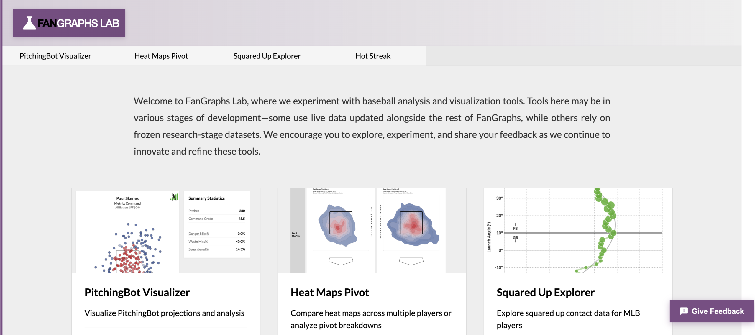
Today, we are proud to announce a new site feature: The FanGraphs Lab. The Lab is a collaboration between the editorial team and the engineering team here at the site, a joint effort to create more ways to sort through and visualize the huge crush of data that pervades baseball these days.
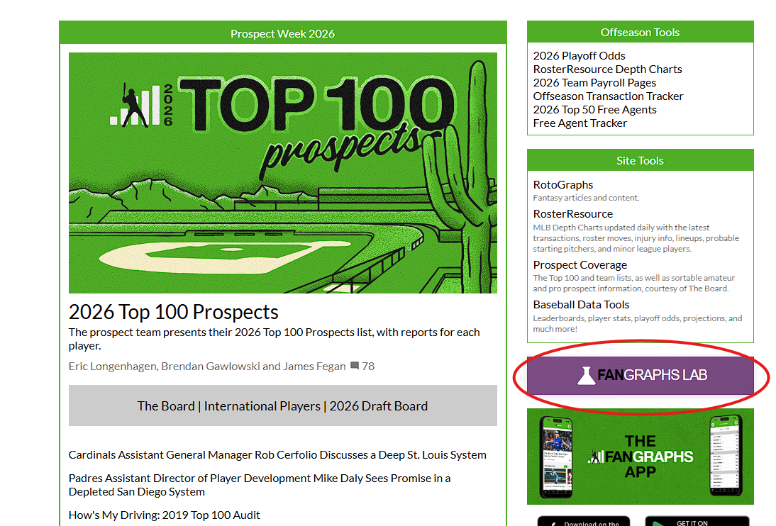
The FanGraphs Lab is a space for experimental data visualization and exploration tools that we believe might one day have a permanent place on the site. The key word there is experimental: One of the reasons we’re so excited about the Lab is that it’s never been easier to go from an idea for a new tool or visual to a functioning version of it. It’s not quite “if you can dream it, you can do it,” but it’s closer than you might think, which means that there’s a lot of room for innovation. The Lab will have a permanent home at www.fangraphs.com/lab. It will also be accessible from the main page of the site on the right navigation bar:
This project grew out of a discussion between the two of us. Actually, “discussion” might be the wrong way to put it: Ben just kept sending Sean links to new apps he had built in rickety programming languages, fun graphing tools without any immediate use case. Instead of politely telling Ben to shove off, Sean came up with a process for turning those concepts into functioning FanGraphs tools. First, with development assistance from Claude Code, Ben rebuilt his initial ideas in the FanGraphs code base. Next, Sean integrated these new pages into the site’s data and infrastructure. From there, we bounced ideas off of each other and iterated until we were happy with the output. After taking a few months to jump-start the process, the first prototypes are coming off the assembly line now.
The Lab’s tools will use a wider variety of visual styles than you might used to seeing on FanGraphs, and features might be abruptly added or changed. Not all of the tools that we test will stick around forever. Conversely, popular tools will likely get integrated into the main site over time by Sean and Keaton Arneson. We hope this process yields plenty of useful failures and obvious successes, with the Lab giving us space to try new things and refine our ideas.
Some tools are built to use the site’s regular data flow and will be updated whenever we load new data, while others use limited, pre-calculated data sets. Some will use experimental metrics or novel analysis; others will leverage existing statistics or present popular analytics in new permutations. We’ve purposefully given ourselves the ability to do a great variety of things in this space, because we’re still experimenting with what’s possible.
On a personal note, I (Ben) have had an incredible time making these tools. There’s something inherently satisfying about doing something new and different, and making data visualization tools definitely counts as that for me. Seeing things I can picture in my head take shape on the website is a wonderful sensation. I’ve already gotten ideas for new Lab tools from my writing, not to mention ideas for writing topics from my Lab designs. Both of us hope that these tools improve the FanGraphs experience for readers, but I’m already comfortable saying that they’ve made FanGraphs more fun for me.
We hope you’ll play around with these new tools and offer feedback. We’ve included a form for giving that feedback on every page of the Lab, in fact. Everything here is inherently open to change — “still in beta,” to put software terminology on it. If you like something, let us know. If you think it’s missing functionality or should do something else, we’d like to hear that too. We set the Lab up this way because your comments sometimes spark ideas.
That’s the big-picture thinking behind the Lab. Now let’s get into the nitty-gritty of the four tools we’re releasing today.
PitchingBot Visualizer
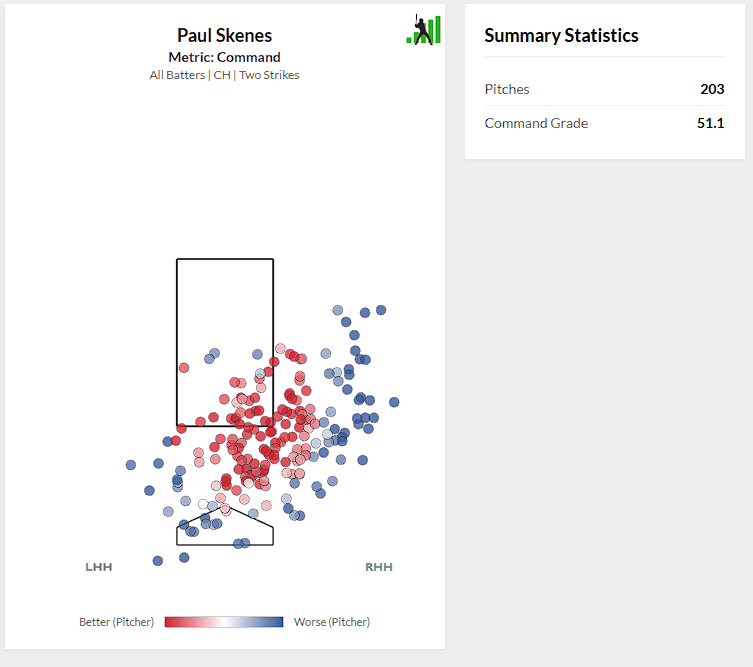
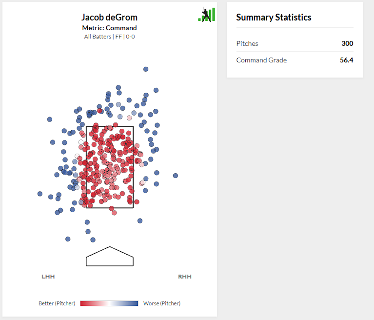
PitchingBot is a phenomenal tool, and it’s one we haven’t made enough use of. This is the start of us trying to fix that. The model operates on a per-pitch basis, grading every offering a pitcher throws on three axes: stuff, command, and overall. We aggregate that pitch-level data up to a single grade by default – but we don’t have to. This tool instead lets you graph each individual pitch matching a set of criteria – pitcher, pitch type, count, and batter handedness – on any of the three metrics. The pitches are shaded based on their grade. We used the generally accepted heat map scale — red for good and blue for bad — even though Ben’s personal view is that green is good and red is bad. Such is life.
If you’re looking for where Paul Skenes locates his changeup in strikeout counts, and what our model thinks about those locations, you can get that:
If you’re more interested in where Jacob deGrom throws his fastball early in the count, or whether his best stuff is associated more with pitches in the zone or ones he bounces, that information is only a few filters away:
You can do any permutation of inquiries like that, in fact. And if you’re looking for more descriptive data about the pitches you’ve selected, click the Analysis button for more:
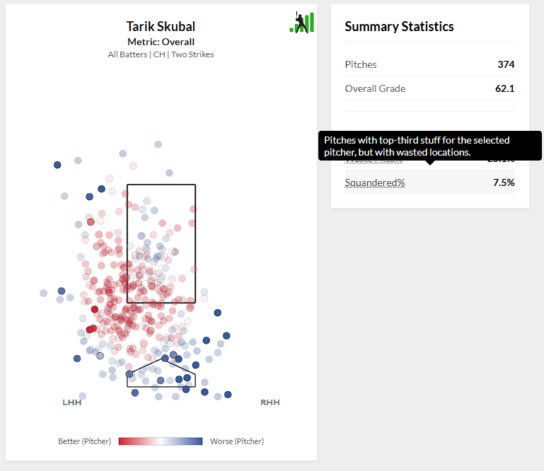
You can separate middle-middle misses from balls in the dirt, investigate how pitch characteristics in a given sample differ from that pitcher’s overall baseline, and more. We’re still figuring out more ways to parse and analyze PitchingBot data with this level of granularity. Today, it’s individual pitch grades. In the future, it might be measuring the loud contact pitchers allow or finding optimal locations for unique pitches.
Heat Maps Pivot
The “Graphs” part of FanGraphs has been an integral part of the site from the beginning. Open up any player page, click on Heat Maps, and you can create heat maps of pitch locations and outcomes using a bunch of different filters. Want to see where pitchers throw Juan Soto fastballs in two-strike counts? It’s just a number of clicks away.
That’s all well and good, but heat maps like that are most interesting for their difference. Where Soto sees fastballs in two-strike counts is more interesting if you also know where he sees them in no-strike counts. Similarly, seeing fastball locations is more interesting if you can also see slider locations. Sean, inspired by a conversation with Jeff Zimmerman about platoon splits, had this limitation in mind when we were brainstorming ideas for the initial Lab roster, and he had a solution ready: just show multiple graphs at once. Behold:
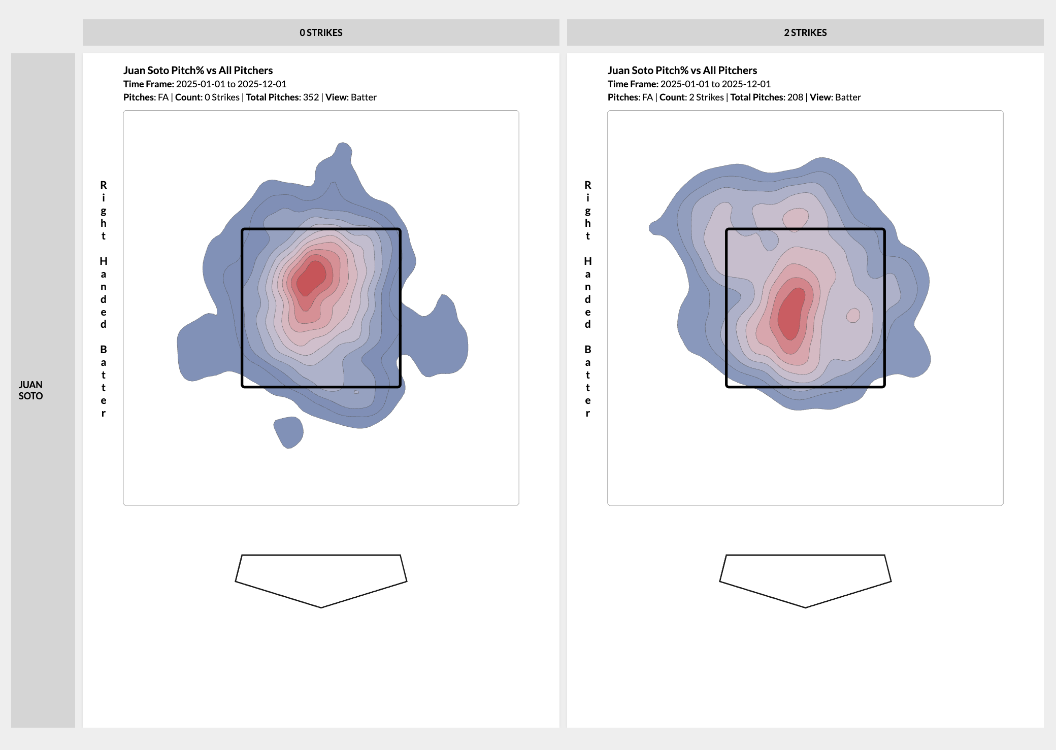
If you can think of two variables, the Heat Maps Pivot can create a grid of all the different combinations of them. How does Tarik Skubal change the location of his changeup as he gets more strikes in the count? You can graph it. You can graph how he changes each of his pitches by count, or by batter handedness, or even by time frame:
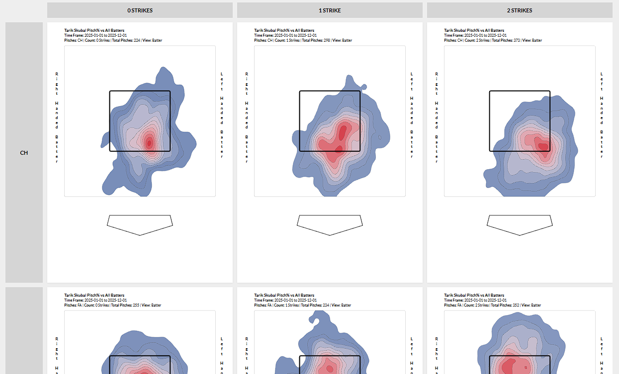
You can look at either hitters or pitchers. You can look at multiple players at once if you want. You can select any subset of pitches and then pivot those. If you want to see where a pitcher throws his slider in each possible count, you can do that. If you want to see where they throw each pitch in a particular count, or to a particular kind of hitter, you can do that too.
You can create a 2D Heat Maps pivot on:
- Player
- Handedness
- Strikes
- Balls
- Pitch Type
- Date – Months
- Date – First/Second Half
- Date – Custom Date Range
You can have any dimension as either rows or columns, and you can filter which values are pivoted. Initially there will be a 15-heat map limit for performance reasons, though this might change in either direction as we test it. We designed the tool with maximum flexibility in mind, so let your pivoting imagination run wild.
Squared-Up Explorer
When Statcast introduced their bat tracking data, they also introduced squared-up rate, and Ben has been fascinated by it ever since. It measures the frequency with which a batter makes flush contact with the ball. It’s calculated by measuring the difference between the theoretical maximum speed that a bat-ball collision could produce and the actual launch speed. If a batter hits a ball at 80% of that theoretical maximum or harder, it’s “squared up.” This is a good measure of bat-to-ball skill, as well as the ability to get the most out of bat speed. That said, one single number for squared-up rate doesn’t tell the whole story.
Different swings square the ball up best at different launch angles. Yandy Díaz and Trent Grisham square the ball up at similar rates, but they don’t do it the same way. Díaz’s swing squares the ball up most frequently when he hits it low; Grisham gets flush contact when he puts it in the air. This tool lets you visualize that difference by graphing squared-up rate against launch angle, showing where different hitters make their purest contact:
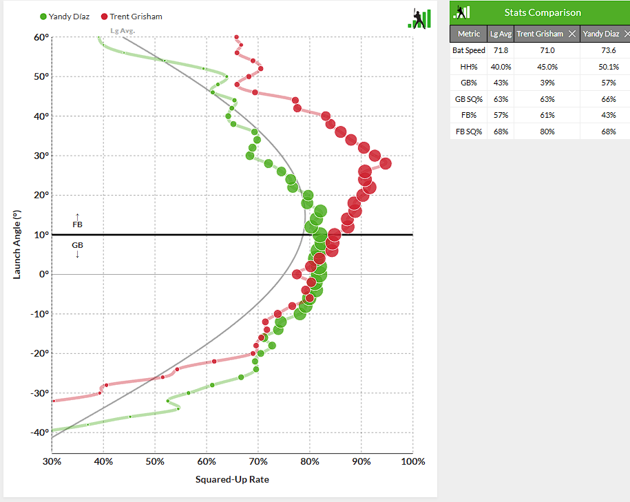
Each circle represents how frequently a batter squares up their contact for a given launch angle. The size of the circle is proportional to how often the batter hits the ball at that given angle. That’s how you can tell that Soto hits the ball squarely at all angles, while Aaron Judge’s most frequent contact, and most squared-up contact, is in the air:
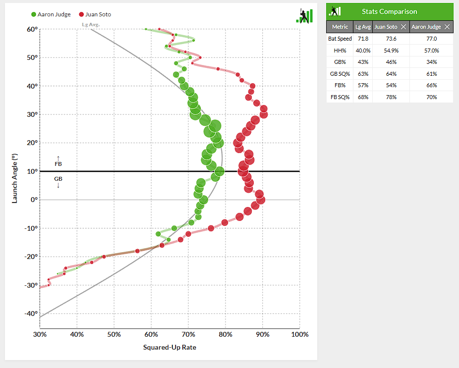
You can also see how those hitters compare to league average. Naturally, the overall population of hitters squares the ball up most frequently when they’re hitting line drives. If you’d like, you can graph individual players using the same smoothed curve. Kyle Schwarber and Kyle Tucker have each optimized their swings. Schwarber makes frequent squared-up contact at high launch angles, while Tucker rips line drives and low fly balls:
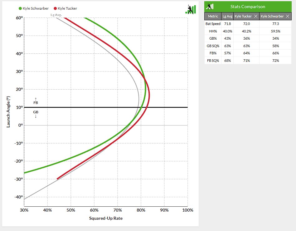
The Squared-Up Explorer is useful both for comparing players to each other and comparing them to league average. It helps identify players with swing shapes that don’t fit their batted ball distribution, as well as hitters who make the most of their gifts. Is it predictive? No idea. But is it interesting? Absolutely, and we’re optimistic that it’s more than just a curiosity. A granular look at contact quality feels overdue given how much more exit velocity matters in the air compared to on the ground.
Hot Streak
This tool comes from the mind of Jason Martinez, with Ben executing the design. Sometimes aggregate statistics don’t tell the story of how a given stretch of the season actually went. A 150 wRC+ over a week of play could mean a hitter is consistently getting on base – or that they had a three-homer game and then a bunch of zeroes. This tool disaggregates those numbers by showing the day-to-day performance of the entire lineup in one graphic:
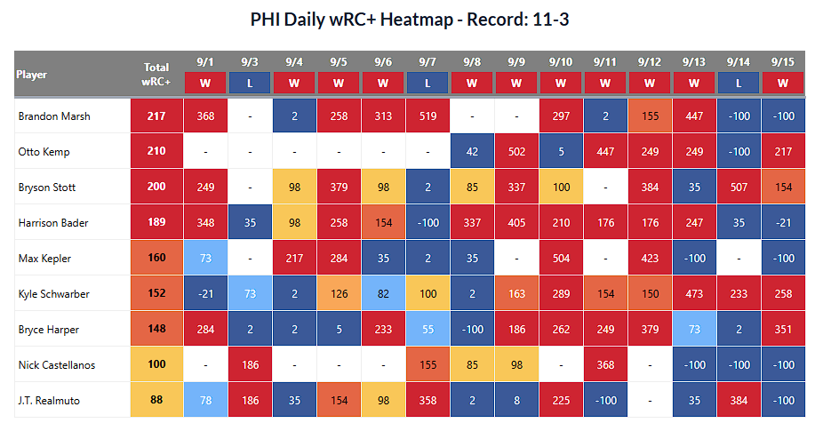
Select any team, any season, and any span within that season. Choose whether you’d like to see the nine most-frequent batters, or everyone who appeared in that timeframe. The table view will show you the daily performance of those players in that span, and it helpfully displays the team’s record over that timeframe as well. The graphical view displays 10-game rolling averages for one of a number of available statistics:
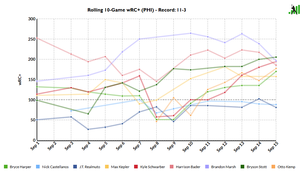
Curious how a hot streak or a cold spell by a star player is affecting the team? Wondering if you can see the effect of a utility player putting together an electric week of offense? You can look through the daily performance to find out. You can also get some pre-canned analysis from us. Who did the best in wins? The worst in losses? Who was the straw that stirred the drink, hitting in wins and scuffling in losses? Who was the metronome of the group? We calculate each of those automatically. It’s notably missing the pitching half of the equation, but if you’re looking for an explanation of how a team’s offense did, this view has all the information you could possibly need.
So go out and have fun with these tools. We hope you like them, and we’d love to hear from you about it. Comment in this article, use the feedback option on the lab pages, or let us know on social media. We’ll be listening – when we aren’t too busy tinkering around in the Lab, that is.
Yay. Incredible. Data visualization is a weird obsession of mine. Can’t tell you how much I appreciate Fangraphs for making my baseball and fantasy baseball experience fun. Thank you!
Seriously, this is why I am a member!
This looks like a ton of fun! Nice work.
Now I’m going to get even less work done at the office, thanks for that
Ben! How dare you two drop these amazing features on me when I have work to do! I never going to be able to tear myself away from these.
Lab League!
awesome stuff. Hot Streak one is especially interesting to me, haven’t seen an analysis like that before. Will def be playing around with it!
WOW Ben and Sean and everyone who worked on creating this. For “visual learners” these tools are fantastic! I can’t wait for the regular season to start!
I love this.
I’ve already put in my first feature request to make it even better. 🙂
Really cool. Where would I look on FG in future to possible refresh or review “ how to” instructions?
There will be a ‘Lab’ tag for all blog posts introducing Lab tools, and every lab tool we introduce will have instructions, so hopefully that will handle it.
Is there any chance a color toggle switch could be added? I’m color blind enough that sometimes the graphs are hard to differentiate. Thanks!
Indeed we can.
Great great work I’m looking forward to exploring it!
This is a pretty massive deal. Your guys’ work is amazing.
This is amazing! Thank you!
My productivity at work is gonna take a huge hit from this lol.
I appreciate the transparency that claude code was used to make this a reality. Like everyone else in a data/tech adjacent field I’m interested in (and a little terrified of) how effective these things are.
Thank you, I never need to leave this site now
That hot streak visualizer is going to be so fun to track over the season!
This looks incredible!
“green is good and red is bad” is great unless you are red/green colorblind, which is the most common form; then it just becomes “grey is good and grey is bad”
colorblind support is incoming on Squared-Up Explorer, and we’re now taking it into account for future tools. Just an oversight by me there because I was so excited about making a new data viz in FanGraphs green.
This is great! The other day I was looking at the sweet spot trackers that I think Michael B. posted on Bluesky and was like “where can I get those?”
I work for a fortune 50 company and we have nothing this nice in house for data wrangling: thank you!
Phenomenal stuff. Thank you!
Best value on the Internet.
Love it! Have tried to get the squared up data to show me something for months and this is more interesting than anything I could come up with. Can you give any hints on what language or libraries you are using most?
These tools are in React, but I like to mock things up in Python first. That’s the part I mentioned before about getting it up to FanGraphs caliber; take the prototype, then rewrite it in something more robust.
FREAKING INCREDIBLE. Ben, you were born to do stuff like this! I cannot imagine anything more enjoyable than developing and testing models like you are doing. Hitting and pitching coaches will have new and an incredibly robust tool. It will be interesting to see how much they use it. I’m wondering if there is a way to track its usage! CONGRATULATIONS! This is the kind of stuff FanGraphs should do!
Woweee!!! Just when I thought you couldn’t make data any cooler, you go and do it again anyway.
awesome stuff. On the squared up explorer, i noticed that Shohei and Andrew Benintendi have basically the same distribution. but one guy hits it a mile while the other does not. So, it would be interesting to somehow look at the ideal launch angle given the respective average velocities.
In this case I think it’s bat speed–Shohei has a bat speed of 75.8 and Benitendi of 68.7. Benitendi squares up only a little less often than Shohei, but maxxing out a slower swing gets you a lot less.
The squared-up explorer is giving kind of weird results compared to the overall stats. For instance, Arraez’s graph is pretty much a straight line of dots at 90%, but in the stats box his GB SQ% is given as 86% and his FB SQ% is given as 81%–which doesn’t seem mathematically possible with the graph. Are the stats over there drawing from different sources?
Anyway very cool! Just wanted to flag what looks like a possible bug.
The stats are from the same place, but the graphing tool drawing the dots selects a ton of batted balls in the area to handle sample size, and that sometimes makes them look large enough that it’s hard to work out the exact middle. If you turn off the frequency bubbles, you can see that most of Arraez’s launch angles are a hair below 90%, and then he tails off at extreme angles. I agree that it’s hard to tell that precisely from the graph, though, but they both pull from the same dataset.
Well done.
Does FanGraphs have to make any adjustments for the new ABS strike zone, whick varies with each player size?
This is right at my intersection of (1) being a fan of baseball and (2) enjoying graphs. I give this a 10/10 will recommend.
Absolutely love the process here. Results are also cool!
I see your pitching charts with a “command grade,” and I’m curious about how you measure command.
I consider command as putting the ball where intended, and I think you need to know where the catcher setup to measure that. (To the degree that the catcher’s setup tells us that.)
Good Command: pitcher ahead 0-2 and misses on the next two pitches to go 2-2
Bad Command: pitcher ahead 0-2 and throws two strikes, located mid-mid, and both get fouled very loudly, count still 0-2.
Is your command measure related to balls and strikes?
(Sorry, I’m kind of off-topic on the new labs features. Kudos on that!)