
A FanGraphs Playoff Odds Performance Update

Look, I get it. You keep refreshing FanGraphs, and it keeps saying that the Mets are 99.9999% likely to make the playoffs (okay, fine, 79.4%). You’ve seen the Mets play, though. They stink! They’re 32-48 since June 13. The White Sox are better than that! We think they’re going to make the playoffs? These Mets?! What, do we not watch the games or something?
Well, to be fair, our models don’t actually watch the games. They’re just code snippets. But given how the Mets’ recent swoon has created the most interesting playoff race in baseball this year, and given that our odds keep favoring them to pull out of a tailspin, the time is ripe to re-evaluate how our playoff odds perform. When we say a team is 80% likely to make the playoffs, what does that mean? Read on to find out.
In 2021, I sliced the data up in two ways to get an idea of what was going on. My conclusions were twofold. First, our model does a good job of saying what it does on the tin: Teams that we give an 80% playoff chance make the playoffs about 80% of the time, and so on. Second, our model’s biggest edge comes from the extremes. It’s at its best determining that teams are very likely, or very unlikely, to make the playoffs. Our flagship model did better than a model that uses season-to-date statistics to estimate team strength in the aggregate, with that coverage of extreme teams doing a lot of the work.
This time, I’m going to try to give you as many different looks at the data as possible. First, though, a quick refresher is in order. Our playoff odds (which I’ll refer to as the FanGraphs odds throughout this piece) sound complex, but the way they work is straightforward. We average the Steamer and ZiPS projections for every player, and assign playing time according to RosterResource’s depth chart projections. We use the resulting projections to build team-wide results, then feed those team-wide results into BaseRuns to get an approximation of team winning percentage against a neutral opponent. With those team winning percentages in hand, we simulate the season 20,000 times. Our odds report the chances of making the playoffs (or winning the World Series, or clinching a bye, etc.) based on those simulated seasons.
You might have noticed the FanGraphs odds aren’t the only ones we offer on the site. Season-to-date mode replaces the projections with season-to-date statistics to approximate team strength. At the beginning of the season, it also uses stats from last season. Coin flip mode thinks every team is equally good. Those two modes are pretty simple; I’m laying out how they work just to make clear that everything after “determine how good the teams are” uses the exact same methodology.
To assess how our odds perform, I took the odds from each of those modes on every day of every season starting in 2014. I discarded every date after a team had either clinched a spot in the playoffs or been officially eliminated, because those aren’t relevant to our odds. I also noted whether that team missed or made the postseason that year. With all that in hand, I averaged each team’s playoff odds across March and April, then called that “early-season playoff odds.” I grouped those predictions into 5% buckets. Then I calculated how often each bucket made the playoffs. That looks like this:
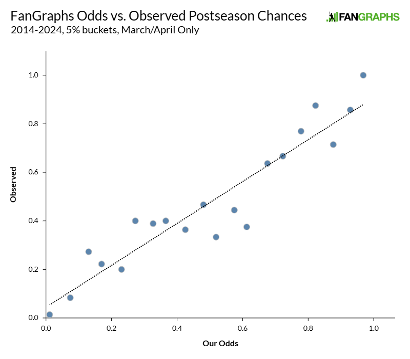
Hey neat, the line goes in the right way. But wait! It’s not perfect. Neither of those are salient observations, though. The question is whether our odds do better than using season-to-date statistics. If our only alternative was the coin flip model (spoiler: it performs poorly, as you’ll see), the FanGraphs odds would be a clear improvement; pitting our odds against a more robust model feels like a better test of whether it’s a useful indicator.
The last time I ran these numbers, I used mean average error as a metric of success. I think that was a poor choice in retrospect, because it’s not what is called a strictly proper scoring rule – mean average error under-penalizes guesses that are far from the mark. That was an error in my earlier work, and one I’ve rectified this time by using Brier score as my metric of choice. Brier score measures mean squared error and is strictly proper. In other words, it’s properly calibrated to reward the best prediction.
The prior iteration’s methodology was, as it turns out, slightly too generous to our model. That’s because the occasional big misses (a team that we thought was very unlikely to make the playoffs making it, or vice versa) weren’t being sufficiently penalized by my choice of ranking methodology.
With that fixed, I set out to run the Brier score for each model for each month. I broke it up by month because I’m particularly interested in when you should be most interested in our odds. That’s what I really care about; I’m absolutely willing to believe that our model makes errors or has blind spots, but I want to know when that is, not merely that it might be the case. I used the same average-of-the-month methodology I described above for each month. Here are the results of that analysis:
| Month | FanGraphs | Season-to-Date | Coin Flip |
|---|---|---|---|
| March/April | 0.170 | 0.168 | 0.204 |
| May | 0.142 | 0.144 | 0.160 |
| June | 0.123 | 0.128 | 0.132 |
| July | 0.124 | 0.124 | 0.132 |
| August | 0.100 | 0.110 | 0.107 |
| Sep/Oct | 0.074 | 0.079 | 0.077 |
| Aggregate | 0.118 | 0.123 | 0.138 |
Brier scores aren’t easy to interpret on their own; for me, at least, they’re most useful when compared. For example, I can’t tell you how good a 0.17 Brier score model is, but I can tell you that the FanGraphs odds have done slightly worse than the season-to-date odds in the March/April period. That finding comes down to me using a better method to measure error; the FanGraphs odds were, in the aggregate, too certain in the early going, racking up large penalties when wrong.
As the season wears on, however, the FanGraphs odds quickly improve, passing the season-to-date odds for accuracy in short order. July is a strange blip – my best explanation is that there’s some weirdness around the trade deadline and the fact that season-to-date play might do a better job of predicting future trades than our projection-based model. That’s just speculation, though. After that, we’re back to the FanGraphs odds outperforming the season-to-date-stats variation.
With these numbers in hand, we can create something called a Brier skill score. It’s a pretty simple transformation – it simply compares one model to another by describing how much it lowers the mean squared error by. For example, in March and April, the FanGraphs odds have a Brier skill score of -0.014 compared to the season-to-date model. That means that it increases mean squared error by 1.4% relative to the season-to-date model. That skill score deficit changes immediately, though:
| Month | FG vs. S2D | FG vs. Coin Flip |
|---|---|---|
| March/April | -0.014 | 0.162 |
| May | 0.016 | 0.115 |
| June | 0.040 | 0.070 |
| July | 0.001 | 0.061 |
| August | 0.093 | 0.066 |
| Sep/Oct | 0.061 | 0.022 |
| Aggregate | 0.040 | 0.144 |
The bottom line? All playoff odds systems improve as the year goes on. The FanGraphs odds improves by more, though. By the latter half of the year, they’re doing a better job than the other options. In the aggregate, that means that the model that uses projections outperforms the season-to-date version by a modest but significant amount over a full season, reducing mean squared error by about 4%, and it’s an even stronger effect in the second half of the year.
That’s not quite what I wanted to know, though. It’s a very useful start, no doubt. We know that our model does better than the simpler methods we’ve created, and also that it’s maybe a little too confident at the beginning of the season. As a side note, “overconfident” models aren’t necessarily bad, and arise frequently when I’m calibrating new systems. Generally speaking, that could be improved by building in some kind of rule that penalizes over-certainty relative to the amount of the season that has transpired so far, but we keep ours extremely simple and so don’t do any post-calculation modification. These are the raw outputs of our model, in other words, which explains the occasional overconfidence.
That’s all well and good, but I’m more interested in what I should think about the Mets, so I designed a test to answer that question specifically. I asked my computer program to only flag observations where the FanGraphs odds and season-to-date mode diverged drastically in their predictions. I set my threshold for drastic at 10 percentage points; if one model gives a team a 60% chance of making the playoffs and the other gives them a 50% chance, that feels meaningful to me. The Mets are at around a 20% gap right now; the season-to-date statistics are far less optimistic about the team than ZiPS and Steamer are.
There are fewer observations here, of course. Most of the time, the models are in broad agreement. Still, I found enough instances where they diverge to make the same charts as before:
| Month | FanGraphs | Season-to-Date |
|---|---|---|
| March/April | 0.194 | 0.187 |
| May | 0.169 | 0.172 |
| June | 0.164 | 0.182 |
| July | 0.186 | 0.187 |
| August | 0.155 | 0.187 |
| Sep/Oct | 0.142 | 0.180 |
| Aggregate | 0.160 | 0.172 |
| Month | FG vs. S2D |
|---|---|
| March/April | -0.033 |
| May | 0.022 |
| June | 0.096 |
| July | 0.008 |
| August | 0.171 |
| Sep/Oct | 0.211 |
| Aggregate | 0.071 |
There’s one screaming signal here. By August and September, when the two models disagree, the FanGraphs model is much better. A 20% reduction in mean squared error is enormous. That’s as much of a reduction in error as you’d get by using projection-based odds instead of coin flip-based odds on the first day of the season, when the coin flip odds are at their worst. Sure, it’s not a huge sample – observations from 127 different team-month pairs were used to create the August and September skill scores here – but it’s a big difference.
It’s also noticeable that all of these numbers are higher, but that makes sense to me. How do you get such strong disagreement between models? You have a team that is playing very differently from its projections, basically. Those forecasts have the largest errors. When season-to-date and projected stats both say “the Red Sox are slightly better than a .500 team,” well, the errors are probably going to be small because the predictions are easy. When the FanGraphs odds says the Brewers are a .550 team and the season-to-date model says they’re a .610 team, you can assume that each model will have higher average errors.
What, then, are my new takeaways from this exercise? After using strictly proper sorting, the FanGraphs odds and the season-to-date odds are roughly equally good early in the season. We’re sometimes too sure about how players will perform after time off, or assign playing time incorrectly, or any number of other small issues. Guys get hurt! Rookies burn surprisingly bright! These things happen! Trying to predict the future is hard. But by the time playing time settles down, some wins and losses are in the books, and we know roughly who will be on each team? Now the projection-based model is better.
By the second half of the season, the FanGraphs odds are handily outperforming the season-to-date odds, though both do better and better as the year wears on. That’s just logical – the more data is already known, the less forecasting needs to be done to predict playoff teams. By September, most of “playoff odds” is just the standings, because most of the games that determine playoff status have already been played.
When the models disagree in September, you’re right to question their outputs. When the two methods disagree by this much, both of them are worse predictors. But the projection-based model does a much better than the season-to-date model at divining the fate of these controversial teams; if you could only choose one, you’d pick the projection-based model every time. It’s not perfect. None of these models are. But if you’re despairing about how to reconcile players who the projection systems like with team performance that just doesn’t stack up, I have good news: You should probably still listen to the projections more.
Ben is a writer at FanGraphs. He can be found on Bluesky @benclemens.
Perhaps the season to date model is also better in March-April because of the trade deadline. If a team did well late last season, they’re probably more willing to go for it at the trade deadline than a team that that did poorly last September.
Maybe the trade deadline even explains the “flatness” in March/April projected vs observed playoff chances when the projections are between .25 and .6? Lucky teams in the first half go for it at the trade deadline, and unlucky ones restock for next season.
But the playoff projections probably shouldn’t account for front office psychology, at least until Fangraphs hires Hari Seldon. 😉
Yes. Note that the season-to-date model also does worse than the coin flip model in August and September. It does not account for the roster changes made but the projections do(right?)
This seems intuitively right — you should always expect that players will regress toward their true talent level and that luck will even out, which is what you’re doing by betting on the projections over the season-to-date performance, and betting on it more heavily when the two disagree more (ie past performance has been less in line with aggregate true talent).
Zips’ stand alone season models include random player injuries and variations in player quality.
I think early season fangraphs projections would be improved substantially by just including a random variation in team quality that scales roughly with the number of remaining games. Early in the season, there are big error bars, your ace pitcher blows out his arm on April 10th, and suddenly the April 9th projections are off by quite a bit, and on April 9th, there’s lots of season left for someone to have a breakout or injury or big trade, by September there’s noticably less uncertainty of that sort, so the added random quality factor should vary with time of year and should, IMAO, exist.
Brier score is simply another bit of mathematics that the Mets will giddily defy in the pursuit of hurting their fans.
Is there any way to factor into the model that the Mets are god’s least favorite children
Ah, the Billy Baldwin memorial award
Have you run this analysis specifically only on the Mets, to see if they have been cursed by the Eldritch lords?
On the other side of “the most interesting playoff race in baseball this year” is the Arizona Diamondbacks. I wonder which projections they used to decide to sell at the deadline.
I’ve been saying that the FG projections are too far away from 50/50 for most individual games for a while. I’m not sure if these tables support that conclusion or not, but I’m pretty sure that the minimum they don’t refute it. It’s not super comforting to see that FG isn’t any better than season to date in the early months considering how much noise there is in so few games. Nor is it super comforting to see how it isn’t that much ahead of the coin flip in the second half of the year.
I’m pretty sure the reason why the season-to-date performs marginally better early in the year is because it’s effectively double-counting banked wins. Projections are flimsy compared to banking wins, a full season is a large space to project over. I’m less certain about why the coin flip catches up as time goes on, but my guess is that the FG projection model is too linear.
The individual game projections aren’t completely separate from our playoff odds, since they use some of the same components, but they’re also not specifically factored into the playoff odds. We just use series matchups and win %.
We’ll definitely chat about what the takeaways are and if there’s stuff we want to change in the off-season, but in general our pre-season win totals are pretty conservative. I think there’s been some discussion in the past that our projected outcomes are a bit too tight and we might need to inject some extra variance in our model. I think Dan brought this up early in the season, so we’ll take a look at that.
Well done!
At this second the Mets have an 88% chance of making the playoffs and the Red Sox 87%. That makes the Guardians the most interesting team to watch.