
A New Way of Looking at Depth
One of the great perks of working at FanGraphs is that I get to discuss baseball with my equally obsessed coworkers. Obviously, this is the kind of job you don’t get into unless you love the sport. A lot of the time, that means we just end up nerding out over how much we enjoy some minor but cool thing, or perhaps discussing our favorite of the game’s idiosyncrasies. Sometimes, though, we come up with new ideas together, or one person’s passing fancy turns into another person’s brainstorm, and before you know it, something nifty and novel is happening.
That’s why I’m writing this article today. At the December Winter Meetings, a subset of us sat down for our annual let’s-talk-about-fun-baseball-problems technical meeting. David Appelman and Sean Dolinar ran things. Folks like Jeff Zimmermann and Dan Szymborski popped in at various points. Jason Martinez and Keaton Arneson had big plans for how to improve the site’s functionality. Those guys are great at building models, running websites — advancing the state of how FanGraphs (and ZiPS) works, basically. I like to make jokes and write articles about bunts, so as far as I can tell, I got invited because I’m good at coming up with bad but interesting ideas.
That said, this year one thing was on a lot of our minds: depth. I’ve written a lot about how well our playoff odds reflect reality. They’re pretty good! But there’s always been an obvious problem with them. They use static rosters, which means they don’t account for the fact that some teams are more vulnerable to injury or underperformance than others.
The reason things work this way is straightforward. To run our playoff odds model, we begin by constructing an estimate of each team’s strength. We come up with that estimate from the bottom up. First, we project the playing time that each player receives — or rather, we use Jason Martinez’s playing time estimates, which feed our depth charts and RosterResource. Then we estimate how those players will perform using a blend of ZiPS and Steamer projections. We add those all up, sprinkle in a little BaseRuns magic, and voila! We have estimates of how many runs a team will score and allow per game, which you can convert into expected winning percentages.
As I’ve written in several similar explainers before, the best part of this model is its simplicity. It runs more or less continuously throughout the day; every time a new game ends, our odds change to reflect the result. There’s not much chance of some kind of weird model outcome we can’t explain; we know who’s getting the playing time and how good we expect them to be, so there’s just nowhere for it to break (sorry, David, I’m sure I jinxed something by saying this).
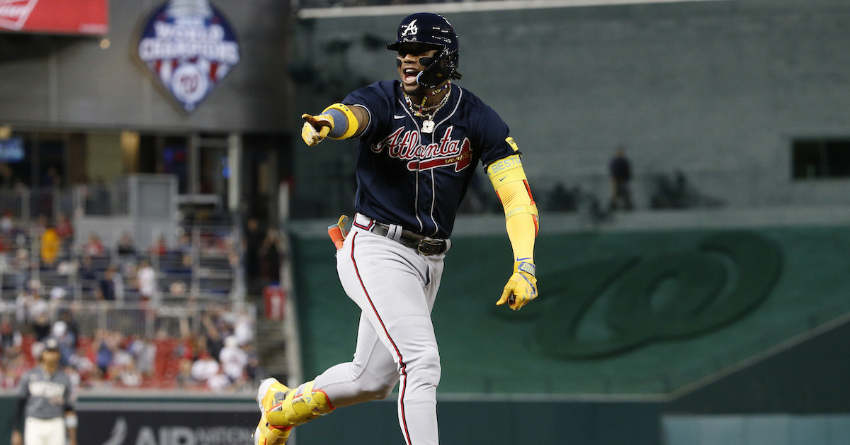
The big weakness of this plan? Let’s take a look at the Braves’ depth chart for a simple example. Ronald Acuña Jr. is projected for 679 plate appearances. In every one of the 20,000 simulations we run each time the model updates, we pencil Acuña in for exactly 679 plate appearances. But that’s not how things have gone. Last year, he had 735 plate appearances. In 2021, he had only 360 thanks to injury. Obviously, the Braves would be a good deal worse if Acuña were to miss time, but because of the way we run things, we’re not capturing that possibility (though should some misfortune befall Acuña, the depth charts and the playoff odds would reflect it in a hurry).
We’ve known about this limitation of the model construction for quite a while, and from time to time we’ve tried to brainstorm solutions. Some very helpful readers of the site have wasted hours trying to explain fancy math to me. My friends have given me suggestions. We’ve talked about various options internally. But this winter, Appelman figured something out, and I’m delighted to share the rough contours of it with you today.
It started with an idle thought: What if you just removed random players from each roster? You could rebuild the team without them, figure out the difference in team quality, and run the odds with that new, post-removal estimate of team strength as a proxy for the chance of injury. Roll enough dice for each team on each run, and maybe random removal could do a good job approximating the vagaries of health.
As it turns out, that’s easier said than done. It’s computationally intensive, for one thing. We’re also not set up to rebuild a roster on the fly. But this idea of subtracting individual players and working out team strength from there struck a chord with all of us, and as the winter went on, Appelman kept sending me new iterations of his approach to the problem.
At one point, we wanted to estimate the strength of a team’s starters, its listed second string, and its listed third string. Then we could just interpolate between the three, or perhaps randomly weight each group, to get an estimate of team winning percentage that took into account the likelihood of its backups getting significant playing time. That worked alright most of the time, but it’s actually hard to define a team’s “second string.” I specifically remember looking at a Cardinals depth chart at one point this winter. The second string, if you just took the player projected for the second-most plate appearances at each spot in the field, included three Brendan Donovan’s and three Tommy Edman’s. Right, well, that probably wouldn’t work then.
After plenty of trial and error, though, Appelman and team have come up with a really cool solution. It’s a variation on the original idea, in fact. Rather than thinking of it as a playoff odds tool, the idea is to create a grid that shows how each team’s expected winning percentage changes as we remove the top players from the roster. First, we calculate the full-strength numbers against neutral opposition, which are what you can see on our projected standings page. Then we lop off the player with the most projected WAR and increase the plate appearances (or innings pitched) of the guys below that player on the depth chart to refill the team’s playing time.
Let’s use Acuña as an example again. He’s projected to be the Braves’ best player, of course. Our process gets rid of his entire season and replaces it with plate appearances for other players on Atlanta’s roster. Jarred Kelenic is second on the depth chart, but he can’t get all 679 of Acuña’s plate appearances; he’s already projected for 525 plate appearances as the team’s everyday left fielder. Even Cal Ripken Jr. couldn’t top 1,200 plate appearances in a year, so Appelman’s algorithm is a bit more complicated than that.
The process first adds a missing player’s playing time to his top backup, but then there’s a check: If someone has more than a full season’s playing time (700 non-catcher PA, 640 catcher PA, or 200-ish innings pitched for a starter), the algorithm caps them at 100% playing time. It subtracts those “extra” projected PAs/IP proportionally from each position. In Kelenic’s case, that means he’d lose mostly right and left field playing time, with a tiny bit of center field to boot. Then those freed-up plate appearances get kicked down the line – at each of the three outfield spots, Forrest Wall is the next man up after Kelenic, and he’s only projected for 98 plate appearances right now, so he soaks up the entire remainder of the playing time.
As you can imagine, that makes the Braves a lot worse. Specifically, when we recalculate their expected winning percentage without Acuña, they fall from a .598 team to a .567 squad. That 31-point decline is the biggest that any team in baseball would suffer if their best player got completely replaced by backups. That makes sense – Acuña has the best projection not just on the Braves but in all of baseball, and Atlanta’s options behind him are lackluster. For comparison, the Cubs project to suffer the smallest decline in performance. We have Nico Hoerner down as their best player, and we like a lot of the options behind him; Nick Madrigal, Michael Busch, and Patrick Wisdom can absorb a lot of infield innings between them with admirable aggregate projections.
From there, our new process just keeps going. Next, we lop off the top two players on each team. We’ll stick with Atlanta; this time, Acuña and Spencer Strider are both out. In the case of a pitcher, we hand out playing time in terms of starts, with no player getting more than 20% of the starts. So every other starter picks up some of the slack, with Bryce Elder and Huascar Ynoa seeing the greatest increases. It’s the same process behind the scenes, though. First, Max Fried gets all of Strider’s 180 innings, but then he has way too many, so we push his excess innings down the chain to Charlie Morton. That results in Morton having way too many, so they get pushed down the line, and so on. There’s only one exception: players who are currently injured are specifically excluded from having their playing time increased, which prevents a starter currently ticketed to return from TJ in the second half of the year from soaking up unrealistic innings.
We’ve run this process pretty far down the roster – until we’ve eliminated each team’s top 10 projected performers, to be precise. These depth charts look pretty dire; remove any team’s best 10 players, and things get a lot worse! To stick with the Braves as an example, try to imagine them without Acuña, Austin Riley, Michael Harris II, Matt Olson, Ozzie Albies, Sean Murphy, Strider, Fried, Morton, and Chris Sale. Our method thinks that they’d be a .452 team (against league average opposition) if those 10 missed the entire season.
We have to take a few shortcuts to handle cuts of that magnitude, because there aren’t always enough players listed at each position to make it work, and some very deep backups end up with over-allocated playing time, but at the point where you’re wondering who should pick up J.P. Martínez’s projected playing time from among the Braves’ non-listed options, the overall effect on their winning percentage is quite small. That means that there are some weird discrepancies here and there when you get all the way down the playing time ladder, but they’re tiny in magnitude and as best as I can tell, not worth worrying about. We think the Braves improve from a .452004 team to a .452197 team, for example, when we remove their 10th-best player and backfill all that playing time, but that just comes down to which replacement-level player we’re handing that playing time to. A quick clarifying note here: Since the model can only work with our existing depth charts, only players projected for at least one plate appearance or batter faced enter into our calculations. That doesn’t perfectly match reality, but this far down the depth chart, most teams are picking between a variety of replacement-level players anyway, so we don’t think the model loses much from that limitation.
Okay, you’ve stuck around for all the rambling, so let’s get down to brass tacks. You’re reading this article because you want to know who does well by this method. Here’s the giant raw grid of team winning percentage as we lop players off of each team’s roster:
| Team | 0 | 1 | 2 | 3 | 4 | 5 | 6 | 7 | 8 | 9 | 10 |
|---|---|---|---|---|---|---|---|---|---|---|---|
| Braves | .598 | .567 | .551 | .532 | .518 | .502 | .485 | .473 | .462 | .452 | .452 |
| Dodgers | .573 | .556 | .538 | .525 | .506 | .500 | .494 | .484 | .480 | .462 | .455 |
| Astros | .560 | .537 | .517 | .495 | .481 | .469 | .463 | .455 | .449 | .443 | .435 |
| Yankees | .549 | .530 | .504 | .494 | .487 | .477 | .471 | .465 | .457 | .450 | .451 |
| Rays | .534 | .526 | .518 | .511 | .502 | .495 | .490 | .485 | .488 | .484 | .485 |
| Mariners | .528 | .508 | .497 | .477 | .465 | .462 | .452 | .443 | .440 | .434 | .425 |
| Orioles | .525 | .513 | .503 | .491 | .484 | .474 | .469 | .466 | .460 | .458 | .453 |
| Phillies | .523 | .510 | .493 | .479 | .458 | .450 | .446 | .439 | .424 | .424 | .420 |
| Blue Jays | .522 | .515 | .503 | .487 | .476 | .472 | .466 | .463 | .462 | .450 | .452 |
| Twins | .521 | .510 | .499 | .491 | .483 | .473 | .466 | .458 | .453 | .451 | .445 |
| Diamondbacks | .515 | .503 | .490 | .480 | .467 | .461 | .448 | .447 | .438 | .435 | .434 |
| Cardinals | .514 | .506 | .496 | .491 | .487 | .482 | .474 | .476 | .471 | .472 | .472 |
| Rangers | .506 | .492 | .482 | .478 | .471 | .459 | .453 | .449 | .443 | .437 | .428 |
| Cubs | .501 | .500 | .496 | .490 | .485 | .478 | .466 | .467 | .474 | .466 | .471 |
| Red Sox | .501 | .488 | .473 | .474 | .468 | .468 | .463 | .457 | .461 | .460 | .450 |
| Padres | .500 | .475 | .462 | .450 | .442 | .436 | .428 | .424 | .416 | .410 | .411 |
| Brewers | .497 | .490 | .483 | .473 | .463 | .459 | .449 | .451 | .450 | .450 | .448 |
| Mets | .496 | .482 | .474 | .462 | .457 | .444 | .438 | .433 | .428 | .425 | .425 |
| Giants | .495 | .483 | .490 | .484 | .481 | .476 | .473 | .472 | .469 | .457 | .452 |
| Marlins | .495 | .491 | .485 | .477 | .468 | .459 | .448 | .438 | .430 | .430 | .428 |
| Guardians | .493 | .476 | .469 | .463 | .457 | .450 | .439 | .431 | .419 | .416 | .411 |
| Tigers | .489 | .479 | .476 | .466 | .458 | .457 | .458 | .456 | .454 | .459 | .456 |
| Reds | .488 | .485 | .482 | .477 | .477 | .474 | .471 | .466 | .453 | .451 | .449 |
| Angels | .481 | .466 | .455 | .450 | .442 | .433 | .428 | .422 | .420 | .410 | .399 |
| Pirates | .477 | .470 | .465 | .460 | .451 | .439 | .441 | .438 | .436 | .438 | .428 |
| Royals | .467 | .450 | .441 | .429 | .424 | .425 | .425 | .425 | .426 | .425 | .423 |
| Athletics | .443 | .437 | .436 | .426 | .424 | .424 | .421 | .423 | .419 | .417 | .412 |
| White Sox | .417 | .402 | .392 | .384 | .375 | .363 | .358 | .353 | .357 | .354 | .360 |
| Nationals | .408 | .393 | .386 | .379 | .374 | .372 | .367 | .363 | .360 | .367 | .367 |
| Rockies | .394 | .387 | .383 | .381 | .377 | .375 | .374 | .374 | .374 | .365 | .365 |
Yeah, that’s an overwhelming amount of data, and the table is sortable in case you want to play around with it. In terms of broad conclusions, the teams least affected by dropping their 10 best players are largely the ones that are already bad. The Rockies, Athletics, Nationals, and Royals are all in the top 10 of least-affected teams, and they sport four of our five lowest projected winning percentages at full strength. Pity the poor White Sox, who have so little depth that they managed to get quite a bit worse even starting from such a low floor. One quick note on all of these, by the way: In each case, we’re only removing players from the team in question. When we say that the Braves project for a .452 winning percentage with 10 players gone, that’s against an otherwise normal league.
The teams with the most to lose in such a complete roster destruction are basically just the best teams. The Braves see their winning percentage decline the most, with the Astros and Dodgers hot on their heels. Some interesting exceptions to this rule: The Cardinals, Rays, and Cubs have projected full-strength records above .500 but all finish in the top 10 for least-injury-impacted. In other words, they have capable replacements in addition to starters good enough to compete for the playoffs on their own merits. Those are the types of teams that our current odds method tends to underrate. The Brewers and Reds only miss that group because we think they’re just worse than .500 at full strength; in other words, the entire NL Central has pretty excellent depth.
Perhaps a more interesting question is which teams suffer the most from a more realistic number of injuries – say three top stars. The Braves and Astros are head and shoulders above the field here. But make no mistake: Those teams are still really good. Those two might project to suffer the biggest decline in performance due to injury, but we still think they’d be top-five teams in baseball in a hypothetical world where every organization was missing its best three players. Here, you can sort by either change in winning percentage or absolute winning percentage with three players missing to see how even with those big losses, Atlanta’s squad is built to crush:
| Team | Full Strength | 3 Missing | Change |
|---|---|---|---|
| Braves | .598 | .532 | -.066 |
| Dodgers | .573 | .525 | -.048 |
| Astros | .560 | .495 | -.065 |
| Yankees | .549 | .494 | -.055 |
| Rays | .534 | .511 | -.023 |
| Mariners | .528 | .477 | -.051 |
| Orioles | .525 | .491 | -.034 |
| Phillies | .523 | .479 | -.044 |
| Blue Jays | .522 | .487 | -.034 |
| Twins | .521 | .491 | -0.03 |
| Diamondbacks | .515 | .480 | -.036 |
| Cardinals | .514 | .491 | -.024 |
| Rangers | .506 | .478 | -.028 |
| Cubs | .501 | .490 | -.012 |
| Red Sox | .501 | .474 | -.027 |
| Padres | .500 | .450 | -.049 |
| Brewers | .497 | .473 | -.024 |
| Mets | .496 | .462 | -.034 |
| Giants | .495 | .484 | -.011 |
| Marlins | .495 | .477 | -.017 |
| Guardians | .493 | .463 | -0.03 |
| Tigers | .489 | .466 | -.024 |
| Reds | .488 | .477 | -.011 |
| Angels | .481 | .450 | -.031 |
| Pirates | .477 | .460 | -.016 |
| Royals | .467 | .429 | -.038 |
| Athletics | .443 | .426 | -.016 |
| White Sox | .417 | .384 | -.032 |
| Nationals | .408 | .379 | -.029 |
| Rockies | .394 | .381 | -.013 |
In fact, the Braves project for a .501 winning percentage even if we remove their top five players from the depth chart. In some ways, sure, they’re a thin team. But one way to weather an injury storm is to be so dang good that the rest of your starters can pick you up, and that’s where Atlanta is this year.
When you lop six players off of each team, the Dodgers have the best projected winning percentage. At seven players, the Rays take a tiny edge, and with each remaining gradation, they have the best projection. The Cardinals aren’t far behind by that point. But even with 10 players gone, the Braves have the seventh-best projection in the majors. It’s a completely different way of thinking about depth than I’m used to, but I think it’s a really cool result.
The best part about all of this? With enough massaging and reformatting of the way we do our playoff odds, and with plenty of careful calibration to handle how often to call up each injury scenario for each team, we can eventually integrate this knowledge into our projections. In some potential future, the Braves might be missing their top two players – or some combination of the middle players that affects their winning percentage in a similar way – while the Phillies and Mets have pristine health. How would the division go in that case? That could be one of our runs.
Drawing from each team’s injury table independently does a better job of simulating the many possible outcomes of a season than using a static depth chart. Want to know what the Rays’ vaunted depth is worth? Over a giant batch of simulations, their poor injury draws hurting them less than other teams will give them an advantage. Likewise, I doubt Atlanta’s lack of depth is a huge issue, because the team is just so good to begin with.
I don’t have the answers to that part of the equation today. We – and by we, I mainly mean Appelman – haven’t worked out how to integrate this new way of looking at depth and injury into our existing model. Adding this methodology to our playoff odds will require careful calibration and some reworking of the existing code. But that’s something we’re working on, and I think the results of this project are already plenty cool. It’s all well and good to say that depth matters. Here, now, we can say how much it matters, and for which teams.
One note to pre-empt a question I’m sure you’re wondering about: lopping off a team’s best players in order doesn’t exactly reflect reality. Neither does having those players miss the entire season instead of some portion of it. That’s true. But we’re trying to create an abstraction here, because all models are abstractions of reality in one way or another. We think this is a pretty good one – it’s telling us something useful about team composition that our existing option misses. I think it’s fascinating, and I hope you will as well.
Ben is a writer at FanGraphs. He can be found on Bluesky @benclemens.
What an awesome undertaking.
Excited to see how it evolves.
It would seem to me that you could use historical injury days (both in players and days lost ) to create a high end, mean and low end estimate of an expectation. Then apply that to each existing team.
There might be some additional info that might be used to tweak this (older average age teams may have more days lost to injuries, turf vs grass , south vs north ).
Maybe a likelihood number (1, 2 or 3 or a %) for each player to describe the chances he’ll play his estimated innings/PAs. (Byron Buxton never plays a whole because he’s hurt, and Carlos Santana always shows up for work as a 1B/DH.) Bucket the Buxtons as most likely to go out and the Santanas as least likely and empty the unreliables first in descending WAR value.
You already have some of this work done in the estimates for playing time, but the new model assumes Buxton would be free for 80 games to pick up someone else and that’s not really a good assumption.
The issue I can see with this right now is that it will overestimate the resilience of platoon-heavy teams. If you have to play the Dodgers-era version of Joc Pederson against left-handed pitching, the rate stats will plummet. Maybe that’s already been addressed in the models, but it’s something that a simple delete-and-replace approach wouldn’t do.
Still, you can sort of see the broad outlines of why a platoon-heavy team of guys who don’t strictly need to be platooned would be remarkably resilient. Mike Yastrzemski has a wRC+ of 89 in his career against left-handed pitching, and one of 122 against right-handed pitching. Randal Grichuk has a career wRC+ of 92 against right-handed pitching, and a 116 against left-handed pitching. If you ran a straight platoon, you’d get something like 3.5 or 4 wins above replacement over the course of an entire season, depending on the defensive numbers. If one of them gets hurt, it’s probably a lot nicer to have a guy with a career wRC+ of 90 against same-handed pitching than relying on Bradley Zimmer or whoever you’ve found to back him up.
Related to this: You should also have a similar problem with shifting players to positions they can’t really play, or where their defensive talents are wasted. If Enrique Hernandez has to play center field, you’re probably fine. If Enrique Hernandez has to play shortstop, he’s probably a net-negative when he plays. Just adding more PAs and extrapolating out on his “defense” number won’t cut it here. Similarly, if you have to move your second baseman like Xander Bogaerts to first base because of injuries (or because you’re AJ Preller and you signed one hundred players who can play second base and shortstop and no first basemen) he’s not going to put up the same value.
That would be easier to adjust for in the models, though.
This likely isn’t a problem because of how “unsticky” individual player platoon splits actually are. The Book makes clear that we have to regress those so heavily that it’s pretty rare to get a player with a large enough career playing time sample to believe they have meaningfully better or worse than average splits, and the guys who do get that kind of playing time rarely find themselves in a platoon situation anyway.
If anything, this could soften the effect of these projections not explicitly accounting for platoons, and assuming that players will get roughly normal playing time based on opponent handedness. That’s often not right, but it can be difficult to conclusively identify a platoon ahead of time, and in practice (due to injuries, rest days, etc) both sides of a platoon still wind up with a lot of PAs against same handed pitchers.
Still, I like how the Reds don’t lose much when they lose their top 3 players, probably because they have a thousand players to cover 2B, SS, and 3B. It’s like it knows, “oh, you don’t actually need all those players. Even the good ones.”
The Tigers actually improve if you take away Javy Baez.
This got downvoted..but, the Tigers win % does go UP when you take away their 6th best player..Assuming it is in fact Baez, that is funny…& also, weird..trying to think of what it actually means.
Most likely it means that moving someone else to SS opens up AB’s elsewhere for someone else that make the net effect a small positive.
Would be fun to see a deeper dive on who/how that occurs.
Ben mentioned this in the article: “ That means that there are some weird discrepancies here and there when you get all the way down the playing time ladder, but they’re tiny in magnitude and as best as I can tell, not worth worrying about. We think the Braves improve from a .452004 team to a .452197 team, for example, when we remove their 10th-best player and backfill all that playing time, but that just comes down to which replacement-level player we’re handing that playing time to.”
I would never have thought to approach projecting strength of depth in this way, but the gradual reappropriation of playing time down the roster ladder makes good sense to me. In-season call-ups who show out grab all the fantasy headlines, but in practice it’s the existing guys that do most of the covering for injury. Thanks for sharing these intriguing prelim results!
It’s not a jackknife but it’s got some philosophical similarities.
https://en.wikipedia.org/wiki/Jackknife_resampling
there’s just no way the yankees are a .494 team without Judge, Soto, and Cole. There’s just no way!!!!
Measured against the neutral field, yes. Measured in reality against the AL East, probably not. Models are approximate.
They were .506 last year with only Cole, some Judge, no Soto and injuries to Rodon, Rizzo, Stanton, Nestor, ect.
If I understand the methodology correctly you would subtract top 3 players but players 4-10 and beyond are healthy. So that would mean:
Judge gone but full season of Stanton (lol)
Soto gone but full season of Rizzo
Cole gone but full season of Rodon
In that scenario it doesn’t seem unreasonable that compared to the 82 win injury plagued 2023 team that a team without Judge, Soto, Cole but an otherwise healthy roster against a neutral field would be a 80 win team.
Wait, is that right? I thought players 4-10 keep whatever projections they currently have on the depth charts–Stanton’s is currently 455 PA.
Ok so in this scenario you’re trading (compared to last year) 100 games of Judge for Grisham, 160 games of Soto for Periera, 32 starts of Cole for Warren and in exchange getting full years of the declining Stanton, Rizzo, and DJ. 80-82 honestly seems generous.
How well does this model account for players returning from an injury midseason? EG TEX with DeGrom, Scherzer, Mahle looking for 3 of the 4 best starters to return midseason. Kershaw with the Dodgers, albeit he may not be in their top 10.
Do they count as injuries from the start? Do they get removed somewhere in the players 4-6 injuries count and model as never coming back this season?
This is something I should have addressed, and I’ll add a clarifying note. Players designated as currently injured cannot add PT. They have separate flags that exclude them from the waterfall redistribution.
I’m guessing you could look at the historical expected probabilities of losing projected player #1, projected player #2….down to #10, and use these along with the chart of expected winning percentages here to develop an expected value of winning percentage accounting for expected key injuries. Then just rescale these winning percentages back up to .500 for the full MLB and there you have it.
(This is some great stuff btw!!!)
It would be interesting to see different combinations of 2 or 3 players removed to identify where each team’s depth is strongest/weakest or if some particular combination causes really causes havoc with a roster.
I feel like this approach almost rewards the wrong type of depth. If I’m the Braves, “How do we best compete if Acuña and Strider miss the year?” is not my top concern. It’s “assuming those two are mostly healthy, how do I avoid letting a vintage year of those two be derailed by other injuries?”. I assume you’re also going to see artifacts where good pitching can become a liability. I don’t think any team can thrive with the entire rotation going down, but only teams where 5 of there top 10 players are pitchers have to entertain that scenario.
I may be underestimating the computational complexity of your code, but is it really that prohibitive to just run the depth algorithm you created here 500 times per team or something? And injure players randomly based on projected PA/IP? That’ll concentrate the analysis on high impact starters but give you a more balanced sense of flexibility, not “god, 3B is a dumpster fire for this team, but it’ll never bite them because there starter is only #11 on the team.
That was absolutely fascinating. You guys are amazing. Man, I hope you guys didn’t give the skinflint owners any (more) ideas.
Maybe a better way of displaying that first table would be to show the delta instead of all the absolute number. So the Braves would be shown as .598, -.021, -.016, -.015 etc.
It might help any inflection points or weird trends to stand out because, like you said, there is an awful lot of data there. Maybe color code it like a heat map too. Darker red means a bigger loss.
This is a cool and thought provoking exercise. A few thoughts:
*I feel like this is really extensive and exhaustive model for what quickly becomes very far tail outcomes. Chances your top 5 players miss some timely – definitely happens. Chances your top 5 players are out for the year? – unlikely. Could it instead be run as each player missing half the season? Or maybe 50% for hitters and 75% for pitchers since their injuries are more likely to be season ending?
*Could likely simplify this exercise and cap the modeling at 6 or 8 players, right? Does anyone really lose all 10 of their top players?
*As others have mentioned, likelihood of injury needs to be accounted for. This can be daunting but I think a simple fix is already available. The depth charts already have playing time projections – take this data and calculate a WAR per PA (rate value). If a player has a higher rate value than his backups but isn’t getting 100% of a playing time projection then he must be getting dinged for injury probability. You could then calculate the superior players shortfall to 100% playing time as a ratio to assign their injury probability.
I’d think of this as more of a stress test than a prediction that the a team actually loses its entire starting 9 for the year. Ben’s trying account for losses to each major player (e.g., do you have terrible backup catching?) and combinations (one super utility player makes you look strong to any one injury, but falls apart as soon as two positions need filling in) while not having to run more than 10 simulations per team. In that sense, whether players are out for a year or a month, it’s showing you the sensitivity to missed time, not a specific prediction.
When talking about my optimism for the Phillies on another site, I was explaining how open the NL really is, and jokingly said Braves and Dodgers are in the playoffs even if you take out their top 3 players.
This shows I was right as both the Dodgers and Braves have the best NL winning % missing 3 players even if the rest of the NL is healthy.
The amount of .500 level NL teams is comical.
New York, San Diego, San Fran, the entire NLC except Pittsburgh. Optimistically the Marlins and pessimistically Arizona.
Typo in the last table? Twins are minus ,3…..
Lots of cool stuff here. It requires way more thought than anyone could give right away…. Did you retroactively run this for previous years? If you mentioned that, I missed it….
It’s not strictly a typo but it’s weird formatting–it looks like the table drops trailing zeroes, so the Twins and Guardians are listed as -0.03 (with a zero before the decimal point) instead of -.030.
I was surprised that the Yankees w/o Judge wasn’t the biggest loss of the #1 player, then I remembered that the Braves’ depth is the fact that all of their position players play almost every game.
This just doesn’t seem to be a satisfying definition of depth, to me. I don’t think of the Cubs as a deep team, I think of them as a mid team.
I almost feel like it would make more sense to go Silicon Valley and do this exact same method but from the middle out. As in, rather than removing the best player, remove the median player from the roster. Just a thought
The Cubs have no superstars but five all-star caliber position players (Bellinger, Swanson, Hoerner, Happ, and I would count Suzuki based on how he played in the second half). Their redundancy is such that unless you lose both middle infielders, or two of the three outfielders, you have enough quality flexible players behind them to not alter the season’s trajectory.
Pitching is a different animal. They collapsed in the stretch last year because they only had two above average starters and one legit closer – and only one of those three was healthy in September.
The depth tool isn’t what I expected when I clicked on the article. For instance I was shocked that Acuna is projected with the same number of at bats in all 20,000 seasons!? The tool created doesn’t feel like the best tool to fix what the problem is. But I don’t envy trying to belt-and-suspenders a solution into an existing process like this.
But when I read what the tool did, my first thought was “I bet the Cubs come out great in this exercise”.
Love this idea in theory, in practice I feel like it needs to weight how players with longer injury histories are more likely to be the ones to go down to be really useful
“Specifically, when we recalculate their expected winning percentage without Acuña, they fall from a .598 team to a .567 squad. That 31-point decline is the biggest that any team in baseball would suffer if their best player got completely replaced by backups.”
598 WP = 97ish wins
567 = 92ish wins
So, Acuna is around 7 WAR and his replacements about 2 WAR?
It would seem like using WAR would be an option……that seems simpler. Also, this gets to a team/player specific WAR in some ways, since we see how much more Acuna is than his actual replacements (or at least an approximation thereof). Now, that makes THAT WAR not helpful for comparing players across teams….
This is awesome. This is a solid, simple way to approach things that IMO passes the sniff test and, when translated to winning percentage, tells us some useful things about a roster.
My one quibble is that this is more like variance as opposed to depth. Depth, to me, is about the quality of the 11th player (or 26th player) on the roster. Which is independent of how well the top player performs. The methodology described here is about the delta between #1 and #26.
Depth has judgement associated with it (good/bad, deep/shallow), and by this measure teams would score worse as their top player gets better? Even if their 26th player is performing as expected.
Ben:
Maybe I am not thinking about this correctly or didn’t read this correctly, but did you identify the top-10 players based on the full team or did you perform a re-evaluation after the best player was removed? For example, you remove the best player and see their impact. Then do you remove the second best player from the full time…or do you see who is NOW the best player and remove that player?
The way you reallocate IP from losing a top SP (Strider, in the example) doesn’t make sense to me. Why would other current starters (the rest of the Braves rotation, in the example) make more starts or pitch more innings beyond their current projections? The injured SP’s innings would certainly go to depth SP options in AAA and/or long reliever/backend SP, but not the current rotation…
I guess you don’t say *how* many innings the current rotation would augment, so maybe you’re just explaining a bit of how the math works but their actual increase in SP would be nil or negligible until you get to the parts of the roster whose playing time projections are limited by opportunity rather than health.
I had a similar thought….
I thought this too. Max Fried isn’t going to suddenly start pitching every 4 games or pitching complete games every time out because Strider is hurt. The 6th starter would take Strider’s place and everyone else would get their normal turns/innings. The only way it might make sense is if you’re assuming that 1 pitcher on the Braves will get hurt so if that one is Strider then everyone else will have a healthy season (not a good assumption of course.) Heck, for the Dodgers Glasnow is probably more likely to get hurt if you give him extra innings to make up for Yamamoto being out…
I suppose if all of the SP are capped at 20% of starts, then the waterfall effectively will just bypass the rest of the starters already in the rotation and effectively entirely fill it in with depth. Though players already projected to miss time would then be projected to take the extra starts, which seems like a methodology error.
Just to clarify this, a player is capped at 20%, and players who are injured can’t get more playing time as part of the waterfall.
Thanks for the clarification, I was thinking of players who are healthy, but projected for less than 20% of starts due to a track record of unavailability, like Chris Sale or James Paxton. For example, if the projection expects Sale to miss a few starts when the roster is at full strength, then a hypothetical Strider injury shouldn’t really change that.
I had the same thought – also wrt position players. Most players need days off, even if just one or two days a month coming off the bench. If a starter gets hurt I don’t anticipate that the remaining starters would no longer take rest days. At the margins they’ll get a few more at bats but have to believe the bulk of replacement innings/at bats comes from the bench or call-ups.
Though I’m less hung up on that than I am on running 20,000 seasons with uniform playing time assumptions. As I’m sure the Fangraphs team is hence they are spitballing ideas like this to address the simulations. This tool, if incorporated and though imperfect, is better than what they are doing now. (And of course what they are doing now is great.)
Yeah. This is how things work in real life. SP1-3 are making every start they are able to. SP4 might miss a turn here and there. SP5 misses lots of starts. If SP1 goes down then everyone gets moved up in the rotation and now SP6 picks up the last slot. But SP2 isn’t all of a sudden going to throw more innings.
Other than those depth SPs, the only guys picking up more innings will be middle relievers who get called into the game more frequently when those depth SPs falter, or because depth issues mean the occasional bullpen game outright.
The Rays! Top 10 players removed and they still are almost a .500 club.
This was the first thing I checked to see if it passed the smell test.
So a full, healthy Rockies team would have a winning % worse than 27 other teams each without their top 10 players. That is… incredible. In a bad way. Very bad.
(amazing article btw)
Nats are worse than 26.
All hail our Dark Lord!
Seriously! 26 teams are better after losing their top 10 players than my Nationals fully healthy! That seems impossible!
Wouldn’t my Nats gain some wins if the other teams lost the top 20 players?
Typo Top 10
This analysis is that it also answers the question “Taking their team into account, who are the most indispensable players in baseball?” Granted, it looks at it from a wins perspective rather than a playoff odds perspective, but it’s still interesting to me.
The teams/players with the top 5 biggest drop offs are the Braves/Acuna (-.031, or ~5 wins), Padres/Tatis (-.025, 4.1 wins), Astros/Tucker (-.023, 3.7 wins), Mariners/Julio (-.020, 3.2 wins), and Yankees/Judge (-.019, 3.1 wins).
At the bottom, you find the Cubs, Reds, Marlins, and A’s losing less than a win.
Somewhat interesting!
How does this differ from whatever it is that Dan already does with ZIPs? Or do we not know that ‘cuz Dan keeps that part of ZIPs confidential? (which I wouldn’t blame him for, seeing as how this is how Dan earns his living and all)
Great work!
One question. How did Nico Hoerner become the Cubs best player?
He’s similar to Dansby in that they both have an elite glove with average to slightly above average output. I think he has a higher floor due to the low k%, whereas Dansby strikes out a ton. Bellinger could be their best player, but he’s almost impossible to project at this point.
The Rays are mind blowing…..they’re good at full strength and maybe even better as the normal wear and tear of a season degrades other rosters….
I’m curious about the couple of teams that get BETTER by losing their 10th guy?
Is that a reflection of a prospect that would be pushing into playing time that wouldn’t otherwise or what?
I’m reminded of “Its a Wonderful Life” and Potter telling George Bailey that he’s worth more if he was dead–it’s like telling that 10th BEST player–we’d be a better team if you were injured!
Is this an empirical Bayes approach at its heart. Nice analysis.
Wouldn’t it make sense to start further down the line than the best player?
Sure, the best player might get hurt. But let’s say you want to see the impact of one major injury. Wouldn’t it make more sense to start at, say, the 4th best player, since on average that’s a more realistic outcome (because the best player might get hurt, or the 7th best player, or anyone in between).
So you start somewhere in the middle and work your way out. 4th best, then 3rd best and 4th best, then 3rd best, 4th best, and 5th best, etc. Or make the order even more random.
Overall, it’s a great project and I’m excited to see what comes of it.
Acuña reporting meniscus irritation this morning, and I blame you, Ben!
I’m still trying to wrap by head around taking away a team’s 10 best players and them still being a .452 team. That’s not good but that’s still better than a handful of teams. And .452 isn’t really an outlier.
Take away the Cubs or Cardinals 10 best and they’re still a 470 team, basically as good as the Royals and a lot better than the White Sox. This is an amazing visualization of how far away those teams are from contention.
I’m 4 days late, but…
I love this though I have to say the methodology for assigning playing time is bit strange. If Acuña is out for the year, Kelenic might get a few more at bats. But as a starter his playing time reflects his injury risk and that he’ll likely not play against LHP. He’s not losing time to Acuña. Even if you assert than injuries to players 1-n mean you’ve shifted the injury distribution and players >n are healthy, it still feels off. Maybe Kelenic gets 650 PA but not 700.
Even stranger is an injury to the #1 starter suddenly makes the #2 and #3 starters into iron men.
Love everything about this. It reminds me of trying different factors (recent important games, rest, health, home/away, etc…) to help decipher World Series winners.
As far as I know, nothing works. But that doesn’t keep fans from trying.