Author Archive

Updated Player Graphs!

We have updated the graphs on our player pages that have been a part of the site since FanGraphs was founded in 2005. The player graphs are now much more interactive and have been updated to feature some of the most popular and commonly used advanced stats on FanGraphs, such as WAR, wRC+, wOBA, OPS and FIP. We are also retaining the left/right and home/away splits options. These new graphs are interactive and have tool tips available on some data points.

Updated Player Graphs Season

There are four modes that represent different ways to delineate time: By Year, By Age, By Day and By Game. By Year and By Age are similar to each other; they replicate what has previously been available on the player pages showing season stats on a line graph with a league-average line. The league-average line is the most noticeable difference between Year and Age. Since the league average for a season is different than the average production for a given age.

Read the rest of this entry »


Job Postings Word Cloud

Over the past year, we have posted 32 different job postings from 20 different Major League Baseball teams and 15 job postings from TrackMan, Baseball Information Solutions, Inside Edge, STATS Inc, TruMedia, Wasserman Media Group and the Sydney Blue Sox. At Paul Swydan’s suggestion, I created word clouds to summarize these postings. These give a quick overview of what those jobs entail and the required qualifications. For those not familiar with the research and data science side of baseball, I’ll explain a few of the software tools which are prominent in the job postings and can be found in the word cloud.

To make the word cloud, I collected all the pieces we’ve published since January 2015 that contained “Job Posting” in the title. I separated the text content of each post into two different categories: job description and qualifications. From there, I took those two documents into R and used the tm package to clean the text, removing punctuation and unnecessary words like articles and prepositions. The package also tabulated the words. Additionally, I removed some other words like baseball, experience and strong. These words occurred frequently in the posts, but they were either obvious or not helpful. Then with the processed text data, I constructed the graphic using the aptly named wordcloud package. If you are unfamiliar with word clouds, larger words indicate that the specific word was found more often in the job postings.

Job Posting Descriptions

Read the rest of this entry »


Win Probability Added Leaders Through the LDS

During the postseason, Win Expectancy charts become ubiquitous, because each play, misplay, decision and comeback is magnified in its importance in front of a national TV audience. While Win Expectancy (WE) and Win Probability Added (WPA) aren’t great stats to evaluate players, they are a tool to understand how the dynamics of how a game changes from the first pitch to the last out.

For those not all too familiar with Win Expectancy, our library has a good entry and the interpretation can be boiled down to

If a team is losing and has a 24% win expectancy, only 24% of teams in similar situations in the past have ever come back to win.

So using historical data and the current inning, score, outs and runners on base, WE tells you what percentage of teams have won given those circumstances. These numbers aren’t a prognostication, since anything can still happen, but they give an estimate of what you might expect from the situation.

Win Probability Added is derived from Win Expectancy — being the difference from one play to the next. For example, The batter/runner is given credit for a hit, while the pitcher on the mound will be debited an equal amount for that hit. Plays that dramatically swing the score late in the game with two outs in the inning generally have the highest WPA. WPA is written out like batting average (.000), but it should be interpreted in the same way as win expectancy (0.0%). A play with a .360 WPA increases the WE +36.0%.

Below is our standard WE chart combined with the signed* WPA chart. The WE chart is the running total of the WPA chart. The top chart shows the sum of all the plays until a certain point in the game, and the bottom chart shows the change in WE for each play, which is also the signed WPA.
Royals-Astros Game Graph

Top Players

Batters

Now with the basics out of the way, we can make some WPA leaderboards for this postseason. First, batters through the end of the LDS.

LDS Postseason Batter WPA

Read the rest of this entry »


The Use and Frequency of Emoji in MLB Twitter Engagement

As I have done a few times before, I’m going to present Twitter analytics for Major League Baseball team twitter accounts concerning fan engagement. In the initial off-season analysis, the Mariners had the most fan engagement over the off-season. In May, the Cubs blew all the other teams away by responding to fans, and the Yankees scored at the bottom both times.

This post will expand upon the original engagement metrics (retweets, replies, media and favorites) and add emoji metrics. I’ve addressed emojis before, albeit briefly in regard to which emojis different fanbases used, but this analysis will look specifically at team’s social media accounts.

The interaction metrics, replies, retweets and favorites, measure how often the team interacts with fans. A reply requires the most time and retweets are a form of endorsement. These both create more engagement than a favorite. The inclusion of media and emoji does not denote a personal interaction, but they communicate in a different way than text does. Images and video can show behind-the-scenes actions, lineup cards, or highlights. Emoji, while sometimes criticized for being silly, are continually changing digital media, facilitating the communication of emotion. The fire emoji in particular is use to denote “hot” players, strikeouts or outstanding plays.

The tweets used in this analysis were collected from June 15, 2015 to the All-Star break (July 16, 2015). I detailed the original collections methods the first post. I added to these methods by counting the number of tweets that contain emojis and denoted if there was a fire emoji used. I omitted any retweets from both the emojis metrics in order to capture the emoji use of each specific team. The general emoji metric is a count of tweets with any emojis in it, and the fire emoji metric is the count of tweets with a fire emoji present.

Read the rest of this entry »


A New Way to Look at Sample Size: Math Supplement

This article is co-authored by Jonah Pemstein and Sean Dolinar.

For the introductory, less math-y post that explains more about what this project is, click here.

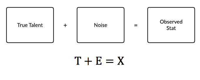
The concept of reliability comes from the classical test theory designed for psychological, research, and educational tests. The classical test theory uses the model of a true score, error (or noise) and observed score. [2]

CTT_EQUATION_diagram

To adapt this to baseball, the true “score” would be the true talent level we are seeking to find, and observed “score” is the actual production of a player. Unfortunately, the true talent level can’t be directly measured. There are several methods to estimate true talent by accounting for different factors. This is, to an extent, what projection systems try to do. For our purposes we are defining the true talent level as the actual talent level and not the value the player provides adjusted to park, competition, etc. The observed score is easy to measure, of course — it’s the recorded outcomes from the games the player in question has played. It’s the stat you see on our leaderboards.

The error term contains everything that can affect cause a discrepancy between the true score and the observed score. It contains almost everything that affects the observed outcome in the stat: weather, pitcher, defenses, park factors, injuries, and so on. This analysis isn’t interested in accounting for those factors but rather measuring the noise those factors in aggregate impart to our observed stat.

Read the rest of this entry »


Modeling Salary Arbitration: Stat Components

This post is part of an ongoing arbitration research project and is coauthored by Alex Chamberlain and Sean Dolinar.

April 24: Modeling Salary Arbitration: Introduction

Feb. 25: 2015 MLB Arbitration Visualized

* * *

A couple of weeks ago, we introduced a couple of regressions that modeled arbitration results using a basic formulae predicated on wins above replacement (WAR). Ultimately, the models estimated that an arbitration-eligible pitcher could expect his salary to increase by 14 percent, and his raise in salary to increase by 56 percent, for each additional WAR. A hitter could expect increases of 13 percent and 46 percent, respectively.

The models, however, were incomplete: they did not incorporate any other stats aside from WAR. This was by design, as we wanted to introduce simple one-variable equations for the sake of demonstration. WAR is, conveniently, a comprehensive variable that attempts to summarize a player’s worth in one easily digestible number. But what about the effects of a player’s age or arbitration year?

Moreover, the r-squared statistic — a quick-and-easy check of a model’s validity — for each specification is not especially strong, clocking in anywhere between .30 and .56. This is partly a result of specifying only one explanatory variable, so including more variables — which we have done in this post — should improve the goodness of fit of the models, assuming the variables are relevant.

With that said, we have new-and-improved models to share with you: one comprised of composite statistics and another comprised of traditional statistics. They are all vanilla, linear ordinary least squares (OLS) regression models, and it is important to remember that the values for each stat can only be used in the context of that specific model.

Non-Traditional Statistics

For each player, we specify…

  • a composite statistic, such as wins above replacement (WAR) for batters and RA9-WAR for pitchers, to measure overall performance (RA9-WAR uses runs allowed per nine innings rather than FIP);
  • a service statistic, such as plate appearances (PA) and innings pitched (IP), to measure playing time;
  • a “glory” statistic, such as home runs (HR) and saves (SV), to account for baseball’s affinity for traditional statistics and social constructs;
  • arbitration year (for pitchers*), indicating a player’s total service time;
  • and his age (for hitters*), to measure as best we can the number of years for which he has inhabited the earth.

We identify these particular stats not only to cover as much analytical ground as possible but also minimize the use of stats that have high correlation among themselves (multicollinearity). We want to isolate different aspects of player performance or value as best we can.

Read the rest of this entry »


A Visual Look at Defensive Metrics

As we move into May and people start to check our WAR leaderboards, there will inevitably be a discussion about why certain players rank highly, especially if they aren’t putting up big offensive numbers. Most of the time, that discussion revolves around the player’s defensive value; For example, last August, Alex Gordon sat on top of our WAR leaderboards, which generated a fair amount of controversy at the time.

Here at FanGraphs, we use Ultimate Zone Rating (UZR) as the fielding component of WAR. UZR is one of two defensive run estimators we host here on the site, the other being Defensive Runs Saved (DRS). Both metrics go beyond traditional fielding stats using the same Baseball Information Solutions (BIS) data set to assign runs to players by dividing the field into different areas and then comparing each play to a league average. At FanGraphs, we don’t have UZR values for catchers or pitchers, so those positions are simply removed from any data visualizations in this post. We also have great library entries that go over the minutiae of the metrics better than I can in this post.

Read the rest of this entry »


A Look at Statcast’s Broadcast Debut

Last night’s broadcast of the Cardinals and Nationals game debuted live, in-game Statcast enhanced graphics and replays. Statcast is the next-generation player tracking technology that combines both optical and radar measurements promising to create new ways to quantify previously unmeasurable aspects of baseball. The hype leading up to this game was billed as historic, and here at FanGraphs, we even had a special edition of the After Dark Live chat to cover this momentous occasion.

If you were expecting something earth-shattering from Statcast, once you began to watch the game you were probably disappointed at the slow start. If you were unable to watch the broadcast, no need to worry, because all the important replays from the broadcast were posted on Major League Baseball’s site, and I’m about to review and critique the different elements of the Statcast presentation.

First, before analyzing specific images and gifs from the game, MLB Network appeared to treat this as a normal broadcast using Statcast to augment their broadcast, not define it. 90% of the broadcast contained traditional camera angles, graphics, replays, and other broadcast elements. When Statcast was used, it was to produce enhanced replays and player positioning. There weren’t graphical overlays over live-game action aside from a few pre-pitch positioning graphics. ESPN currently has more detailed graphics for live-action pitch tracking with their K-Zone graphical overlay.

Read the rest of this entry »


Investigating the Idea of Scarce Right-Handed Power

I want to put to rest the discussion about the lack of right-handed power in Major League Baseball today. There has been a lot of anecdotal commentary about how scarce right-handed power has become, but there haven’t been too many analytical articles supporting this idea. If anything, the handful of articles that have been written question if the problem even exists in the first place. There are two different arguments about this topic: the first is that right-handed power is scarce — that is to say left-hand power is bountiful — but right-hand power is not, while the second argument, which I won’t address today, is that relative to left-handed power hitters, right-handed power hitters have declined in number.

In a hypothetical choice between players of equal talent, you would almost always prefer a left-handed power hitter to a right-handed power hitter, since the lefty will have the platoon advantage more often and should be more productive as a result. There are valid arguments concerning rounding out line-ups, but right-handed batters are not scarce; good left-handed hitters are actually the scarce commodity.

For reference, the general population is estimated at having a left-handed rate of 10%, while baseball has a left-handed rate among batters is about 33%; lefties are overrepresented in baseball.

This is a box plot of the various player-seasons from 2010 until 2014. I’ve chosen this time span since it’s recent and it falls after the implementation of PITCHf/x, which improved the measurement of the strike zone. I’ve excluded switch hitters for simplicity, and set a floor at 200 plate appearances.

2010-2014 Single Season HR

Read the rest of this entry »


BABIP and Year-to-Year Offensive Fluctuations

As we anticipate the start of the 2015 Major League Baseball season, we begin to speculate about player performance in the upcoming season. While most players are somewhat consistent year-to-year, there are some who have either breakout years or terrible seasons. These extreme years are a confluence of events throughout the season such as player health, skills peaking, and luck — which can be partially captured by BABIP.

To find the seasons with the greatest offensive output changes, I calculated year-to-year changes for players from 2000-2014 in a handful of offensive statistics: WAR, OPS, BABIP, and HR. Since playing time can fluctuate because of injury or being a rookie, I eliminated comparisons of seasons that a player had a high discrepancy in plate appearances.

To visually compare the seasons, I used slope graphs to show the year-to-year changes in the various statistics. Each graph is limited to players in the sample who had the largest changes in both the positive and negative directions. The left end of the line represents the player’s statistic in one year with the right end of the line representing the following year. A steeper the slope indicates the largest change between two years.
Read the rest of this entry »