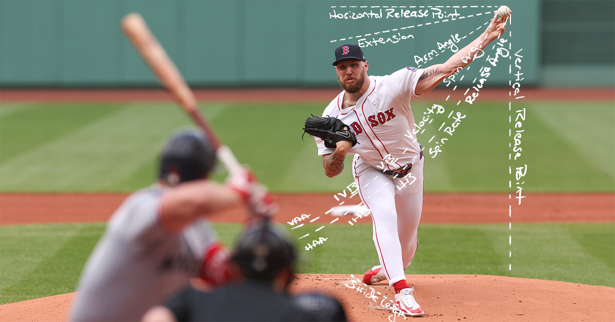
One morning, about two weeks ago, a YouTube video made me feel like I was asleep at the wheel. Ethan Moore, a former analyst with the Rockies and the Reds, had posted a video titled “Every Baseball Analyst is Missing Something Important.” I’d like to consider myself a baseball analyst, and it sounded like I might be missing something important. And so I clicked to see what that might be.
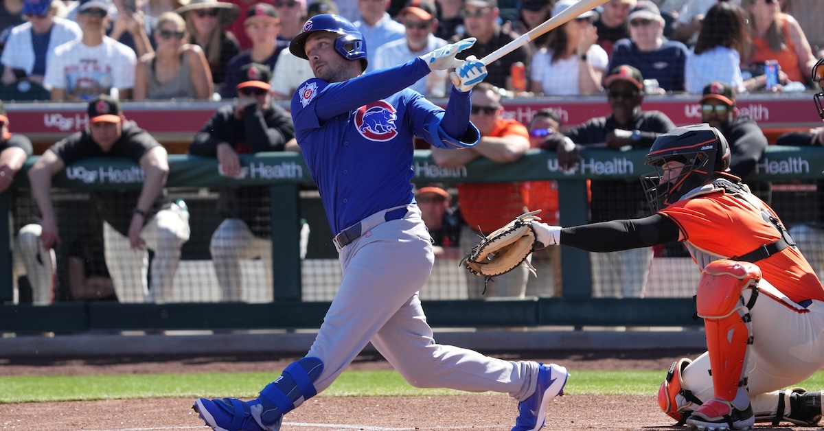
Over the span of 36 minutes, Ethan broke down a total of three pitches, all of which were thrown by Nolan McLean to Pete Crow-Armstrong in the second inning of a late September game between the Mets and Cubs. He used this plate appearance to illustrate his central claim: There is so much happening in the handful of milliseconds between the release of the ball and the swing of a bat, and that the psychology of the hitter — conscious thoughts, subconscious expectations, muscle memories — dictates the decision of when to swing, and where, and how hard. As Ethan put it, “When the ball is in the air, on the way to the plate, what is actually happening in the mind and the subconscious brain of the hitter?”
It reminded me of another video I saw a bit earlier in the spring. It featured Vinnie Pasquantino, before he captained Team Italy in the WBC, wearing a microphone during a live batting practice session against his Royals teammate Steven Zobac. It’s meant to be a short and funny clip, and it is both of those things, but I just kept thinking about Pasquantino’s subconscious. Read the rest of this entry »
In the new season’s early going, the challenge system has been all the rage across the majors. If you don’t believe me, you can read ESPN’s coverage of it, or The Athletic’s, or MLB.com’s, or … well, you get the idea. The coverage has been extensive and positive, and I couldn’t agree with its enthusiasm more. I love the new system, and I’m also really excited to think about challenges in general. There are so many fun angles to consider. So here’s the math nerd’s take on what challenges have looked like so far, and what I’m most interested to learn about them moving forward.
How I’m Thinking About Challenges
Every time a strike or ball is called, there’s an opportunity for a challenge, at least so long as the relevant team has one remaining. That makes it easy to measure the prospective value of a challenge on any given pitch: It’s worth however much flipping the result of that particular pitch would change the game situation in the challenging player’s favor. All we have to do is figure out how many runs were likely to score in the inning in each case and compare the two. Read the rest of this entry »
I’ve been doing a lot of looking at depth charts this week. All of us FanGraphs writers have – these positional power rankings don’t write themselves. When you look at the majors through this lens, you’ll naturally do a lot of thinking about floor and ceiling. The Yankees are playing who at third base? The Brewers are getting how much WAR by avoiding weak spots? The Red Sox have that many outfielders?
I’ve written someteamoverviews this winter. In them, I make the following claim: “Building a team that outperforms opponents on the strength of its 15th to 26th best players being far superior to their counterparts on other clubs might help in the dog days of August, when everyone’s playing their depth guys and cobbling together a rotation, but that won’t fly in October.” The converse of that claim – that stars matter disproportionately in October – is part and parcel of this depth argument. But is that true?
Some might say that the best time to answer this question is when the playoffs are just around the corner. I’d counter that those people haven’t just spent seven hours staring at a pile of acceptable-but-not-overwhelming third base and starting pitcher options and trying to write something about each one. So in the spirit of doing anything other than looking at power rankings, I decided to test out this assumption. Read the rest of this entry »
If you spend some time poking around the nooks and crannies of FanGraphs, you’ll eventually encounter one weird thing. Go to our Depth Charts Team WAR Totals page, and you’ll see all 30 teams arranged by the amount of WAR we project them to accrue this season. Go to our Projected Standings page, and you’ll see the winning percentage we expect for each team. Sometimes, those two pages seem to be displaying the exact same information. Sometimes, they don’t quite line up.
Take right now, for instance. We project the Padres for 40.8 WAR, the Giants for 38.7 WAR, and the Diamondbacks for 38.2 WAR. Look at the projected standings, however, and we have the Padres down for a .490 winning percentage, the Giants at .504, and the Diamondbacks at .501. That doesn’t feel right. Shouldn’t the team with the most projected WAR also project for the best record? Well, buckle up, because to explain how this works, we’re going to have to do some math.
We’ll break this one down into two parts. First, what does a team WAR projection mean? Most basically, it’s the sum of each player on that team’s WAR projection, but we’ll have to get more specific than that. Our projection systems can spit out a WAR, but that’s not their real output. They project actual on-field baseball results. Manny Machado’s Depth Charts projection is for 644 plate appearances, 28 doubles, 26 homers, 127 strikeouts, and so on. The WAR part of it gets calculated after the fact. Read the rest of this entry »
Earlier this week, I wrote about the cost of a win in free agency. I loved seeing the discussion of that article online and in the comments section, so I thought I’d set aside some time to consider a few of the questions readers had. Here are my answers to those questions.
What if We Used More Tiers?
If three tiers is good, would four be better? Five? Six? In my initial analysis, I ran all these variations in the background and decided that three was optimal for presentation and clarity. I also determined that the sample sizes would get vanishingly small as we expanded to more and more tiers. But as several readers asked for more granular looks, why not? Here is a four-tier version:
What are teams paying for a win in free agency? Earlier this month, I answered a FanGraphs Weekly Mailbag question about that very issue, outlining a rule I’ve been using in formulating my contract predictions. I left my explanation loose and vague because it was one of four questions in a mailbag, but to give you the general gist, I think about free agent salaries on a graduated scale, with role players being paid less per win above replacement than superstars. Today, I’d like to back up my argument with a bit more mathematical rigor.
One of the benefits of writing for FanGraphs is that smart baseball thinkers read the site. I woke up last Monday to a direct message from Tom Tango, MLB’s chief data architect. Tango had a few suggestions for further research, a method for adjusting past years of data for current payroll situations, and even a link to a discussion of the cost of a win with Sean Smith. Smith, better known as Rally Monkey, is the creator of Baseball Reference’s calculation of WAR – when you see rWAR, that actually stands for Rally WAR, not Reference WAR. In other words, I got help from some heavy hitters.
With Smith’s excellent article on free agency as a guide, I built my own methodology for examining the deals that free agents receive and turning them into a mathematical rule. I took every starting pitcher and position player (relievers are weird and should be modeled differently due to leverage concerns) and noted their projected WAR in the subsequent season, as well as the length and terms of their contract. I excluded players who signed minor league deals, were projected for negative WAR, or whose contract details were undisclosed. To give you a sense, applying this approach to the 2025-26 offseason leaves us with 89 players, from Kyle Tucker all the way down to Jorge Mateo. Read the rest of this entry »
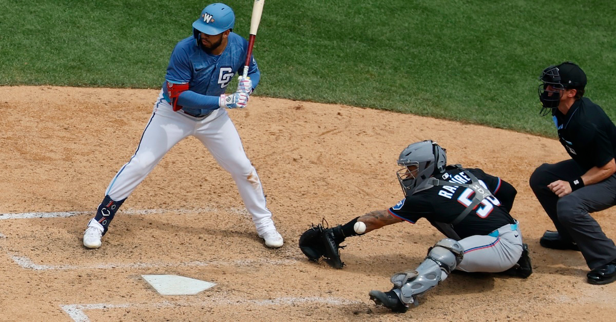
On Monday, Michael Rosen wrote a fun article about catcher blocking. He didn’t just write about it; he created his own blocking metric from scratch in order to grade every catcher in the game and to understand how much value a single block or passed ball can carry. The whole article is excellent, but one piece in particular caught my eye. Michael put together a supercut of Agustín Ramírez’s passed balls, all of which shared a theme. They weren’t the pitches in the dirt that you’d expect to end up as passed balls. They were normal pitches on the edges of the zone, ones that Ramírez tried so hard to frame them that he ended up missing them entirely. Michael drew the obvious inference: His framing focus, I believe, may have led to some of these inexcusable passed balls. At the risk of piling on, here are the pitches in question:
I’m so sorry, Agustín. This is brutal, and it makes Michael’s point very bluntly. It also makes me wonder about the relationship between the framing skill and the blocking skill. Does selling out to be a better framer hurt your blocking? Clearly, it can and at least sometimes does for Ramírez, but it still doesn’t strike me as a particularly likely hypothesis overall. Moreover, even if framing does hurt your blocking, the trade-off would certainly be worth it. Read the rest of this entry »
In his pitch models piece, Davy outlined in four bullet points what happens when one team gains an edge over the others:
Teams realize the immense value of a skill.
An arms race ensues as they scramble to cultivate it.
The skill becomes widespread across the league.
Since the skill is more evenly distributed, it loses much of its value.
“The second we gained the ability to calculate the value of catcher framing, everybody started working on it,” he wrote. No longer was Ryan Doumit allowed to work behind the plate once it became clear he was capable of leaking 60 runs of value in a single season. Davy produced this helpful plot to demonstrate this convergence of catcher framing value, the Competitive Advantage Life Cycle in action:
All the teams are smart now. Even the Rockies might be smart! Even in areas that ostensibly look like pockets of inefficiency — reliever contracts, for example — there is likely some sort of internal justification for the behavior. Once something can be quantified, the serious outliers disappear. Right?
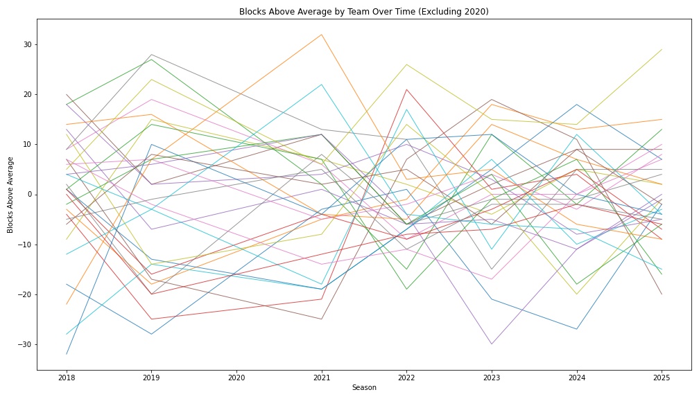
Maybe not quite. Three years ago, catcher blocking statistics surfaced on Baseball Savant, though teams surely were measuring this skill internally for years prior to its public introduction. Has there been a general convergence in the years since? To some degree, yes. Here is the blocking equivalent of Davy’s plot, with Savant’s “blocks above average” metric on the y-axis. There isn’t a clear clustering trend like in the framing case, but the middle of the pack appears a touch tighter.
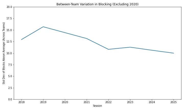
Measured as the standard deviation between teams, the trend is a little clearer. Slowly but surely, teams are beginning to converge.
But the catcher blocking revolution is a tentative one. While it’s moving in the right direction, it’s too soon to say the arms race is fully on. To wit: Last year was the worst catcher blocking season in recorded history.
Though Savant introduced the metric publicly in 2023, they have in the years since provided data going back to 2018. Between 2018 and 2025, there were 538 qualifying catcher seasons. Agustín Ramírez’s -28 blocks below average last year ranked 538th among that cohort. It should noted that blocks above average is not a rate stat; he did all that in just 73 games behind the dish.
The slower convergence on blocking is, I think, understandable. Of all the things a catcher does, it’s among the least sexy. Framing, naturally, has received most of the attention from analysts over the last decade or so; it tends to comprise the plurality of catcher defensive value, even in this phase of the Competitive Advantage Life Cycle. Throwing runners out, meanwhile, gets the most love on broadcasts, and it’s the easiest to spot.
Blocking sort of falls between those two catcher activities. It’s somewhat visible, but the difficult blocks happen relatively infrequently. And the value is muted: Savant estimates each block above (or below) average grades out to a quarter of a run. Even Ramírez’s record-breaking season, then, only resulted in -7 runs of blocking value. By comparison, it isn’t all that remarkable to lose seven or more framing runs; eight catchers bested (worsted?) that mark in 2025 alone.
Additionally, there is not much blocking discourse. What distinguishes a good block from a great block? How much is a block worth? Who is the best at this skill? I don’t think there is a common consensus on these questions.
Defined as it is by Savant, blocking is, in some sense, the fundamental task of catching. Only a subset of all pitches are potentially “framable.” Catching a runner stealing is even less common. But on nearly every single pitch, the catcher must catch the ball. It’s right there in the name! Catcher!
For a full-time catcher, that comes out to tens of thousands of pitches in a single season. Perhaps you are saying, ‘OK, how many of those are actually hard to catch?’ I submit that they all are; professional catchers just make it look easy. Imagine a moderately athletic young person was thrown into a game to catch for nine innings. They’d miss hundreds of pitches. To catch in the major leagues, you cannot miss hundreds of pitches. You need to catch them all.
Compared to the general population, Ramírez is an amazing catcher. He saw thousands of pitches with crazy velocity and mind-bending spin and caught nearly every one. But he did not catch them all. In fact, he made a mess of many catchable pitches in the 2025 season. On Savant, the “blocks above average” statistic is described thusly:
Every pitch is assigned a probability of being a passed ball or wild pitch based upon several inputs, most notably: pitch location, pitch speed, pitch movement, catcher location, and batter/pitcher handedness. Based on that knowledge, each pitch a catcher receives (or fails to) is credited or debited with the appropriate amount of difficulty. For example, if a catcher blocks a pitch that is a PB + WP 10% of the time, he will receive +0.10. If he blocks a pitch that is a PB + WP 90% of the time, he will receive +0.90.
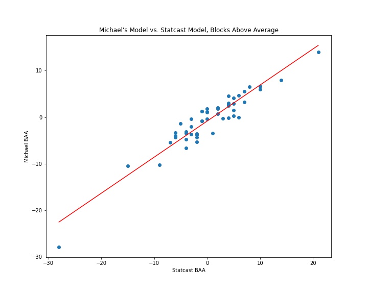
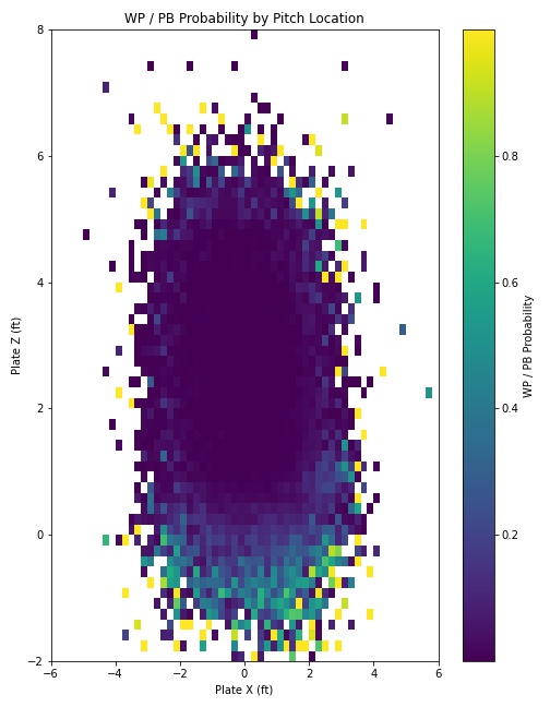
I wanted to better understand what this looked like in practice, so I tried to recreate the Statcast model from scratch and apply it to all the pitches in the 2025 season. I was not privy to some of the inputs of the Statcast model, such as the positioning of the catcher, and my physics knowledge was not robust enough to calculate where a spiked pitch intercepted the ground, as Tom Tango did in this explainer post.
What I do have access to, however, is Python, and a just-good-enough knowledge of machine learning techniques. I started with pitch location, release position, pitch movement, and velocity as my predictor variables. At first, it was terrible. But after some trial and error, I landed on a CatBoost framework, and the resulting model came surprisingly close to reproducing Tango’s model. While it slightly underrated the likelihood of wild pitches, it nonetheless correlated nearly identically with the Savant leaderboard at the individual catcher level (0.9 r-squared).
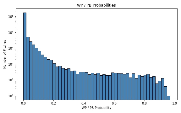
Once I had a good-enough approximation, I set out to better understand the spectrum of wild pitch/passed ball probabilities. Out of nearly 200,000 pitches with runners on base in the sample, just 198 graded out as both a) having a less than 1% chance of being a wild pitch or passed ball, and b) ultimately becoming a wild pitch or passed ball. Here is the general distribution:
Of those 198 extremely unlikely passed balls/wild pitches, 12 can be attributed to Ramírez himself. Funnily enough, he actually graded out as a roughly average framer. But his framing focus, I believe, may have led to some of these inexcusable passed balls. Apologies to the man, but I compiled a reel of his lowlights that can be seen below:
(There is hope yet for Ramírez. Shea Langeliers finished with -26 BAA in 2024; his framing declined in 2025, but his blocking graded out as bang-on average.)
One way to lose lots of blocking value is to whiff on these sorts of catchable offerings, but catchers can make up ground by smothering difficult pitches. Here’s the best block of the year, according to my model, which gave Austin Wells just a 14% chance of corralling this splitter. Leverage isn’t considered here, but it must be noted that this block literally saved the game; the Yankees went on to win in 11 innings:
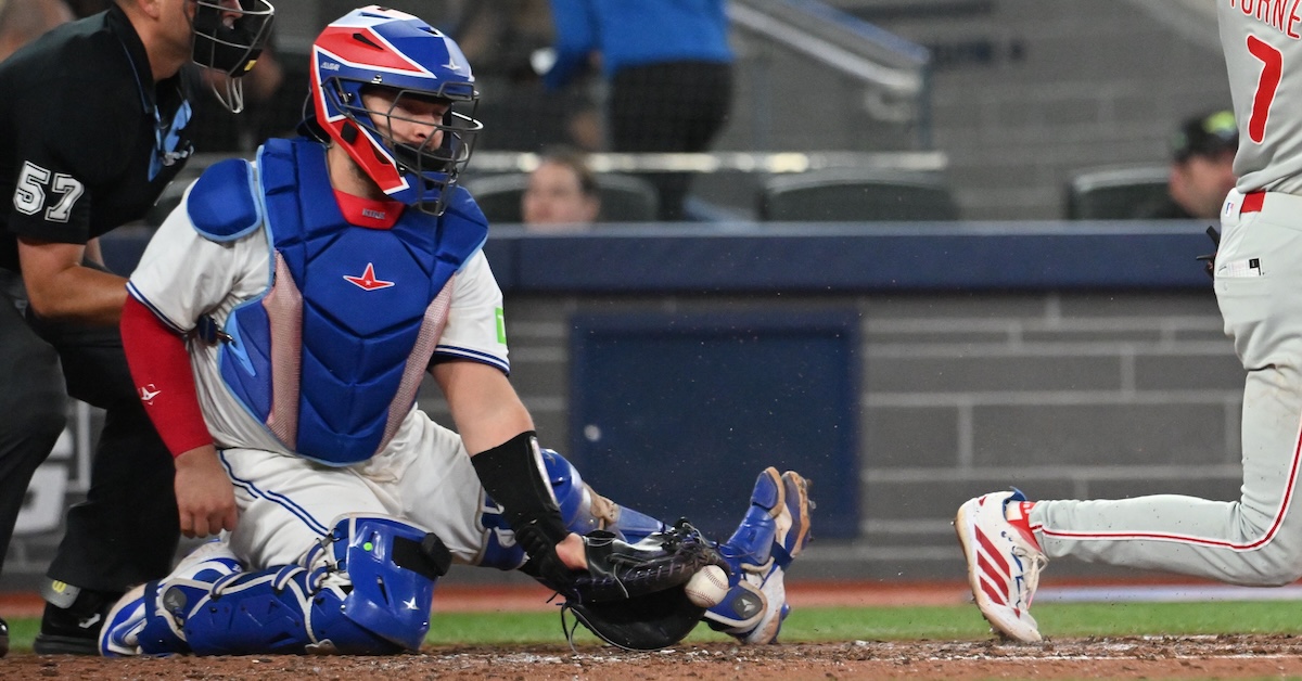
Wells is a decent blocker, but he is far from the best. That honor goes to Alejandro Kirk, who excels not just at limiting mistakes, but also wrangling unruly breaking balls in the dirt. As this plot shows, the highest probability wild pitches/passed balls live down there:
Kirk is able to smother these types of pitches better than anyone in the league. Watch him make easy work of this 89-mph knuckle-curve in the dirt:
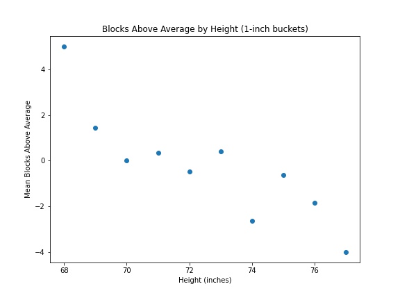
One thing to know about Kirk: He’s short (for a baseball player, anyway.) He’s got a low center of gravity, and he gets down to block those pitches. Does being short help you succeed at blocking? It seems like there’s at least some evidence that’s the case:
For now, Kirk is the reigning king of blocking, and Ramírez its court jester. Give it a few years — say, by 2030 — and blocking will likely find itself in the same place as framing, eliminating itself of Doumit-y characters, anything that reeks of serious lost value. All the mess gets filtered out eventually. As of now, we find ourselves in a purgatorial phase of the Competitive Advantage Life Cycle. Enjoy the imperfections while they last.
Thanks to Stephen Sutton-Brown for technical assistance.
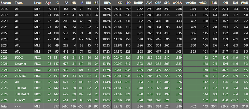
How much WAR does FanGraphs project Ronald Acuña Jr. for in 2026? It’s a really straightforward question. It should be especially straightforward now that all of our projections are out. But as it turns out, it’s less clear cut than it sounds at first, and clarifying it has two benefits. First, it’ll help you better understand our projections. Second, it’s fun to play with math. So buckle up: We’re doing arithmetic.
First, let’s settle on what the “FanGraphs projection” even is. Here’s the relevant section of Acuña player page:
Eight projections, each with tons of numbers. That’s a lot! But when I say the “FanGraphs projection,” I’m referring to the first green row, the FanGraphs Depth Charts projection or FGDC. That’s the top-line projection we use anywhere on the website that pulls in projections to make predictions. When you see “2026 (Proj),” it’s using that number unless otherwise stated.
That’s settled then, right? We’re projecting Acuña for 5.4 WAR. Why did I have to waste your time with an article about it? It has to do with how we make that projection, a process you’re about to learn about, probably in more detail than you wanted. Read the rest of this entry »
Before we get started, I need you to promise to hold on until the end here. I have buried the lede. The crux of this article is in the last two graphs, all the way at the bottom. I put them there on purpose because I want the data to tell you a story, so I need you to see this story through to the end. I think it’s worth it.
Last Tuesday, Ben Clemens wrote an article titled, “They Don’t Make Barrels Like They Used To.” Sadly, it was not a scathing takedown aimed at the shoddy craftsmanship of modern-day coopers. It documented the steady decrease in the value of barrels over the course of the Statcast era. In 2025, barrels were worth roughly 250 fewer points of wOBA than they were in 2015. That’s a staggering loss – the entire career wOBA of Pepe Frias up in smoke – and Ben broke down several culprits for the theft, along with one other factor: intention. “Tell hitters that barrels get them paid,” Ben wrote, “and they might start to change their behavior in a way that produces less valuable barrels, squared up to center field or in other ways that are easier to produce but less likely to land safely.” He attributed this to Goodhart’s Law: “When a measure becomes a target, it ceases to become a good measure.”
This law has a sports-specific corollary that you’re probably familiar with. I’ve previously referred to it as the Competitive Advantage Life Cycle in the context of catcher framing:
Teams realize the immense value of a skill.
An arms race ensues as they scramble to cultivate it.
The skill becomes widespread across the league.
Since the skill is more evenly distributed, it loses much of its value.
The second we gained the ability to calculate the value of catcher framing, everybody started working on it. The terrible framers either got better or got run out of the sport. Players who were excellent at framing but worse at other parts of the game suddenly found more playing time because their skills were appreciated. Lastly, as the average framing level rose, the rest of the league started catching up to the very best framers. This graph is three years old now, but it shows that convergence very clearly.
The terrible framers are gone, and the great framers don’t stand out as much as they used to. Everybody’s a bit closer to the new, tougher standard, so framing is more important than it’s ever been, but also less valuable. All this got me thinking about one of the oddest measurement tools we have these days: pitch modeling. Read the rest of this entry »