Further Adventures In Starting vs. Relieving
Last week, I investigated the changing performance of starters relative to relievers. There’s nothing too crazy about that — FanGraphs is a baseball analysis website, after all, and the starter/reliever divide is a rich topic for analysis. I have to confess, though, that the reception of the article was pretty exciting for me. You see, I got into baseball statistics when a friend recommended The Book to me, and there was Tom Tango, writing about my piece.
Aside from making me feel validated, Tango went over a few methodological improvements I could make to strip a little more noise out of the data. That, in essence, is what all of this analysis is doing — removing noise piece by piece, hoping to find the sweet, sweet signal underneath it all. In my initial article, I covered three topics: pitchers the first time through the order, starters vs. relievers but only using good pitchers, and swingmen. Today, I’d like to look at each of the three with a slightly different aim.
First, let’s talk about performance the first time through the order. Focusing on this consistent set of data (first time through the order, batters 1-7) for both starters and relievers lets us strip out distributional effects from starter workload changes. Merely looking at these splits, however, left out one key factor: home vs. away performance. Mitchel Lichtman has found that home field advantage isn’t a constant — it’s highest in the first inning. Road batters have a pronounced disadvantage relative to home batters in the first inning, which fades away somewhat afterwards. Credit it to having to hit cold, or go the other way and say that road starters are off their game in the first inning, but it’s worth exploring home and away splits to see if there’s anything there.
To handle this, I looked at starter and reliever performance in away games. Even with halved sample sizes, our data is still pretty robust — 17,000-ish batters faced per year for starters. 2019 is going to be significantly noisier, with only 4,400 plate appearances so far, but that’s the price of slicing more finely. So, do we still see the past two years as a significant step forward for starters as the past two years of overall data show?
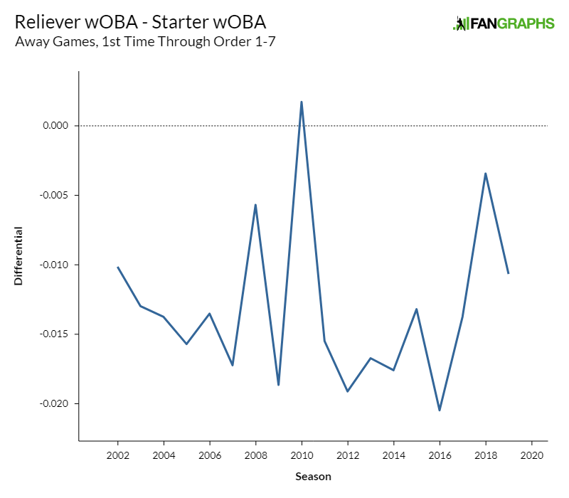
Hmm. With the caveat that the 2019 point has a larger margin of error than the rest, this data looks less promising. 2018 is still a relative weak spot for relievers, but 2019 has moved back to the pack, and that’s not even addressing those weird blips in 2008 and 2010. Let’s look at the data again, this time adding in home and overall wOBA differential.
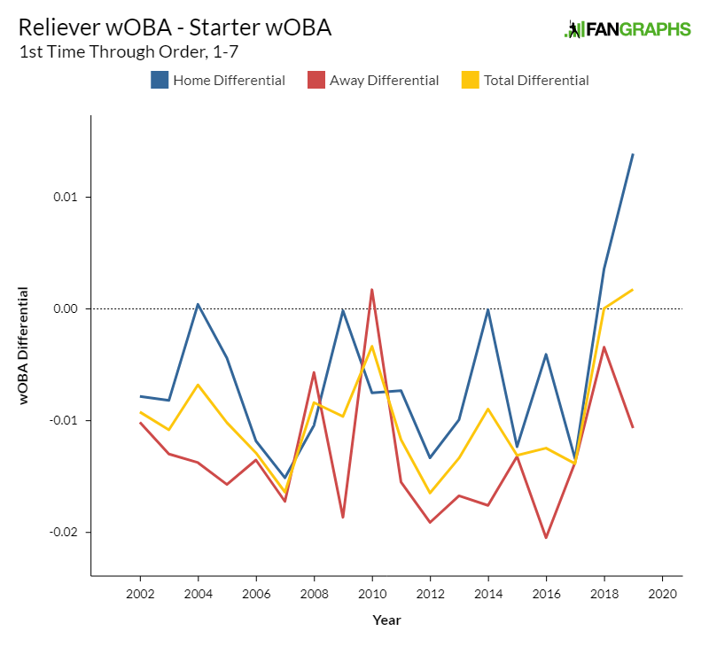
This is marginally more enlightening. Relievers almost always have less of a wOBA advantage when pitching at home, which makes sense given the penalty away batters face in the first inning. Additionally, both split samples look noisier than the overall data, which makes sense given the declining sample sizes. Here’s the data in table form, for those inclined to play around with it.
| Year | Home Differential | Away Differential | Total Differential |
|---|---|---|---|
| 2002 | -0.008 | -0.010 | -0.009 |
| 2003 | -0.008 | -0.013 | -0.011 |
| 2004 | 0.000 | -0.014 | -0.007 |
| 2005 | -0.004 | -0.016 | -0.010 |
| 2006 | -0.012 | -0.014 | -0.013 |
| 2007 | -0.015 | -0.017 | -0.016 |
| 2008 | -0.010 | -0.006 | -0.008 |
| 2009 | 0.000 | -0.019 | -0.010 |
| 2010 | -0.008 | 0.002 | -0.003 |
| 2011 | -0.007 | -0.015 | -0.012 |
| 2012 | -0.013 | -0.019 | -0.016 |
| 2013 | -0.010 | -0.017 | -0.013 |
| 2014 | 0.000 | -0.018 | -0.009 |
| 2015 | -0.012 | -0.013 | -0.013 |
| 2016 | -0.004 | -0.020 | -0.012 |
| 2017 | -0.013 | -0.014 | -0.014 |
| 2018 | 0.004 | -0.003 | 0.000 |
| 2019 | 0.014 | -0.011 | 0.002 |
Okay, so that didn’t clear up much. We’ll need more data this year to say whether home field advantage is changing, but this could certainly muddle up our data. Still, the overall trend is probably pointing up, even if this year is a bit of a confounding variable so far when it comes to home/road splits.
For the next section, I was faced with a difficult experimental design. Last article, I looked at relievers and starters who faced at least 120 batters the first time through the lineup as a proxy for the performances of “good” pitchers, the ones their team wants out there. Tango rightly pointed out, though, that this method runs into some selection bias. Pitchers who get results tend to get more playing time, so my sample ends up biased because a player’s presence on the list implies he started out pitching effectively.
To avoid this pitfall, I used a split-half methodology. I cut every year in half at July 1 and used the first half of the year to select my pitchers. In each year, I selected the 150 starters and 150 relievers with the most total batters faced. I took those pitchers and looked at their second-half results. In this way, I think I was able to work out which pitchers teams trusted the most without letting the first half results mess with my data.
Why 150? Well, that gives each team five starters and five relievers who they truly want out there. This, I think, gets rid of the problem of the back end of the bullpen diluting reliever results while still amassing a sufficient sample. Next, I selected the split I wanted: the 150 highest-workload starters and relievers, the first time through the order. I chose to look at away games to deal with the issue addressed in the first study above, but I could see the merit in looking at home games or overall performance as well just to be a stickler for detail.
That methodological note completed, let’s look at the results. We have, most likely, isolated the effects of Triple-A shuttle relievers who didn’t have a roster spot 10 years ago. How does it look?
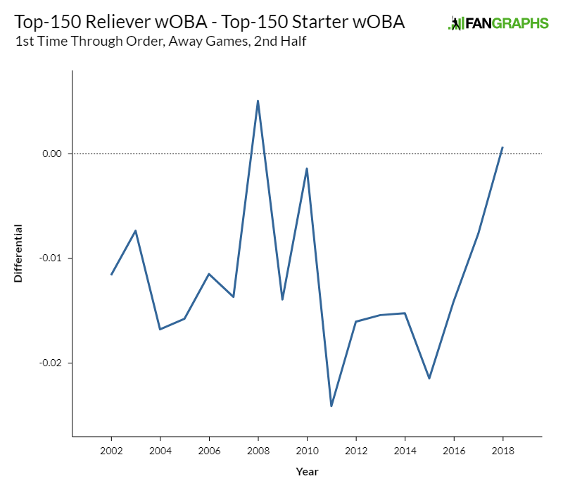
Sigh. Looks like we’ll need to do some interpretation, because this data is again kind of confusing. 2017 and 2018 were both good years for starters relative to relievers, but once again, we’re left to wonder what’s going on with 2008 and 2010? It’s probably not a sample size issue, at least not exclusively — these samples were around 8000 batters a year for each group, which isn’t insignificant. About the only good news is that the 2008 and 2010 spikes were mirrored in the above dataset, so it doesn’t look like we’re introducing new problems into our analysis.
What can we say about these pools? Well, between the years we “care about” — 2017 and 2018 — relievers’ overall advantage over starters declined across the board. On the road, relievers fared worse by 10 points of wOBA. That’s when the relevant trend looks like it started in the overall data. How did the “best” relievers and starters fare between those years? Relievers’ advantage declined by eight points of wOBA. To a large extent, then, the recent decline in reliever performance wasn’t limited to the fringes of the roster. The best relievers were right alongside their more marginal compatriots in terms of losing relative effectiveness.
This data, to me, suggests patience. Could the reliever decline be entirely limited to talent dilution? Sure, maybe. Still, even after stripping out the newly promoted fringe arms, the effect remains. It’s noisy, absolutely. Trying to find an effect like this always will be. Still, the best relievers have less of an advantage over the best starters than they have at nearly another other point this millennium. Theories that ignore that fact are probably missing something. The best course of action is probably to gather more data — 2019 is looking like another good year for starters relative to relievers, so let’s take a peek at these splits again at the end of the year.
There’s one last angle to cover in refining my initial piece. When I looked at swingman performance since 2008, MGL chimed in on Twitter to ask whether swingmen were throwing harder as starters than they used to. This question requires less interpretation and data slicing than our previous two — simply build your population of swingmen and look at their fastballs.
One great thing about looking at velocity is that your sample size issues go away. In this data set, for example, I looked only at four-seam fastballs thrown by pitchers who made 10 starts and 10 relief appearances. I weighted each pitcher’s velocity differential by the lesser of the two pitch counts. If a pitcher threw 200 fastballs in relief and 300 while starting, in other words, I counted that as 200 pitches. Even using this sampling method, I obtained more than a thousand pitches worth of data in every year of the sample, and velocity stabilizes quickly. I’m confident in this data in a way that I’m simply not for some of the skimpier wOBA sample sizes.
With that out of the way, let’s cover a few caveats. I manually stripped out openers in 2018. I ignored knuckleballers entirely — Tim Wakefield’s fastball might be a delight to watch, but it’s not the pitch we’re looking for in this study. With those qualifications out of the way, how do the data look?
| Year | Velo Gain (mph) | Pitches |
|---|---|---|
| 2008 | 1.1 | 2562 |
| 2009 | 0.8 | 2362 |
| 2010 | 0.6 | 1675 |
| 2011 | 0.6 | 1710 |
| 2012 | 1.0 | 1600 |
| 2013 | 0.6 | 2283 |
| 2014 | 0.7 | 2477 |
| 2015 | 1.2 | 2083 |
| 2016 | 0.8 | 3129 |
| 2017 | 0.9 | 2814 |
| 2018 | 1.0 | 3516 |
Well, ugh. Just, ugh. There’s nothing here at all! If starters are really throwing harder knowing that they’ll pitch fewer innings, the effect doesn’t carry over to swingmen. The data on swingmen’s relative improvement as starters is middling at best, and there’s no evidence at all that they’re doing it by throwing harder in their abbreviated starts.
What’s the upshot of all of this data? Starters are still getting better relative to relievers. That’s indisputable. The mechanism for that improvement remains very much in doubt, however. Is it talent dilution? Probably! Still, even the top 150 starters are getting better relative to the top 150 relievers. Are starters throwing harder in abbreviated stints? Maybe! Swingmen don’t seem to be, though. Like a Facebook relationship status, it’s complicated.
Perhaps this is always going to be the result of sifting data with such a fine-toothed comb. There are no slam dunk stories, and no easy narratives. Still, there’s always value in looking, and with the feedback of two esteemed sabermetricians, I think I was able to look a bit more closely this time.
Ben is a writer at FanGraphs. He can be found on Bluesky @benclemens.
Good work honing your study. Small suggestion on the graphs: It would be good to express the Y-axis to 3 decimal places with no leading zero, since that’s how we commonly speak of wOBA. As they are now, it took me a minute to realize that “-0.01” means what we might say out loud as “ten points less of wOBA.”
The issue you’re studying here is interesting by itself, but more so as part of the bigger question:
— Is the shift in workload from SP to RP paying dividends?
Another piece of THAT question is, what’s happening with “3rd-time-thru” results as the number of those keeps falling? This year’s early returns are intriguing:
So far, 2019 has the smallest “3rd-time penalty” in OPS since 1995, in both raw and % terms (+.028, +3.8%). By itself, that would tend to suggest that such matchups are being distributed more efficiently towards the SPs most likely to fare well.
However, there’s a big discord between this year’s data and the recent trend lines.
— The rate of 3rd-time batters has been falling steadily. From the 2014 baseline of 17.7%, each of the past 4 years saw a drop of roughly 1 point, landing at 13.5% last year.
— But those 4 years showed no notable gain in 3rd-time OPS, which stayed between 6.1% and 7.7% above overall OPS.
— 2018 was the SMALLEST ever share of 3rd-time batters, but the LARGEST % gap in 3rd-time OPS vs. overall.
If this year’s data do reflect optimized distribution of those batters towards the better pitchers, it’s very odd to see no sign of such optimization at any prior point in this 5-year trend.
I can’t think of a great way to test this analytically but with starters expected workloads dropping maybe teams have gotten that much more willing to keep guys starting when in previous years they became bullpen aces. There has to be some ever changing and some unknown “optimum” for starters vs. relievers innings and which pitchers are starters and which are relievers that gives a team the best outcomes. Maybe we are getting to the point where we are either past or at least approaching the optimum inning distribution and talent distribution for relievers vs. starters
To me it seems wrong to call it talent dilution but more just how teams are using that talent. Maybe its better to let a pitcher throw 6 innings at a slightly lower performance than 5 at a higher performance if it means easing use of bullpen. This is all more overarching than what these studies are trying to determine, but I still find it quite fascinating that we are at a point where starter ERA’s are almost the same as relievers and just the fact that it can be close goes to show how much the game has changed the last 10 years
Agree with much of your comment. But as to talent dilution, it’s a matter of how you define the term.
There are undeniably many more pitchers now getting regular work with subpar results than just a few years ago. One example: Pitchers with 30+ relief outings and zero bWAR or less:
— 72 last year;
— no more than 56 any other year.
If you study RP usage in various ways, it’s clear that the “fringe” has gotten worse in the last 2 years. “Talent dilution” seems an apt enough term for that.
MLB teams are hitting 9 players, not 7. I get that 8,9 are some sort of weak combination but they are in the order… especially the first two times through. Ignoring them is exactly the problem with overly simplistic analysis – like trips through the order. It is probably not as bad as lumping the 3 and 7 hitter in the same group though.