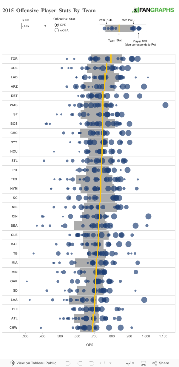
Before the season began I made an interactive graphic showing the on-base plus slugging percentage (OPS) of our Depth Charts projections for each team. Since the season is almost over and players’ offensive output stats won’t change much between now and October 4, I remade the interactive visual using the player’s 2015 OPS and weighted on-base average (wOBA).
The original Depth Charts projections use a combination of ZiPS and Steamers for OPS and wOBA. The original chart from March is at the bottom of the page for reference. Projections — the expected performance of a player — should fall in the middle of the possible performance spectrum, so the season results will have more spread than the projections do.
The visualization shows each player’s OPS or wOBA as a circle with the size of the circle corresponding to plate appearance. The gray box and yellow line represent summary information about the team. The gray box brackets the middle 50% of players on each team and the yellow line is the team OPS or wOBA. Please note this isn’t the average or median OPS or wOBA but rather how the team performed on the aggregate. Together these elements create a psuedo boxplot.
There isn’t much surprising in the visualization. Bryce Harper is quite the outlier for both OPS and wOBA, and the Blue Jays top the charts as a team. The original visualization with the projections from March are below.
You Aren't a FanGraphs Member
It looks like you aren't yet a FanGraphs Member (or aren't logged in). We aren't mad, just disappointed.
We get it. You want to read this article. But before we let you get back to it, we'd like to point out a few of the good reasons why you should become a Member.
1. Ad Free viewing! We won't bug you with this ad, or any other.
2. Unlimited articles! Non-Members only get to read 10 free articles a month. Members never get cut off.
3. Dark mode and Classic mode!
4. Custom player page dashboards! Choose the player cards you want, in the order you want them.
5. One-click data exports! Export our projections and leaderboards for your personal projects.
6. Remove the photos on the home page! (Honestly, this doesn't sound so great to us, but some people wanted it, and we like to give our Members what they want.)
7. Even more Steamer projections! We have handedness, percentile, and context neutral projections available for Members only.
8. Get FanGraphs Walk-Off, a customized year end review! Find out exactly how you used FanGraphs this year, and how that compares to other Members. Don't be a victim of FOMO.
9. A weekly mailbag column, exclusively for Members.
10. Help support FanGraphs and our entire staff! Our Members provide us with critical resources to improve the site and deliver new features!
We hope you'll consider a Membership today, for yourself or as a gift! And we realize this has been an awfully long sales pitch, so we've also removed all the other ads in this article. We didn't want to overdo it.
In case you didn't read all that, here's the short version. Membership includes:
NOTES: The 2015 stats are current as of 10/1/2015 and I limited the players to a those who had a minimum of 50 PAs. The player stats are also broken up by team, so a player traded mid-season will have stats for two or more teams.
I am pretty sure the AL MVP had more than 50 PA for Toronto this year. Not sure why he does not appear in this view, but it makes me question what else was dropped off.
Graham
11 years ago
Ummm … Josh Donaldson? Is he off the first chart to the right or something?
Harper, Votto, Trout: being on a island all by oneself.
Must suck to be that good on a sub-par team.
dilettante
11 years ago
Request: same kind of graph, but with averages/percentiles for league stats rather than for team states. Team lines are great, but seeing them relative to league states would be awesome.
Omar Infante
11 years ago
Remember when I almost started for the AL All-Stars.
Jason
11 years ago
Funny to see Min and LAA both near the very bottom, as they are both fighting for a playoff spots in the AL.


Offensive player stats, indeed.
Trayce though!
I am pretty sure the AL MVP had more than 50 PA for Toronto this year. Not sure why he does not appear in this view, but it makes me question what else was dropped off.
Ummm … Josh Donaldson? Is he off the first chart to the right or something?
Aaaaaaannnnd …… fixed.
Looks like Harper has escaped the Nats’ gravitational field.
Blast off. Blast off to no where.
Harper, Votto, Trout: being on a island all by oneself.
Must suck to be that good on a sub-par team.
Request: same kind of graph, but with averages/percentiles for league stats rather than for team states. Team lines are great, but seeing them relative to league states would be awesome.
Remember when I almost started for the AL All-Stars.
Funny to see Min and LAA both near the very bottom, as they are both fighting for a playoff spots in the AL.