FanGraphs Lab Updates: Squared-Up Explorer and Hot Streak Tool
We’ve made two major updates to the FanGraphs Lab. Below, you’ll see an overview of the new capabilities. You can also see a list of all of the Lab upgrades and bug fixes, minor and major, here. Sean has been busy elsewhere, too, which you can read about here.
Squared-Up Explorer
The initial iteration of the Squared-Up Explorer used a pre-calculated dataset to handle the extensive transformations that take a raw set of batted ball data and turn it into an interpolated chart. We used that method to get the tool in front of people as quickly as we could, but the long-term goal was always to connect to the main FanGraphs database to allow more years of data, finer slicing, and increased flexibility across the board.
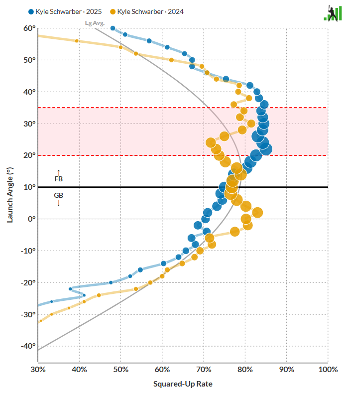
Sean and David Appelman built the necessary tools to handle the data processing in the background, before it ever hits Squared-Up Explorer. That expanded the capabilities of the tool significantly. Sean and Ben then rebuilt the user interface with the new capabilities in mind. Want to see how Kyle Schwarber hit for so much more power in 2025 than he did in 2024? You can compare his swing:
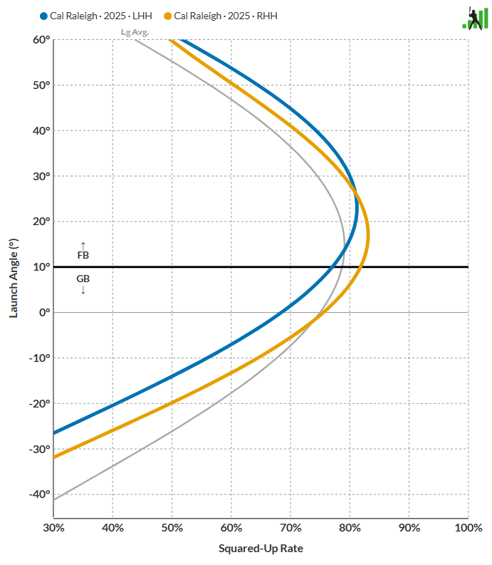
Want to dig into Cal Raleigh’s tendencies from each side of the plate? We’ve got you covered:
Want to look into Michael Harris II’s wild first-half/ second-half splits? It’s as simple as deciding which date ranges you care about. It turns out that your batted ball results will improve if you just square up everything more frequently, and get more balls in the air while you’re at it:
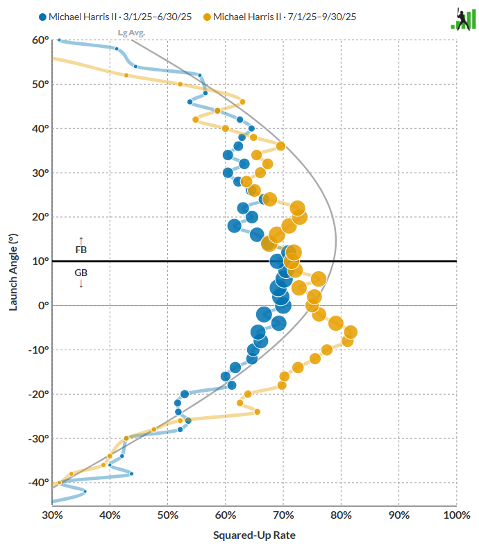
With the new data architecture in place, you can select by batter handedness, pitcher handedness, pitch type, and even time span. Mookie Betts against lefty four-seamers early in the year? Sure thing. Ozzie Albies batting righty against sinkers? You can do that too. You can even compare someone to another player or themselves over a different time period, against a different pitch type, or any permutation of these options.
Slicing up aggregated data into tiny sample sizes like this is definitely going to result in some weird charts. For example, here’s what Aaron Judge did against curveballs in 2025:
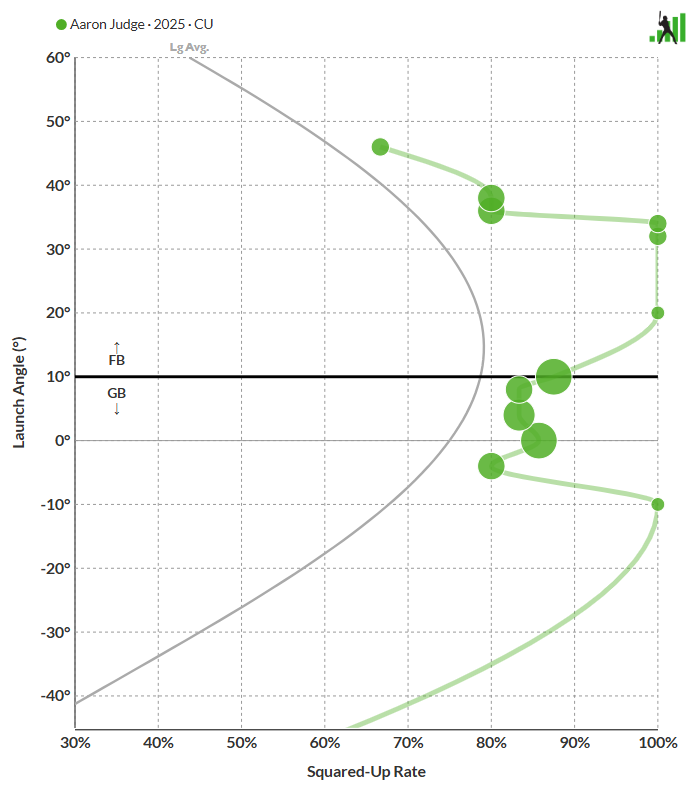
With so few observations, extreme values are bound to happen, like the multiple launch angles where Judge squared up every curveball he put into play. When you split things this minutely, be aware that the resulting charts are descriptive but volatile. There aren’t that many batted balls of separation between 2025 and 2024 here, and yet the charts and interpolated lines look quite different:
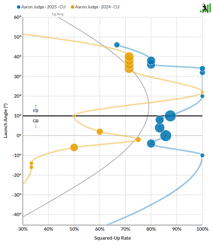
We mention that merely as a word of caution as you interpret results, not to say that you can’t use the Explorer this way. Batters really do have different swing profiles against different pitch shapes, and it’s fun to investigate that visually. Just take the results with a grain of salt, the same way you would with any small-sample baseball dataset. We’ve added a line to the summary statistic table showing the number of batted balls that make up each graph so that you can see for yourself. For example, Judge’s two years of data cover 17 and 18 curveballs, respectively.
We’ve also added a few other upgrades to complement the newly available data. Hovering over a frequency bubble now displays launch angle, squared-up rate, and relative frequency. The interpolation behavior has been updated to change dynamically with the chart orientation. We’ve also added detail to the legends and descriptors to make it easier to see which split you’re viewing. Try it out – we think you’ll like the upgrades.
Hot Streak Tool Update
We received a huge number of feature requests to upgrade our Hot Streak tool, and Sean bundled many of them into a single large update.
Opponent Information
Each game now displays the opposing team, opposing team’s starting pitcher, and that pitcher’s handedness. In addition, the opposing team’s name is a link to that team’s Hot Streak page:

More Stats
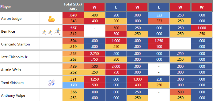
We’ve added wOBA, xwOBA, xSLG, and xBA to the statistics that are available to chart. We’ve also added the ability to display two statistics stacked on top of each other in the same table. Want to see power and contact together? Now you can:
More Context
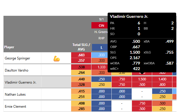
Even when you’re displaying two statistics at once, valuable data could still be missing. Our solution? A tooltip with a detailed line score for each player and game:
More Sortability
Want to see the most recent games first? You can now choose between oldest-to-newest and newest-to-oldest.
That’s the latest and greatest in the FanGraphs Lab. We hope you’ll enjoy trying out these enhancements. And if these tools aren’t quite your speed, stay tuned. We’ll be addressing team strength and pitch pairings in our next release, and we have a few other ideas percolating.