
Fun with WAR Math
How much WAR does FanGraphs project Ronald Acuña Jr. for in 2026? It’s a really straightforward question. It should be especially straightforward now that all of our projections are out. But as it turns out, it’s less clear cut than it sounds at first, and clarifying it has two benefits. First, it’ll help you better understand our projections. Second, it’s fun to play with math. So buckle up: We’re doing arithmetic.
First, let’s settle on what the “FanGraphs projection” even is. Here’s the relevant section of Acuña player page:
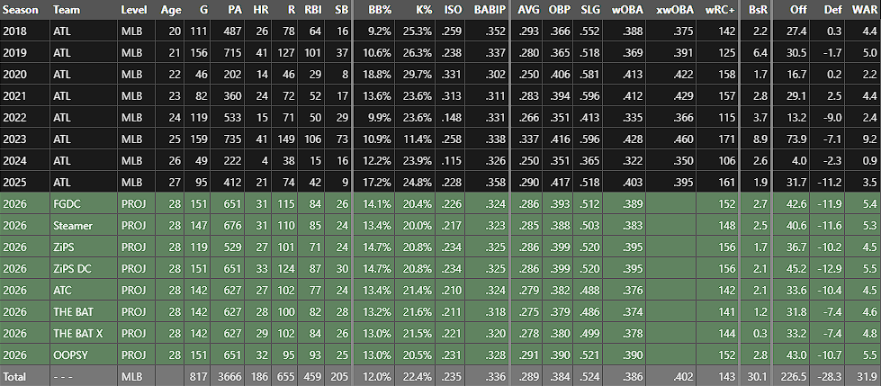
Eight projections, each with tons of numbers. That’s a lot! But when I say the “FanGraphs projection,” I’m referring to the first green row, the FanGraphs Depth Charts projection or FGDC. That’s the top-line projection we use anywhere on the website that pulls in projections to make predictions. When you see “2026 (Proj),” it’s using that number unless otherwise stated.
That’s settled then, right? We’re projecting Acuña for 5.4 WAR. Why did I have to waste your time with an article about it? It has to do with how we make that projection, a process you’re about to learn about, probably in more detail than you wanted.
Projection systems are, at their core, pretty simple things. They might get there in complicated ways, but they’re all trying to guess how good at baseball a given player is going to be in the future, and they all try to do that by predicting the results that that player is going to accrue on the field. If you have a projection system, you have projections for homers, singles, strikeouts, walks, stolen bases, and so on, as well as a projection for plate appearances, so you by definition also have a per-plate appearance projection for each of those statistics.
We don’t use a single model in our official FGDC projections. We take a 50/50 blend of the per-plate appearance projections from ZiPS and Steamer. Those projections work really well! I’m not going to go into the specifics of validation here, but multi-model predictions built from good models tend to work well, and that’s what we use. The rate statistic projections we spit out are as good as we can possibly get them, at least in our estimation. We discard the playing time projections from ZiPS and Steamer, though, because we have a separate process for projecting playing time.
Going from that blended rate statistic projection to the numbers you see on the website requires a good playing time estimate. Luckily, that’s what Jason Martinez and Jon Becker do at RosterResource. They project playing time for everyone in baseball; we multiply that playing time by the per-plate appearance results, and that gives us a projected batting line. It also gives us projected baserunning and defense, not to mention all the relevant metrics for pitchers, but for today’s example, we’ll be focusing on Acuña’s batting statistics. You can imagine the same process playing out in every facet of WAR.
How does the RosterResource team assign playing time? They fill out each roster with their best guess of what that team’s playing time will look like. They don’t forecast injuries – how could they? Our depth chart projections look like a depth chart, naturally enough. The starter on the depth chart is projected for a full-time role. That’s just how it is.
This makes good logical sense, though it might take a second to wrap your head around. Why not try to project the mean outcome, with some chance of injury? Mostly because that’s not what people are actually looking for in projections. “How many home runs do you project Aaron Judge to hit this year?” inherently assumes a healthy season. “Only 15, because I project him to get hurt on May 7” would be a really strange answer to that question. If you’re wondering what an everyday player’s projection looks like, “in a full season” is an unspoken norm. The only exception to this rule is a sound one: currently injured players see their playing time reduced by the estimated time it will take them to return from injury. Zack Wheeler, for example, is down for 127 innings this year, because he won’t be ready for Opening Day. For currently healthy players, though, we assume continued health.
Take Acuña’s projection, for example. He’s averaged just under 500 plate appearances per full season so far, with several catastrophic injuries slowing him down. If he reaches his FGDC projected 651 plate appearances, it would be the third-most he’s taken in his career. But we’re not trying to guess how well Acuña’s knee might hold up in our preseason projection. We’re projecting what he’ll look like if he plays a full season. That’s what people want, in my estimation, the thing they’re actually asking for. Maybe not every person. But in the aggregate, I think that is clearly the most common use case for a projection system, the most fair way to answer the question of how good a guy is going be, which is what these models were built to address.
If you’ll allow me a brief playoff odds tangent, I’ve actually spent a good deal of time thinking about how this system translates to odds projections. And over-allocating playing time to the top players in this manner still works well in our playoff odds model. We just add up the individual contributions of every player on a team to figure out how a team projects to play, then toss those results into the BaseRuns formula, which does an excellent job of turning team-level outcomes into run scoring estimates. Sure, projecting Acuña for 651 plate appearances is a little optimistic, but we’re symmetrically optimistic. We have Mike Trout down for his most games since 2019. We have Alex Bregman down for 679 plate appearances, a number he’s only hit once in the 2020s. This is a feature, not a bug: We project teams at full strength in the FGDC numbers. That playoff odds model isn’t even looking at WAR (well, the WAR-based odds model is, but that’s a story for another day). It works perfectly well merely by looking at outcome statistics.
Our odds already handle in-season injuries quickly; if a player gets hurt, their playing time declines to reflect that injury. We’ve also experimented with accounting for depth and chance of injury in our playoff odds. That method feels promising, and I’ll have more on it as we get closer to the season. But that’s a small adjustment to an already-good model. The existing playoff odds model already handles the optimistic playing time allocation well, something we’ve tested on multiple occasions.
Alright, let’s get back to WAR. The FGDC projections for home runs, singles, and the like are a great estimate of what Acuña’s statistical results will look like if he plays a full season, of that I am sure. But WAR isn’t an on-field statistic. It’s a derived statistic we add later that relates a player’s contributions to what a replacement-level player would do. During the season, this is simple to calculate. We take actual results and use them to define replacement level. Everyone’s performance gets measured relative to that league-wide replacement level. The system works in the way you’d expect. It reduces all the different dimensions of performance into a single currency of runs, compares those runs to a baseline set by looking at league-wide production, and turns those inputs into WAR.
Projection systems don’t have that luxury. They don’t know what the league average results will be in 2026. They project a WAR figure, of course, but that’s relative to a baseline that they calculate in their models, based on how that particular system handles playing time allocation. It’s only natural: To calculate wins above replacement, you have to know replacement.
At the individual model level, that’s fine. But we’re not using an individual model. We aggregate models at a per-plate appearance level and then assign our own different playing time, which is sometimes meaningfully different than what either Steamer or ZiPS used. Again, we do that on purpose. We do so because it helps create team-level projections the way we want, and helps answer the “What would this player look like in a full season?” question that most everyone is asking.
How different would the scoring environment be if every star played as frequently as our Depth Charts playing time suggests? Let’s stop for an example. Think about the major league hitters who played in 2024 and also in 2025. If you take their 2024 results and weight them by their 2025 playing time, you get a .311 wOBA. In other words, the talent level of the players who played in 2024 and 2025, in 2024 terms, is a .311 wOBA.
Try that again with our Depth Charts projections for 2026, and you’ll get something different. The talent level of the players who we’re projecting to appear in 2026 – their 2025 wOBA weighted by their 2026 playing time – comes out to a .316 mark. That’s a meaningful difference, even though it sounds small. Over 600 plate appearances, that’s an extra three or so runs. Over the 193,000 or so plate appearances that the players returning from 2025 to 2026 are projected to accrue, it’s more like 800 runs. In our hypothetical 2026 world, the one that we build by taking rate statistics from the models and adding our own playing time, the offenses are all good.
The pitching staffs are all good too, of course. But our Depth Charts rendition of talent doesn’t measure this interaction. The hitters are projected to be really good, because their projections are against a lower baseline. The pitchers are also projected to be really good, because we do the same kind of over-allocation of playing time to stars on that side of the ball. But since we just take Steamer and ZiPS rate statistics rather than doing some kind of adjustment for opposition on our end, we don’t dock any batters for their expected tougher competition. The result is a kind of Lake Weobegone projection: We think that both batters and pitchers will be above average in 2026.
That sounds pretty weird, but it’s not a problem when it comes to projecting the season. When we run our playoff odds, we take team runs scored and runs allowed estimates produced by our depth charts, turn that into a winning percentage, and thus get a measure of team strength that doesn’t account for opposition. To simulate a game, we just compare the team strengths of the two teams playing. Since everyone is over-estimated and we’re only comparing teams relatively, the projections still work properly. We might be projecting a much more talented league in 2026 than in 2025, but there aren’t any extra wins to go around at the end of the day, and since we’re measuring everyone relative to their opposition, it just works.
There’s some weird math stuff here that you have to hold in your head. There’s no way that all of our WAR projections can be right. It’s literally impossible. There’s a fixed amount of WAR to go around every year. We have our hitters down for more than that. If we’re actually right about playing time, the baseline level will simply be higher, and the same amount of offensive contribution will just be worth fewer wins above replacement.
Why then don’t we just adjust the replacement level baseline up in our FGDC projections? It sounds like that would be the simplest solution. But if you stop and think about it, that’s definitely not the right thing to do. If we adjust the baseline higher, we’re implicitly saying something about the value of production in 2026. The rate stats? Those projections are good, and we’re not touching them. If we change the mapping between that offensive production and WAR, though, we’re starting to do something that makes no sense.
What is it going to look like if Ronald Acuña Jr. plays a full season in 2026? We think that it’ll look like a .286/.393/.512 slash line with 31 homers. If he accrues those numbers, what do we think his WAR will be? Our 5.4 estimate is probably pretty good, even though the way we get to it seems weird. That’s because the actual observed talent level in the majors in 2026 isn’t going to be anywhere near what our purposefully-optimistic playing time projections would suggest.
Here’s the real question people are asking when they look at a WAR projection: How valuable will this player be, relative to a reasonable league average baseline, if he plays an entire season? If we re-centered our preseason WAR estimates around the higher average level of competition that we project, we’d be answering a different question: How valuable will this player be if he and also every other star in baseball plays an entire season? That second question isn’t the one that’s top of mind. Clearly, then, that method wouldn’t work.
The question we answer, the one that I think matches what people want, has problems of its own. Our results are impossible by nature. They won’t be true in the aggregate. Fortunately, though, none of those problems actually matter all that much in the real world. Our projections still work because they look at relative team strength. The Depth Charts might allocate too much WAR to every team, but it doesn’t allocate too much WAR to any star: Each projection is that star’s baseline outcome in a healthy season, exactly what we want it to be.
I can tell, reading back over this article, that it’s going to be a confusing one. It’s hard enough to talk about how WAR works when we’re looking at already-accrued results; layering in projections and re-centering and allocation clouds the matter even further. The good news is that the takeaways are simple. Our projections do a good job of figuring out relative team strength. They also do a good job of projecting player talent level. They take a few mathematical shortcuts to get there, but those shortcuts don’t interfere with either of the two principal things the projections are for: answering the questions “How good will this guy be?” and “Will my team make the playoffs?”
Ben is a writer at FanGraphs. He can be found on Bluesky @benclemens.
Bonus points for the the PHC reference.
Thanks for this Ben! Would a fair takeaway for the fantasy crowd be that using the preseason FGDC playing time projections as-is may be dangerous because perennially unhealthy guys with starting jobs at the moment may have their projected playing time inflated?
I kinda did this in an unkept players draft ending up with Stanton, Musgrove, B. Garrett, Santander among others that are either clever like a fox or too clever by half….
Whoa, wait a minute. That was a mindful, even for a Ben Clemens article. You gotta give me a day or two to digest that one😎
My one and only quibble with the logic, and it’s a small one, is that by the definition I believe I understand, this projection system will by its very nature, accentuate team projections that are outliers (positive and negative). If we consider the distribution of team strength when best players are at full strength, it would mean the best team gets a larger increase in relative strength than the worst team. This will make the best teams look better by a relative few wins and the worst teams look worse by a relative few wins.
Effectively, if we think that each team will realistically lose 10% of its max performance (all players healthy) and then delegate that performance to replacement level players, this projection system is spiking the top team strength. As an example if the worst team has a “true strength” of 75 and the best team has a “true strength” of 125, but we then scale those up assuming all players remain healthy (+10%)… the worst team gets 7.5 pts better (82.5) while the best team gets 12.5 pts better (137.5) than actual. Now team to team relative comparisons give more “relative” weight to better teams than they deserve.
My hypothesis would be that while all the math makes sense toe stimate a player in a full healthy season, when using the individual based projections for WAR and converting to run value, that an intermediate step is needed to nerf a team’s total runs created. You would do this by replacing X% of the team value with replacement level value, where X represents the amount of time the average team loses to injury. I would then run model comparisons of past seasons with pre-season projections v. actuals to determine if the “reduced” teams relative value has a better correlation to actual W-L than the non-adjusted version.
I did a version of this last year: https://blogs.fangraphs.com/an-even-newer-way-of-looking-at-depth/
I tend to agree with you, and that ‘teams with good starters get overestimated’ seems like a thing that our odds might do. I haven’t found a ton of evidence for it in practice, but I’m nevertheless working on a project to create an additional odds view here with playing time adjustments. The method I used was slightly different than yours, but it gets at the same thing. The big difference, I’d say, is that mine uses the actual team replacement level instead of a generic one, but I do like the idea, and I’m gonna do similar backtesting of mine when I get it finished.
Do we have data on the success of fangraphs playoff odds (based on FGDC, etc.) vs. ZIPs playoff odds (the method that Dan wrote about a couple of days ago)? Agree that the the FGDC probably answer the question that most people want to know on individual players, but would think they necessarily overrate teams with injury prone players from a playoff odds perspective compared to Dan’s method.
Ben, this is great. I love this concept. It seems like you have at least 2 team level outputs here: a projected winning percentage for the team and a playoff odds probability. Am I reading that right? If so, are they anywhere on the site. Id love to see the team level output. I looked under the projections tab but only saw player-level data. Thank you for all you do.
Sorry if I’m not “every person,” but this seems to me wrong:
“Take Acuña’s projection, for example. He’s averaged just under 500 plate appearances per full season so far, with several catastrophic injuries slowing him down. If he reaches his FGDC projected 651 plate appearances, it would be the third-most he’s taken in his career. But we’re not trying to guess how well Acuña’s knee might hold up in our preseason projection. We’re projecting what he’ll look like if he plays a full season. That’s what people want, in my estimation, the thing they’re actually asking for. Maybe not every person.”
Pitching is better than hitting for illustrating this, but I think everyone who wants to know, oh, Jacob DeGrom’s projection or Blake Snell’s projection actively wants those projections to be based on our best understanding of the odds of recurrent injuries, and how those are likely to affect their statistics at the end of this year. And yes, I think that applies to Acuña, Buxton and other hitters as well, even though I understand that it is much less consistent and predictable whether position players who are habitually injured are for reasons likely to recur.
Regardless, it seems to me that every fan (and fantasy owner) works with an implicit model related to injuries, and that it is not too much to ask professional projection systems to try to add rationality to what we know on this topic, rather than simply projecting everyone for their ideal playing time. At very least I’d like you to survey FanGraphs readers thoughts about this, rather than assuming what people want.
The regular ZiPS projections feature the playing time that that model projects, so if that is what you’re looking for, we definitely have them.
I definitely agree with you. Then again, as you put it, I’m not “every person” either. I would have naively believed that most others think like me and would prefer for playing time to be taken into account, but clearly a lot of the responses to this article are going the other way. Ultimately what’s more important is to know what the projection system is actually measuring, so I’m glad this article made clear that the projected playing time isn’t always realistic.
I agree – for Fantasy players, if you have adequate estimates for rate stats (Avg, OBP, SLG, ERA, WHIP), playing time (PA or IP) is the most important thing to predict correctly. 50 PA or 15 IP either way can move a player quite a bit.
For example, if I remove 50 PA from Willi Castro (by my measures a perfectly average hitter), he falls 10 spots in the overall rankings (and since there are lots of MI in this range, 6 slots there).
The early nerd gets the WARm.
I work in higher education, and this resonates very strongly with a question that feels really obvious to answer but turns out to be quite difficult: how many students are there? Different people mean different things by student, and to answer each flavor of the question in the way that the asker desires requires including/excluding different groups of students. Invariably, the outputs are in conflict. “This report says we have 23,452 students but that one says we have 25,994.” Well, yes, the first measured fall enrollment and the second measured 12-month unduplicated headcount (or any of about 12 other reasons).
The math here is more complicated, for sure, but the underlying reason for the tension in the outputs is the same: we ask different questions that require making different assumptions about what matters and what doesn’t.