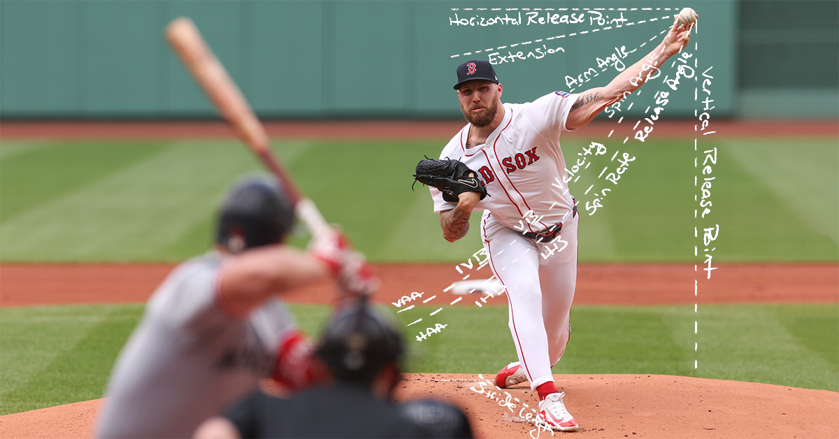
Fun with WAR Math

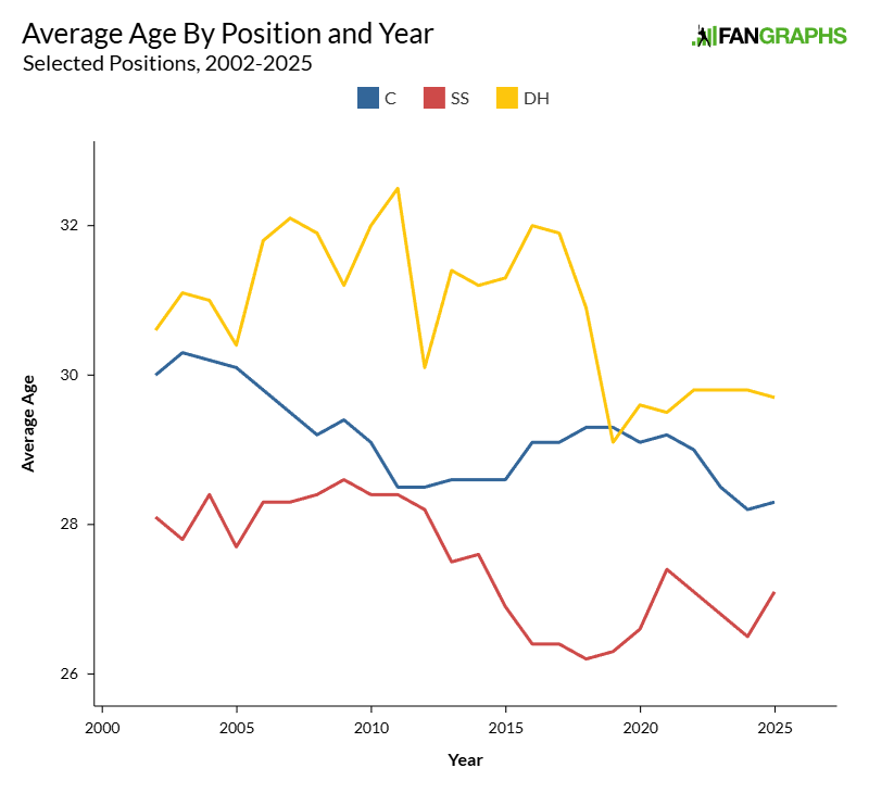
How much WAR does FanGraphs project Ronald Acuña Jr. for in 2026? It’s a really straightforward question. It should be especially straightforward now that all of our projections are out. But as it turns out, it’s less clear cut than it sounds at first, and clarifying it has two benefits. First, it’ll help you better understand our projections. Second, it’s fun to play with math. So buckle up: We’re doing arithmetic.
First, let’s settle on what the “FanGraphs projection” even is. Here’s the relevant section of Acuña player page:
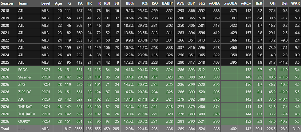
Eight projections, each with tons of numbers. That’s a lot! But when I say the “FanGraphs projection,” I’m referring to the first green row, the FanGraphs Depth Charts projection or FGDC. That’s the top-line projection we use anywhere on the website that pulls in projections to make predictions. When you see “2026 (Proj),” it’s using that number unless otherwise stated.
That’s settled then, right? We’re projecting Acuña for 5.4 WAR. Why did I have to waste your time with an article about it? It has to do with how we make that projection, a process you’re about to learn about, probably in more detail than you wanted. Read the rest of this entry »