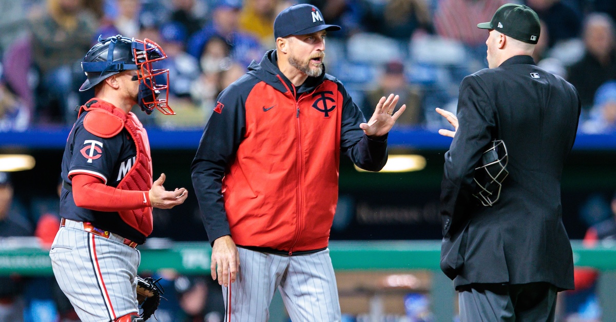
I’ve been writing about the strike zone for a few years now, and if there’s been one overarching theme to my work so far, it’s the inescapable takeaway that umpires are excellent at what they do. When Major League Baseball introduced PITCHf/x in 2008, umpires got 84.1% of ball-strike calls right according to the Statcast strike zone. Over the intervening years, while ever-nastier stuff and a revolution in pitch framing had made their jobs harder and harder, umpires did nothing but get better. Accuracy broke 92% in 2021 and inched its way toward 93% over the next two seasons. That trend of improving every year finally changed in 2024.
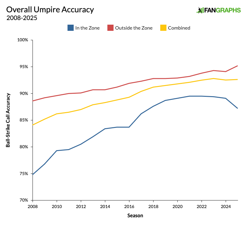
As I wrote yesterday, last season marked the first time that umpires got worse rather than better. That’s interesting enough on its own, but right when it was time to wonder whether they’d gotten as good as they could get, the rules of the game changed. Over the offseason, a new labor agreement included a change to the way that umpires are assessed by the league. The grading got much tighter, reducing the buffer around the edges of the strike zone from two inches on the outside of the zone to three-quarters of an inch on either side. The strike zone is the same, but umpires are being judged much more tightly. Let’s dive into the numbers and see what looks different so far this season. Here’s a graph that shows overall accuracy in every season of the pitch tracking era.
The yellow line shows overall accuracy, and it’s ticked back up from 2024. Even though it’s early in the season, a time when umpires are at their least accurate, they’re still doing better than they did last year. Accuracy fell from 92.81% in 2023 to 92.53% in 2024, and is now back up to 92.63%. In fact, if you look only at March and April stats – which is more fair, because umpires are worse earlier in the season – you’ll find that umpires just had their best opening month of the season ever. They called 82% of pitches in the shadow zone correctly. Read the rest of this entry »
Back in January, I wrote an article called “Unfuzzing the Strike Zone.” The premise was pretty simple. As umpires have grown more accurate, as the edges of the strike zone have gotten clearer and more distinct, the strike zone has effectively gotten smaller. Misses go both ways, but there’s a big difference between an incorrectly called ball and an incorrectly called strike. Calling a pitch inside the zone a ball doesn’t shrink the effective size of the zone, but calling a pitch outside the zone a strike does make it bigger. As long as a pitcher knows it’s possible to get a strike call out there, they’ll consider it part of the zone. Little did I know that as I was writing that article, Major League Baseball was preparing to test its exact premise.
The strike zone has steadily shed its fuzz over the past 23 seasons, but on Thursday, Jayson Stark and Ken Rosenthal reported in The Athletic that the league has decided to break out a sweater shaver. Over the offseason, the Major League Umpires Association came to a new agreement with MLB. Part of the agreement included tightening the standards by which ball-strike calls are graded.
Umpires used to have a two-inch buffer around the edge of the strike zone, meaning that if they’d missed a call by fewer than two inches outside the zone, the call would still go down as correct in their assessments. Having that buffer is necessary because calling balls and strikes is extraordinarily difficult. It’s extremely rare for an umpire to get every call right even in a single game. The new border is just three-quarters of an inch on either side. The league is demanding a less fuzzy strike zone. Read the rest of this entry »
Every winter, pitchers step off the mound and into the lab. Sure, not every pitcher is in a wind tunnel with a high speed camera from October to January, but enough are that everyone seems to reap the benefits. You’ve got the sweeper, the kick change, the rise of the splitter, new fastball shapes – you name it, someone has tried it recently. That means that every year, I spend the first month or two of the season catching up to the new hot thing going on in the world of pitching.
But I have to level with you: On the whole, things haven’t changed as much this year as I expected. That won’t stop me from walking through what has changed, though, and the first shift to highlight is a subtle one – we’re seeing more bendy sliders and fewer gyro offerings:
Slider Usage By Year
Year
Sweeper
Slider
2020
1.1%
16.8%
2021
1.9%
17.2%
2022
3.9%
16.9%
2023
5.6%
16.3%
2024
6.5%
15.5%
2025
7.6%
14.9%
Why? Two things are happening. First, sweeping sliders do better against same-handed batters, so pitchers are choosing that as their secondary of choice when they have the platoon advantage. In 2021, 2.6% of pitches that righties threw to righties were sweepers. In 2025, that number has ballooned to 10.7%; it’s 10.9% for lefties against lefties. Usage is less than half as high when opposite-handed batters are at the plate.
Meanwhile, “regular” sliders are on the decline when pitchers have the platoon advantage. That makes good sense – they’re just throwing sweepers instead. And when pitchers aren’t facing same-handed batters, neither slider is particularly great; pitchers are staying away from both, more or less. That means that the traditional, gyro-spin slider is declining in prevalence overall. Read the rest of this entry »
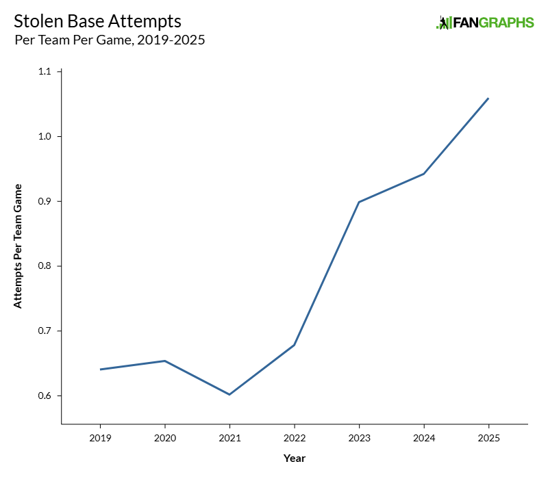
This season is the third since the implementation of a spate of significant rule changes across the majors. Along with a pitch clock and limits on defensive positioning, a limit on disengagements (read: pickoff throws plus idle standing around) combined with slightly larger bases gave runners a collective green light. With fewer throws to first, bigger targets to slide into, and more predictable pitcher deliveries thanks to the clock, stealing a base got much easier overnight. In 2022, the last year of the old rules, the majors saw 2,486 steals across the entire season. In 2024, that number surged to 3,617 steals. Even better from an offensive perspective, the stolen base success rate jumped from 75.4% to 79% over that span.
The first year of the new rules was all about experimentation. Some players ran wild – Ronald Acuña Jr. more or less took off every time he could. Meanwhile, the Giants stole just 57 bases as a team, fewer thefts than the previous year, when those steal-boosting rules weren’t yet in effect. None of that seems particularly surprising to me; when new rules of this import are added to the game, every team will scramble to figure out how to change their own behavior to benefit. There were a ton of moving parts, and many teams took a simple approach: keep stealing more and more until it starts to fail.
The 2024 season was the year of the defensive reaction. Teams attempted 209 more steals in 2024 than they did in 2023, but only succeeded on 114 of those extra steals. The aggregate effect was a lower success rate on marginally more attempts. Catcher pop times improved, pitchers threw over more often, and defenses were more attentive to baserunners in general. That brings us to 2025, and in the early going, it looks like the baserunners are continuing to push the envelope:
To every thing there is a season, and a time to every purpose under the heaven:
A time to be born, and a time to die; a time to plant, and a time to pluck up that which is planted;
A time to kill, and a time to heal; a time to break down, and a time to build up;
A time to weep, and a time to laugh; a time to mourn, and a time to dance;
A time to cast away stones, and a time to gather stones together; a time to embrace, and a time to refrain from embracing;
A time to get, and a time to lose; a time to keep, and a time to cast away;
A time to rend, and a time to sew; a time to keep silence, and a time to speak;
A time to love, and a time to hate; a time of war, and a time of peace.
– Ecclesiastes 3:1-8
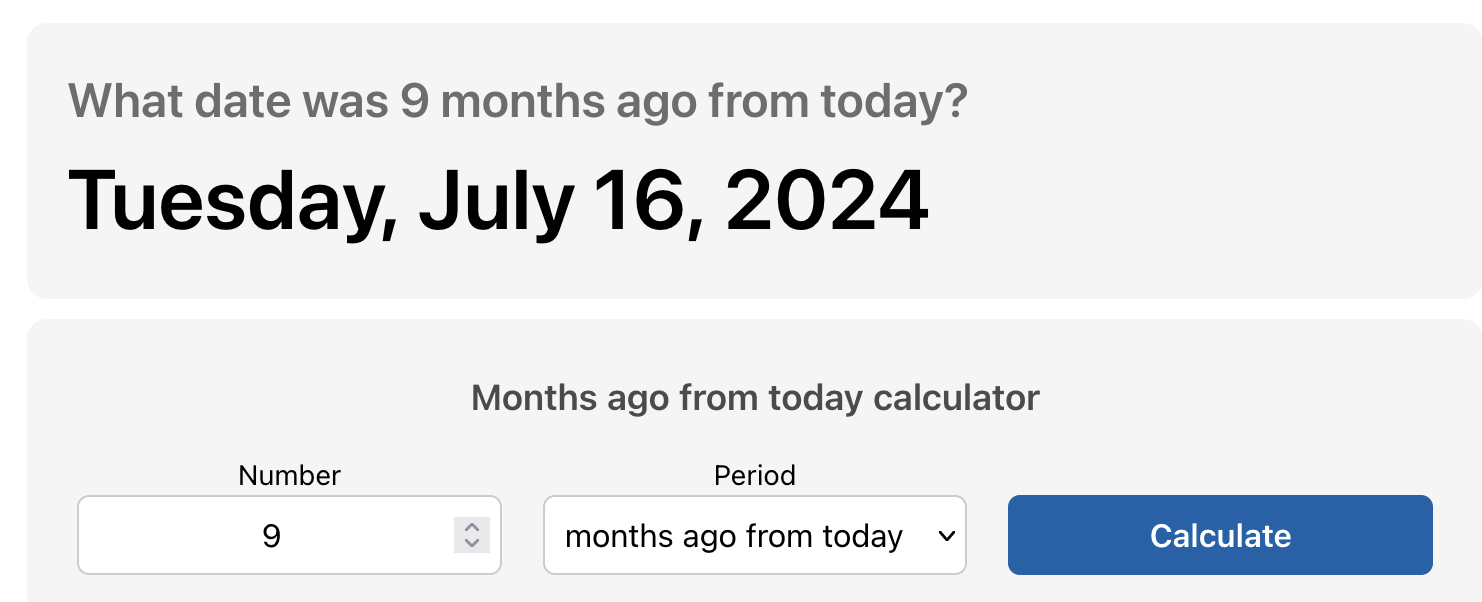
On Thursday, Toronto Blue Jays outfielder Nathan Lukes welcomed a baby named Jett into the world. That same day, teammate Daulton Varsho was expecting to welcome his own baby. When I read the news, I did what anyone would do. I thought, “How wonderful for the Blue Jays,” and then I asked the internet to do some math for me.
Well that’s fun. Nine months before Lukes and Varsho became fathers, it was July 16, 2024. That date may ring a bell, because it was also the date of the All-Star Game. Lukes wasn’t in the majors at the time, but clearly, both players had very productive All-Star breaks. I decided it was time for a full investigation. Do baseball players make all their babies during the All-Star break? Read the rest of this entry »
Last year, David Appelman and I set about injuring a ton of players. Wait, that doesn’t sound right. Let’s try this again. Last year, David Appelman and I developed a method to use our depth charts projections to simulate how much injuries to the league’s top players might affect each of the teams in baseball. Today, we’re updating that article for the 2025 season. I’ll also present some research I’ve done into how these injury-aware depth charts compare to actual historical seasons.
First, a review of the methodology is in order. If you don’t need an update, or if you simply want to get right to the data, you can skip ahead; the results section is clearly labeled below. We decided to simulate depth by first removing the top X players from a team’s depth chart and then reallocating playing time to fill in the missing plate appearances or innings pitched. We then created a number of rules to make sure that these new depth charts were generated in a reasonable way, at least to the greatest extent possible.
Let’s use the 2025 Phillies as an example. As of the time of our run on April 7, we projected the Phillies for a .545 winning percentage against league average opposition. That projection comes from allocating playing time to each Phillies player according to our depth charts, using blended projections from ZiPS and Steamer to estimate the talent level of those players, and then plugging those projections into the BaseRuns formula to estimate runs scored and runs allowed. But those projections have an obvious weakness: they’re static. Read the rest of this entry »
I thought I had it sorted out; it took one batted ball to convince me otherwise. It was the bottom of the seventh inning during the Rays’ first game in their new George M. Steinbrenner (GMS) Field digs. Jonathan Aranda worked his way into a 2-0 count against Rockies reliever Tyler Kinley. With runners on second and third, one out, and the Rays down two runs, Kinley hung a slider. Aranda uncorked his A swing, launching the ball deep to right field. Off the bat, I thought it looked way gone. It didn’t even go 300 feet:
As I write this, the winter free agency period has essentially drawn to a close. Out of the top 50 free agents I highlighted before the offseason began, 48 have found homes — sorry, David Robertson and Kyle Gibson. Per RosterResource, only five free agents – including the two holdovers from the top 50 – accrued 1 WAR or more in 2024 and haven’t yet signed new deals. In other words, all the signing that is going to happen basically has, so it’s time to look back and see how you and I did at predicting the deals players would sign.
I like to evaluate my own predictions in service of making better ones in the future, dividing them up into a few categories. First, I break signings down by position, because the market for relievers and second basemen is different. Second, I look at both average annual value and total guarantee. There’s no set ratio for how to relate those two, so looking at each independently seems best to me. Finally, I look at both the individual predictions (how close to the actual contract that a player signed my predictions came), as well as the overall trend (how my aggregate predictions for each position group did compared to the total amount they received).
This year, I made all of that back-checking more rigorous. I put all of my predictions, as well as every crowdsourced one, into a giant spreadsheet. I noted all the contracts that were signed, made adjustments for deferrals, and ignored non-guaranteed money. I compared each actual contract to our predictions. I also gathered some of the best non-FanGraphs predictions I could find, looking to outlets like ESPN, The Athletic, and MLB Trade Rumors. Below, you’ll find how both the crowd (you) and I did, as well as the best non-FanGraphs entrant in each category. Read the rest of this entry »
Sorry, I’ve just always wanted to write that. I’ll tell you later on why I gasped. Let’s start here. Last Tuesday, while making his Grapefruit League debut with the Blue Jays, Max Scherzer challenged a pitch. Then he challenged the challenge system. Scherzer’s start against the Cardinals marked his first experience with the automated ball-strike system, which is being rolled out in some spring training facilities this year, continuing its inexorable, years-long creep toward implementation in regular season games. Scherzer, for one, does not welcome our new robot overlords.
On his 11th pitch, Scherzer fired a 1-0 fastball to Lars Nootbaar, just clipping the outside corner, at least according to home plate umpire Roberto Ortiz, an organic life form who uses an inefficient pair of weird, goo-filled orbs to assess pitches. Nootbaar – who, we should note, played some rehab games in Triple-A last season, and so was at least somewhat familiar with the challenge system – immediately patted his head. That’s the official way to request a challenge (though I would strongly encourage the league to require the player to rub their stomach with their other hand too). Scherzer, never a fan of waiting around when there’s pitching to do, canted his head from side to side like a racehorse in the starting gate. The machines spoke: The pitch was 2.3 inches off the plate, or as the humanoid Buck Martinez put it, “way outside.”
Just like Scherzer, this was my first experience with the challenge system, and I found the graphic adorable. That’s the point, I guess: implement an all-seeing eye that judges everything and everyone with detached, ruthless precision, then soften it with a lovable cartoon face. Scherzer recovered to strike out Nootbaar, then made his own challenge in the second inning. The right-hander, who tracks his pitches using the same goo-based technology as Ortiz, didn’t agree that he’d missed low with a 1-0 curveball to JJ Wetherholt, and he pounded the top of his cap like a bongo drum.
Reader, that’s when I gasped. Then I laughed. I gasp-laughed. According to the delightful ABS graphic, the pitch was hilariously low. It was nowhere near the strike zone. This pitch was in the Cactus League. It was so far away that Social Distortion wrote a song about it called “So Far Away.”
In fairness, we should acknowledge a few things. First, one of the consensuses that emerged during last year’s test of the challenge system was that teams should disempower the pitcher from making them. Catchers are right there, and they have a much better sense of the actual location of the pitch. Second, Scherzer indicated after the game that the challenge was more an experiment than an expression of his certainty that the pitch had clipped the zone. “That was a rare occurrence for me, with a curveball down, to actually see if that’s actually a strike or not,” he said. You’re allowed to take that notion with a grain of salt. Part of me believes Scherzer, but, uh, he was bopping himself on the head with a lot of conviction.
We should also note that the steep shape of a curveball makes it hard for the pitcher in particular to judge the exact spot where it crosses the plate. The really interesting thing is that curveballs are actually relatively easy for umpires to judge. That’s not necessarily intuitive. Curveballs approach the plate at such a steep angle that they hit the catcher’s glove (or the dirt) far lower than they cross the plate, which might fool the umpire into thinking a pitch was lower than it was. And curveballs that come in at the very top of the zone leave the pitcher’s hand so high and possess such a loopy shape that they also might be hard to recognize as strikes. Where a fastball or cutter pushes straight through the zone cleanly, a breaking ball slices through it at an oblique angle, and it just seems logical that the more of the zone a pitch catches, the more likely it is that it will be recognized for doing so. But apparently that’s wrong. I broke down the 2024 stats for curveballs and fastballs (four-seamers, sinkers, and cutters) in three areas of the zone: the heart, the top and bottom of the shadow zone down the middle, and the top and bottom thirds of the zone down the middle. I’ve highlighted those areas in pink.
In all three areas, Curveballs had higher strike rates than fastballs. On pitches over the heart of the plate, it was a matter of a few tenths of a percent, but in the middle graph, curveballs were ahead 83% to 80%, and on the right it was 83% to 81%. Maybe it’s just that curveballs are easier to judge because they’re slower, but umpires are better at recognizing when they’re strikes, so in that sense Scherzer picked a bad pitch to challenge. However, much like Scherzer’s curveball, we’re drifting away from our main objective here. We’re focusing on how far the pitch was from the zone, and just to reiterate: It was far.
However, you might notice something about that graphic: There’s no distance measurement. When Nootbaar challenged in the first inning and earned his Nootbaal, the graphic zoomed way in to show us the exact size of the miss down to a tenth of an inch.
When Scherzer challenged, no measurement popped up, and I suspect that I know why. I think this is a deliberate decision made to avoid embarrassing a player who challenges a pitch that’s not particularly close. Nearly all challenges that end up as balls will show the miss distance. But if the pitch doesn’t even touch the shadow zone – that is, if it’s not even within one baseball-width of the strike zone – the graphic leaves off the exact distance so as to avoid blowing up the pitcher’s spot. Max Scherzer, trailblazer that he is, has showed us that although robots don’t feel, they can still be programmed to blush.
Don’t worry. We’re still going to blow up Scherzer’s spot. Because of all the cool graphics, it’s still really easy to get an exact measurement for pitches that land in the Zone of Embarrassment. We know the measurements of just about everything else on the screen. We know the strike zone is exactly 17 inches wide and the ball is approximately 2.9 inches wide, and through the magic of Statcast, we know that because Wetherholt is 5-foot-10, his strike zone is roughly 18.55 inches tall. I threw a screengrab into Photoshop, measured each of those constants, then used the ratio of pixels to inches to calculate the distance. The ball was 3.98 inches from the strike zone. It missed the shadow zone by more than an inch. It crossed the plate just over a foot off the ground.
That looks pretty damning, but allow me to blow your mind for a moment. If we’re being fair to Scherzer, we need to acknowledge that the pitch was actually much closer to the rulebook strike zone than Statcast makes it look. Let’s think about it under the rules of the current, non-computerized strike zone. Keep in mind that this was a curveball breaking downward. Now let’s look at the way that the Hawkeye cameras measure a pitch, courtesy of an MLB.com explainer by Anthony Castrovince.
Keep your eye on the diagram on the right. Statcast’s strike zone is two-dimensional, and it’s measured from the very center of home plate. That’s a perfectly reasonable way to design an ABS system – an earlier version was 3-D, so it seems safe to assume that this 2-D version is, for some tangible reason, an improvement upon it – but it’s not the way the strike zone has worked for the entirety of baseball history, including right now. The rulebook definition starts like this: “The STRIKE ZONE is that area over home plate…” and that’s really all we need to know. The strike zone is three-dimensional. It’s seven-sided, a pentagonal prism, and the ball just needs to clip any part of it in order to be a strike.
At The Athletic, Jayson Stark had the good fortune to be present in the clubhouse after the game, when Scherzer found out that the robo-zone didn’t match the rulebook zone: “Wait, I thought it was the whole plate,” he said. “So now we have to redefine what the strike zone is? You said it was a 3-D zone. Now we’ve got a 2-D zone? Hasn’t it always been a 3-D zone?” The answer to that question is yes. It has always been a 3-D zone and it still is, but now there’s also a 2-D zone. There are two strike zones. We’ll dig into the philosophical implications of this dichotomy later, but for now, that’s how umpires are judging pitches, so why don’t we try measuring things that way?
Let’s start with how curveballs work. Their path gets steeper and steeper as they approach the plate. There are plenty of reasons for this. Curveballs actually leave the pitcher’s hand traveling slightly upward; the classic way to recognize a curveball is seeing it jump up out of the pitcher’s hand. The magnus force created by the ball’s topspin pulls it downward, and that force compounds upon itself over the length of the pitch. Here’s where it starts. The baseball is traveling horizontally, and the topspin interacts with the air to start pulling it down.
Now it’s traveling at a steeper angle, but guess what? The topspin is still pulling it downward, so its angle is going to keep getting steeper and steeper as it goes.
Moreover, gravity amplifies this effect for a pitch that’s always breaking downward. Air resistance slows the pitch down as it nears the plate, but gravity is pulling the pitch downward at a constant rate. So say it takes a tenth of a second for the ball to travel the first 10 feet toward home plate, and in that time, gravity pulls it down five centimeters. By the time it reaches the plate, it’s going slower, so over the last tenth of a second, it only travels eight feet, but gravity is still pulling it down five centimeters. All the numbers in this example were completely made up, but you get the point; the ratio of downward movement to horizontal movement is increasing. A curveball’s approach angle keeps getting steeper. You can see it in Statcast’s 3-D pitch visualizations.
These are two actual Scherzer curveballs from last year. We’re going to focus on the bottom one, which came in a bit below the plate. The red line shows a straight line between the position of the ball when it crosses home plate and the position when it’s 50 feet away.
Now, let’s zoom in and look at the path of the pitch over the last few feet of its journey. As you can see, our new purple line is significantly steeper.
None of this should be particularly surprising if you’re familiar with Alex Chamberlain’s primer on vertical approach angle, but the point is that curveballs, with their sharp downward movement compounded by gravity, are the steepest pitches of all. According to Alex’s pitch leaderboard, Scherzer’s curveball averaged a vertical approach angle of -9.9 degrees last season. For now, let’s assume this pitch had the same VAA. With help from our friend Pythagoras, we can calculate that a pitch traveling at an angle of -9.9 degrees would be 1.48 inches higher when it crossed the front of the plate than when it crossed the middle of the plate. Here’s how that works.
OK, so measuring at the front of the plate, the pitch comes in 1.48 inches higher. It’s now missing the zone by just 2.50 inches. It’s well within the shadow zone. That certainly makes it sound a little closer, don’t you think? Here’s what that looks like in our original diagram.
You know what? It’s still pretty far away from the strike zone. Stark’s article mentioned that after the game, reporters told Scherzer that his pitch would have been a strike according to a 3-D zone. They were way off base. In order to do so, the pitch would have had to arrive at the plate with an absurd VAA of 25 degrees. That ain’t happening. This pitch is still unequivocally a ball. There’s no system – goo-based, camera-based, vibes-based, none – in which this pitch hits in the strike zone. It was so far away that Carole King wrote a different song about it, also called “So Far Away.”
That said, I do suspect that this particular curveball actually had a steeper VAA than -9.9 degrees, making it a bit closer than the graphic above indicates. Just using the old-fashioned goo-orb test, it looked sharper than the typical Scherzer curveball. Second, I was talking things over with Michael Rosen, our resident pitching genius, and he got curious and pulled data for a Scherzer curveball, just one random curve from 2023. That pitch had a VAA of -10.1 degrees over the last 10 feet.
That VAA would move Scherzer’s pitch a few hundredths of an inch closer to the zone, and this one solitary, particularly sharp curve could’ve been even closer. It’s still not a strike according to any definition of the strike zone, but it highlights the disconnect between the two current competing versions.
So far we’ve only been talking about the front of the plate, but this would also be true of both the back and the sides. A pitch with a steep horizontal approach angle can clip the corner of the plate before it reaches the midpoint. The back gets tricky because of the plate’s pentagonal shape, but it’s still possible; the closer to the center a high pitch is located, the better a chance it will have of dropping down and catching a piece of the rulebook zone. ABS would tell you that every one of the pitches illustrated below is a ball. But according to a normal three-dimensional strike zone – which is what umpires are calling – that’s not actually true. It’s smaller than the rulebook zone.
As things stand, when the league does implement an ABS challenge system for regular season play – and at this point, that seems like a virtual certainty, though which regular season is still undecided – then the game will officially have two different strike zones. It’s possible that the league could change the rulebook definition for umpires so that it matches the Statcast zone, but that strikes me as unlikely for many reasons, chief among them it would essentially turn the iconic shape of home plate into a vestigial appendage. In the two-zone world – the world that Triple-A players have been living in for a while now – a pitcher would be able to throw a strike, get robbed by the umpire, challenge that incorrect call, and lose the challenge because according to the robot umpire, the pitch really was a ball. Even crazier, the pitcher will throw a strike, the umpire will get the call right, and then the batter will challenge it and that correct call will get overturned! The umpire and the computer will make two different calls, and both will be correct because they’ll have two different zones.
As the numbers from our curveball example show, we’re not talking about a couple of unlikely edge cases. The differences in movement from the front and back of the plate to the middle aren’t minuscule. Some pitchers’ curves average above 11 degrees of VAA, and the sweepiest sweepers average more than six degrees of horizontal approach angle. We’re often going to be talking about well over an inch of difference. This is going to happen all the time. I’m not the first person to notice this. On Wednesday, Baseball Savant’s Tom Tango crunched the numbers and announced that in 2024, one percent of all takes would have fallen into this category, just for issues with the front and back of the plate.
As things look right now, baseball will soon officially have a human strike zone and a robot strike zone. The robot strike zone will be so thin as to be non-existent, while the human strike zone, as it always has, will be shaped like an infinite number of infinitely thin home plates. Honestly, I don’t know how any pitcher who’s had it fully explained to them will avoid succumbing to paralysis halfway through their windup and toppling off the mound simply because they’ve exhausted their ability to process the disjuncture of the situation.
I mentioned earlier that setting up the robo-zone in two dimensions rather than three was a perfectly reasonable choice. The more I think about it, however, the more I think it might be the only reasonable choice. Calling balls and strikes is incredibly difficult. I’ve had to do it before, and I’d approximate that I felt 100% certain on about 30% of the pitches I called. But even then, I doubt I was really thinking about the strike zone the way the rulebook demands. The rulebook zone doesn’t have four corners; it has 10 corners. And it doesn’t have an edge; it has 15 edges. The difference between a two-dimensional plane and a three-dimensional space is the difference between a topographical map and a mountain.
On the one hand, this makes me wish the robo-zone were three-dimensional, just because I’m imagining how much more fun the challenge graphics would be. We’d see in precise cartoon glory not just whether the ball nicked the corner of a box, but one particular corner of a 10-cornered pentagonal prism. It would rule. On the other hand, it’s absolutely preposterous that we ask human beings to process information with anything approaching this level of precision. Wherever you’re sitting right now, try to imagine a pentagonal prism floating in the air next to you. Now try to picture yourself deciding whether a Tarik Skubal fastball nicked one of its seven sides. Now do it again, but first squish your prism down a bit because Nick Madrigal is up next. So maybe it does make sense to have two zones; we’ve just got them reversed.
Scherzer was candid and engaging with reporters, and after processing all of this information, he closed with the takeaway that most of us saw in the headlines: “Can we just play baseball?” he asked. “We’re humans. Can we just be judged by humans? Do we really need to disrupt the game? I think humans are defined by humans.” When he puts it that way, it’s a pretty reasonable request. Right now, umpires and batters track pitches using the exact same equipment, and that makes plenty of sense. If the game is played by humans, it’s certainly not laughable to feel that human eyes and brains should be deciding what’s a strike and what’s a ball. I don’t mean to say that there’s wisdom in every mistake simply because it’s made by a human, but once a computer is making the decisions, the objective of the game becomes slightly less fun, for the same reason that playing chess against the computer isn’t particularly enjoyable. It becomes less of a game and more of a problem solving exercise.
These days, there’s no end to the ways that computer programs are judging us – CAPTCHA requests, Spotify recommendations, suspicious login emails, targeted advertising, personalized search results, automated insurance denials, the artificially indiscriminate firings going on throughout the federal government – and with vanishingly few exceptions, the people being judged would like nothing better than to smash all of these robot judges with a hammer.
Don’t get me wrong, I would love to smash the computers that turned Google into such a joke with a hammer, but the difference here is that many of those systems were designed as shortcuts, either to save time, to replace human workers, or to shift accountability away from the person instituting a crappy policy and onto the circuit board that implements it. On the other hand, the challenge system is a particularly elegant solution to the problem at hand. It will introduce an extra layer of accountability into umpiring without replacing the umpires or undermining their centrality to the game. It won’t obliterate the value of pitch framing, but it will hopefully reduce the amount of shouting umpires have to bear. Now that we have the ability to know the exact location of every pitch, it’s probably not completely defensible to just ignore that knowledge. Instant replay was instituted for the same reason. “I like it when somebody screws up and somebody gets screwed over” is not exactly a winning campaign pitch.
Let me hit you with one last disconnect. The really funny thing is that depending on how you look at it, Scherzer is both the best and worst messenger for this argument. He’s a sure-fire Hall of Famer and a longtime union rep. He’s not afraid of a fight, and his standing in the game ensures that when he speaks, people will listen. His comments warrant plenty of counterarguments, but “Max Scherzer doesn’t know what he’s talking about” is not among them.
On the other hand, Scherzer has never had that much use for umpires in the first place. Since Sports Info Solution started tracking pitches in 2002, 328 pitchers have thrown at least 800 innings. Scherzer’s 14% swinging strike rate ranks ninth among them and his 27% whiff rate ranks 19th. His 17% called strike rate, however, ranks all the way down at 212th. Scherzer has always succeeded by racking up whiffs, pumping his fastball by hitters and tempting them into chasing sliders and curves. Relying on the umpire for called strikes has never remotely been his game. In fact, since 2008, Statcast says he’s had 1,262 would-be strikes stolen from him, third-most in all of baseball. Few players have relied less on human umpires or accumulated more reasons to be fed up with them than Scherzer. Maybe we should tell him that after his next start. I’m sure he’ll have something interesting to say about it.
Last week, I wrote about the careers of the two former college baseball players who have been featured on this season of Love Is Blind, and don’t worry, I’m not going to follow up with a detailed breakdown of their performance on the episodes released this past weekend. (Though if anyone wants the short version: It’s been pretty dire. Ben is getting flamed on TikTok so bad his fiancée is thinking about pulling the plug, while Dave… I don’t know what you’re doing, man. Get it together. You’re in your mid-30s. You should be able to have a frank, productive conversation with your partner.)
I bring all this up because it’s been hard to shake something I mentioned in Friday’s article: Ben Mezzenga’s astonishingly high incidence of taking strike three. In his best years, only about half of his strikeouts came swinging. A typical big league hitter strikes out three times swinging for every time he strikes out looking. Last year, José Ramírez ran a ratio north of 15-to-1, the highest mark in baseball. Cavan Biggio was the only hitter who had 50 or more strikeouts with more than half of them coming with the bat on his shoulder. Read the rest of this entry »