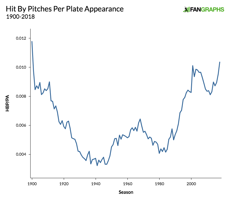
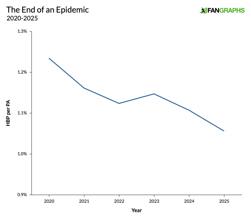
Opportunity, Takeoff Rate, and Stolen Base Opportunism


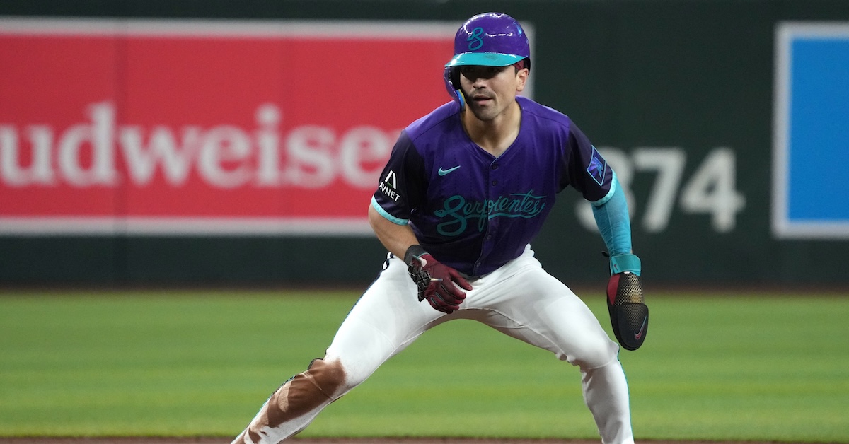
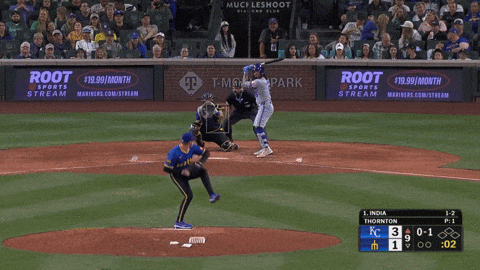
David Hamilton doesn’t wait casually at first base. He lurks, waiting for the slightest opening to take off. Watch an at-bat where Hamilton is on the bases, and he’s often as much a point of discussion as the man at the plate. Take the game between the Red Sox and Guardians on September 1, for example. Hamilton pinch-ran for Carlos Narváez with Connor Wong at the plate. Wong fouled off a bunt for strike one with the entire defense focused on Hamilton at first base. Then Hamilton stole second on the next pitch even with the catcher, pitcher, and infielders all fixed on his every move.
Hamilton isn’t the most prolific basestealer in the majors. He isn’t the most successful. But he is the baserunner who tries to steal most frequently, after adjusting for opportunities, and so he’s a great poster boy for what I’d like to talk about today: stolen base opportunities and takeoff rate.
It doesn’t take much to make a stolen base possible, just a runner and an open base. You do need both of those, though. Draw a walk to load the bases, and you’re not attempting a steal without something very strange going on. Stolen base opportunities aren’t easy to find in a box score or a game recap. They’re the negative space of baseball – no one’s counting them, and it’s easier to see where they aren’t than where they are. So, uh, I counted them. Read the rest of this entry »