If you clicked through to read this post, you’ve probably visited the ABS Challenge Leaderboard on Baseball Savant at some point this season. While you were there, you may have sorted by Won% to see which players have been the most successful with their challenges. And if you, like me, are a bit of hater, you also reverse sorted to see which players are now considered a fire hazard because of how rapidly they burn through challenges. In that case, you know that James Wood has won just 20% of his 15 challenges, that Josh Naylor owns a 25% success rate on 12 challenges, and that Jazz Chisholm Jr. has a 27% hit rate on his 15 challenges. Players this bad at picking their spots probably shouldn’t be allowed to challenge at all, right? Well the truth is, those samples probably aren’t large enough to definitively signal an inability to consistently win ABS challenges. Or maybe they are large enough, but it’s tough to say for sure because the ABS challenge system hasn’t been in place long enough to generate the volume of data needed to determine an appropriate sample size.
But even if there were absolute certainty about which players lack the eye for challenging ball/strike calls, sitting a player down and telling him he’s not allowed to challenge anymore because he sucks at it isn’t exactly the best strategy. It runs the risk of damaging the relationship between the player and the team and it shuts down the opportunity to improve with additional reps. And let’s say that player is in the box for a pitch that absolutely should be challenged — given the short window to challenge following a call, a batter paralyzed by self-doubt or concern over potential reprimand is set up to fail. It’s also much easier to communicate and get buy-in on a single, team-wide philosophy than it is to devise a bunch of player-specific exceptions to the rule.
The good news is that there’s a straightforward method for eliminating many of the most infuriating failed challenges, a method independent of any given player’s ability to judge whether a pitch was in the zone. Because there’s more to challenging than assessing whether a ball/strike call is correct and then assigning a level of certainty to that assessment. If you’ve ever watched a batter on your favorite team spend a challenge on an 0-0 count in the first inning, you know that it’s vexing on multiple levels. Even a successful challenge in that scenario doesn’t offer a significant swing in advantage, since it’s just flipping an 0-1 count to a 1-0 count (a swing in run expectancy of about a tenth of a run, depending on the base-out state). And to make things even more maddening, it also tightens the calculus around future challenges, since an additional failed challenge risks leaving the team unable to act on a potential missed call in a late-and-close situation. Read the rest of this entry »
On April 15, Zach Neto was at the plate with one out and nobody on in the top of the fifth inning of the Angels’ game in the Bronx, where his team trailed the Yankees, 3-2. The first two pitches, a low changeup and a high slider, were nowhere near the zone, and Neto laid off easily. The 2-0 pitch from Luis Gil was another slider, this one about belt high and bending away from the right-handed Neto, who kept the bat on his shoulder and watched as the pitch appeared to clip the outside edge of the zone. Home plate umpire Lance Barksdale held up his hand. Strike one. Neto tapped his helmet immediately to challenge the call.
The graphic on the gigantic video board in center field showed that the pitch had missed by 0.4 inches. The call was overturned; the count was now 3-0. Neto walked on the next pitch. Mike Trout stepped in, took a fifth straight ball from Gil, then let a four-seam fastball over the heart of the plate get deep on him. He unloaded, clobbering the cookie 383 feet into the right field seats for a go-ahead two-run blast.
The no-doubt Trout clout would have been the decisive blow in an Angels win if not for a misplayed popup and a Jordan Romano meltdown. The Yankees walked it off on a José Caballero single, relegating Neto’s challenge to a footnote in that night’s game story, if it was mentioned at all. Even so, the gamble was an early example of how the new automated ball-strike challenge system can make the difference between winning and losing a game. Read the rest of this entry »
Mark Hoffman/Milwaukee Journal Sentinel/USA Today Network via Imagn Images
Last week, the illustrious Ben Clemens wrote about the state of the bunt, because the state of the bunt, as it turns out, is strong. Hitters are bunting more often, picking their spots better, and finding greater success. It’s a bunting renaissance. He didn’t appear in Ben’s article, but Milwaukee’s David Hamilton is at the forefront, leading the league with 10 bunt hits and 23 total bunts. It’s just the 12th time this decade a player has reached 23 bunts in a season, and we’re only halfway through June! Ben noted that 74.1% of bunts have been successful – meaning the bunt resulted in either a hit, an error on the defense, or a sacrifice – the highest mark in the universal DH era. With so much bunt in the air (and on the ground), I got to wondering how pitchers can fight back.
The first line of defense is to alter your positioning. You bring your third baseman in, play the corners in, put on the wheel play. But I wanted to come at it from another angle. If you’re a pitcher, and you want to make sure the batter at the plate doesn’t get a successful bunt down, what can you do? The two biggest things you can control are your pitch type and location. I dug into the Statcast data on bunts and attempted bunts over the past 18 years. This is not earthshaking research, and some of what I found is fairly intuitive, but I’m not sure I’ve ever seen it laid out, and I definitely haven’t seen any numbers behind it. Read the rest of this entry »
Last season was the year of the left-handed pitcher. Southpaws combined for a record 142.3 WAR in 2025, and their collective 3.84 ERA was nearly half a run lower than right-handers’ 4.28 mark. That’s the largest difference between righty and lefty run prevention in recorded major league history, surpassing the gap from 1886, when lefties like Toad Ramsey, Lady Baldwin, and Cyclone Miller took the league by storm.
While the names might not have been quite as much fun to say in 2025, the pitchers were just as fun to watch. (I mean, I presume. I’m slightly too young to have seen Ramsey, Baldwin, or Miller in action.) Tarik Skubal took home his second straight Cy Young award, and Garrett Crochet made him earn it. Max Fried signed the richest contract a left-handed pitcher has ever seen, and wasted no time demonstrating why the Yankees thought him worthy of it. Cristopher Sánchez proved he belonged in the conversation with those bigger names, earning himself an extension on top of an extension this spring. And it wasn’t just the stars doing the heavy lifting. You could remove Skubal, Crochet, Fried, and Sánchez from the equation, and lefties still outperformed their right-handed counterparts by more than a third of an earned run. Simply put, left-handed pitchers dominated, and those of us watching couldn’thelpbuttakenotice.
A big reason left-handed pitchers were so successful in 2025 was how well they handled right-handed hitters. We expect lefty pitchers to dominate same-handed matchups, and they had no trouble doing so last year. Left-handed pitchers generally hold left-handed batters to a wOBA about 15 to 25 points below the overall league average. In 2025, they held them to a .292 wOBA, while the league average was .313. That’s a 21-point gap, perfectly within the typical range. Read the rest of this entry »
It’s no secret that I’m an obsessive chronicler of bunting in the big leagues. Very good and very bad bunts frequently populate my Five Things column. I’ve written about the best and worst bunts you’ll see in a season, the optimal strategy for bunting in extras, and any number of otherinterestingbunting-related things – or at least, bunting-related things that are interesting to me. And there’s another great bunting topic to write about right this instant. See, bunts are making a comeback, and for once, they’re doing it for the right reasons instead of the wrong ones. So let’s celebrate the return of the bunt – and also think about why it’s back.
So far this year, batters have bunted the ball into play (or struck out by bunting the ball foul) 640 times. That’s 0.9% of all the plate appearances in the majors in 2026, and while that might not sound like much, it’s a new high in the universal DH era, 25% higher than the 2025 season, which was itself the bunt-heaviest year in that stretch at 0.7%. There were a lot more bunts in the days when pitchers batted in National League parks, of course. But if you limit the search to American League parks and reach into the past, a clear trend emerges. Bunting declined as teams thought more about how bad sacrificing an out is. But then it bottomed out, and now teams are starting to bunt more often:
This is just a chart of how many bunts there are, not how good those bunts have been. In fact, the reason the bunt started to decline in the first place is that many bunts were counterproductive. Sacrificing a runner from first to second at the cost of an out is usually a bad decision on the run-scoring front. It might be a fine fail case – if you fail to bunt for a hit and accidentally sacrifice, that’s not so bad – but pure surrender bunts only make sense in very limited circumstances. Read the rest of this entry »
As the resident FanGraphs playoff odds watcher, I spend a lot of time looking at our playoff odds and trying to figure out both what they’re seeing and what they’re missing. Over the years, I’ve writtenmanyaudits of how well our odds perform. Last fall, I described a Bayesian method that does slightly better than any of our existing models at predicting playoff teams. It’s particularly useful early in the season, when the headline FanGraphs mode (using projections) can be slow to pick up on new information and the season-to-date mode is prone to overreaction. A Bayesian filter does a good job balancing those two – or so I found last year.
If you’re looking for a detailed technical description of the way that I’m blending up our existing playoff projections to churn out different odds projections, you can find it at the bottom of the article. But first, let’s take a Bayesian trip through the league and highlight the divisions where reconsidering our odds in light of how much the results so far have diverged from preseason expectations matters the most.
This is an analysis I’ve wanted to do for a while. It’s not that important or complicated, and most of it is fairly obvious. But it gets at something that comes up from time to time in the various places baseball is discussed online. The conversation tends to start like this: Team A should sign Player X and move him to a new position. Inevitably, one of the first questions asked about such a plan is whether Player X has the arm strength to play that new position.
The number that gets cited to “yay” or “nay” such a follow-up is arm strength, in miles per hour. But ask any baseball fan to sit with this for a moment, and they’ll raise a concern. Arm strength, to some degree, is a function of position. A third baseman has a longer throw to make than a second baseman. A right fielder has a longer throw to make than a left fielder. This means players with better arms tend to play those positions, as we can see in this plot:
A few weeks ago, I presented some in-depth research on the size of the 2026 strike zone. The results were clear and unambiguous: The called strike zone is smaller this year than it was last year, and most of that shrinking is coming at the top of the zone. But saying that the strike zone is smaller is different than saying that the smaller zone is causing the overall major league walk rate to increase, and walks are up by a lot this season. Last year, batters walked in 8.4% of their plate appearances. This year, through May 8, they’ve walked in 9.5% of plate appearances. Still, walk rates move around all the time for reasons unrelated to the strike zone. That meant I had another question to answer: Are the walks coming from the smaller strike zone, or are they coming from something else?
First, I decided to look for which counts have had the greatest impact on the increase in walks. To do so, I used a technique called Markov chain decomposition. Think of each plate appearance as falling through a Plinko board. Every plate appearance starts at 0-0, and then it progresses in one of four ways: ball, strike, ball in play, or hit-by-pitch. Ball in play and hit-by-pitch results end the plate appearance, of course, but ball and strike outcomes on 0-0 feed into other buckets: 1-0 and 0-1 counts. In each of those counts, the same thing happens, with the next pitch resulting in either a ball, strike, ball in play, or hit-by-pitch. That keeps happening – with foul balls behaving like do-overs in two-strike counts – until you get to three strikes, four balls, a ball in play, or a hit-by-pitch. The reason that this is helpful is because you can start with small events – balls, strikes, balls in play – and build bigger outcomes, like walks and strikeouts. In that way, you can use per-pitch results to learn things about per-plate-appearance results.
That’s a Markov chain. To figure out how much each count’s changing results are contributing to the change in walk rate, we need to do a little decomposition, which means that another example is in order. Imagine a 2-2 count. Next, imagine that the only possible results are ball and strike. Further, imagine that there’s a two-thirds chance of a ball on 2-2, and a 50% chance of a ball on 3-2. You can work out the odds of a walk – one-in-three – and the odds of a strikeout – two-in-three – from those numbers. Now, let’s imagine a world where the walk rate balloons from 33% to 40%.
How can that happen? One of two ways: batters reaching 3-2 more frequently, or batters walking more frequently when they reach 3-2 counts. If 2-2 pitches go from being balls two thirds of the time to being balls 80% of the time, the walk rate would hit 40% without anything at all changing in 3-2 counts. Likewise, if 3-2 pitches go from being balls half the time to being balls 60% of the time, the walk rate would hit 40% without anything at all changing in 2-2 counts. In both of those scenarios, the walk rate goes up by the same amount, but in each case, the change in walk rate can be directly attributed to changing behaviors in a given count. As the likelihood of each individual result in each count varies, a Markov chain can calculate how much that affects the overall results.
In real life, the decomposition is a bit more complex, because there are more intermediate states and more outcomes, and because the results in each count are all changing at once. But that’s really just a matter of more math; it doesn’t alter the core concept. That means that you can look at a change in walk rate between two years and break down which counts are contributing to it the most. I did just that. I took every pitch from the 2025 and 2026 seasons and used them to create Markov chains. Then I decomposed them by count to see what’s going on with more granularity:
Contribution To Change In Walk Rate, 2025-2026
Count
Contribution To Walk Rate Change
3-2
0.23%
3-1
0.18%
2-0
0.18%
0-0
0.15%
1-0
0.13%
2-2
0.07%
1-1
0.06%
2-1
0.06%
3-0
0.04%
0-1
0%
0-2
-0.02%
1-2
-0.04%
Note: Markov chain decomposition of change in walk rate attributable to each count, full-season 2025 and 2026 data
There’s an easy story here. Walks aren’t increasing because hitters are recovering from disadvantageous counts more frequently. Walks are increasing because when hitters get ahead in the count, they’re turning that advantage into a walk more frequently. The biggest contributing count is 3-2, with 2-0 and 3-1 close behind. It’s interesting to see 0-0 in the mix, but I think it’s very notable that four of the five counts that are contributing most to the higher walk rate feature more balls than strikes. The only reason 3-0 isn’t on that list is because the count hits 3-0 fairly rarely; it can’t contribute much.
Digging into why results in each count are changing requires leaving our Markov chain behind. If you compare 3-2 counts from 2025 and 3-2 counts in 2026, balls are happening 1.4 percentage points more often. Strikes are happening about one percentage point less often (the reason these don’t match the per-plate appearance results is that foul balls lead to a redo). But that doesn’t tell us why we’re getting more balls. To learn more, we’ll have to start integrating pitch location and batter behavior.
I’d say we should start with zone rate, but we run into a problem right away: “Zone rate” doesn’t mean the same thing anymore. There’s a new strike zone in town. And even putting aside the fact that the zone is being called more tightly, the zones listed by Statcast on each pitch have changed. I did a quick test: I took all the batters who have appeared in both 2025 and 2026, and measured the change in the listed height of their strike zone in those two years. If you weight it by the number of pitches that they faced in 2025, the aggregate league-wide strike zone, as defined by ABS, is about three inches shorter than it was last year, with most of the decline coming at the top of the zone. Only three batters in all of baseball have taller strike zones in 2026 than in 2025.
Since zone rate is a moving target, we’ll have to measure pitch locations relative to one consistent zone. I chose to use the 2026 zone, but really, we could use either. The key here is that we have to make sure we’re comparing apples to apples, as it were. That’s because we need to distinguish between two effects: pitchers throwing to the same place but getting called balls where they used to get called strikes, and pitchers throwing to less central locations.
I broke up the strike zone into 14 regions. There are four “just inside the zone” regions, four “just outside the zone in one direction” regions, four “just outside the zone, on the corner” regions, and then the heart of the zone and far from the zone. Using a consistent zone, pitchers are throwing the ball outside the strike zone slightly more often in 3-2 counts this year:
3-2 Pitches By Location, 2025 vs. 2026
Region
2025 Pitch%
2026 Pitch%
Change
Heart
49.25%
49.03%
-0.22%
Top Edge In
1.68%
1.40%
-0.28%
Bottom Edge In
1.75%
2.09%
0.33%
Inside Edge In
1.64%
1.53%
-0.11%
Outside Edge In
1.80%
1.64%
-0.16%
Just Above
1.52%
1.19%
-0.33%
Just Below
1.53%
1.56%
0.03%
Just Inside
1.63%
1.41%
-0.22%
Just Outside
1.69%
1.38%
-0.30%
Up In Corner, Outside Zone
0.05%
0.07%
0.02%
Up Away Corner, Outside Zone
0.03%
0.01%
-0.01%
Down In Corner, Outside Zone
0.04%
0.06%
0.02%
Down Away Corner, Outside Zone
0.09%
0.08%
-0.01%
Far Outside
37.32%
38.56%
1.24%
Note: Consistent strike zone defined based on player height, and applied to both 2025 and 2026.
For the record, “far outside” is defined here as far enough out of the regulation zone that a take will almost never lead to a called strike. I chose one inch as the cutoff for the size of my “just inside” and “just outside” zones, which worked fairly well to differentiate between close calls and easy ones. In 2025, only 2.3% of taken pitches in the “far outside” zone were called strikes. In 2026, only 0.8% of them have been called strikes, out of a sample of more than 3,000 pitches.
Not every one of those “far outside” pitches gets taken, of course. Here are swing rates in each region on 3-2 pitches in 2025 and 2026:
3-2 Pitch Swing Rate, 2025 vs. 2026
Region
2025 Swing%
2026 Swing%
Change
Heart
90.89%
90.52%
-0.36%
Top Edge In
86.13%
84.30%
-1.83%
Bottom Edge In
70.53%
72.93%
2.39%
Inside Edge In
78.19%
76.69%
-1.50%
Outside Edge In
77.34%
80.28%
2.94%
Just Above
83.65%
79.61%
-4.04%
Just Below
67.44%
78.52%
11.08%
Just Inside
69.84%
69.67%
-0.17%
Just Outside
74.14%
68.33%
-5.80%
Up In Corner, Outside Zone
75.00%
100.00%
25.00%
Up Away Corner, Outside Zone
75.00%
0.00%
-75.00%
Down In Corner, Outside Zone
63.64%
40.00%
-23.64%
Down Away Corner, Outside Zone
51.85%
28.57%
-23.28%
Far Outside
41.92%
40.37%
-1.55%
Note: Consistent strike zone defined based on player height, and applied to both 2025 and 2026.
You don’t have to worry too much about the changes in swing rates on corner pitches, because pitchers have only hit the corners a combined 19 times in our 2026 sample. It’s just not a very frequent area of attack on 3-2 – and really, we’re talking about hitting one-square-inch targets, so it’s not a very frequent area of attack generally.
I performed a more complete analysis by working out how many pitches batters took in each region in 2025 and 2026, accounting for both changing pitcher behavior (where they locate the ball) and batter behavior (how often they swing). In 2025, 23.4% of 3-2 pitches resulted in hitters taking a pitch that was located outside the consistent strike zone we defined. In 2026, 24.5% of pitches have resulted in hitters taking a pitch located outside the consistent strike zone. That adds to the rate of called balls, but not by 1.1 percentage points. That’s because not every pitch outside of the strike zone is called a ball, and vice versa:
3-2 Called Strike Rate, 2025 vs. 2026
Region
2025 Called Strike Rate
2026 Called Strike Rate
Change
Heart
93.88%
95.04%
1.15%
Top Edge In
63.89%
52.63%
-11.26%
Bottom Edge In
42.50%
77.55%
35.05%
Inside Edge In
58.56%
80.65%
22.09%
Outside Edge In
69.05%
78.57%
9.52%
Just Above
53.25%
14.29%
-38.96%
Just Below
34.42%
13.79%
-20.62%
Just Inside
32.89%
10.81%
-22.08%
Just Outside
43.70%
15.79%
-27.91%
Up In Corner, Outside Zone
25.00%
0.00%
-25.00%
Up Away Corner, Outside Zone
0.00%
0.00%
0.00%
Down In Corner, Outside Zone
0.00%
0.00%
0.00%
Down Away Corner, Outside Zone
0.00%
0.00%
0.00%
Far Outside
2.28%
0.80%
-1.48%
Note: Consistent strike zone defined based on player height, and applied to both 2025 and 2026.
That’s right: The areas at the fringes of the strike zone are being called differently. It’s not so much that the areas where strikes are most frequently called have moved (with the exception of the area just above the top of the zone, which as previously noted, is where the zone is shrinking). The difference is that balls outside the zone are being called strikes less frequently than before, while balls inside the zone are being called strikes more frequently than before.
Let’s set aside the top of the zone for a moment. On the other three edges, the transition from 2025’s all-umpire strike zone to the 2026 challenge/umpire hybrid zone has been, well, striking. Balls that are just barely in the strike zone on those three edges were called strikes 56.7% of the time in 2025; they’re being called strikes 76.7% of the time in 2026. Balls just off those three edges were called strikes 37% of the time in 2025; they’re being called strikes 13.5% of the time in 2026. In other words, the strike zone is getting less fuzzy. The shape is only changing at the top, but the number of incorrect calls in a given area is declining across the board.
How does that lead to an increase in walk rate? It’s a neat little mathematical relationship. The closer a pitch is to the center of the strike zone, the more likely a batter is to swing, particularly in two-strike counts. That means that an increase in accuracy across the board will add more balls than strikes, because there will be more takes, and thus more chances for the umpire to call a ball or strike, on pitches located outside of the strike zone.
Take the example we just used. Swing rates on the inside, outside, and bottom edges of the zone – but still in the zone – hover around 75%. Swing rates on pitches just off those edges are around 70%. That’s a small but non-negligible effect from a one-inch difference in location – and it’s bigger in counts that don’t feature two strikes, where swinging at a ball in the strike zone is optional. There’s an even bigger difference between pitches over the heart of the plate and pitches outside the strike zone. Centrally-located pitches are being called strikes 1.2 percentage points more frequently in 2026 than they were in 2025, while pitches far outside the zone are being called strikes 1.5 percentage points less frequently. But batters swing at 90% of the strikes and only 40% of the balls, so the net effect is that improving ball/strike accuracy in three-ball counts leads to more walks.
There are three effects driving the change in outcomes on 3-2 counts this year: pitcher/batter behavior, a change in the definition of the top of the strike zone, and increased call accuracy. I mathematically decomposed those into three parts using a simple test. First, I calculated what the walk rate would be if we took all of the actual pitches, swings, and takes from 2026, but used the called strike rates by zone from 2025 (based on the consistent strike zone definition detailed above) for taken pitches. This explains how much the walk rate would increase merely from changes in batter/pitcher behavior with a constant strike zone. A methodological note here: I only considered pitches thrown to batters who appeared in both 2025 and 2026 so that I could standardize the size of the strike zone for our analysis. That means that the overall numbers differ slightly from league-wide rates, though the divergence is minimal.
Next, I took the relevant pitches from 2025 and used the 2026 called strike rates for the top of the strike zone and the 2025 called strike rates for the rest. That gave me the increase in walk rate you’d expect if the only change was the shape of the top of the zone. Finally, I took the relevant pitches from 2025 and the 2026 called strike rates for everywhere except the top of the zone, where I kept the 2025 rates. That gave me the increase in walk rate you’d expect from increased ball/strike accuracy. I found that you can attribute 0.9% of the increased rate of 3-2 balls to changing batter/pitcher behavior, 0.1% to changes in calls at the top of the strike zone, and 0.4% to changes in correct call frequency in the rest of the strike zone.
That analysis explains the change in 3-2 results. To understand the whole picture, I just repeated the calculation for every count. That gave me values for how much changes in batter/pitcher behavior, changes at the top of the strike zone, and increased call accuracy changed the rate of balls and strikes in each count so far this year. Then, to complete the circle, I fed this data back into our Markov chain from above; I ran hypothetical Markov chains for each of the three effects independently, which let me calculate the change in overall walk rate attributable to each.
In the aggregate, you can split the change in walk rate into three parts. One is a change in pitcher/batter behavior. This covers changes in where pitchers locate, how frequently batters swing in each location, how frequently they make contact, and how frequently that contact is fair. Those changes have added 0.5 percentage points to the overall walk rate. Next, changes in the shape of the top of the strike zone have added 0.2 percentage points. Finally, an increase in the accuracy of calls has added 0.4 percentage points to the overall walk rate. That’s the headline finding of this study: Walks are increasing for three different reasons, all working in concert.
The next question I had was how much of that increased accuracy is due to challenges – not the overall challenge system, but specifically the pitches that players have challenged and in some cases overturned. There’s an easy way to test this: I just told my computer to take the original umpire calls instead of the final calls. The results are both interesting and intuitive: ABS challenges themselves have actually decreased the walk rate. That’s not surprising – more balls have been overturned into strikes than the reverse – but it sounds funny when you say it out loud. MLB switched to an ABS challenge system this year, and the direct effect of that system is slightly decreasing walk rates. Also, walk rates have increased by a striking amount, and more than half of that is attributable to changes in the way that balls and strikes are called, which appears to be an indirect effect of the ABS challenge system. Isn’t that weird?
Finally, I performed some analysis to ensure that my findings are robust. I varied the sizes of the slices I used to define the various zones in this analysis. Regardless of how large or small I made those slices, the contribution of pitcher and batter behavior to walk rate was stable at around 0.5 percentage points. But the relative contributions of the top of the zone and of increasing accuracy changed; the larger I defined the top of the zone to be, the more effect it had. For very large definitions of “top of zone,” the effect was roughly equal in magnitude to the effect of increased accuracy. In other words, it’s difficult to disentangle exactly how much of the walk rate increase can be attributed to increased accuracy of an existing zone and how much can be attributed to a change in the size of that zone, but both factors are important, and I think it’s quite likely that the accuracy component is of slightly greater import.
So 3,000 words in, what does it all mean? This year’s strikingly high walk rate isn’t just about pitchers and batters behaving differently, and it isn’t just about the size of the strike zone. It’s both, and it’s also about umpires making calls more accurately. I think that’s why the increase appears so dramatic; lots of things are all changing at once, and they all happen to be changing in the same direction.
This isn’t a stable equilibrium. Both pitchers and batters will continue to adjust to the new way that balls and strikes are being called. Batters are swinging less frequently this year, and pitchers will likely adjust to that by throwing in the strike zone more frequently. Now that the rewards to fishing off the edges have declined thanks to an increase in call accuracy, attacking the zone is being rewarded even further. And batters don’t have to take those potential changes lying down. If pitchers start throwing in the zone more frequently, batters will likely increase their aggression.
I’m not sure where walk rate is headed. But I do feel confident in saying that plenty of this year’s increase comes down to a change in the way balls and strikes are called. I also feel confident that a majority of that effect is about the increased accuracy of calls rather than a change in the size of the strike zone. Finally, challenges themselves aren’t contributing to this change; taken in isolation, they’ve actually decreased walk rate.
As is customary, I’ve included the dataset and Python code used to generate these results here. The study can also be expanded to previous years or run on different data; in fact, I couldn’t upload the 2025 data to GitHub for size reasons, so you’ll need to download that yourself. You can also replace those with your own similarly-formatted data if you’re interested in expanding the analysis.
With the advent of the ABS challenge system, the definition of the strike zone has been laid out with new precision. MLB defines the new ABS zone as follows: “The strike zone will be a two-dimensional rectangle that is set in the middle of home plate with the edges of the zone set to the width of home plate (17 inches) and the top and bottom adjusted based on each individual player’s height (53.5% of the batter’s height at the top and 27% at the bottom).” That’s a change from the way that the strike zone had been understood since 1996. Per MLB.com, that zone was “the area over home plate from the midpoint between a batter’s shoulders and the top of the uniform pants – when the batter is in his stance and prepared to swing at a pitched ball – and a point just below the kneecap. In order to get a strike call, part of the ball must cross over part of home plate while in the aforementioned area.” Those two zones are different, clearly, and it’s reasonable to assume that they would have different sizes and shapes. But how different?
Before the season, estimates of how the zone mightchange ball and strike calls abounded. We’ve heard anecdotally that pitchers thinkit’s smaller, and that hitters think it’s taller. But I haven’t seen any studies that attempt to measure it empirically, so I set out to do so.
I’m going to bore you with plenty of math in this article, so let’s start with a few pictures before we dive into the details. I measured a 50% called strike probability border, normalized by player height, using 2025 and 2026 data. The zone has gotten lower and smaller:
That zone considers righties and lefties together. Break it down by handedness, and you get a similar result:
The upshot is that the strike zone has shrunk by around 14 square inches for a 6-foot tall batter, from roughly 454 square inches to 439 square inches. This finding matches the direction of the result that MLB expected to see before the season, if not the precise magnitude. In their ABS explainer, they approximated the strike zone in 2-2 counts as being 449 square inches with the old human-called strike zone and 443 square inches with the new ABS zone.
Now that I’ve given you my top-line findings, let’s get into the methodology. First, I took all the pitches that were called balls or strikes during the 2025 and 2026 seasons. I only considered batters who appeared in both seasons so that I could use their official measured height; I used their official height in 2026 for both years to ensure a consistent sample. Then, for each pitch in each year, I normalized vertical location by height. In other words, a 3-foot high pitch thrown to a 6-foot tall batter would receive a value of 3/6 or 0.5, while a 3-foot high pitch thrown to a 7-foot tall batter would receive a value of 3/7. In this way, I produced a height-normalized form of measurement that is consistent between the past two years, rather than using relative distance from a rulebook defined strike zone. This let me compare like for like — not the area of the strike zone relative to the rulebook in each year, but the true (height-normalized) size of the zone in each year. This is especially important because the exact definition of the zone and the way the zone is called have not always correlated perfectly; in fact, despite no change in the rulebook zone, changes in umpire evaluation have moved the strike zone borders around in recent years.
I took all the normalized pitch locations in my remaining sample, and then I further restricted it by time. I used only pitches that were thrown through April 25, 2025 last season, and through April 25, 2026 this season. I’m not sure whether there are any hidden calendar effects to strike zone size, but I didn’t want to take any chances; this methodology relies on comparing a like zone, and this time restriction still gave me plenty of data. After all, the limiting factor here is the fact that the 2026 season is still incomplete, and I haven’t dropped any of that data.
With these called balls and strikes in hand, I transformed the individual calls into a probability distribution using Nadaraya-Watson kernel regression. In layman’s terms, this is a bin-and-smooth technique. It works by creating a grid, 121×121 in this case, and then placing each pitch into those bins. It then smooths each pitch’s location using a Gaussian filter and calculates the smoothed called-strike probability in each zone. Those called-strike probabilities are used to create the frontier of the 50% called-strike-probability zone, which I’m using to define “the strike zone” for this study. I used the 50% called-strike rate as the border because that matches the on-field experience of the strike zone. For everything inside this border, an umpire is more likely than not to call a strike. For everything outside it, they’re more likely than not to call a ball. Given the inherent uncertainty of the zone as called by humans with occasional robot assistance, I think this is a definition that comes closest to matching how the zone feels to players. As a bonus, it’s also the standard definition used by many seminalstudiesof the strike zone.
Using this method, I estimated the size and shape of the strike zone in the past two seasons. For example, the top of the strike zone for a 6-foot batter in 2025 was roughly three feet, 5.5 inches. The top of the strike zone for a 6-foot batter in 2026 has been roughly three feet, 4.5 inches. The bottom of the zone for that 6-foot batter was roughly one foot, six inches in 2025; it’s been roughly one foot, 5.5 inches in 2026. There was no meaningful change in the width of the strike zone, as you’d expect; that’s defined by the width of home plate, which has not changed.
To determine whether these changes were statistically significant, I calculated bootstrapped confidence intervals. To do this, I broke my sample out by game and then picked games at random, with replacement, to form new samples for both years. I repeated this process 100 times. I took the 2.5th-percentile and 97.5th-percentile results of the bootstrap to form confidence intervals, both for the size of the zone and the change in the size of the zone. Those results are as follows (reported for a 6-foot batter):
Strike Zone Size By Year, 95% Confidence Intervals
Metric
2025
2026
2.5th Pctile Change
97.5th Pctile Change
Zone Top (ft)
3.448-3.475
3.369-3.396
-0.067
-0.033
Zone Bottom (ft)
1.514-1.541
1.461-1.488
-0.033
-0.017
Zone Width (ft)
1.725-1.775
1.7-1.725
-0.075
0
Zone Height (ft)
1.921-1.961
1.881-1.922
-0.079
-0.012
Zone Area (sq. in)
448-460
435-442
-22
-8
Note: 2025 and 2026 zone sizes are reported as the 2.5th-percentile value and 97.5th-percentile value of the given metric. “Change” is the 2.5th-percentile and 97.5th-percentile value of the difference between 2025 and 2026 bootstrapped samples.
I interpret this as saying the following: The top of the strike zone is lower. The bottom of the strike zone is also lower, though by less. The width of the zone may be very slightly smaller, though it’s hard to say. The total area of the strike zone has declined, likely by between eight and 22 square inches, somewhere between 2% and 5% of the total strike zone area.
Another form of analysis proved more difficult: determining the changing shape of the zone in different counts. There’s a two-fold problem here. First, the sample sizes of the raw pitches thrown in each count are far smaller than they are for the overall population. Second, we’re looking for zones of the plate where strikes are called roughly 50% of the time so that we can perform boundary analysis, but batters don’t take a lot of 50/50 balls in certain counts. Look for a cluster of pitches in a 1-2 count that didn’t produce a swing and yet had a 50% chance of being called a strike, and you’re going to be looking for a while. Batters don’t take those pitches.
However, I was able to cobble something together with a little help from our extensive library. The PitchingBot model produces estimates of the likelihood of a swing for every pitch. I used those estimates to create an inverse probability weighting for each pitch. The less likely a given count/location/pitch type combination was to lead to a take, the more I weighted it in our sample. This statistical method corrects for the sampling bias inherent in looking at only pitches that a batter took.
This method produced two interesting takeaways. First, the strike zone in three-ball counts hasn’t really changed, even while everything else has shrunk. Umpires are in fact calling a slightly larger strike zone in counts with three balls, though it’s statistically indistinguishable from the 2025 zone in the same counts. Second, the old effect of umpires tightening the strike zone in two-strike counts is vanishing. In zero-strike counts, the 2026 strike zone is 8% smaller than the 2025 strike zone. In two-strike counts, the 2026 zone is 1% smaller than the 2025 zone. I’m not confident in this effect size, thanks to the fact that I cut sample sizes down significantly by bucketing by count, but I am confident that an effect exists.
I do not feel confident in making any strong claims about the downstream effects of these changes. This study was set up particularly to measure the size of the zone, not to consider how pitcher and batter behavior have changed as a result. That said, it’s certainly suggestive that walk rates have increased. It’s even more suggestive that the called strike rate for fastballs just above the borders of the ABS strike zone, 53.5% of a batter’s height, has declined markedly. In 2025, fastballs thrown within the width of home plate and between zero and four inches above that 53.5% cutoff were called strikes 54.3% of the time. So far in 2026, pitches thrown to that area have been called strikes 40.8% of the time.
Another interesting effect: ABS challenges themselves aren’t having much effect on the size of the zone. I took all challenged calls and reverted them to the original umpire call, then re-ran the entire model. The difference was minimal; using pre-challenge calls, the zone has shrunk ever so slightly more than the measured effect reported in this study, though not by a statistically significant amount. The net effect of challenges is quite small. Here’s a graphical representation of the difference between the as-called zone (using the final result, post-challenges) and the zone assuming no challenges were allowed:
None of this is settled science. The zone will continue to evolve as batters, pitchers, catchers, and umpires adjust to the new rules. The definition of the strike zone isn’t set in stone – obviously so, given that the zone was called in three dimensions last year and is called in two dimensions in 2026. There are meaningful downstream behavioral implications, too, and I expect league-wide walk rates to decline as pitchers adjust to the new strike zone. But so far, pitchers’ reports of the zone are correct: The strike zone, as called by umpires and the ABS challenge system in 2026, covers less area than it did in 2025.
Appendix A: Data
The data and Python code used to prepare the principal analysis in this article are available here. This code covers the method for normalizing pitch locations, constructing normalized pitch plots, measuring the difference between the two, bootstrapping confidence intervals, and separating results by handedness. A markdown document explaining the function and design of the Python code is also available at that link. Further documentation is available as needed. I’ve left out anything that uses internal-only data, like PitchingBot model values, but I’m happy to discuss specific methodology further on a one-off basis.
Appendix B: Further Reading
I linked to several articles about the changing shape of the strike zone in 2026 at the top of this article. The following is a more complete bibliography of sources who have written about the size of the zone in the ABS era:
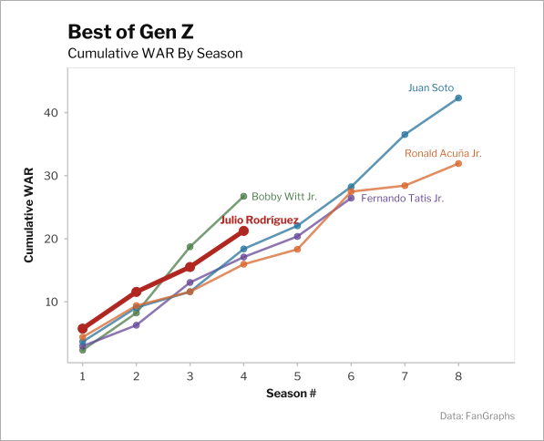
When I wrote about Julio Rodríguez a few weeks ago, one of the points I made was that he has a “not-so-distant” shot at being the best player of Generation Z. My wording was intentional, a careful hedge illustrated by this plot:
The plot shows Rodríguez was the best player among Gen Z through his first two seasons and the second best through four seasons, behind only Bobby Witt Jr. This is a lie of omission. Rodríguez debuted when he was 21, and Witt debuted when he was 22; the plot compares them to Ronald Acuña Jr. and Fernando Tatis Jr., who each debuted when they were 20, and Juan Soto, who debuted at 19. Read the rest of this entry »