Michael McLoone, Eric Canha, and Brian Fluharty-Imagn Images
There’s a war going on across major league baseball. It’s been waged over decades, in fact, between two opposing factions of the game. Pitchers, at times aided by their catchers, want to own the top of the strike zone, the place where their fastballs have the easiest time missing bats. Hitters want to hit home runs, and the top of the zone is an ideal launching pad. But while both sides would dearly love to own the territory, they can’t both win at once. What follows are some dispatches from the front, the latest moves and counter-moves by some of the game’s best in this contested space.
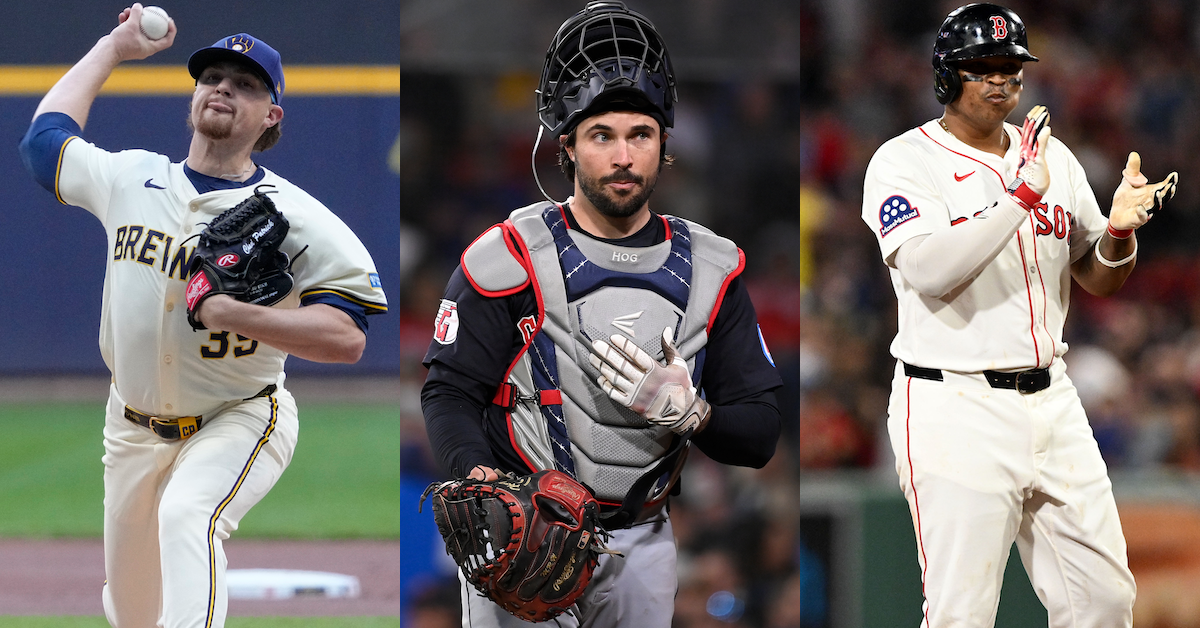
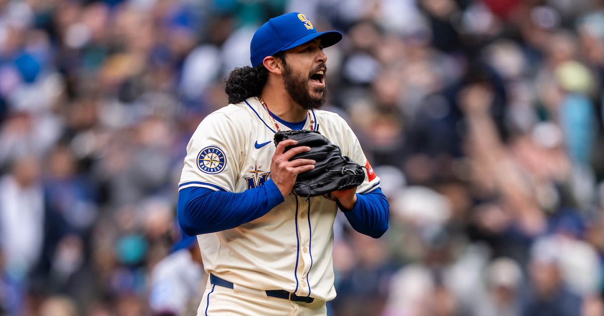
Chad Patrick lives at the top of the zone. No pitcher in baseball throws upstairs fastballs more frequently. He might not seem like the type. He’s a soft tosser in the context of the modern major leagues, sitting in the low 90s with his four-seamer and sinker, and the high 80s with his cutter. But for Patrick, shape is more important than velocity.
As Alex Chamberlain has extensivelyexplained, the plane of a pitch when it reaches home plate is a key determinant of its success. That’s most true at the top of the zone for four-seamers. Pitches that come in high and flat act like optical illusions – the average fastball thrown to that area falls more, because it’s falling at a steeper angle. Read the rest of this entry »
This is a public service post of sorts. If you’re like me, when you type “Run Ex” into Google, it will auto-complete to “Run Expectancy Matrix.” It knows what I want – a mathematical description of how likely teams are to score in a given situation, in aggregate. I use this extensively in analysis, and I also use it in my head when I’m watching a game. First and third, down a run? That’s pretty good with no outs, but isn’t amazing with two.
There’s just one problem with that Google search: It’s all old data. Oh, you can find tables from The Book. You can find charts that are current through 2019. There’s a Pitcher List article that I use a lot — shout out to Dylan Drummey, great work — but that’s only current through 2022. And baseball is changing so dang much. Rather than keep using old information, I thought I’d update it for 2025 and give you some charts from past years while I’m at it, so that you can understand the changing run environment and use them for your own purposes if you so desire.
First things first: Let’s talk methodology. I downloaded play-by-play logs for all regular season games played between 2021 and 2025. For each play, I noted the runners on base, the number of outs, and then how many runs scored between that moment and the end of the inning. I did this for the first eight innings of each game, excluding the ninth and extras, because those innings don’t offer unbiased estimates of how many runs might score. Teams sometimes play to the score, and the home team stops scoring after the winning run. If you have the bases loaded and no one out in the bottom of the ninth, one run will usually end it, and that provides an inaccurate picture of run scoring. That’s also why I skipped 2020; the seven-inning doubleheaders and new extra innings rules produced a pile of crazy results, and the season was quite short anyway. No point in trying to wade through that maze. Read the rest of this entry »
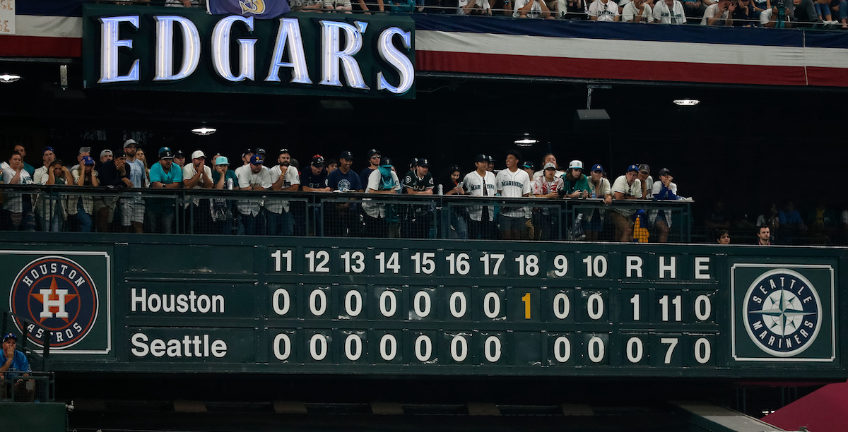
Home teams don’t win enough in extra innings. It’s one of the most persistent mysteries of the last five years of baseball. Before the 2020 season, MLB changed the extra innings rules to start each half of each extra frame with a runner on second base. (This only occurs during the regular season, which means the 18-inning ALDS tilt between the Mariners and the Astros in the picture above didn’t actually feature zombie runners, but the shot was too good to pass up.) They did so to lessen the wear and tear on pitchers, and keep games to a manageable length. Almost certainly, though, they weren’t planning on diminishing home field advantage while they were at it.
In recent years, Rob Mains of Baseball Prospectushasextensivelydocumented the plight of the home team. Connelly Doan measured the incidence of bunts in extra innings and compared the observed rate to a theoretical optimum. Earlier this month, Jay Jaffe dove into the details and noted that strikeouts and walks are a key point of difference between regulation frames and bonus baseball. These all explain the differing dynamics present in extras. But there’s one question I haven’t seen answered: How exactly does this work in practice? Are home teams scoring too little? Are away teams scoring too much? Do home teams play the situations improperly? I set out to answer these questions empirically, using all the data we have on extra innings, to get a sense of where theory and practice diverge.
The theory of extra inning scoring is relatively simple. I laid it out in 2020, and the math still works. You can take a run expectancy chart, start with a runner on second and no one out, and figure out how many runs teams score in that situation in general. If you want to get fancy, you can even find a distribution: how often they score one run, two runs, no runs, and so on. For example, I can tell you that from 2020 to 2025, excluding the ninth inning and extra innings, teams that put a runner on second base with no one out went on to score 0.99 runs per inning. Read the rest of this entry »
Yesterday, I wrote an introduction to Statcast’s latest round of bat tracking metrics. MLB.com’s Mike Petriello wrote a real primer, so I tried to build on that by analyzing how the different metrics work together using a couple common pitch types. We’re still figuring out how to use these new toys, but today I’d like to explain how my first dive into the bat tracking metrics led me to one particular player who is doing something weird, which led me to learn something small about the way swings work. After all, that’s why we’re here exploring all these strange new numbers in the first place.
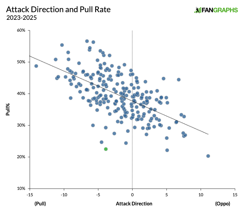
In my first shot at playing with the metrics, I tried to establish something simple. I pulled the overall bat tracking data for all qualified players, and I focused on Attack Direction, which tells you the horizontal angle of the bat at the moment of contact (or, in the case of a whiff, at the moment when the bat is closest to the ball). That seemed pretty straightforward to me. As with most bat tracking metrics, it’s also a timing and location metric. You generally need to meet inside pitches further out in front of home plate. If you’re behind the pitch, your bat will be angled toward the opposite field, and you won’t pull the ball. If you’re out in front of the pitch, your bat will be angled toward the pull side, and you’ll pull it. A player’s average Attack Direction should correlate pretty well with their pull rate, and the numbers pretty much bear that out. Attack Direction and pull rate have a .60 correlation coefficient:
Most of the dots are clustered around that very clear trendline. Players who pull the ball more tend to have their bats angled toward the pull side just as you’d expect. What interested me was that green dot way at the bottom. It belongs to Leody Taveras. I guess it is Leody Taveras, if we really believe in our graphs, which we probably should at this particular website.
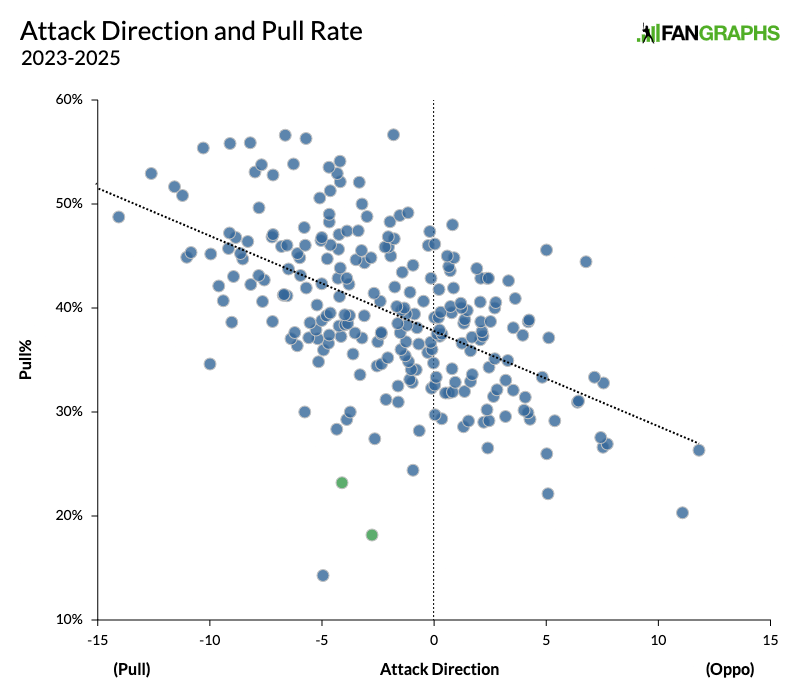
Taveras has a moderately low Attack Direction, four degrees to the pull side, but he’s got the third-lowest pull rate of any player on this chart. I couldn’t help wondering how exactly he was doing that. Before I dug into it too deeply, I was reminded that the fact that he’s a switch-hitter might have something to do with it. So I pulled the data again, this time separating out all players by handedness. On the chart below, switch-hitters will appear twice:
The correlation isn’t quite as strong, because switch-hitters are now broken into two different players with two smaller samples (that’s how small-sample right-handed Patrick Bailey got way down at the bottom). But there are two green dots now! And they’re both Leody Taveras! From both sides of the plate, Taveras looks like he should have a pull rate that’s a bit above average, and instead has one of the very lowest pull rates in the game. At this point, I was officially curious, so I started poking around.
First, I specifically looked at Attack Direction on balls hit to the opposite field. Since the start of bat tracking midway through the 2023 season, when Taveras hits the ball the other way, his average Attack Direction is three degrees toward the opposite field. Only four players in baseball have an average Attack Direction that’s less oriented toward the opposite field. Oddly, they’re all sluggers. Salvador Perez, Yordan Alvarez, Aaron Judge, and José Ramírez are all at two degrees toward the opposite field, and Austin Riley is tied with Taveras at three degrees. Taveras is definitely not a slugger. He could not be more different from these five guys. So not only is he doing something way different from most hitters when he goes the opposite way, but the only players out on that ledge with him have completely different swings than he does. There really is something weird about him.
Next, I tried looking specifically for balls hit to the opposite field even though the bat was angled toward the pull side at the moment. Just 21% of balls hit to the opposite field have the bat angled toward the pull side at all. I ran a Baseball Savant search, setting the minimum Attack Direction at seven degrees toward the pull side. Since bat tracking started, 5.5% of Taveras’s batted balls have fallen into this category. Among the 375 players with at least 200 BIP over that period, that’s the 11th-highest rate. Elehuris Montero is the champion at a shocking 10.5%, but no player who has put as many balls in play as Taveras has run as high a rate as he has.
At that point, I decided to look at individual balls that fell into this category: balls that go to the opposite field even though the bat is angled toward the pull side at contact. How exactly does this happen? Try to picture it in your mind. If the bat is angled toward the pull side, and it’s being swung in that direction anyway, how does the ball end up going in the opposite direction? There are two main answers. Here’s the less common way:
That’s Taveras way, way out in front of a curveball, hitting it off the very end of his bat. He cued it up so perfectly that if the end of his bat were cupped, the ball might have just gotten stuck in there. So that’s one way to do it. In fact, 21% of the balls we’re looking at, hit to the opposite field even though the Attack Direction is seven or more degrees to the pull side, are squibbers hit off the end of the bat below 80 mph. That’s one way to do it.
The other way is much more common, and it looks like this:
Of those same balls, hit to the opposite field even though the Attack Direction is seven or more degrees to the pull side, 50% are classified as popups, and 65% have a launch angle above 38 degrees. Basically, when you hit a ball in that weird manner, it’s almost always going to be either a cue shot or a popup. Leody Taveras taught me that.
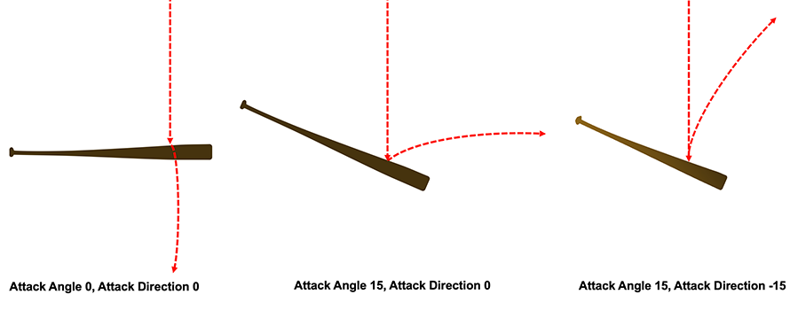
This has a lot to do with Attack Angle. If your bat were perfectly parallel to the ground, but angled toward the pull side, it would be pretty much impossible to hit the ball the other way. But when you pop the ball up, you’re not hitting it flush. You’re getting under it. And regardless of the situation, your bat is almost never parallel to the ground. According to Statcast, the bat is angled downward on more than 80% of swings. If you just look at popups, that number is up above 90%. About half of popups come on four-seamers and cutters, where the batter has trouble catching up and swings just under the pitch. The rest come on softer stuff, and those pitches are usually low in the zone. I need you to do some 3D visualization in your head here, because my diagram is not very good:
On the left is a perfectly level bat, parallel with the front of the plate. Now imagine you’re angling your bat downward and you get just underneath the ball. If your bat is angled toward the opposite field or, as in the middle example, straight toward center field, you’ll likely just foul the ball off behind you or into the opposite field stands. Once you angle it toward the pull side, however, it can stay fair, bouncing up and toward the opposite field. Please imagine that the bat on the right looks so funky because it’s foreshortened, pointed out toward the first baseman. Taveras can show us what that looks like in the real world:
If his Attack Direction were zero, he would’ve fouled the ball up and into the stands down the third base line. He only kept it fair because of his Attack Direction of 18 degrees.
Look, I don’t have a big takeaway here. I just think this interesting. I think it highlights the way that the angle of the bat informs even the most mundane batted balls. If you’d asked me yesterday whether it’s possible to go the opposite way while your bat was angled toward the pull side, I would’ve had to think about it, but my first reaction would’ve been to say no. The bat and ball move through space so quickly that they can be hard to track, but the bat tracking metrics help explain why exactly Taveras pops out so very, very often, and how it’s even possible to hit a ball like that in the first place.
Aaron Nola is having a truly awful season: Through nine starts, he’s 1-7 with a 6.16 ERA, which is bad for any pitcher. For the putative no. 2 starter on a big-market team whose fans are getting pretty tetchy about not having won a World Series in a while, it’s disastrous. Especially when said pitcher is in year two of a seven-year, $172 million contract. In fact, you’d have to say Nola has been surpassed in the pecking order by Cristopher Sánchez at the very least, and possibly by newcomer Jesús Luzardo.
Everyone’s got their theories as to what’s gone wrong. Davy Andrews tried to figure out Nola’s deal last month. Timothy Jackson of Baseball Prospectusspeculated earlier this week that there’s something off with his fastball, and that lefty-heavy opposing lineups might be to blame. The Phillies, for their part, just put Nola on the (non-COVID) IL for the first time in almost eight years. The stated reason is an ankle injury Nola says is messing up his mechanics, but a player in a slump this bad can almost always use some time off to clear his head as well. Read the rest of this entry »
At one point or another, most of us have done the thing where we go to the refrigerator in search of a snack, decide nothing looks appealing, close the door, then come back 15 minutes later to check again and somehow feel annoyed when the contents remain unchanged. It’s a near-universal experience despite the illogical nature of the whole thing. And when we relate this experience to others, it’s always the refrigerator, even though we could just as easily choose to re-check a cabinet or the pantry. But I think this is where we do get some credit for being slightly logical. The contents of a refrigerator are far more transient than the dry and canned goods stored elsewhere in the kitchen. The fridge is where we keep the perishables, the food that by definition isn’t meant to last long. Food in the refrigerator comes and goes, rots and gets tossed, all at a much faster rate than elsewhere in the kitchen.
Park factors work a little like a refrigerator. They present a single value that contains within it the influence of several different components that vary from park to park, much in the way my refrigerator is two-thirds beverages and cheese, while yours probably has fruits and veggies and maybe some leftover ham from Easter that you should definitely throw away. Some of the components captured by park factors are static and easily measured, like surface dimensions and wall height. They’re the condiments that remain consistently stocked in the fridge door.
But sometimes you throw open the door to a park’s refrigerator and get whacked in the face with a stench of unknown origin. And that stench becomes all the more potent as it mingles with a to-go box of leftover Thai and a carton of milk growing more questionable by the day. Likewise, wind speeds, the daily dew point, and the angle of the sun at different points relative to the solstice all fluctuate and interact in a way that a scientist with the right expertise could tease out and quantify, but that remain a bit fuzzy to the casual observer.
It was these squishier components of park factors, the ones that ebb and flow as weather cycles in and out and the seasons change, that sparked my curiosity about how park factors might vary over the course of such a long season. Traditionally, park factors are calculated over multiple full seasons of data (though sometimes single-season park factors are useful for capturing more recent trends), and that’s not just a sample size consideration. A full season of data is needed to ensure a balanced schedule where every opponent faced on the road is also faced at home and vice versa. This ensures that when comparing runs per game at home to runs per game on the road, the team quality is consistent in both subsets. Read the rest of this entry »
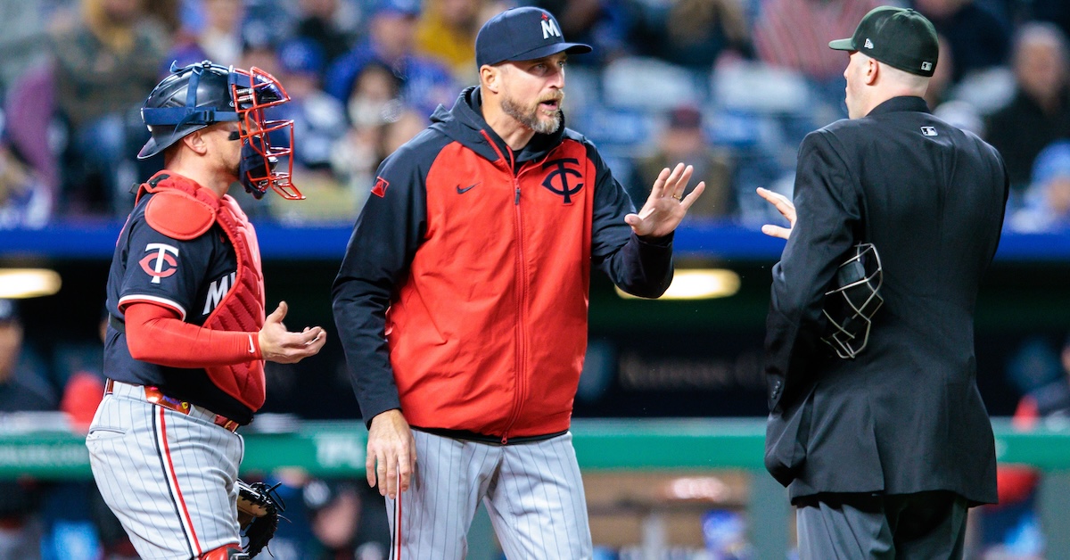
Last week, I investigated the increasing divergence between the way pitchers approach same-handed and opposite-handed batters. I learned that pitchers across the league are varying their arsenals more and more every year. But that was a broad look, and I had some follow-up questions. Mainly, who specifically? Which teams? Which players? And how? Today, I’ll provide some answers.
As a refresher, I calculated what I’m calling “adaptation score” by comparing how frequently a pitcher uses his top-two offerings, both against same-handed and opposite-handed batters. Adaptation score is simply the difference between how frequently a pitcher throws his two best pitches when he has the platoon advantage and how often he throws those same two pitches when the batter has the edge. I split the data up by teams to see who was driving the move. First, we’ve got the five most and least adaptable teams in 2025:
Most Adaptable Pitching Staffs, 2025
Team
Adaptation Score
Orioles
28.2
Marlins
26.9
Nationals
26.1
Guardians
24.8
Reds
23.2
Least Adaptable Pitching Staffs, 2025
Team
Adaptation Score
Twins
13.1
Cubs
13.9
Royals
14.8
Blue Jays
15.7
Dodgers
15.9
Not much to see here. The Dodgers’ being on the bottom might suggest that adaptation is bad, even. But truthfully, there’s a big element we’re missing in looking at the data this way: personnel. Changing who’s on your team, even if you have the same philosophy, can change how you score in this metric. The Dodgers were in the middle of the pack last year when it came to adaptation score. Then they overhauled their pitching staff and ended up here. Read the rest of this entry »
If you are familiar with Andrés Muñoz, the baseball player, you may know that he is good. It may be enough for you to simply witness and bask in his elite performance, and question it no further. (Rarely are we so content here.) You may not realize he is unusual; you may not care. Often in baseball, being good and being unusual go hand in hand. This is a short exploration, albeit one preceded by an exorbitantly long prologue, of why Muñoz is good and unusual.
If you are familiar with FanGraphs, the baseball website, you may know about approach angles. If not: A pitch’s approach angle is the three-dimensional angle at which it crosses the front of home plate. Broken down into its two-dimensional vectors, it becomes vertical approach angle (VAA) and horizontal approach angle (HAA).
VAA is a description of pitch shape and thus depends on other physical attributes of the pitch — namely, its velocity and acceleration in all three dimensions. While representing the most distilled measurements of a pitch’s movement through space, the velocity and acceleration vectors themselves are functions of release height, release angle, release speed, spin rate, spin axis, spin efficiency… it goes on. VAA, as it happens, is very sensitive to pitch height. Reporting a pitch’s average VAA is not especially meaningful without either providing locational context or stripping it of that context all together.
To accomplish the latter, I developed VAA Above Average. It’s a simple recalculation that communicates a fastball’s flatness or steepness irrespective of pitch height. Through this it’s much easier to see that, for example, flatter VAAs induce higher swinging strike rates (SwStr%) at all pitch heights compared to steeper VAAs (forgive the half-baked visualization):
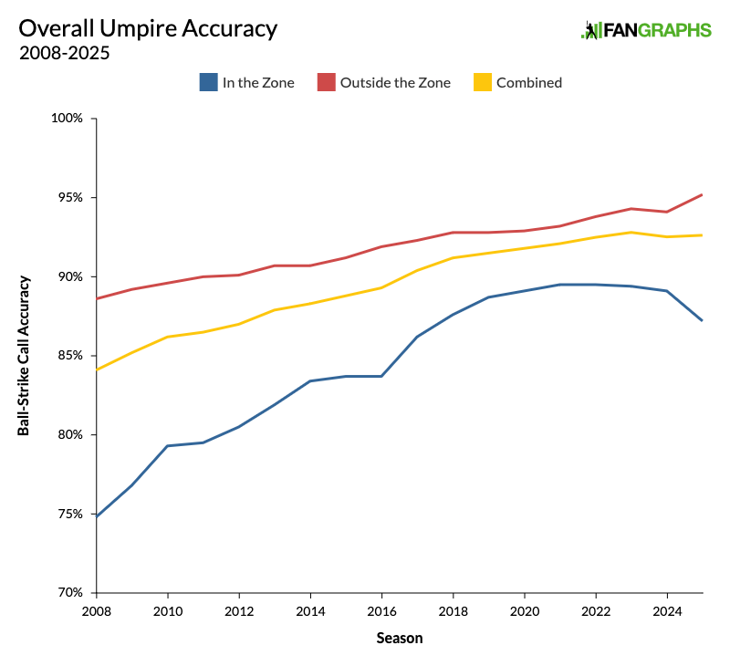
I’ve been writing about the strike zone for a few years now, and if there’s been one overarching theme to my work so far, it’s the inescapable takeaway that umpires are excellent at what they do. When Major League Baseball introduced PITCHf/x in 2008, umpires got 84.1% of ball-strike calls right according to the Statcast strike zone. Over the intervening years, while ever-nastier stuff and a revolution in pitch framing had made their jobs harder and harder, umpires did nothing but get better. Accuracy broke 92% in 2021 and inched its way toward 93% over the next two seasons. That trend of improving every year finally changed in 2024.
As I wrote yesterday, last season marked the first time that umpires got worse rather than better. That’s interesting enough on its own, but right when it was time to wonder whether they’d gotten as good as they could get, the rules of the game changed. Over the offseason, a new labor agreement included a change to the way that umpires are assessed by the league. The grading got much tighter, reducing the buffer around the edges of the strike zone from two inches on the outside of the zone to three-quarters of an inch on either side. The strike zone is the same, but umpires are being judged much more tightly. Let’s dive into the numbers and see what looks different so far this season. Here’s a graph that shows overall accuracy in every season of the pitch tracking era.
The yellow line shows overall accuracy, and it’s ticked back up from 2024. Even though it’s early in the season, a time when umpires are at their least accurate, they’re still doing better than they did last year. Accuracy fell from 92.81% in 2023 to 92.53% in 2024, and is now back up to 92.63%. In fact, if you look only at March and April stats – which is more fair, because umpires are worse earlier in the season – you’ll find that umpires just had their best opening month of the season ever. They called 82% of pitches in the shadow zone correctly. Read the rest of this entry »
Back in January, I wrote an article called “Unfuzzing the Strike Zone.” The premise was pretty simple. As umpires have grown more accurate, as the edges of the strike zone have gotten clearer and more distinct, the strike zone has effectively gotten smaller. Misses go both ways, but there’s a big difference between an incorrectly called ball and an incorrectly called strike. Calling a pitch inside the zone a ball doesn’t shrink the effective size of the zone, but calling a pitch outside the zone a strike does make it bigger. As long as a pitcher knows it’s possible to get a strike call out there, they’ll consider it part of the zone. Little did I know that as I was writing that article, Major League Baseball was preparing to test its exact premise.
The strike zone has steadily shed its fuzz over the past 23 seasons, but on Thursday, Jayson Stark and Ken Rosenthal reported in The Athletic that the league has decided to break out a sweater shaver. Over the offseason, the Major League Umpires Association came to a new agreement with MLB. Part of the agreement included tightening the standards by which ball-strike calls are graded.
Umpires used to have a two-inch buffer around the edge of the strike zone, meaning that if they’d missed a call by fewer than two inches outside the zone, the call would still go down as correct in their assessments. Having that buffer is necessary because calling balls and strikes is extraordinarily difficult. It’s extremely rare for an umpire to get every call right even in a single game. The new border is just three-quarters of an inch on either side. The league is demanding a less fuzzy strike zone. Read the rest of this entry »